1. Introduction to Writing Modes
CSS Writing Modes Level 3 defines CSS features to support for various international writing modes, such as left-to-right (e.g. Latin or Indic), right-to-left (e.g. Hebrew or Arabic), bidirectional (e.g. mixed Latin and Arabic) and vertical (e.g. Asian scripts).
A writing mode in CSS is determined by the writing-mode, direction, and text-orientation properties. It is defined primarily in terms of its inline base direction and block flow direction:

Latin-based writing mode

Mongolian-based writing mode

Han-based writing modes
The inline base direction is the primary direction in which content is ordered on a line and defines on which sides the “start” and “end” of a line are. The direction property specifies the inline base direction of a box and, together with the unicode-bidi property and the inherent directionality of any text content, determines the ordering of inline-level content within a line.
The block flow direction is the direction in which block-level boxes stack and the direction in which line boxes stack within a block container. The writing-mode property determines the block flow direction.
Writing systems typically have one or two native writing modes. Some examples are:
- Latin-based systems are typically written using a left-to-right inline direction with a downward (top-to-bottom) block flow direction.
- Arabic-based systems are typically written using a right-to-left inline direction with a downward (top-to-bottom) block flow direction.
- Mongolian-based systems are typically written using a top-to-bottom inline direction with a rightward (left-to-right) block flow direction.
- Han-based systems are commonly written using a left-to-right inline direction with a downward (top-to-bottom) block flow direction, or a top-to-bottom inline direction with a leftward (right-to-left) block flow direction. Many magazines and newspapers will mix these two writing modes on the same page.
A horizontal writing mode is one with horizontal lines of text, i.e. a downward or upward block flow. A vertical writing mode is one with vertical lines of text, i.e. a leftward or rightward block flow.
These terms should not be confused with vertical block flow (which is a downward or upward block flow) and horizontal block flow (which is leftward or rightward block flow). To avoid confusion, CSS specifications avoid this latter set of terms.
The typographic mode determines whether to use typographic conventions specific to vertical flow for vertical scripts (vertical typographic mode) or to use the typographic conventions of horizontal writing modes (horizontal typographic mode). This concept distinguishes vertical typesetting from rotated horizontal typesetting.
The text-orientation component of the writing mode controls the glyph orientation in vertical typographic modes, dictating whether a particular typographic character unit is typeset upright or typeset sideways.
See Unicode Technical Note #22 [UTN22] (HTML version) for a more in-depth introduction to writing modes and vertical text.
1.1. Module Interactions
This module replaces and extends the unicode-bidi and direction features defined in [CSS2] sections 8.6 and 9.10. The interaction of its features with other text operations in setting lines of text is described in CSS Text 3 § A Text Processing Order of Operations.
The computed values of the writing-mode, direction, and text-orientation properties (even on elements to which these properties themselves don’t apply [CSS-CASCADE-4]) are broadly able to influence the computed values of other, unrelated properties through calculations such as the computation of font-relative lengths or the cascade of flow-relative properties which purposefully depend on the computed writing mode or on font metrics that can depend on the writing mode.
1.2. Value Definitions and Terminology
This specification follows the CSS property definition conventions from [CSS2] using the value definition syntax from [CSS-VALUES-3]. Value types not defined in this specification are defined in CSS Values & Units [CSS-VALUES-3]. Combination with other CSS modules may expand the definitions of these value types.
In addition to the property-specific values listed in their definitions, all properties defined in this specification also accept the CSS-wide keywords as their property value. For readability they have not been repeated explicitly.
Other important terminology and concepts used in this specification are defined in [CSS2] and [CSS-TEXT-3].
2. Inline Direction and Bidirectionality
While the characters in most scripts are written from left to right, certain scripts are written from right to left. In some documents, in particular those written with the Arabic or Hebrew script, and in some mixed-language contexts, text in a single (visually displayed) block may appear with mixed directionality. This phenomenon is called bidirectionality, or "bidi" for short.

Bidirectionality
The Unicode standard (Unicode Standard Annex #9) defines a complex algorithm for determining the proper ordering of bidirectional text. The algorithm consists of an implicit part based on character properties, as well as explicit controls for embeddings and overrides. CSS relies on this algorithm to achieve proper bidirectional rendering.
Two CSS properties, direction and unicode-bidi, provide explicit embedding, isolation, and override controls in the CSS layer. Because the base directionality of a text depends on the structure and semantics of the document, the direction and unicode-bidi properties should in most cases be used only to map bidi information in the markup to its corresponding CSS styles.
The HTML specifications ([HTML401], section 8.2, and HTML § 15.3.5 Bidirectional text) define bidirectionality behavior for HTML elements.
If a document language provides markup features to control bidi, authors and users should use those features instead and not specify CSS rules to override them.
2.1. Specifying Directionality: the direction property
| Name: | direction |
|---|---|
| Value: | ltr | rtl |
| Initial: | ltr |
| Applies to: | all elements |
| Inherited: | yes |
| Percentages: | n/a |
| Computed value: | specified value |
| Canonical order: | n/a |
| Animation type: | not animatable |
Because HTML UAs can turn off CSS styling, we recommend HTML authors to use the HTML dir attribute and <bdo> element to ensure correct bidirectional layout in the absence of a style sheet. Authors should not use direction in HTML documents.
This property specifies the inline base direction or directionality of any bidi paragraph, embedding, isolate, or override established by the box. (See unicode-bidi.) In addition, it informs the ordering of table column layout, the direction of horizontal overflow, and the default alignment of text within a line, and other layout effects that depend on the box’s inline base direction.
Values for this property have the following meanings:
- ltr
- This value sets inline base direction (bidi directionality) to line-left-to-line-right.
- rtl
- This value sets inline base direction (bidi directionality) to line-right-to-line-left.
The direction property has no effect on bidi reordering when specified on inline boxes whose unicode-bidi value is normal, because the box does not open an additional level of embedding with respect to the bidirectional algorithm.
The direction property, when specified for table column boxes, is not inherited by cells in the column since columns are not the ancestors of the cells in the document tree. Thus, CSS cannot easily capture the "dir" attribute inheritance rules described in [HTML401], section 11.3.2.1.
2.2. Embeddings and Overrides: the unicode-bidi property
| Name: | unicode-bidi |
|---|---|
| Value: | normal | embed | isolate | bidi-override | isolate-override | plaintext |
| Initial: | normal |
| Applies to: | all elements, but see prose |
| Inherited: | no |
| Percentages: | n/a |
| Computed value: | specified value |
| Canonical order: | per grammar |
| Animation type: | not animatable |
Because HTML UAs can turn off CSS styling, we recommend HTML authors to use the HTML dir attribute, <bdo> element,
and appropriate distinction of text-level vs. grouping-level HTML element types to ensure correct bidirectional layout in the absence of a style sheet. Authors should not use unicode-bidi in HTML documents.
Normally (i.e. when unicode-bidi is normal) an inline box is transparent to the unicode bidi algorithm; content is ordered as if the box’s boundaries were not there. Other values of the unicode-bidi property cause inline boxes to create scopes within the algorithm, and to override the intrinsic directionality of text.
The following informative table summarizes the box-internal and box-external effects of unicode-bidi:
| Outside | |||
|---|---|---|---|
| strong | neutral | ||
| Inside | scoped | embed | isolate |
| override | bidi-override | isolate-override | |
| plaintext | — | plaintext | |
Values for this property have the following (normative) meanings:
- normal
- The box does not open an additional level of embedding with respect to the bidirectional algorithm. For inline boxes, implicit reordering works across box boundaries.
- embed
-
If the box is inline, this value creates a directional embedding by opening an additional level of embedding with respect to the bidirectional algorithm.
The direction of this embedding level is given by the direction property. Inside the box, reordering is done implicitly.
This value has no effect on boxes that are not inline.
- isolate
-
On an inline box, this bidi-isolates its contents.
This is similar to a directional embedding (and increases the embedding level accordingly)
except that each sequence of inline-level boxes
uninterrupted by any block boundary or forced paragraph break is treated as an isolated sequence:
- the content within the sequence is ordered as if inside an independent paragraph with the base directionality specified by the box’s direction property.
- for the purpose of bidi resolution in its containing bidi paragraph, the sequence is treated as if it were a single Object Replacement Character (U+FFFC).
This value has no effect on boxes that are not inline.
- bidi-override
- This value puts the box’s immediate inline content in a directional override. For an inline, this means that the box acts like a directional embedding in the bidirectional algorithm, except that reordering within it is strictly in sequence according to the direction property; the implicit part of the bidirectional algorithm is ignored. For a block container, the override is applied to an anonymous inline box that surrounds all of its content.
- isolate-override
- This combines the isolation behavior of isolate with the directional override behavior of bidi-override: to surrounding content, it is equivalent to isolate, but within the box content is ordered as if bidi-override were specified. It effectively nests a directional override inside an isolated sequence.
- plaintext
-
This value behaves as isolate except that for the purposes of the Unicode bidirectional algorithm, the base directionality of each of the box’s bidi paragraphs (if a block container) or isolated sequences (if an inline) is determined by following the heuristic in rules P2 and P3 of the Unicode bidirectional algorithm (rather than by using the direction property of the box).
Following Unicode Bidirectional Algorithm clause HL3 [UAX9], values other than normal effectively insert the corresponding Unicode bidi control codes into the text stream at the start and end of the inline element before passing the paragraph to the Unicode bidirectional algorithm for reordering. (See § 2.4.2 CSS–Unicode Bidi Control Translation, Text Reordering.)
| unicode-bidi value | direction value | |||
|---|---|---|---|---|
| ltr | rtl | |||
| start | end | start | end | |
| normal | — | — | — | — |
| embed | LRE (U+202A) | PDF (U+202C) | RLE (U+202B) | PDF (U+202C) |
| isolate | LRI (U+2066) | PDI (U+2069) | RLI (U+2067) | PDI (U+2069) |
| bidi-override* | LRO (U+202D) | PDF (U+202C) | RLO (U+202E) | PDF (U+202C) |
| isolate-override* | FSI,LRO (U+2068,U+202D) | PDF,PDI (U+202C,U+2069) | FSI,RLO (U+2068,U+202E) | PDF,PDI (U+202C,U+2069) |
| plaintext | FSI (U+2068) | PDI (U+2069) | FSI (U+2068) | PDI (U+2069) |
| * The LRO/RLO+PDF pairs are also applied to the root inline box of a block container if these values of unicode-bidi were specified on the block container. | ||||
Because the unicode-bidi property does not inherit, setting bidi-override or plaintext on a block box will not affect any descendant blocks. Therefore these values are best used on blocks and inlines that do not contain any block-level structures.
Note that unicode-bidi does not affect the direction property even in the case of plaintext, and thus does not affect direction-dependent layout calculations.
Because the Unicode algorithm has a limit of 125 levels of embedding, care should be taken not to overuse unicode-bidi values other than normal. In particular, a value of inherit should be used with extreme caution in deeply nested inline markup. However, for elements that are, in general, intended to be displayed as blocks, a setting of unicode-bidi: isolate is preferred to keep the element together in case the display is changed to inline (see example below).
2.3. Example of Bidirectional Text
The following example shows an XML document with bidirectional text. It illustrates an important design principle: document language designers should take bidi into account both in the language proper (elements and attributes) and in any accompanying style sheets. The style sheets should be designed so that bidi rules are separate from other style rules, and such rules should not be overridden by other style sheets so that the document language’s bidi behavior is preserved.
In this example, lowercase letters stand for inherently left-to-right characters and uppercase letters represent inherently right-to-left characters. The text stream is shown below in logical backing store order.
<section dir=rtl>
  <para>HEBREW1 HEBREW2 english3 HEBREW4 HEBREW5</para>
  <para>HEBREW6 <emphasis>HEBREW7</emphasis> HEBREW8</para>
</section>
<section dir=ltr>
  <para>english9 english10 english11 HEBREW12 HEBREW13</para>
  <para>english14 english15 english16</para>
  <para>english17 <quote dir=rtl>HEBREW18 english19 HEBREW20</quote></para>
</section>
Since this is arbitrary XML, the style sheet is responsible for setting the writing direction. This is the style sheet:
/* Rules for bidi */
[dir=rtl] {direction: rtl; unicode-bidi: isolate; }
[dir=ltr] {direction: ltr; unicode-bidi: isolate; }

/* Rules for presentation */
section, para  {display: block;}
emphasis       {font-weight: bold;}
quote          {font-style: italic;}
If the line length is long, the formatting of this text might look like this:
               5WERBEH 4WERBEH english3 2WERBEH 1WERBEH

                                8WERBEH 7WERBEH 6WERBEH

english9 english10 english11 13WERBEH 12WERBEH

english14 english15 english16

english17 20WERBEH english19 18WERBEH
The first <section> element is a block with a right-to-left base direction,
the second <section> element is a block with a left-to-right base direction.
The <para>s are blocks that inherit the base direction from their parents.
Thus, the first two <para>s are read starting at the top right,
the final three are read starting at the top left.
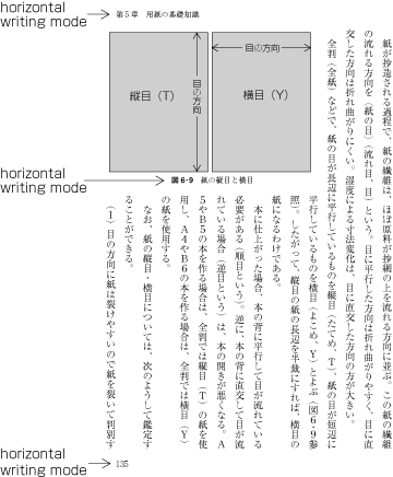
The <emphasis> element is inline-level,
and since its value for unicode-bidi is normal (the initial value),
it has no effect on the ordering of the text.
The <quote> element, on the other hand,
creates an isolated sequence with the given internal directionality.
Note that this causes HEBREW18 to be to the right of english19.
If lines have to be broken, the same text might format like this:
       2WERBEH 1WERBEH
  -EH 4WERBEH english3
                 5WERB

   -EH 7WERBEH 6WERBEH
                 8WERB

english9 english10 en-
glish11 12WERBEH
13WERBEH

english14 english15
english16

english17 18WERBEH
20WERBEH english19
Notice that because HEBREW18 must be read before english19, it is on the line above english19. Just breaking the long line from the earlier formatting would not have worked.
Note also that the first syllable from english19 might have fit on the previous line, but hyphenation of left-to-right words in a right-to-left context, and vice versa, is usually suppressed to avoid having to display a hyphen in the middle of a line.
2.4. Applying the Bidirectional Reordering Algorithm
User agents that support bidirectional text must apply the Unicode bidirectional algorithm to every sequence of inline-level boxes uninterrupted by any block boundary or “bidi type B” forced paragraph break. This sequence forms the paragraph unit in the bidirectional algorithm.
2.4.1. Bidi Paragraph Embedding Levels
In CSS, the paragraph embedding level must be set (following UAX9 clause HL1) according to the direction property of the paragraph’s containing block rather than by the heuristic given in steps P2 and P3 of the Unicode algorithm.
There is, however, one exception: when the computed unicode-bidi of the paragraph’s containing block is plaintext, the Unicode heuristics in P2 and P3 are used as described in [UAX9], without the HL1 override.
2.4.2. CSS–Unicode Bidi Control Translation, Text Reordering
The final order of characters within each bidi paragraph is the same as if the bidi control codes had been added as described for unicode-bidi (above), markup had been stripped, and the resulting character sequence had been passed to an implementation of the Unicode bidirectional algorithm for plain text that produced the same line-breaks as the styled text.
Note that bidi control codes in the source text are still honored, and might not correspond to the document tree structure. This can split inlines or interfere with bidi start/end control pairing in interesting ways.
2.4.3. Bidi Treatment of Atomic Inlines
In this process, replaced elements with display: inline are treated as neutral characters, unless their unicode-bidi property is either embed or bidi-override, in which case they are treated as strong characters in the direction specified for the element. (This is so that, in case the replaced element falls back to rendering inlined text content, its bidi effect on the surrounding text is consistent with its replaced rendering.)
All other atomic inline-level boxes are treated as neutral characters always.
2.4.4. Paragraph Breaks Within Embeddings and Isolates
If an inline box is broken around a bidi paragraph boundary (e.g. if split by a block or forced paragraph break), then the HL3 bidi control codes assigned to the end of the box are also added before the interruption and the codes assigned to the start of the box are also added after it. (In other words, any embedding levels, isolates, or overrides started by the box are closed at the paragraph break and reopened on the other side of it.)
For example, where <BR/> is a forced paragraph break the bidi ordering is identical between
<para>...<i1><i2>...<BR/>...</i2></i1>...</para>
and
<para>...<i1><i2>...</i2></i1><BR/><i1><i2>...</i2></i1>...</para>
for all values of unicode-bidi on inline elements <i1> and <i2>.
Note that this behavior is applied by CSS for CSS-declared bidi controls applied to the box tree; it does not apply to Unicode’s bidi formatting controls, which are defined to terminate their effect at the end of the bidi paragraph.
2.4.5. Reordering-induced Box Fragmentation
Since bidi reordering can split apart and reorder text that is logically contiguous, bidirectional text can cause an inline box containing such text to be split and its fragments reordered within a line.
For each line box, UAs must take the fragments of each inline box and assign the margins, borders, and padding in visual order (not logical order). The start-most fragment on the first line box in which the box appears has the start edge’s margin, border, and padding; and the end-most fragment on the last line box in which the box appears has the end edge’s margin, border, and padding. For example, in the horizontal-tb writing mode:
- When the parent’s direction property is ltr, the left-most box fragment on the first line box in which the box appears has the left margin, left border and left padding, and the right-most box fragment on the last line box in which the box appears has the right padding, right border and right margin.
- When the parent’s direction property is rtl, the right-most fragment of the first line box in which the box appears has the right padding, right border and right margin, and the left-most fragment of the last line box in which the box appears has the left margin, left border and left padding.
Analogous rules hold for vertical writing modes.
The box-decoration-break property can override this behavior to draw box decorations on both sides of each fragment. [CSS3-BREAK]
3. Vertical Writing Modes
In addition to extensions to CSS2.1’s support for bidirectional text, this module introduces the rules and properties needed to support vertical text layout in CSS.
3.1. Introduction to Vertical Writing
This subsection is non-normative.
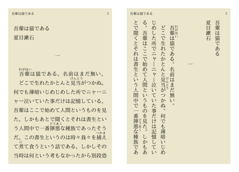
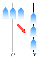
Unlike languages that use the Latin script which are primarily laid out horizontally, Asian languages such as Chinese and Japanese can be laid out vertically. The Japanese example below shows the same text laid out horizontally and vertically. In the horizontal case, text is read from left to right, top to bottom. For the vertical case, the text is read top to bottom, right to left. Indentation from the left edge in the left-to-right horizontal case translates to indentation from the top edge in the top-to-bottom vertical case.
Comparison of vertical and horizontal Japanese: iBunko application (iOS)
For Chinese and Japanese lines are ordered either right to left or top to bottom, while for Mongolian and Manchu lines are ordered left to right.
The change from horizontal to vertical writing can affect not just the layout, but also the typesetting. For example, the position of a punctuation mark within its spacing box can change from the horizontal to the vertical case, and in some cases alternate glyphs are used.
Vertical text that includes Latin script text or text from other scripts normally displayed horizontally can display that text in a number of ways. For example, Latin words can be rotated sideways, or each letter can be oriented upright:
Examples of Latin in vertical Japanese: Daijirin Viewer 1.4 (iOS)
In some special cases such as two-digit numbers in dates, text is fit compactly into a single vertical character box:
Mac Fan, December 2010, p.49
Layouts often involve a mixture of vertical and horizontal elements:
Mixture of vertical and horizontal elements
Vertical text layouts also need to handle bidirectional text layout; clockwise-rotated Arabic, for example, is laid out bottom-to-top.
3.2. Block Flow Direction: the writing-mode property
| Name: | writing-mode |
|---|---|
| Value: | horizontal-tb | vertical-rl | vertical-lr |
| Initial: | horizontal-tb |
| Applies to: | All elements except table row groups, table column groups, table rows, table columns, ruby base containers, ruby annotation containers |
| Inherited: | yes |
| Percentages: | n/a |
| Computed value: | specified value |
| Canonical order: | n/a |
| Animation type: | not animatable |
This property specifies whether lines of text are laid out horizontally or vertically and the direction in which blocks progress. Possible values:
- horizontal-tb
- Top-to-bottom block flow direction. Both the writing mode and the typographic mode are horizontal.
- vertical-rl
- Right-to-left block flow direction. Both the writing mode and the typographic mode are vertical.
- vertical-lr
- Left-to-right block flow direction. Both the writing mode and the typographic mode are vertical.
The writing-mode property specifies the block flow direction, which determines the ordering direction of block-level boxes in a block formatting context; the ordering direction of line boxes in a block container that contains inlines; the ordering direction of rows in a table; etc. By virtue of determining the stacking direction of line boxes, the writing-mode property also determines whether the line boxes' orientation (and thus the writing mode) is horizontal or vertical. The text-orientation property then determines how text is laid out within the line box.
The content of replaced elements do not rotate due to the writing mode:
images and external content such as from <iframe>s, for example, remain upright,
and the default object size of 300px×150px does not re-orient.
However embedded replaced content involving text
(such as MathML content or form elements)
should match the replaced element’s writing mode and line orientation
if the UA supports such a vertical writing mode for the replaced content.
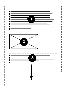
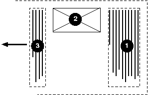
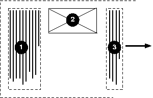
In the following example, two block elements (1 and 3) separated by an image (2) are presented in various flow writing modes.
Here is a diagram of horizontal writing mode (writing-mode: horizontal-tb):
Here is a diagram for the right-to-left vertical writing mode commonly
used in East Asia (writing-mode: vertical-rl):
And finally, here is a diagram for the left-to-right vertical
writing mode used for Manchu and Mongolian (writing-mode: vertical-lr):
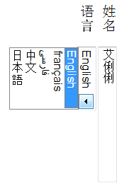
In the following example, some form controls are rendered inside a block with vertical-rl writing mode. The form controls are rendered to match the writing mode.
<style>
  form { writing-mode: vertical-rl; }
</style>
...
<form>
<p><label>姓名 <input value="艾俐俐"></label>
<p><label>语言 <select><option>English
                       <option>français
                       <option>فارسی
                       <option>中文
                       <option>日本語</select></label>
</form>
If a box has a different writing-mode value than its parent box (i.e. nearest ancestor without display: contents):
- If the box would otherwise become an in-flow box with a computed display of inline, its display computes instead to inline-block.
- If the box is a block container, then it establishes an independent block formatting context.
- More generally, if its specified inner display type is flow, then its computed inner display type becomes flow-root. [CSS-DISPLAY-3]
As all other inherited CSS properties do, the writing-mode property inherits to SVG elements inlined (rather than linked) into the source document. This could cause unintentional side effects when, for example, an SVG image designed only for horizontal flow was embedded into a vertical flow document.
Authors can prevent this from happening by adding the following rule:
3.2.1. Obsolete SVG1.1 writing-mode Values
SVG1.1 [SVG11] defines some additional values: lr, lr-tb, rl, rl-tb, tb, and tb-rl.
These values are obsolete in any context except SVG1 documents and are therefore optional for non-SVG UAs.
3.2.1.1. Supporting SVG1.1 writing-mode values in CSS syntax
UAs that wish to support these values in the context of CSS must compute them as follows:
| Specified | Computed |
|---|---|
| lr | horizontal-tb |
| lr-tb | |
| rl | |
| rl-tb | |
| tb | vertical-rl |
| tb-rl |
The SVG1.1 values were also present in an older version of the CSS writing-mode specification, which is obsoleted by this specification. The additional tb-lr value of that revision is replaced by vertical-lr.
3.2.1.2. Supporting SVG1.1 writing-mode values in presentational attributes
In order to support legacy content with presentational attributes, and to allow authors to create documents that support older clients, SVG UAs must add the following style sheet rules to their default UA stylesheet:
@namespace svg"http://www.w3.org/2000/svg" ; svg|*[ writing-mode=lr], svg|*[ writing-mode=lr-tb], svg|*[ writing-mode=rl], svg|*[ writing-mode=rl-tb] { writing-mode : horizontal-tb; } svg|*[ writing-mode=tb], svg|*[ writing-mode=tb-rl] { writing-mode : vertical-rl; }
svg|text { writing-mode: tb; writing-mode: vertical-rl; }
4. Inline-level Alignment
When different kinds of inline-level content are placed together on a line, the baselines of the content and the settings of the vertical-align property control how they are aligned in the transverse direction of the line box. This section discusses what baselines are, how to find them, and how they are used together with the vertical-align property to determine the alignment of inline-level content.
4.1. Introduction to Baselines
This section is non-normative.
A baseline is a line along the inline axis of a line box along which individual glyphs of text are aligned. Baselines guide the design of glyphs in a font (for example, the bottom of most alphabetic glyphs typically align with the alphabetic baseline), and they guide the alignment of glyphs from different fonts or font sizes when typesetting.

Alphabetic text in two font sizes with the baseline and em-boxes
Different writing systems prefer different baseline tables.
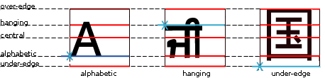
Preferred baselines in various writing systems
A well-constructed font contains a baseline table, which indicates the position of one or more baselines within the font’s design coordinate space. (The design coordinate space is scaled with the font size.)
In a well-designed mixed-script font, the glyphs are positioned in the coordinate space to harmonize with one another when typeset together. The baseline table is then constructed to match the shape of the glyphs, each baseline positioned to match the glyphs from its preferred scripts.
The baseline table is a property of the font, and the positions of the various baselines apply to all glyphs in the font.
Different baseline tables can be provided for alignment in horizontal and vertical text. UAs should use the vertical tables in vertical typographic modes and the horizontal tables otherwise.
4.2. Text Baselines
In this specification, only the following baselines are considered:
- alphabetic
- The alphabetic baseline, which typically aligns with the bottom of uppercase Latin glyphs.
- central
- The ideographic central baseline, which typically crosses the center of the em box. If the font is missing this baseline, it is assumed to be halfway between the ascender (over) and descender (under) edges of the ideographic em box.
In vertical typographic mode, the central baseline is used as the dominant baseline when text-orientation is mixed or upright. Otherwise the alphabetic baseline is used.
A future CSS module will deal with baselines in more detail and allow the choice of other dominant baselines and alignment options.
4.3. Atomic Inline Baselines
If an atomic inline (such as an inline-block, inline-table, or replaced inline element) does not have a baseline, then the UA synthesizes a baseline table thus:
- alphabetic
- The alphabetic baseline is assumed to be at the under margin edge.
- central
- The central baseline is assumed to be halfway between the under and over margin edges of the box.
The vertical-align property in [CSS2] defines the baseline of inline-table and inline-block boxes with some exceptions.
4.4. Baseline Alignment
The dominant baseline (which can change based on the typographic mode) is used in CSS for alignment in two cases:
- Aligning glyphs from different fonts within the same inline box. The glyphs are aligned by matching up the positions of the dominant baseline in their corresponding fonts.
-
Aligning a child inline-level box within its parent. For the vertical-align value of baseline, child is aligned to
the parent by matching the parent’s dominant baseline to the same
baseline in the child. (E.g. if the parent’s dominant baseline is
alphabetic, then the child’s alphabetic baseline is matched to the
parent’s alphabetic baseline, even if the child’s dominant baseline
is something else.)
For values of sub, super, <length>, and <percentage>, the baselines are aligned as for baseline,
but the child is shifted according to the offset given by its vertical-align value.
Given following sample markup:
<p><span class="outer">Ap <span class="inner">ਜੀ</span></span></p>
And the following style rule:
span.inner { font-size: .75em; }The baseline tables of the parent (
.outer) and the child (.inner) will not match up due to the font size difference. Since the dominant baseline is the alphabetic baseline, the child box is aligned to its parent by matching up their alphabetic baselines.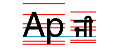
If we assign vertical-align: super to the
.innerelement from the example above, the same rules are used to align the.innerchild to its parent; the only difference is in addition to the baseline alignment, the child is shifted to the superscript position.span.inner { vertical-align: super; font-size: .75em; }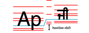
5. Introduction to Vertical Text Layout
Each writing system has one or more native orientations. Modern scripts can therefore be classified into three orientational categories:
- horizontal-only
- Scripts that have horizontal, but not vertical, native orientation. Includes: Latin, Arabic, Hebrew, Devanagari
- vertical-only
- Scripts that have vertical, but not horizontal, native orientation. Includes: Mongolian, Phags Pa
- bi-orientational
- Scripts that have both vertical and horizontal native orientation. Includes: Han, Hangul, Japanese Kana
A vertical script is one that has a native vertical orientation: i.e. one that is either vertical-only or that is bi-orientational. A horizontal script is one that has a native horizontal orientation: i.e. one that is either horizontal-only or that is bi-orientational. (See Appendix A for a categorization of scripts by native orientation.)

In modern typographic systems, all glyphs are assigned a horizontal orientation, which is used when laying out text horizontally. To lay out vertical text, the UA needs to transform the text from its horizontal orientation. This transformation is the bi-orientational transform, and there are two types:
- rotate
- Rotate the glyph from horizontal to vertical
- translate
- Translate the glyph from horizontal to vertical


Scripts with a native vertical orientation have an intrinsic bi-orientational transform, which orients them correctly in vertical text: most CJK (Chinese/Japanese/Korean) characters translate, that is, they are always upright. Characters from other scripts, such as Mongolian, rotate.
Scripts without a native vertical orientation can be either rotated (set sideways) or translated (set upright): the transform used is a stylistic preference depending on the text’s usage, rather than a matter of correctness. The text-orientation property’s mixed and upright values are provided to specify rotation vs. translation of horizontal-only text.
5.1. Orienting Text: the text-orientation property
| Name: | text-orientation |
|---|---|
| Value: | mixed | upright | sideways |
| Initial: | mixed |
| Applies to: | all elements except table row groups, rows, column groups, and columns |
| Inherited: | yes |
| Percentages: | n/a |
| Computed value: | specified value |
| Canonical order: | n/a |
| Animation type: | not animatable |
This property specifies the orientation of text within a line. Current values only have an effect in vertical typographic modes: the property has no effect in horizontal typographic modes.
Values have the following meanings:
- mixed
-
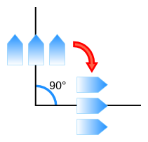
Typographic character units from horizontal-only scripts are typeset sideways, i.e. 90° clockwise from their standard orientation in horizontal text. Typographic character units from vertical scripts are typeset with their intrinsic orientation. See Vertical Orientations for further details.
This value is typical for layout of dominantly vertical-script text.
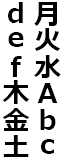
- upright
-
Typographic character units from horizontal-only scripts are typeset upright, i.e. in their standard horizontal orientation. Typographic character units from vertical scripts are typeset with their intrinsic orientation and shaped normally. See Vertical Orientations for further details.
This value causes the used value of direction to be ltr, and for the purposes of bidi reordering, causes all characters to be treated as strong LTR.
Note: The used value, rather than the computed value, of direction is influenced so that rtl can inherit properly into any descendants (such as the contents of a horizontal inline-block) where this directional override does not apply.
- sideways
-
Causes all text to be typeset sideways, as if in a horizontal layout, but rotated 90° clockwise.
| 
| 
|
| mixed | upright | sideways |
text-orientation values (writing-mode is vertical-rl)
Changing the value of this property may affect inline-level alignment. Refer to Text Baselines for more details.
UAs may accept sideways-right as a value that computes to sideways if needed for backward compatibility reasons.
.vertical-upright-hebrew {
    writing-mode: vertical-rl;
    text-orientation: upright;
    unicode-bidi: bidi-override;
    direction: ltr;
}
5.1.1. Vertical Typesetting and Font Features
When typesetting text in vertical-rl and vertical-lr modes, text is typeset either “upright” or “sideways” as defined below:
- upright typesetting
-
Typographic character units are individually typeset upright
in vertical lines with vertical font metrics.
The UA must synthesize vertical font metrics for fonts that lack them.
(This specification does not define heuristics for synthesizing such metrics.)
Additionally, font features (such as alternate glyphs and other transformation)
intended for use in vertical typesetting must be used.
(E.g. the OpenType vert feature must be enabled.)
Furthermore, characters from horizontal cursive scripts (such as Arabic)
are shaped in their isolated forms when typeset upright.
Note that even when typeset “upright”, some glyphs should appear rotated. For example, dashes and enclosing punctuation should be oriented relative to the inline axis. In OpenType, this is typically handled by glyph substitution, although not all fonts have alternate glyphs for all relevant codepoints. (East Asian fonts usually provide alternates for East Asian codepoints, but Western fonts typically lack any vertical typesetting features and East Asian fonts typically lack vertical substitutions for Western codepoints.) Unicode published draft data on which characters should appear sideways as the SVO property in this data file; however, this property has been abandoned for the current revision of [UAX50].
Typographic character units which are classified as
TrorTuin [UAX50] are expected to have alternate glyphs or positioning for typesetting upright in vertical text. In the case ofTrcharacters, if such vertical alternate glyphs are missing from the font, the UA may wish to [RFC6919] (but is not expected to) synthesize the missing glyphs by typesetting them sideways etc. - sideways typesetting
- Typographic character units typeset as a run
rotated 90° clockwise from their upright orientation,
using horizontal metrics and composition,
and vertical typesetting features are not used.
However, if the font has features meant to be enabled
for sideways text that is typeset in vertical lines
(e.g. to adjust brush stroke angles or alignment),
those features are used.
(An example of such a feature would be the proposed
vrtrOpenType font feature.)
5.1.2. Mixed Vertical Orientations
[UAX50] defines the Vertical_Orientation property
for the default glyph orientation of mixed-orientation vertical text.
When text-orientation is mixed,
the UA must determine the orientation of each typographic character unit by its Vertical_Orientation property: typesetting it upright if its orientation property is U, Tu, or Tr;
or typesetting it sideways (90° clockwise from horizontal)
if its orientation property is R.
Note that UAX50 does not handle scripts that rotate -90° in vertical contexts, so they will not be typeset correctly with mixed orientation. The sideways-lr value in Level 4, however, can correctly display such scripts.
The OpenType vrt2 feature, which is intended for mixed-orientation typesetting, is not used by CSS. It delegates the responsibility for orienting glyphs to the font designer. CSS instead dictates the orientation through [UAX50] and orients glyphs by typesetting them sideways or upright as appropriate.
5.1.3. Obsolete: the SVG1.1 glyph-orientation-vertical property
| Name: | glyph-orientation-vertical |
|---|---|
| Value: | auto | 0deg | 90deg | 0 | 90 |
| Initial: | n/a |
| Applies to: | n/a |
| Inherited: | n/a |
| Percentages: | n/a |
| Computed value: | n/a |
| Canonical order: | n/a |
| Animation type: | n/a |
Some SVG user agents will need to process documents containing the obsolete SVG glyph-orientation-vertical property, which was defined to accept an auto keyword as well as <angle> and <integer> values representing multiples of 90°. While supporting this property is optional, UAs that do so must alias glyph-orientation-vertical as a shorthand of text-orientation as follows:
| Shorthand glyph-orientation-vertical value | Longhand text-orientation value |
|---|---|
| auto | mixed |
| 0deg | upright |
| 0 | upright |
| 90deg | sideways |
| 90 | sideways |
UAs must ignore and treat as invalid any other values for the glyph-orientation-vertical property; and treat as invalid the glyph-orientation-horizontal property in its entirety.
Note: The 180deg and 270deg values, the radian and gradian values, and the glyph-orientation-horizontal property are not mapped because they have no known use cases nor significant amounts of dependent content, and are therefore not part of CSS, and have been likewise dropped from SVG.
6. Abstract Box Terminology
CSS2.1 [CSS2] defines the box layout model of CSS in detail, but only for the horizontal-tb writing mode. Layout is analogous in writing modes other than horizontal-tb; however directional and dimensional terms in CSS2.1 must be abstracted and remapped appropriately.
This section defines abstract directional and dimensional terms and their mappings in order to define box layout for other writing modes, and to provide terminology for future specs to define their layout concepts abstractly. (The next section explains how to apply them to CSS2.1 layout calculations and how to handle orthogonal flows.) Although they derive from the behavior of text, these abstract mappings exist even for boxes that do not contain any line boxes: they are calculated directly from the values of the writing-mode and direction properties.
There are three sets of directional terms in CSS:
- physical
- Interpreted relative to the page, independent of writing mode. The physical directions are left, right, top, and bottom.
- flow-relative
- Interpreted relative to the flow of content. The flow-relative directions are start and end, or block-start, block-end, inline-start, and inline-end if the dimension is also ambiguous.
- line-relative
- Interpreted relative to the orientation of the line box. The line-relative directions are line-left, line-right, line-over, and line-under.
The physical dimensions are width and height, which correspond to measurements along the x-axis (horizontal dimension) and y-axis (vertical dimension), respectively. Abstract dimensions are identical in both flow-relative and line-relative terms, so there is only one set of these terms.


Note: [CSS-FLEXBOX-1] also defines flex-relative terms, which are used in describing flex layout.
6.1. Abstract Dimensions
The abstract dimensions are defined below:
- block dimension
- The dimension perpendicular to the flow of text within a line, i.e. the vertical dimension in horizontal writing modes, and the horizontal dimension in vertical writing modes.
- inline dimension
- The dimension parallel to the flow of text within a line, i.e. the horizontal dimension in horizontal writing modes, and the vertical dimension in vertical writing modes.
- block axis
- The axis in the block dimension, i.e. the vertical axis in horizontal writing modes and the horizontal axis in vertical writing modes.
- inline axis
- The axis in the inline dimension, i.e. the horizontal axis in horizontal writing modes and the vertical axis in vertical writing modes.
- block size
- logical height
- A measurement in the block dimension: refers to the physical height (vertical dimension) in horizontal writing modes, and to the physical width (horizontal dimension) in vertical writing modes.
- inline size
- logical width
- A measurement in the inline dimension: refers to the physical width (horizontal dimension) in horizontal writing modes, and to the physical height (vertical dimension) in vertical writing modes.
6.2. Flow-relative Directions
The flow-relative directions, block-start, block-end, inline-start, and inline-end, are defined relative to the flow of content on the page. In an LTR horizontal-tb writing mode, they correspond to the top, bottom, left, and right directions, respectively. They are defined as follows:
- block-start
- The side that comes earlier in the block flow direction, as determined by the writing-mode property: the physical top in horizontal-tb mode, the right in vertical-rl, and the left in vertical-lr.
- block-end
- The side opposite block-start.
- inline-start
- The side from which text of the inline base direction would start. For boxes with a used direction value of ltr, this means the line-left side. For boxes with a used direction value of rtl, this means the line-right side.
- inline-end
- The side opposite start.
Where contextually unambiguous or encompassing both meanings, the terms start and end are used in place of block-start/inline-start and block-end/inline-end, respectively.
Note that while determining the block-start and block-end sides of a box depends only on the writing-mode property, determining the inline-start and inline-end sides of a box depends not only on the writing-mode property but also the direction property.
6.3. Line-relative Directions
The line orientation determines which side of a line box is the logical “top” (ascender side). It is given by the writing-mode property. Usually the line-relative “top” corresponds to the block-start side, but this is not always the case: in Mongolian typesetting (and thus by default in vertical-lr writing modes), the line-relative “top” corresponds to the block-end side. Hence the need for distinct terminology.
A primarily Mongolian document, such as the one above, is written in vertical lines stacking left to right, but lays its Latin text with the tops of the glyphs towards the right. This makes the text run in the same inline direction as Mongolian (top-to-bottom) and face the same direction it does in other East Asian layouts (which have vertical lines stacking right to left), but the glyphs' tops are facing the bottom of the line stack rather than the top, which in an English paragraph would be upside-down. (See this Diagram of Mongolian Text Layout.)
In addition to a line-relative “top” and “bottom” to map things like 'vertical-align: top', CSS also needs to refer to a line-relative “left” and “right” in order to map things like text-align: left. Thus there are four line-relative directions, which are defined relative to the line orientation as follows:
- over or line-over
- Nominally the side that corresponds to the ascender side or “top” side of a line box. (The side overlines are typically drawn on.)
- under or line-under
- Opposite of over: the line-relative “bottom” or descender side. (The side underlines are typically drawn on.)
- line-left
- The line-relative "left" side of a line box, which is nominally the side from which LTR text would start.
- line-right
- The line-relative "right" side of a line box, which is nominally the side from which RTL text would start. (Opposite of line-left.)
See the table below for the exact mappings between physical and line-relative directions.

Line orientation in horizontal-tb

Line orientation in vertical-rl and vertical-lr

Vertical baseline of an upright glyph
Since the baseline is vertical, the definitions for mixed or sideways above still apply; i.e., line-over is on right, and line-under is on left.
This is in line with font systems such as OpenType which defines the ascender on right and the descender on left in their vertical metrics.
6.4. Abstract-to-Physical Mappings
The following table summarizes the abstract-to-physical mappings (based on the used direction and writing-mode):
| writing-mode | horizontal-tb | vertical-rl | vertical-lr | |||
|---|---|---|---|---|---|---|
| direction | ltr | rtl | ltr | rtl | ltr | rtl |
| block-size | height | width | ||||
| inline-size | width | height | ||||
| block-start | top | right | left | |||
| block-end | bottom | left | right | |||
| inline-start | left | right | top | bottom | top | bottom |
| inline-end | right | left | bottom | top | bottom | top |
| over | top | right | ||||
| under | bottom | left | ||||
| line-left | left | top | ||||
| line-right | right | bottom | ||||
Note: The used direction depends on the computed writing-mode and text-orientation: in vertical writing modes, a text-orientation value of upright forces the used direction to ltr.
7. Abstract Box Layout
7.1. Principles of Layout in Vertical Writing Modes
CSS box layout in vertical writing modes is analogous to layout in the horizontal writing modes, following the principles outlined below:
Layout calculation rules (such as those in CSS2.1, Section 10.3) that apply to the horizontal dimension in horizontal writing modes instead apply to the vertical dimension in vertical writing modes. Likewise, layout calculation rules (such as those in CSS2.1, Section 10.6) that apply to the vertical dimension in horizontal writing modes instead apply to the horizontal dimension in vertical writing modes. Thus:
-
Layout rules that refer to the width use the height instead, and vice versa.
-
Layout rules that refer to the *-left and *-right box properties (border, margin, padding, positioning offsets) use *-top and *-bottom instead, and vice versa, mapping the horizontal writing-mode rules of CSS2.1 into vertical writing-mode rules using the flow-relative directions. The side of the box these properties apply to doesn’t change: only which values are inputs to which layout calculations changes. The margin-left property still affects the lefthand margin, for example; however in a vertical-rl writing mode it takes part in margin collapsing in place of margin-bottom.
-
Layout rules that depend on the direction property to choose between left and right (e.g. overflow, overconstraint resolution, the initial value for text-align, table column ordering) are abstracted to the start and end sides and applied appropriately.
For example, in vertical writing modes, table rows are vertical and table columns are horizontal. In a vertical-rl mixed rtl table, the first column would be on the bottom (the inline-start side), and the first row on the right (the block-start side). The table’s margin-right and margin-left would collapse with margins before (on the right) and after (on the left) the table, respectively, and if the table had auto values for margin-top and margin-bottom it would be centered vertically within its block flow.

Table in vertical-rl RTL writing mode
For features such as text alignment, floating, and list marker positioning, that primarily reference the left or right sides of the line box or its longitudinal parallels and therefore have no top or bottom equivalent, the line-left and line-right sides are used as the reference for the left and right sides respectively.
Likewise for features such as underlining, overlining, and baseline alignment (the unfortunately-named vertical-align), that primarily reference the top or bottom sides of the linebox or its transversal parallels and therefore have no left or right equivalent, the line-over and line-under sides are used as the reference for the top and bottom sides respectively.
The details of these mappings are provided below.
7.2. Dimensional Mapping
Certain properties behave logically as follows:
- The first and second values of the border-spacing property represent spacing between columns and rows respectively, not necessarily the horizontal and vertical spacing respectively. [CSS2]
- The line-height property always refers to the logical height. [CSS2]
The height properties (height, min-height, and max-height) refer to the physical height, and the width properties (width, min-width, and max-width) refer to the physical width. However, the rules used to calculate box dimensions and positions are logical.
For example, the calculation rules in CSS2.1 Section 10.3 are used for the inline dimension measurements: they apply to the inline size (which could be either the physical width or physical height) and to the inline-start and inline-end margins, padding, and border. Likewise the calculation rules in CSS2.1 Section 10.6 are used in the block dimension: they apply to the block size and to the block-start and block-end margins, padding, and border. [CSS2]
As a corollary, percentages on the margin and padding properties, which are always calculated with respect to the containing block width in CSS2.1, are calculated with respect to the inline size of the containing block in CSS3.
7.3. Orthogonal Flows
When a box has a different writing-mode from its containing block two cases are possible:
- The two writing modes are parallel to each other. (For example, vertical-rl and vertical-lr).
- The two writing modes are perpendicular to each other. (For example, horizontal-tb and vertical-rl).
When a box has a writing mode that is perpendicular to its containing block it is said to be in, or establish, an orthogonal flow.
To handle this case, CSS layout calculations are divided into two phases: sizing a box, and positioning the box within its flow.
- In the sizing phase—calculating the width and height of the box—the dimensions of the box and the containing block are mapped to the inline size and block size and calculations are performed accordingly using the writing mode of the box establishing the orthogonal flow.
- In the positioning phase—calculating the positioning offsets, margins, borders, and padding—the dimensions of the box and its containing block are mapped to the inline size and block size and calculations are performed according to the writing mode of the containing block of the box establishing the orthogonal flow.
Since auto margins are resolved consistent with the containing block’s writing mode, a box establishing an orthogonal flow can, once sized, be aligned or centered within its containing block just like other block-level boxes by using auto margins.

An example of orthogonal flow
For example, if a vertical block is placed inside a horizontal block, then when calculating the physical height (which is the inline size) of the child block the physical height of the parent block is used as the child’s containing block inline size, even though the physical height is the block size, not the inline size, of the parent block.
On the other hand, because the containing block is in a horizontal writing mode, the vertical margins on the child participate in margin-collapsing, even though they are in the inline-axis of the child, and horizontal auto margins will expand to fill the containing block, even though they are in the block-axis of the child.
This means that when applying shrink-to-fit formula to a box such as an inline-block, float, or table-cell, if its child establishes an orthogonal flow, the calculation dependency must be changed so that the sizing phase of the child runs first and its used block size becomes an input to the inline-size shrink-to-fit formula of the parent.
7.3.1. Available Space of Orthogonal Flows
It is common in CSS for a containing block to have a definite inline size, but not a definite block size. This typically happens in CSS2.1 when a containing block has an auto height, for example: its width is given by the calculations in 10.3.3, but its block size depends on its contents. In such cases the available inline space is defined as the inline size of the containing block; but the available block space, which would otherwise be the block size of the containing block, is infinite.
Putting a box in an orthogonal flow can result in the opposite: for the box’s available block space to be definite, but its available inline space to be indefinite. In such cases a percentage of the containing block’s inline size cannot be defined, and inline axis computations cannot be resolved. In these cases, an additional fallback size is used in place of the available inline space for calculations that require a definite available inline space: this size is the smallest of
- the size represented by the containing block’s inner max size (if that is fixed) floored by its inner min size (if that is fixed)
- the nearest ancestor scrollport’s inner size if that is fixed, else / capped by its inner max size if that is fixed, floored by its inner min size if that is fixed
- the initial containing block’s size
See [css-sizing-3] for further details on CSS sizing terminology and concepts.
7.3.2. Auto-sizing Orthogonal Flow Roots
The inline-axis automatic size of a block-level or block container orthogonal flow (i.e. the size used when its preferred size property is auto)
is calculating as its fit-content size, i.e. min(max-content inline size, max(min-content inline size, stretch-fit inline size),
where the available space used to calculate the stretch-fit inline size is
either the size of the containing block if that is definite,
or else the fallback size as defined above.
The automatic sizing of orthogonal multi-column containers (in both axes) and of other display types not mentioned above is not defined in this specification.
Note: See also CSS Writing Modes Level 4.
7.3.3. Fragmenting Orthogonal Flows
This section is informative.
With regards to fragmentation, the rules in CSS2.1 still hold in vertical writing modes and orthogonal flows: break opportunities do not occur inside line boxes, only between them. UAs that support [CSS3COL] may break in the (potentially zero-width) gap between columns, however.
Note that if content spills outside the pagination stream established by the root element, the UA is not required to print such content. Authors wishing to mix writing modes with long streams of text are thus encouraged to use CSS columns to keep all content flowing in the document’s pagination direction.
In other words, if your document would require two scrollbars on the screen it probably won’t all print. Fix your layout, e.g. by using columns so that it all scrolls (and therefore paginates) in one direction if you want to make sure it’ll all print. T-shaped documents tend not to print well.
7.4. Flow-Relative Mappings
Flow-relative directions are calculated with respect to the writing mode of the containing block of the box and used to abstract layout rules related to the box properties (margins, borders, padding) and any properties related to positioning the box within its containing block (float, clear, top, bottom, left, right, caption-side). For inline-level boxes, the writing mode of the parent box is used instead. (The left/right/top/bottom-named properties and values themselves are still mapped physically; with a special exception made for caption-side, whose top/top-outside and bottom/bottom-outside values are associated to the block-start and block-end sides of the table, respectively.)
For example, the margin that is dropped when a box’s inline dimension is over-constrained is the end margin as determined by the writing mode of the containing block.
The margin collapsing rules apply exactly with the block-start margin substituted for the top margin and the block-end margin substituted for the bottom margin. Similarly the block-start padding and border are substituted for the top padding and border, and the block-end padding and border substituted for the bottom padding and border. Note this means only block-start and block-end margins ever collapse.
Flow-relative directions are calculated with respect to the writing mode of the box and used to abstract layout related to the box’s contents:
- The initial value of the text-align property aligns to the start edge of the line box.
- The text-indent property indents from the start edge of the line box.
- For tables, the ordering of columns begins on the inline-start side of the table, and the ordering of rows begins on the block-start side of the table.
7.5. Line-Relative Mappings
The line-relative directions are over, under, line-left, and line-right. In an LTR horizontal-tb writing mode, they correspond to the top, bottom, left, and right directions, respectively.
The line-right and line-left directions are calculated with respect to the writing mode of the box and used to interpret the left and right values of the following properties:
- the text-align property [CSS2]
The line-right and line-left directions are calculated with respect to the writing mode of the containing block of the box and used to interpret the left and right values of the following properties:
The over and under directions are calculated with respect to the writing mode of the box and used to define the interpretation of the "top" (over) and "bottom" (under) sides of the line box as follows:
- For the vertical-align property, the "top" of the line box is its over edge; the "bottom" of the line box is its under edge. Positive length and percentage values shift the baseline towards the line-over edge. [CSS2]
- For the text-decoration property, the underline is drawn on the under side of the text; the overline is drawn on the over side of the text. [CSS2] Note that the CSS Text Decoration Module defines this in more detail and provides additional controls for controlling the position of underlines and overlines. [CSS3-TEXT-DECOR]
7.6. Purely Physical Mappings
The following values are purely physical in their definitions and do not respond to changes in writing mode:
- the rect() notation of the clip property [CSS2]
- the background properties [CSS2] [CSS3BG]
- the border-image properties [CSS3BG]
- the offsets of the box-shadow and text-shadow properties
8. The Principal Writing Mode
The principal writing mode of the document is determined by the used writing-mode, direction, and text-orientation values of the root element. This writing mode is used, for example, to determine the direction of scrolling and the default page progression direction.
As a special case for handling HTML documents,
if the root element has a body child element [HTML]
whose display value is not none
,
the used value of the of writing-mode and direction properties on root element
are taken
from the computed writing-mode and direction of the first such child element instead of from the root element’s own values.
The UA may also propagate the value of text-orientation in this manner.
Note that this does not affect the computed values of writing-mode, direction, or text-orientation of the root element itself.
Note: Using containment disables
this special handling of the HTML body element.
See the CSS Containment 1 § 2 Strong Containment: the contain property for details.
body element is ignored for determining the principal writing mode if it has display: none. Issue 3779 Note: Propagation is done on used values rather than computed values to avoid disrupting other aspects of style computation, such as inheritance, logical property mapping logic, or length value computation.
8.1. Propagation to the Initial Containing Block
The principal writing mode is propagated to the initial containing block and to the viewport, thereby affecting the layout of the root element and the scrolling direction of the viewport.
8.2. Page Flow: the page progression direction
In paged media CSS classifies all pages as either left or right pages. The page progression direction (see [CSS3PAGE]), which determines whether the left or right page in a spread is first in the flow and whether the first page is by default a left or right page, depends on the principal writing mode as follows:
| principal writing mode | page progression |
|---|---|
| horizontal-tb and ltr | left-to-right |
| horizontal-tb and rtl | right-to-left |
| vertical-rl | right-to-left |
| vertical-lr | left-to-right |
Note: Unless otherwise overridden, the first page of a document begins on the second half of a spread, e.g. on the right page in a left-to-right page progression.
9. Glyph Composition
9.1. Horizontal-in-Vertical Composition: the text-combine-upright property
| Name: | text-combine-upright |
|---|---|
| Value: | none | all |
| Initial: | none |
| Applies to: | inline boxes and text |
| Inherited: | yes |
| Percentages: | n/a |
| Computed value: | specified keyword |
| Canonical order: | n/a |
| Animation type: | not animatable |
This property specifies the combination of multiple typographic character units into the space of a single typographic character unit. If the combined text is wider than 1em, the UA must fit the contents within 1em, see below. The resulting composition is treated as a single upright glyph for the purposes of layout and decoration. This property only has an effect in vertical writing modes. Values have the following meanings:
- none
- No special processing.
- all
- Attempt to typeset horizontally all consecutive typographic character units within the box or text run such that they take up the space of a single typographic character unit within the vertical line box.
In East Asian documents, the text-combine-upright effect is often used to display Latin-based strings such as components of a date or letters of an initialism, always in a horizontal writing mode regardless of the writing mode of the line:
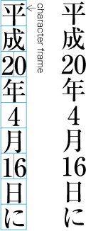
Example of horizontal-in-vertical tate-chu-yoko
The figure is the result of the rules
date span { text-combine-upright: all; }
and the following markup:
<date>平成<span>20</span>年4月<span>16</span>日に</date>
In Japanese, this effect is known as tate-chu-yoko.
Future levels of CSS Writing Modes will introduce values to automatically detect commonly-affected sequences. For example, CSS Writing Modes Level 4 introduces the digits value to combine sequences of digits.
9.1.1. Text Run Rules
To avoid complexity in the rendering and layout, text-combine-upright can only combine plain text: consecutive typographic character units that are not interrupted by a box boundary.
However, because the property inherits, the UA should ensure that the contents of the box effecting the combination are not part of an otherwise-combinable sequence that happens to begin or end outside the box; if so, then the text is laid out normally, as if text-combine-upright were none.
For example, given the rule
tcy { text-combine-upright: all; }
if the following markup were given:
<tcy>12<span>34</span></tcy>
no text would combine.
9.1.2. Layout Rules
When combining text as for text-combine-upright: all, the glyphs of the combined text are bidi-isolated and composed horizontally (ignoring letter-spacing and any forced line breaks, but using the specified font settings), similar to the contents of an inline-block box with a horizontal writing mode and a line-height of 1em. Processing of document white space included in the combined text is not defined in this level. The effective size of the composition is assumed to be 1em square; anything outside the square is not measured for layout purposes. The UA should center the glyphs horizontally and vertically within the measured 1em square.
The baseline of the resulting composition must be chosen such that the square is centered between the text-over and text-under baselines of its parent inline box prior to any baseline alignment shift (vertical-align). For bidi reordering, the composition is treated the same as a typographic character unit with text-orientation: upright. For line breaking before and after the composition, it is treated as a regular inline with its actual contents. For other text layout purposes, e.g. emphasis marks, text-decoration, spacing, etc. the resulting composition is treated as a single glyph representing the Object Replacement Character U+FFFC.
9.1.3. Compression Rules
The UA must ensure that the combined advance width of the composition
fits within 1em by compressing the combined text if necessary.
(This does not necessarily mean that the glyphs will fit within 1em,
as some glyphs are designed to draw outside their geometric boundaries.)
OpenType implementations must use width-specific variants
(OpenType features hwid/twid/qwid;
other glyph-width features such as fwid or pwid are not included)
to compress text
in cases where those variants are available for all typographic character units in the composition.
Otherwise, the UA may use any means to compress the text,
including substituting half-width, third-width, and/or quarter-width glyphs provided by the font,
using other font features designed to compress text horizontally,
scaling the text geometrically,
or any combination thereof.
For example, a simple OpenType-based implementation might compress the text as follows:
- Enable 1/n-width glyphs for combined text of n typographic character units (i.e. use OpenType
hwidfor 2 typographic character units,twidfor 3 typographic character units, etc.) if the number of typographic character units > 1. Note that the number of typographic character units ≠ number of Unicode codepoints! - If the result is wider than 1em, horizontally scale the result to 1em.
A different implementation that utilizes OpenType layout features might compose the text first with normal glyphs to see if that fits, then substitute in half-width or third-width forms as available and necessary, possibly adjusting its approach or combining it with scaling operations depending on the available glyph substitutions.
In some fonts, the ideographic glyphs are given a compressed design such that they are 1em wide but shorter than 1em tall. To accommodate such fonts, the UA may vertically scale the composition to match the advance height of 水 U+6C34 as rendered according to the specified font settings. In such a case the resulting composition assumes the advance height of 水 U+6C34 rather than 1em.
9.1.3.1. Full-width Characters
In order to preserve typographic color when compressing the text to 1em, when the combined text consists of more than one typographic character unit, then any full-width typographic character units should first be converted to their non-full-width equivalents by reversing the algorithm defined for text-transform: full-width in [CSS-TEXT-3] before applying other compression techniques.
Properties that affect glyph selection, such as the font-variant and font-feature-settings properties defined in [CSS3-FONTS], can potentially affect the selection of variants for characters included in combined text runs. Authors are advised to use these properties with care when text-combine-upright is also used.
10. Privacy and Security Considerations
This specification introduces no new privacy leaks, or security considerations beyond "implement it correctly".
Changes
See also list of changes during Candidate Recommendation.
Changes since the December 2019 CSS Writing Modes Module Level 4 Recommendation
- Specified that a display: none
bodyelement does not influence the principal writing mode. (Issue 3779) - Updated “Applies to” line for text-combine-upright to mention text (since certain effects like display: contents can strip the box itself).
- Clarified that the central baseline is the ideographic central baseline. (Issue 5177)
- Reshuffled text in the and improved cross-linking.
Acknowledgements
L. David Baron, Brian Birtles, James Clark, John Daggett, Nami Fujii, Daisaku Hataoka, Martin Heijdra, Laurentiu Iancu, Richard Ishida, Jonathan Kew, Yasuo Kida, Tatsuo Kobayashi, Toshi Kobayashi, Ken Lunde, Shunsuke Matsuki, Nat McCully, Eric Muller, Paul Nelson, Kenzou Onozawa, Chris Pratley, Xidorn Quan, Florian Rivoal, Dwayne Robinson, Simon Sapin, Marcin Sawicki, Dirk Schulze, Hajime Shiozawa, Alan Stearns, Michel Suignard, Takao Suzuki, Gérard Talbot, Masataka Yakura, Taro Yamamoto, Steve Zilles
Appendix A: Vertical Scripts in Unicode
This section is informative.
This appendix lists the vertical-only and bi-orientational scripts in Unicode 6.0 [UNICODE] and their transformation from horizontal to vertical orientation. Any script not listed explicitly is assumed to be horizontal-only. The script classification of Unicode characters is given by [UAX24].
| Code | Name | Transform (Clockwise) | Vertical Intrinsic Direction |
|---|---|---|---|
| Bopo | Bopomofo | 0° | ttb |
| Egyp | Egyptian Hieroglyphs | 0° | ttb |
| Hira | Hiragana | 0° | ttb |
| Kana | Katakana | 0° | ttb |
| Hani | Han | 0° | ttb |
| Hang | Hangul | 0° | ttb |
| Merc | Meroitic Cursive | 0° | ttb |
| Mero | Meroitic Hieroglyphs | 0° | ttb |
| Mong | Mongolian | 90° | ttb |
| Ogam | Ogham | -90° | btt |
| Orkh | Old Turkic | -90° | ttb |
| Phag | Phags Pa | 90° | ttb |
| Yiii | Yi | 0° | ttb |
Exceptions: For the purposes of this specification, all fullwidth (F) and wide (W) characters are treated as belonging to a vertical script, and halfwidth characters (H) are treated as belonging to a horizontal script. [UAX11]
Note that for vertical-only characters (such as Mongolian and Phags Pa letters), the glyphs in the Unicode code charts are shown in their vertical orientation. In horizontal text, they are typeset in a 90° counter-clockwise rotation from this orientation.
Due to limitations in the current feature set of Unicode Technical Report 50 and CSS Writing Modes, vertical mixed typesetting cannot automatically handle either Ogham or Old Turkic. For these scripts, sideways-lr (in CSS Writing Modes Level 4) can be used to typeset passages.