1. Introduction
This section is not normative.
This specification defines features that allow inline flow content to wrap around outside the exclusion area of elements.
1.1. Value Definitions
This specification follows the CSS property definition conventions from [CSS2] using the value definition syntax from [CSS-VALUES-3]. Value types not defined in this specification are defined in CSS Values & Units [CSS-VALUES-3]. Combination with other CSS modules may expand the definitions of these value types.
In addition to the property-specific values listed in their definitions, all properties defined in this specification also accept the CSS-wide keywords as their property value. For readability they have not been repeated explicitly.
2. Terminology
- Exclusion box
- A box ([CSS3BOX]) that defines an exclusion area for other boxes. The wrap-flow property is used to make an element’s generated box an exclusion box. An exclusion box contributes its exclusion area to its containing block’s wrapping context. An element with a float computed value other than none does not become an exclusion.
- Exclusion area
-
The area used for excluding inline flow content around an exclusion box. The exclusion area is equivalent to the border box for an exclusion box.
If a user agent implements both CSS Exclusions and CSS Shapes, the shape-outside property defines the exclusion area instead of the border box.
- Exclusion element
- An exclusion element is a block-level element which is not a float and generates an exclusion box. An element generates an exclusion box when its wrap-flow property’s computed value is not auto.
- Wrapping context
-
The wrapping context of a box is a collection of exclusion
areas contributed by its associated exclusion boxes.
During layout, a box wraps its inline flow content in the
wrapping areathat corresponds to the subtraction of its wrapping context from its own content area.A box inherits its containing block’s wrapping context unless it specifically resets it using the wrap-through property.
- Content area
- The content area is normally used for layout of the inline flow content of a box.
- Wrapping area
- The area used for layout of inline flow content of a box affected by a wrapping context, defined by subtracting the wrapping context from its content area.
- Outside and inside
- In this specification, outside refers to DOM content that is not a descendant of an element while inside refers to the element’s descendants.
3. Exclusions
Exclusion elements define exclusion areas that contribute to their containing block’s wrapping context. As a consequence, exclusions impact the layout of their containing block’s descendants.
Elements lay out their inline content in their content area and wrap around the exclusion areas in their associated wrapping context. If the element is itself an exclusion, it does not wrap around its own exclusion area and the impact of other exclusions on other exclusions is controlled by the z-index property as explained in the 'exclusions order' section.
3.1. Declaring exclusions
An element becomes an exclusion when its wrap-flow property has a computed value other than auto.
3.1.1. The wrap-flow property
| Name: | wrap-flow |
|---|---|
| Value: | auto | both | start | end | minimum | maximum | clear |
| Initial: | auto |
| Applies to: | block-level elements. |
| Inherited: | no |
| Percentages: | N/A |
| Computed value: | as specified except for element’s whose float computed value is not none, in which case the computed value is auto. |
| Canonical order: | per grammar |
The values of this property have the following meanings:
- auto
- No exclusion is created. Inline flow content interacts with the element as usual. In particular, if the element is a float (see [CSS21]), the behavior is unchanged.
- both
- Inline flow content can flow on all sides of the exclusion.
- start
- Inline flow content can flow around the start edge of the exclusion area but must leave the area next to the end edge of the exclusion empty.
- end
- Inline flow content can flow around the end edge of the exclusion area but must leave the area next to the start edge of the exclusion empty.
- minimum
- Inline flow content can flow around the edge of the exclusion with the smallest available space within the flow content’s containing block, and must leave the other edge of the exclusion empty.
- maximum
- Inline flow content can flow around the edge of the exclusion with the largest available space within the flow content’s containing block, and must leave the other edge of the exclusion empty.
- clear
- Inline flow content can only flow before and after the exclusion in the flow content’s block direction and must leave the areas next to the start and end edges of the exclusion empty.
If the property’s computed value is auto, the element does not become an exclusion.
Otherwise, a computed wrap-flow property value of both, start, end, minimum, maximum or clear on an element makes that element an exclusion element. It’s exclusion area is contributed to its containing block’s wrapping context, causing the containing block’s descendants to wrap around its exclusion area.
Determining the relevant edges of the exclusion depends on the writing mode [CSS3-WRITING-MODES] of the content wrapping around the 'exclusion area'.
An exclusion element establishes a new block formatting context (see [CSS21]) for its content.
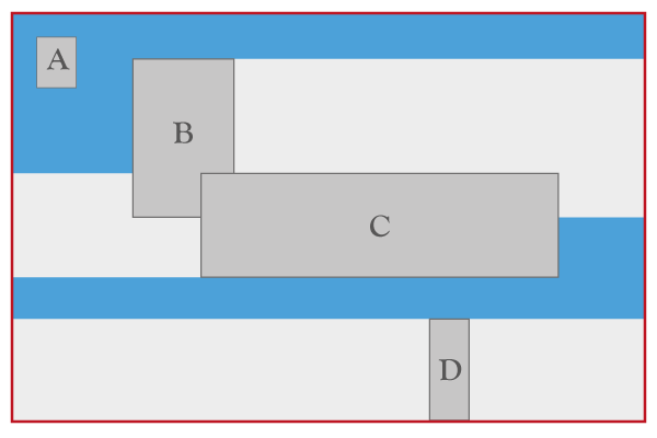
The above figure illustrates how exclusions are combined. The outermost box represents an element’s content box. The A, B, C and D darker gray boxes represent exclusions in the element’s wrapping context. A, B, C and D have their respective wrap-flow computed to both, start, end and clear respectively. The lighter gray areas show the additional areas that are excluded for inline layout as a result of the wrap-flow value. For example, the area to the right of B cannot be used for inline layout of left-to-right writing mode content because the wrap-flow for B is start.
The background blue area shows what areas are available for a left-to-right writing mode element’s inline content layout. All areas represented with a light or dark shade of gray are not available for (left-to-right writing mode) inline content layout.
<div id="grid">
    <div id="top-right" class="exclusion"></div>
    <div id="bottom-left" class="exclusion"></div>
    <div id="content">Lorem ipsum…</div>
</div>

<style type="text/css">
#grid {
    width: 30em;
    height: 30em;
    display: grid;
    grid-columns: 25% 25% 25% 25%;
    grid-rows: 25% 25% 25% 25%;

#top-right {
    grid-column: 3;
    grid-row: 2;
}

#bottom-left {
    grid-column: 2;
    grid-row: 3;
}

.exclusion {
    wrap-flow: <see below>
}

#content {
    grid-row: 1;
    grid-row-span: 4;
    grid-column: 1;
    grid-column-span: 4;
}
</style>
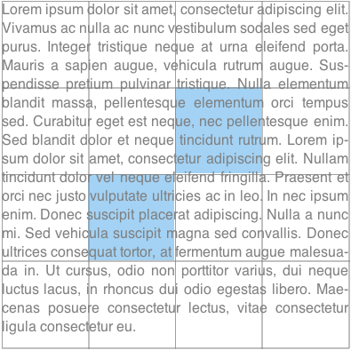
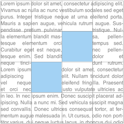
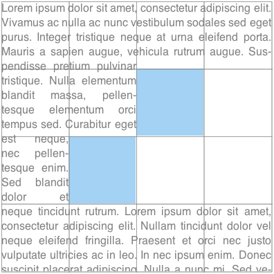
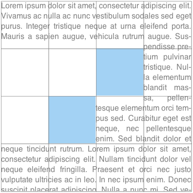
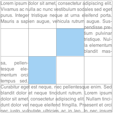
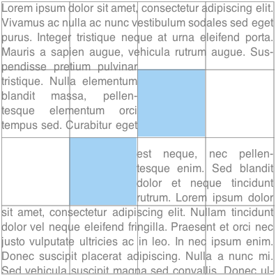
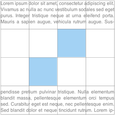
The following figures illustrate the visual rendering for different values of the wrap-flow property. The gray grid lines are marking the grid cells and the blue area is the exclusion box (positioned by the grid).
.exclusion{ wrap-flow: auto; }
| .exclusion{ wrap-flow: both; }
|
| 
|
.exclusion{ wrap-flow: start; }
| .exclusion{ wrap-flow: end; }
|
| 
|
.exclusion{ wrap-flow: minimum; }
| .exclusion{ wrap-flow: maximum; }
|
| 
|
.exclusion{ wrap-flow: clear; }
| |
|
3.2. Scope and effect of exclusions
An exclusion affects the inline flow content descended from the exclusion’s containing block (defined in CSS 2.1 10.1) and that of all descendant elements of the same containing block. All inline flow content inside the containing block of the exclusions is affected. To stop the effect of exclusions defined outside an element, the wrap-through property can be used (see the propagation of exclusions section below).
As a reminder, for exclusions with position:fixed, the containing block is established by the root element.
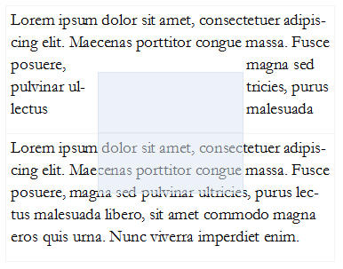
3.3. Propagation of Exclusions
By default, an element inherits its parent wrapping context. In other words it is subject to the exclusions defined outside the element.
Setting the wrap-through property to none prevents an element from inheriting its parent wrapping context. In other words, exclusions defined outside the element, have not effect on the element’s children layout.
Exclusions defined by an element’s descendants still contribute to their containing block’s wrapping context. If that containing block is a child of an element with wrap-through computes to none, or the element itself, then exclusion still have an effect on the children of that containing block element.
3.3.1. The wrap-through Property
| Name: | wrap-through |
|---|---|
| Value: | wrap | none |
| Initial: | wrap |
| Applies to: | block-level elements |
| Inherited: | no |
| Percentages: | N/A |
| Computed value: | as specified |
| Canonical order: | per grammar |
The values of this property have the following meanings:
- wrap
- The element inherits its parent node’s wrapping context. Its descendant inline content wraps around exclusions defined outside the element.
- none
- The element does not inherit its parent node’s wrapping context. Its descendants are only subject to exclusion areas defined inside the element.
<style type="text/css">
    #grid {
        display: grid;
        grid-columns: 25% 50% 25%;
        grid-rows: 25% 25% 25% 25%;
    }

    #exclusion {
        grid-row: 2;
        grid-row-span: 2;
        grid-column: 2;
        wrap-flow: <see below>
    }

    #rowA, #rowB {
        grid-row-span: 2;
        grid-column: 1;
        grid-column-span: 3;
    }

    #rowA {
        grid-row: 1;
    }

    #rowB {
        grid-row: 3;
    }
    </style>

<style type="text/css">
    .exclusion  {
      wrap-flow: both;
      position: absolute;
      left: 20%;
      top: 20%;
      width: 50%;
      height: 50%;
      background-color: rgba(220, 230, 242, 0.5);
    }
</style>

<div id="grid">
    <div class=”exclusion”></div>
    <div id="rowA" style=”wrap-through: wrap;”> Lorem ipsum dolor sit amet...</div>
    <div id="rowB" style=”wrap-through: none;”> Lorem ipsum dolor sit amet...</div>
</div>
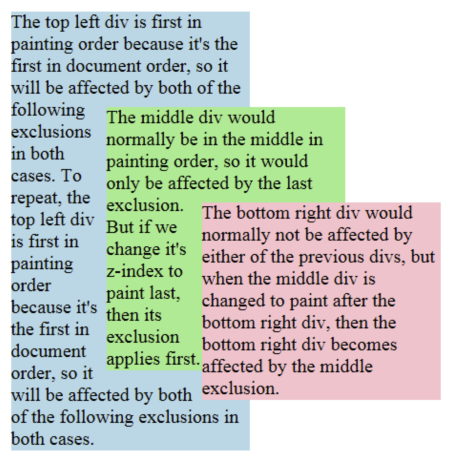
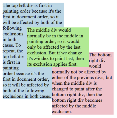
3.4. Exclusions order
Exclusions follow the painting order (See [CSS21] Appendix E). Exclusions are applied in reverse to the document order in which they are defined. The last exclusion appears on top of all other exclusion, thus it affects the inline flow content of all other preceding exclusions or elements descendant of the same containing block. The z-index property can be used to change the ordering of positioned exclusion boxes (see [CSS21]). Statically positioned exclusions are not affected by the z-index property and thus follow the painting order.
Ordering of exclusions.
<style type="text/css">
    .exclusion  {
      wrap-flow: both;
      position: absolute;
      width: 200px;
    }
    .topleft {
      top: 10px;
      left: 10px;
      background-color: lightblue;
    }
    .middle {
      top: 90px;
      left: 90px;
      background-color: lightgreen;
    }
    .bottomright {
      top: 170px;
      left: 170px;
      background-color: pink;
    }
</style>

<div class="exclusion topleft">
    The top left div...
</div>
<div class="exclusion middle">
    The middle div...
</div>
<div class="exclusion bottomright">
    The bottom right div...
</div>
.middle { z-index: auto; }
| .middle { z-index: 1; }
|
| 
|
Is the CSS exclusions processing model incorrect?
The current draft provides a model for exclusions without a collision-avoidance model. The existing exclusion model in CSS uses floats, which have both exclusion and collision-avoidance behavior. Concerns have been raised that allowing exclusions without collision avoidance could be harmful, particularly with absolutely-positioned elements. Three options should be considered:
- Allow exclusions in positioning schemes with no collision avoidance.
- Disallow exclusions in positioning schemes with no collision avoidance.
- Define collision-avoidance behavior for positioning schemes without it, and use this behavior by default with exclusions.
3.5. Processing model
3.5.1. Description
Applying exclusions is a two-step process:
- Step 1: resolve exclusion boxes belonging to each wrapping context
-
Step 2: resolve each wrapping context and lay out
each containing block in turn:
- Step 2-A: resolve the position and size of exclusion boxes
- Step 2-B: lay out containing block, wrapping around each exclusion area
3.5.2. Step 1: resolve exclusion boxes belonging to each wrapping context
In this step, the user agent determines which containing block each exclusion area belongs to. This is a simple step, based on the definition of containing
blocks and elements with a computed value for wrap-flow that is not auto.
3.5.3. Step 2: resolve wrapping contexts and lay out containing blocks
In this step, starting from the top of the rendering tree (see [CSS21]), the agent processes each containing block in two sub-steps.
3.5.4. Step 2-A: resolve the position and size of exclusion boxes
Resolving the position and size of exclusion boxes in the wrapping context may or may not require a layout. For example, if an exclusion box is absolutely positioned and sized, a layout may not be needed to resolve its position and size. In other situations, laying out the containing block’s content is required.
When a layout is required, it is carried out without applying any exclusion area. In other words, the containing block is laid out without a wrapping context.
Step 2-A yields a position and size for all exclusion boxes in the wrapping context. Each exclusion box is processed in turn, starting from the top-most, and each exclusion area is computed and contributed to the containing block’s wrapping context.
Scrolling is ignored in this step when resolving the position and size of position: fixed exclusion boxes.
Once the containing block’s wrapping context is computed, all exclusion boxes in that wrapping context are removed from the normal flow.
3.5.5. Step 2-B: lay out containing block applying wrapping
Finally, the content of the containing block is laid out, with the inline content wrapping around the wrapping context’s exclusion area.
When the containing block itself is an exclusion box, then rules on exclusions order define which exclusions affect the inline and descendant content of the box.
3.5.6. Processing Model Example
This section illustrates the exclusions processing model with an example. It is meant to be simple. Yet, it contains enough complexity to address the issues of layout dependencies and re-layout.
The code snippet in the following example has two exclusions affecting the document’s inline content.
<html><style>
#d1 {
    position:relative;
    height: auto;
    color: #46A4E9;
    border: 1px solid gray;
}

#e1 {
    wrap-flow: both;
    position: absolute;
    left: 50%;
    top: 50%;
    width: 40%;
    height: 40%;
    border: 1px solid red;
    margin-left: -20%;
    margin-top: -20%;
}

#d2 {
    position: static;
    width: 100%;
    height: auto;
    color: #808080;
}

#e2 {
    wrap-flow: both;
    position: absolute;
    right: 5ex;
    top: 1em;
    width: 12ex;
    height: 10em;
    border: 1px solid lime;
}
</style>
<body>
    <div id="d1">
        Lorem ipsusm ...
        <p id="e1"></p>
    </div>
    <div id="d2">
        Lorem ipsusm ...
        <p id="e2" ></p>
    </div>
</body>
</html>
The following figures illustrate:
- the document’s DOM tree
- the layout tree of generated block boxes


3.5.6.1. Step 1: resolve exclusion boxes belonging to each wrapping context
The figures illustrate how the boxes corresponding to the element sometimes
have a different containment hierarchy in the layout tree than in the DOM tree.
For example, the box generated by e1 is positioned in
its containing block’s box, which is the d1-box, because e1 is absolutely positioned and d1 is relatively positioned. However, while e2 is also absolutely
positioned, its containing block is the initial containing block (ICB). See the
section 10.1 of the CSS 2.1 specification ([CSS21]) for details.
As a result of the computation of containing blocks for the tree, the boxes belonging to the wrapping contexts of all the elements can be determined:
- The wrapping context for the html element contains the
e2box: WC-1 (Wrapping Context 1) - The wrapping context for the body element inherits the html element’s wrapping context: WC-1
- The wrapping context for
d1inherits the body element’s wrapping context and adds thee1-boxto it. So the wrapping context is made of both thee1-boxand thee2-box: WC-2 - The wrapping context for
d2inherits the body element’s wrapping context: WC-1
3.5.6.2. Step 2: resolve wrapping contexts and lay out containing blocks
In this step, each containing block is processed in turn. For each containing block, we (conceptually) go through two phases:
- resolve the wrapping context: resolve the position and size of its exclusions
- lay out the containing block
In our example, this breaks down to:
- resolve the position and size of the exclusions belonging to WC-1: RWC-1 (Resolved Wrapping Context 1).
-
lay out the initial containing block (i.e., lay out its content):
- resolve the html element’s wrapping context: RWC-1
-
lay out the html element:
- resolve the body element’s wrapping context: RWC-1
-
lay out the body element:
- resolve the
d1element’s wrapping context: RWC-2 - lay out the
d1element - resolve the
d2element’s wrapping context: RWC-1 - lay out the
d2element
- resolve the
3.5.6.2.1. Resolving RWC-1
The top-most wrapping context in the layout tree contains the e2 exclusion. Its position and size needs to be
resolved. In general, computing an exclusion’s position and size may or may
not require laying out other content. In this example, no content needs to be
laid out to resolve the e2 exclusion’s position
because it is absolutely positioned and its size can be resolved without
layout either. At this point, RWC-1 is resolved and can be used when laying
inline content out.
3.5.6.2.2. Resolving RWC-2
The process is similar: the position of the e1 exclusion needs to be resolved. Again, resolving the exclusion’s position and
size may require processing the containing block (d1 here). It is the case here
because the size and position of e1 depend on
resolving the percentage lengths. The percentages are relative to the size of d1’s box. As a result, in order to resolve a size for d1’s box, a first layout of d1 is done without any wrapping context (i.e., no exclusions applied).
The layout yields a position and size for e1’s box.
At this point, RWC-2 is resolved because the position and size of both e1 and e2 are resolved.
The important aspect of the above processing example is that once an element’s wrapping context is resolved (by resolving its exclusions' position and size), the position and size of the exclusions are not re-processed if the element’s size changes between the layout that may be done without considering any wrapping context (as for RWC-2) and the layout done with the resolved wrapping context. This is what breaks the possible circular dependency between the resolution of wrapping contexts and the layout of containing blocks.
3.6. Floats and exclusions
3.6.1. Similarities
There are similarities between floats and exclusions in that inline content wraps around floats and also wraps around exclusion areas. However, there are very significant differences.
3.6.2. Differences
- scope. While floats apply to content that follows in the document, exclusions apply to content in their containing block.
- positioning. Floats are part of the inline flow and float on the line box. Authors can control how the floats move on the line box, to the right or to the left. By contrast, exclusions can be positioned using any positioning scheme such as grid layout ([CSS3-GRID-LAYOUT]), flexible box ([CSS3-FLEXBOX]) or any other CSS positioning scheme.
- separation of concerns. Making an element a float determines both its positioning scheme and its effect on inline content. Making an element an exclusion only determines its impact on inline content and does not impose constraints on its positioning method.
3.6.3. Interoperability
3.6.3.1. Effect of floats on exclusions
Floats have an effect on the positioning of exclusions and the layout of their inline content. For example, if an exclusion is an inline-box which happens to be on the same line as a float, its position, as computed in Step 2-A will be impacted by the float, as is any other inline content.
3.6.3.2. Effect of exclusions on floats
Exclusions have an effect on the positioning of floats as they have an effect on inline content. Therefore, in Step 2-B, floats will avoid exclusion areas.
Privacy Considerations
No new privacy considerations have been reported on this specification.
Security Considerations
No new security considerations have been reported on this specification.
Acknowledgments
This specification is made possible by input from Andrei Bucur, Alexandru Chiculita, Arron Eicholz, Daniel Glazman, Arno Gourdol, Chris Jones, Bem Jones-Bey, Marcus Mielke, Alex Mogilevsky, Hans Muller, Mihnea Ovidenie, Virgil Palanciuc, Florian Rivoal, Peter Sorotokin, Bear Travis, Eugene Veselov, Stephen Zilles and the CSS Working Group members.
Changes
Changes from the 15 January 2015 Working Draft
Changes from the 28 May 2013 Working Draft
- Editorial fixes.
Changes from the 3 May 2012 Working Draft
- Split Exclusions from Shapes.
- Improved exclusion order example.
- Editorial and markup fixes.
- See also the Changes section of CSS Shapes.