Copyright © 2012 W3C® (MIT, ERCIM, Keio), All Rights Reserved. W3C liability, trademark and document use rules apply.
CSS describes the rendering of documents on various media. When textual documents (e.g., HTML) are laid out on visual media (e.g., screen or print), CSS models their layout as a collection of rectangular boxes containing words, lines, paragraphs, tables, etc., each with properties such as size, color and font.
This module describes the basic types of boxes: block, list item, inline, etc.; and some of their properties, including margins, padding and width/height. It defines a layout called a “flow,” in which a series of boxes is laid out one after the other, and it defines “floating” boxes. Other kinds of layout, such as tables, absolute positioning, ruby annotations, grid layouts, columns and page boxes, are described by other modules. Also, the layout of text inside a line (including the handling of left-to-right and right-to-left scripts) is defined elsewhere.
In CSS level 3, boxes may contain either horizontal or vertical text. Different orientations can be mixed.
This is a public copy of the editors' draft. It is provided for discussion only and may change at any moment. Its publication here does not imply endorsement of its contents by W3C. Don't cite this document other than as work in progress.
The (archived) public mailing list www-style@w3.org (see instructions) is preferred for discussion of this specification. When sending e-mail, please put the text “css3-box” in the subject, preferably like this: “[css3-box] …summary of comment…”
This document was produced by the CSS Working Group (part of the Style Activity).
This document was produced by a group operating under the 5 February 2004 W3C Patent Policy. W3C maintains a public list of any patent disclosures made in connection with the deliverables of the group; that page also includes instructions for disclosing a patent. An individual who has actual knowledge of a patent which the individual believes contains Essential Claim(s) must disclose the information in accordance with section 6 of the W3C Patent Policy.
The CSS Working Group plans to ask for W3C Recommendation status for this specification only when there are sufficiently many implementations. See the section “CR exit criteria” for details.
This module should eventually replace corresponding parts of the revised CSS level 2 specification [CSS21]. But this is an early draft and any differences to level 2 are most likely unintentional, unless they concern new features, such as vertical text or float displacement. Please help us improve the next draft by pointing out such differences.
overflow’ computes to ‘visible’
Inline-block’
or floating, non-replaced elements
float-displace’ property
indent-edge-reset’
property
All sections are normative, unless stated otherwise.
Examples look like this and normally start with the word “Example.” Examples are not normative.
Notes look like this and normally start with the word “Note.” Notes are not normative.
Editorial notes look like this. They will be removed before the document becomes Candidate Recommendation.
Each property is defined in part in the text and in part by a table that groups together a number of facts about the property, including a regular expression to restrict its syntax. See [where?] for the meaning. The “Inherited” and “Initial” rows in the table are used by the Cascading and Inheritance module [CSS3CASCADE] and “Media” by the Media Queries specification [MEDIAQ].
The specification may refer to the used value and the computed value of a property. Unless stated explicitly, the short form “value” means the computed value.
This CSS module depends on the following other CSS modules:
Investigate if it is possible to make a pseudo-element to
select anonymous boxes (‘::paragraph’). See
minutes of 10 Aug 2011.
Note: The model in this specification differs from the model described in the CSS level 2 specification [CSS21], because it is generalized to apply also to vertical text.
CSS assumes that the document to lay out is modeled as a tree of elements. Each element has an ordered list of zero or more child elements, with an optional string of text before the list, in-between the children and after the list. Each child has one parent, except for the unique element that has no parent, which is called the root element.
CSS describes how each element and each string of text is laid out by transforming the document tree into a set of rectangular boxes, whose size, position, and stacking level on the canvas depend on their properties. We say that an element generates one or more boxes. There are block-level boxes, line boxes and inline-level boxes. A block-level box is like a paragraph. A line box is like a line of text. Inline-level boxes are like words inside a line.
When the specification says a box A contains a box B, then B is a box generated by an element that is a descendant of the element that generated A. Typically, box B is geometrically contained in box A as well, but that need not be the case, because of, e.g., overflow or negative margins.
Note: The precise rules are below and in other modules, but in summary, a block-level box contains either other block-level boxes (e.g., a section containing paragraphs, or a table containing rows), or it contains line boxes (e.g., a paragraph containing lines of text). A line box contains inline-level boxes (e.g., a line with words in different styles). An inline-level box may contain either text interspersed with more inline-level boxes, or it may contain a block-level box (e.g., a small table that is rendered inline).
Relation between four displayed boxes in the rendered document (on the right) and the three corresponding elements in the source document on the (left).
For example, a fragment of HTML such as
<ul> <li>The first item in the list. <li>The second item. </ul>
may result in one block-level box for the ul element,
containing two block-level boxes for the two li elements,
each of which has one line box (i.e., one line of text). Both line boxes
contain two inline-level boxes: one that contains the list bullet and one
that contains the text.
Note how the li is transformed into multiple boxes,
including one that contains “generated content,” viz., the list
bullet, which is not present in the source document.
If the document is rendered in a narrow window, it may be that the
li elements get transformed into even more boxes, because
the text requires multiple lines. And if the document is rendered on
paper, it may be that a page break falls in the middle of the
ul element, so that it is not transformed into a single
block-level box, but into two smaller ones, each on a different page.
Each box belongs to exactly one element. It is either generated directly by the element, or it is an anonymous box (defined below), which is inserted because the layout rules of CSS require a box to contain a certain kind of other box, but the boxes generated by the child elements are not of that kind. The anonymous box is defined to belong to the parent.
Note: This is mainly important for WYSIWYG document editors: if the user selects a box on the screen in order to set a property, the editor knows which element to set the property on.
Properties are set on elements and influence how the element is turned into boxes, but in this specification we refer interchangeably to “the P property of an element” and “the P property of a box” (both of which actually mean “the value of property P of…”), unless it is important to distinguish the box and the element, e.g., because the element has several boxes and they don't all have the same value for the property.
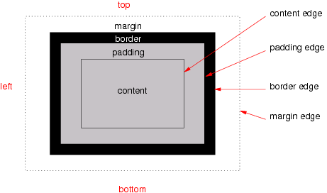
The various areas and edges of a typical box
Boxes have padding, a border and margins (see the figure). Different properties determine the thickness of each of these (which may be zero). The margins are also subject to collapsing.
Each box has a content area (a.k.a. content box). The rectangle that bounds this area is the content edge. Around the content area is the padding area and its outside bounds are called the padding edge. The padding area and content area together form the padding box. Outside the padding is the border area and the outside boundary of that area is the border edge. The border area, padding area and content area together form the border box. Finally, outside the border is the margin area and its outer edge is the margin edge.
When the specification says that the padding or border is “absent” on some side of the box, that actually means that its thickness is zero.
Line boxes cannot have any padding, border or margin, and therefore their margin edge, border edge, padding edge and content edge all coincide.
Note that the margin, unlike the border and padding, may have a negative thickness. That is one way to make adjacent boxes overlap each other.
Note that the edges always form rectangles, even if there is
a ‘border-radius’ [CSS3BG] or a shape [CSS3-EXCLUSIONS].
A box or element is horizontal if its ‘writing-mode’
property is ‘horizontal-tb’, otherwise it is
vertical. The orientation of a box or element is the pair of values
of its ‘writing-mode’ and ‘direction’
Note that there are theoretically eight possible orientations, but CSS only defines six:
‘writing-mode: horizontal-tb’
| ‘writing-mode: vertical-rl’
| ‘writing-mode: vertical-lr’
| |
|---|---|---|---|
‘direction: ltr’
|
Text is written from left to right and paragraphs grow downwards
|
Text is written top to bottom and paragraphs grow to the left
|
Text is written top to bottom and paragraphs grow to the right
|
‘direction: rtl’
|
Text is written from right to left and paragraphs grow downwards |
Text is written bottom to top and paragraphs grow to the left |
Text is written bottom to top and paragraphs grow to the right |
There is no “horizontal-bt.”
This specification sometimes refers to abstract edges head, end, tail and start, which are relative to the orientation of a box. They map to top, right, bottom and left as follows:
Value of ‘writing-mode’
| Value of ‘direction’
| Meaning of “head” | Meaning of “end” | Meaning of “tail” | Meaning of “start” |
|---|---|---|---|---|---|
‘horizontal-tb’
| ‘ltr’
| top | right | bottom | left |
‘horizontal-tb’
| ‘rtl’
| top | left | bottom | right |
‘vertical-rl’
| ‘ltr’
| right | bottom | left | top |
‘vertical-rl’
| ‘rtl’
| right | top | left | bottom |
‘vertical-lr’
| ‘rtl’
| left | bottom | right | top |
‘vertical-lr’
| ‘ltr’
| left | top | right | bottom |
For example, the “head padding” by default refers to the ‘padding-top’ and the
“end border” is by default the ‘border-right’.
[Alternative terminology:]
This specification sometimes refers to abstract edges A, B, C and D, which are relative to the orientation of a box. They map to top, right, bottom and left as follows:
Value of ‘writing-mode’
| Value of ‘direction’
| Meaning of “A” | Meaning of “B” | Meaning of “C” | Meaning of “D” |
|---|---|---|---|---|---|
‘horizontal-tb’
| ‘ltr’
| top | right | bottom | left |
‘horizontal-tb’
| ‘rtl’
| top | left | bottom | right |
‘vertical-rl’
| ‘ltr’
| right | bottom | left | top |
‘vertical-rl’
| ‘rtl’
| right | top | left | bottom |
‘vertical-lr’
| ‘rtl’
| left | bottom | right | top |
‘vertical-lr’
| ‘ltr’
| left | top | right | bottom |
For example, the “A padding” by default refers to the ‘padding-top’ and
the “B border” is by default the ‘border-right’.
Similarly, the specification sometimes refers to the inline and block flow dimensions of a box, instead of width and height, as follows:
| Writing mode | Meaning of “inline dimension” | Meaning of “block flow dimension” |
|---|---|---|
| horizontal | width | height |
| vertical | height | width |
These correspond to the dimensions in the inline base direction and the block flow direction, respectively.
[Alternative terminology:]
Similarly, the specification sometimes refers to the B-D and A-C dimensions of a box, instead of width and height, as follows:
| Writing mode | Meaning of “B-D” | Meaning of “A-C” |
|---|---|---|
| horizontal | width | height |
| vertical | height | width |
These correspond to the dimensions in the inline base direction and the block flow direction, respectively.
Finally, the headside, endside, tailside and startside of a box are defined as the sides that correspond to the head, end, tail and start, of the containing block of the box.
For example, if a box has a ‘writing-mode’ of ‘horizontal-tb’, then its top content edge acts as its
head content edge, and the headside edges of its children are
therefore their top edges, independent of what their own ‘writing-mode’ is.
The second child box is a vertical box and has its “head” content edge on the right. But its “headside” content edge is at the top.
[Alternative terminology:]
Finally, the A′, B′, C′ and D′ sides of a box are defined as the sides that correspond to the A, B, C and D sides of the containing block of the box.
For example, if a box has a ‘writing-mode’ of ‘horizontal-tb’, then its top content edge acts as its
A content edge, and the A′ edges of its children are therefore
their top edges, independent of what their own ‘writing-mode’ is.
The second child box is a vertical box and has its “A” content edge on the right. But its “A′” content edge is at the top.
Check terms. At Cambridge ftf Aug 2008 we chose: Property
name: block-flow with values tb | lr | rl | bt. Descriptive terms:
horizontal mode (= tb & bt), vertical mode (= lr & rl). The May
2012 Writing Modes module now has ‘writing-mode’ with values ‘horizontal-tb’, ‘vertical-rl’ and ‘vertical-lr’ (and no ‘bt’
anymore).
User agents for continuous media generally offer users a viewport (a window or other viewing area on the screen) through which users consult a document. User agents may change the document's layout when the viewport is resized (see the initial containing block).
When the viewport is smaller than the area of the canvas (see below) on which the document is rendered, the user agent should offer a scrolling mechanism. There is at most one viewport per canvas, but user agents may render to more than one canvas (i.e., provide different views of the same document).
For all media, the term canvas describes the space where the formatting structure is rendered. The canvas is infinite for each dimension of the space.
For the purposes of the width and height calculations below, CSS distinguishes four kinds of replaced elements:
For raster images without reliable resolution information, a size of 1 px unit per image source pixel must be assumed. These images thus are of type 1.
E.g., in the section on inline replaced
elements, if the replaced element is an HTML document and the height
is specified as ‘auto’, e.g.:
... <object data="example.html"
style="width: 30em; height: auto"></object>...
then the used height will be 150px, which is unlikely to be the real
height of the example.html document. But if the height is specified as
‘complex’, e.g.:
... <object data="example.html"
style="width: 30em; height: complex"></object>...
then the height will be the height the example.html document normally has when displayed on its own with the given width. This enables almost seamless integration of external text in a document, without a scrollbar or similar. (The external text is still displayed with its own style sheet.)
An (external) mathematical formula in MathML is an example of replaced content with an intrinsic width and height. Assume the file m.mml contains a formula, then the HTML fragment
... derive <img src="m.mml" alt="that the sum of p(i) for i greater than 0 equals N"> for the case...
renders the formula at its intrinsic size.
The mathematical formula would however benefit from a way to negotiate available space against intrinsic size, or even negotiate available space against the number of boxes, so that the formula could be broken in two or more boxes and occupy space on two or more lines (similar to how lines of text are broken or words are hyphenated). But an easier solution might be to extend HTML with native support for math and CSS with math boxes, so that replaced elements remain single boxes.
As described in the introduction, elements give rise to boxes and those boxes are laid out on a canvas. Different kinds of boxes are laid out differently. This section describes the layout of one flow of boxes.
The approximate model for the layout of a flow of boxes is that sibling
boxes are laid out one after the other in one long series with margins
between them and parent boxes tightly wrap the series of child boxes. The
‘writing-mode’
property of the parent determines if that series grows down (‘tb’), to the left (‘rl’), to
the right (‘lr’) or up (‘bt’). Although the rules below depend on terms that are
only defined further down, the rules are given at the outset, to provide
at least an approximate model of how boxes are positioned relative to one
another.
The following rules define the position of block-level boxes relative to the box that is their flow root. Other sections and other modules describe how other boxes are laid out. E.g., floating boxes are described further down in this module and absolutely positioned boxes are described in the Absolute Positioning module [CSS3POS].
Before applying these rules, the width, height and margins of each box must be computed as described in the sections “Calculating widths, heights and margins” and “Collapsing margins.”
Consider the first box (in document order) of a set of sibling boxes that all belong to the same flow. There are four cases:
If none of its margins collapse with its parent's head margin and the box is not collapsed through, then the box is placed such that the box's headside margin edge touches the parent's head content edge, the startside margin edge touches the parent's start content edge and the endside margin edge touches the parent's end content edge.
[Add illustration.]
[Alternative terminology:] If none of its margins collapse with its parent's A margin and the box is not collapsed through, then the box is placed such that the box's A′ margin edge touches the parent's A content edge, the D′ margin edge touches the parent's D content edge and the B′ margin edge touches the parent's B content edge.
If none of its margins collapse with its parent's head margin but the box is collapsed through, then its content edge (which is also its border edge and padding edge) is defined as what it would have been if the box had a non-zero tailside border. (I.e., recompute the margins given that border and then apply the previous rule.)
Note that the box is effectively invisible, but the edges have to be defined to position any descendants, such as floating or absolutely positioned children.
If exactly one of its margins collapses with its parent's head margin, then the box is placed such that the box's headside border edge touches the parent's head content edge, the startside margin edge touches the parent's start content edge and the endside margin edge touches the parent's end content edge.
[Add illustration.]
If two of its margins collapse with its parent's head margin, then its position is such that its content edge (which is also its border edge) touches its parent's head border edge and that its startside margin edge touches its parent's start content edge and its endside margin edge touches the parent's end content edge.
Note that the box is effectively invisible, but the edges have to be defined to position any descendants.
For a box that has a preceding sibling in the same flow there are two cases:
If the box is not collapsed through, it is positioned such that its margin edge touches the parent's start content edge and end content edge and such that its content edge on the touches the [...]
A box that has a preceding sibling in the same flow and that is collapsed through, [...]
The layout of boxes in the flow is in large part determined by the
interplay of the ‘display’ properties of an element and its
parent, and then fine-tuned with margins and padding.
| Name: | display |
| Value: | inline | block | inline-block | list-item | run-in | compact | table | inline-table | table-row-group | table-header-group | table-footer-group | table-row | table-column-group | table-column | table-cell | table-caption | ruby | ruby-base | ruby-text | ruby-base-group | ruby-text-group | align-box | none |
| Initial: | inline |
| Applies to: | all elements |
| Inherited: | no |
| Percentages: | N/A |
| Media: | visual (‘none’ applies to all media)
|
| Computed value: | specified value, except for floats, root elements and positioned elements; see text |
There is an old proposal to split ‘display’ into
display-role (the function of the element in its parent) and display-model
(how the element lays out it children). That allows some combinations that
have no keyword, such as a table cell (‘display-role:
table-cell’) that is itself a table (‘display-model: table’), without the need for an extra
wrapper element. It allows certain things (for math layout, e.g.), but is
not easy to use. An alternative proposal is an ‘::outside’ pseudo-element to create an extra box on
which to set a different ‘display’ value. That is not easy either, and
doesn't cascade well. And a third proposal is to allow two values on ‘display’: if there are
two (in any order), one is the role and the other the model, unless the
pair makes no sense. That doesn't make the concept any easier, but it
hides the complexity better.
This property, in combination with ‘float’ and ‘position’, determines the type of box or boxes
that are generated for an element. The values are as follows:
block’, but forces the element to be
a flow root,, which, e.g., stops its
margins from collapsing with margins of child elements and includes
floating children in its height. [C.f. the discussion of how to force an element to contain
floats.]
display’
property on the descendants.
Note that ‘none’ does not create
an invisible box; it creates no box at all. See ‘visibility’ for a
mechanisms that enables an element to generate boxes that affect
formatting but are not visible themselves.
Note that both ‘clear-after’ and ‘align-box’ can be used to force the next element after
this one to start after any floats inside this element, but the effect is
not exactly the same. E.g., ‘display: box’ also
affects certain forms of margin collapsing.
Note that ‘vertical-al ign’
applies to ‘align-box’ elements, hence the
name. The ‘vertical-align’ property
doesn't apply to other block-level elements, except ‘table-cell’ elements.
Any sense in vertically spreading out the contents,
something like ‘vertical-align: justify’?
Simpler to not use ‘vertical-align’, but creating ‘top-box’, ‘middle-box’ and
‘bottom-box’?
The ‘vertical-align’ property applies
to ‘align-box’ elements [check in [CSS3TEXT]!], and can thus
be used to create vertically centered content, without wrapping the
content in a table (which may not be always possible, and also causes the
‘width’ property to
behave differently).
div.slide {
display: align-box;
height: 15em;
vertical-align: middle;
border: thin solid }
with a document fragment like this:
<div class=slide>
<ul>
<li>Bullet lists are boring
<li>They distract from the speaker
<li>Don't use them!
</ul>
</div>
might look like this figure:
The ‘vertical-align: middle’
causes the content of the ‘align-box’ to be
vertically centered.
The computed value of ‘display’ depends on ‘position’ [CSS3POS], ‘float’ and ‘overflow’:
display’ is ‘none’, then the computed value is ‘none’ (and ‘overflow’, ‘float’ and ‘position’ do not apply).
position’ is ‘absolute’ or ‘fixed’, or if
‘float’ is not
‘none’, or if ‘overflow’ is not ‘visible’, or if the element is the root element, then
the computed value of ‘display’ is set according to the following
table:
| Specified value | Computed value |
|---|---|
| inline-table | table |
| inline, run-in, table-row-group, table-column, table-column-group, table-header-group, table-footer-group, table-row, table-cell, table-caption, inline-block | block |
| others | same as specified |
display’ is the same as the specified value.
There may be documents that combine different layout models, such as
documents that combine HTML (typically rendered with the CSS box model)
and SVG (rendered with its own graphics
model). If an element that is rendered according to the CSS box model has
a child that is to be rendered with a different model, that child needs to
have a ‘display’
property with a value that indicates that the child is not in the box
model.
Such a child is treated as a replaced element for the purposes of determining its size, position, margins, padding and border.
Should we allow a more complex model, where such a child may negotiate with the CSS environment to have several boxes and several baselines, so that it can take part in line breaking and page breaking?
This specification defines no value(s) for the ‘display’ property that
indicate that an element is formatted according to a different model than
the box model, but separate specifications may do so.
A block-level box is a box that has a computed value for ‘display’ of ‘block’, ‘align-box’,
‘list-item’, ‘table’, ‘table-*’ (i.e., all
table boxes, see [CSS3TBL]), ‘run-in’ (under certain circumstances, see “Run-in boxes” ), or ‘compact’ (under certain circumstances, see “Compact boxes”).
An inline-level box is a box that has a computed value for ‘display’ of ‘inline’, ‘inline-block’,
‘inline-table’, ‘ruby’, ‘run-in’ (under
certain circumstances), or ‘compact’ (under
certain circumstances).
[What about the other ruby values?]
An anonymous box, informally, is a box that
cannot be addressed with CSS selectors. All its properties, except for
‘display’, have
their default values (either the initial value or inherited). Anonymous
boxes are created when the CSS box model requires a child box with a
certain value for ‘display’, but the child actually has a
different value. In that case an anonymous box of the right kind is
created and wraps the child (or children). Other modules (e.g., [CSS3TBL], [CSS3TEXT]) may
also define anonymous boxes. The anonymous boxes defined by this module
are the following:
display’ of ‘block’.
An example of the last point above is this document fragment:
<p>Somebody whose name I have forgotten, said, long ago: <q>a box is a box,</q> and he probably meant it.</p>
with these style rules:
p { display: block }
q { display: block; margin: 1em }
The p element has both line boxes and a child box for the
q element, which is a block-level element. The line boxes
before the q are wrapped in an anonymous block-level box and
so are the line boxes after the q. The resulting tree of
boxes might be as follows (refer to the figure):
When the fragment is rendered, the text before the q is wrapped in an anonymous block and the text after the q in another.
Note that the anonymous boxes defined in this module are all block-level, but anonymous boxes defined in other modules may be different.
The containing block of a box
is a rectangle that is associated with the box and that is used in various
definitions in this specification. Apart from a size and a position, the
rectangle also has ‘direction’ and ‘writing-mode’
properties. The containing block of a box is defined as follows:
direction’ and ‘writing-mode’ of
the initial containing block are the same as those of the root element.
run-in’ that is
rendered inline in a sibling element, then its containing block is the
content edge of the principal box of that sibling.
table-cell’ or a ‘block’), then the containing block is the
content edge of the parent's principal
box.
In the above, a block container box
is, informally, a box that can contain block boxes. More precisely: any
box generated by a (pseudo-)element with a computed value for ‘display’ of ‘block’, ‘inline-block’,
‘table-caption’, ‘table-cell’ or ‘list-item’.
Note that most floating and absolutely positioned
elements have a computed ‘display’ of ‘block’. Also, a flow
root has a computed ‘display’ of ‘block’. Or insert the
definition of block container box from CSS 2.1 here?
Also define principal box somewhere.
Issue 142 of CSS 2.1 suggests that an anonymous cell box, unlike anonymous block boxes, can establish the containing block for its children. If that is accepted, make sure the table module modifies the above definition.
Note that the above is modified by the Absolute Positioning
module [CSS3POS]:
in particular, if a box's ‘position’
property is neither ‘static’ nor ‘relative’, its containing block is established
differently.
If an element [or a viewport?] has scrollbars
(see ‘overflow’),
then any space taken up by the scrollbars should be excluded from
(subtracted from the dimensions of) any containing block formed by that
element.
A flow root is a box that satisfies at least one of the following:
float’ is not ‘none’.
overflow’ is not
‘visible’.
display’ is ‘table-cell’, ‘table-caption’ (see [CSS3TBL]), ‘inline-block’, ‘inline-table’ or ‘align-box’.
position’ is ‘absolute’ or ‘fixed’ (see
[CSS3POS]).
transform’ is not ‘none’.
child-align’ is not ‘auto’. [If ‘child-align’ is adopted, rather than, say,
‘margin: fill’]
Note that an element with ‘display:
inline’ therefore cannot be a flow root: it doesn't float
(otherwise its ‘display’ would be ‘block’), and neither ‘overflow’ nor ‘writing-mode’ apply to inlines.
Note: The terminology in the CSS level 2 specification is different. A flow root is called “an element that establishes a new formatting context.”
Other modules may define additional flow roots. [Can
we thus remove ‘table-caption’, ‘table-cell’, and ‘position’ from the list above?]
The flow (a.k.a. normal flow) of a given flow root is a set of boxes. A box belongs to the flow if all of the following are true:
display’ is ‘block’, ‘list-item’ or
‘table’.
float’ is ‘none’.
position’ is
‘static’ or ‘relative’.
For example, the fragment
<div class=sidebar> <p>Text in a sidebar. <p>Here is quote: <blockquote lang=ja> <p>... </blockquote> <p>Etc. etc. </div>
with the style
div.sidebar { writing-mode: tb; float: left }
blockquote[lang|=ja] { writing-mode: rl; height: 10em }
defines two flows:
div is a flow root, because it floats. Its flow
consist of the 1st, 2nd and 4th p and the
blockquote.
blockquote is a vertical box inside a horizontal parent and it is thus a flow
root. Its flow is formed by the 3rd p.
(The div itself belongs to a third flow, but its flow root
is not shown in the fragment.)
Note that a flow root is not necessarily block-level, it may
be an ‘inline-block’, e.g.
The boxes of a flow are laid out inside their flow root one after the
other in the direction of the ‘writing-mode’ property of the flow root and in
the same order as in the source document. Their position is given by how
much their margins overlap (see “Collapsing margins”) and by the fact
that their side margin edges coincide with content edges of their
containing blocks. More precisely: Each box's left and right margin edges
coincide with the left and right edges of its containing block (if the
flow root is ‘tb’), or its top and bottom
margin edges coincide with the top and bottom edges of its containing
block (if the flow root is ‘rl’ or ‘lr’).
A ‘run-in’ element (or pseudo-element) A behaves as follows:
display: block’.
display: none’. If B exists and has a specified value for
‘display’ of
‘block’ or ‘list-item’ and is not replaced, then A is rendered as an ‘inline’ element at the start of B's
principal box. Note: A
is rendered before B's ‘:before’
pseudo-element, if any. See [CSS3GENCON].
display: block’.
In the above, “siblings” and “children” include both normal elements and :before/:after pseudo-elements.
An element or pseudo-element C inhibits run-in behavior if one or more of the following are true. (Note that the definition is recursive.)
display’ is one of ‘block’, ‘list-item’,
‘table’ or ‘run-in’.
display’ of ‘inline’ and it has one or more children that
inhibit run-in behavior. (Where “children” includes both normal
elements and :before/:after pseudo-elements.)
A ‘run-in’ box is useful for run-in headers,
as in this example:
<!DOCTYPE HTML PUBLIC "-//W3C//DTD HTML 4.01//EN">
<HTML>
<HEAD>
<TITLE>A run-in box example</TITLE>
<STYLE type="text/css">
H3 { display: run-in }
</STYLE>
</HEAD>
<BODY>
<H3>A run-in heading.</H3>
<P>And a paragraph of text that
follows it.
</BODY>
</HTML>
This example might be formatted as:
A run-in heading. And a paragraph of text that follows it.
Despite appearing visually as part of the following block box, a run-in
element still inherits properties from its parent in the source tree.
It is undefined in level 2 if a run-in inherits from a
‘:first-line’ pseudo-element. How about in
level 3?
Define here or in extended box module?
A compact box is a box that is either put in the margin of the next box or becomes a block of its own, depending on whether it is small enough to fit in the margin or not. The typical use case is for lists where most labels are small enough to fit in the margin, except for a few.
An example is the DL list in HTML. Its COMPACT attribute indicates to the formatter that the labels of the list are good candidates for display as compact boxes:
<h3>Farm animals</h3> <dl compact> <dt>cat <dd>Lorem ipsum dolor sit amet, consectetaur adipisicing elit… <dt>dog <dd>Ut enim ad minim veniam, quis nostrud exercitation… <dt>hippopotamus <dd>Duis aute irure dolor in reprehenderit in voluptate velit… <dt>fly <dd>Excepteur sint occaecat cupidatat non proident, sunt in… </dl>
With a style rule like
dl[compact] dt {display: compact}
this might be rendered as in the figure below.
Three of the four labels are narrow enough to fit in the left margin. The one that is too wide is converted into a block.
Whether a compact box C is displayed as
a block or in the margin is determined as follows. Let N be the
next sibling element in document order in the same flow as C, if any. Let W be the
hypothetical distance between the startside margin edge and endside margin edge of C if the ‘display’ property of C were set to ‘block’ and any ‘auto’ on its
inline dimension were replaced by ‘fit-content’.
display’ of ‘list-item’, then C is
displayed as a block.
If C is displayed as a block, it is a
block-level element and it is sized
and positioned exactly as if its ‘display’ had been ‘block’.
Otherwise, C is placed such that its startside margin edge aligns with the start margin edge of its containing block and its headside border edge aligns with the headside border edge of N. It is in this case an inline-level element.
Do we do anything to avoid that floats overlap with C? Do we do anything if C is taller than N? E.g., adjust
the ‘min-height’
of N?
Simple example...
This example shows a compact box that has a different writing mode than its containing block:
dl {writing-mode: tb; direction: ltr}
dd {margin-left: 3em}
dt {display: compact; writing-mode: rl}
...
<dl>
<dt>cat
<dd>Lorem ipsum dolor sit amet, consectetaur adipisicing elit…
</dl>
The margin that is considered is the left margin of the DD, because the containing block (established by the DL) is top-to-bottom/left-to-right. That margin is thus compared to the width of the DT and it is large enough, which leads to a rendering similar to the figure below.
The word “cat” written sideways fits to the left of the definition.
| Name: | padding |
| Value: | [ <length> | <percentage> | auto ]{1,4} |
| Initial: | (see individual properties) |
| Applies to: | all elements |
| Inherited: | no |
| Percentages: | width* of containing block |
| Media: | visual |
| Computed value: | see individual properties |
| *) if the containing block is horizontal, otherwise the height | |
| Name: | padding-top , padding-right, padding-bottom, padding-left |
| Value: | [ <length> | <percentage> | auto ] |
| Initial: | 0 |
| Applies to: | all elements |
| Inherited: | no |
| Percentages: | width* of containing block |
| Media: | visual |
| Computed value: | <length> |
| *) if the containing block is horizontal, otherwise the height | |
Sets the thickness of the padding area. The value may not be negative.
‘Padding’ is a
shorthand for the other four properties. If ‘padding’ has four values, they are for top,
right, bottom and left in that order. If left is omitted, it is the same
as right. If bottom is omitted it is the same as top, if right is omitted
it is the same as top.
Note that percentages on ‘padding-top’ and ‘padding-bottom’
are relative to the width of the containing
block, not the height (at least in a horizontal flow; in a vertical flow
they are relative to the height).
Note that percentages are not required for CSS level 2.
For example, the following two ways to set the padding of
h1 are equivalent:
h1 { padding: 0.5em }
h1 { padding-top: 0.5em;
padding-right: 0.5em;
padding-bottom: 0.5em;
padding-left: 0.5em }
Values may not be negative, thus the third line is ignored, but what about the fourth?
p { font-size: 10pt;
padding-left: 2em;
padding: -11pt;
padding-left: calc(1em - 11pt)
}
Margins in CSS serve to add both horizontal and vertical space between boxes.
| Name: | margin-top , margin-right, margin-bottom, margin-left |
| Value: | <length> | <percentage> | auto |
| Initial: | 0 |
| Applies to: | see text |
| Inherited: | no |
| Percentages: | width* of containing block |
| Media: | visual |
| Computed value: | the percentage as specified or the absolute length or ‘auto’
|
| *) if the containing block is horizontal, otherwise the height | |
| Name: | margin |
| Value: | [ <length> | <percentage> | auto]{1,4} |
| Initial: | (see individual properties) |
| Applies to: | see text |
| Inherited: | no |
| Percentages: | width* of containing block |
| Media: | visual |
| Computed value: | see individual properties |
| *) if the containing block is horizontal, otherwise the height | |
Add a stretch value to allow vertical distribution of blocks in a
fixed-height containing block? css3-flexbox currently (May 2012) proposes
to use ‘auto’, but in normal flow we probably
need something else, because ‘auto’ already
means ‘0’ there.
<stretch> = fill( [ <length> | <percentage> ] )
This sets an elastic margin with a minimum thickness. Maybe it is enough without the minimum thickness, i.e.:
<stretch> = fill
Collapsing margins of which at least one has a <stretch> value would yield
‘fill(M - N), or maybe just
’fill'.
To find the size of such a collapsed margin, find the nearest enclosing
containing block in the same flow that has a fixed height, call that
height H1. Compute the height of the content in that
containing block (while treating ‘fill(P)’ as if it was simply P)
and call that height H2. Count the number N of
stretchable margins. If H2 < H1, then increase
all the stretchable margins by (H1 -
H2)/N. If there is no such enclosing block,
‘fill(P)’ simply means
P.
In a multi-column element, each column box is a separate containing block for the purpose of stretching the margins.
These properties set the thickness of the margin area. The value may be negative.
‘Margin’ is a
shorthand for the other four. If ‘margin’ has four values, they set top, right,
bottom and left in that order. If left is omitted, it is the same as
right. If bottom is omitted, it is the same as top. If right is omitted it
is the same as top.
The properties apply to all boxes except certain table-* boxes (see [CSS3TBL]) and certain inline-level boxes (see [CSS3TEXT]).
Margins must satisfy certain constraints, which means that the used
value may be different from the computed value. See “Calculating widths, heights and margins.” The
meaning of ‘auto’ is also explained there.
Note that in a horizontal flow, percentages on
‘margin-top’ and
‘margin-bottom’ are relative to the width of the containing block, not the height
(and in vertical flow, ‘margin-left’ and ‘margin-right’ are
relative to the height, not the width).
For example, the following two ways of setting the margins of
p are equivalent:
p { margin: 1em 2em }
p { margin-top: 1em;
margin-right: 2em;
margin-bottom: 1em;
margin-left: 2em }
Certain adjoining margins, as defined in this section, combine to form a single margin. Those margins are said to collapse. Margins are adjoining if there are no nonempty content, padding or border areas or clearance to separate them.
For example, in the following fragment with the given style rules:
p { display: block; margin-bottom: 2em 0 1em 0 }
div { display: block; margin: 2.5em 0 }
...
<p>First paragraph</p>
<div>
<p>Second paragraph</p>
</div>
the bottom margin of the first p (=1em), the top margin of
the div (=2.5em) and the top margin of the second
p (=2em) collapse. The result is a single margin of 2.5em
(the maximum of the three) between the bottom of the first p
and the top of the second.
Schematic representation of the previous example.
In the following fragment,
p { display: block; margin: 2em 0 1em 0 }
div { display: block; margin: 2.5em 0;
border: thin solid }
...
<p>First paragraph</p>
<div>
<p>Second paragraph</p>
</div>
the bottom margin of the first p and the top margin of the
div collapse, but the top margin of the second
p does not collapse with them, because it is not adjoining; the border of the
div separates them.
Schematic representation of the previous example.
If a set of adjoining margins collapses, then the width of the resulting margin is M - N, where M is the maximum of the adjoining margins that are positive, or zero if there are none; and N is the minimum of the adjoining margins that are negative, or zero if there are none.
We call an element or box collapsed through if two of its margins collapse with each other.
The most common use of collapsing through elements is that empty paragraphs don't cause extra white space:
<p>First paragraph <p>Second paragraph <p> <p>Last paragraph
There is equal space between the first and second paragraphs as between the second and last.
The following two sets of rules determine which margins collapse.
height’ that is not
‘auto’, or if setting its ‘min-height’ and
‘max-height’ to
their initial values would change its used height, then the tail margin of the element does not collapse
with any of its children's margins. [Check with latest
CSS 2.1 if min/max width/height still have this effect.]
width’ that is
not ‘auto’, or if setting its ‘min-width’ and ‘max-width’ to their
initial values would change the used width, then the tail margin of the element does not collapse
with any of its children's margins. [Check with latest
CSS 2.1 if min/max width/height still have this effect.]
Except when forbidden by the list above, the following margins collapse:
If a margin P collapses with a margin Q and margin Q with a margin R, then P, Q and R collapse together. (“Collapsing is transitive”)
A margin of a box collapses with the head margin of its parent box if those two margins are adjoining.
A margin of a box collapses with the tail margin of its parent box if those two margins are adjoining.
The head margin of a box collapses with the tail margin of a sibling box if the two margins are adjoining.
The top and bottom margins of a box A collapse with each other if the two margins are adjoining and the parent box B is horizontal. (The box is “collapsed through.”)
The left and right margins of a box A collapse with each other if the two margins are adjoining and the parent box B is vertical. (The box is “collapsed through.”)
If a box A is collapsed through and it has the same mode as its parent (i.e., both are horizontal or both are vertical), then the position of its head border edge is defined as follows.
Note that box A itself is invisible and its position has no effect on the positions of the other elements with whose margins it is being collapsed; the border edge position is only required for laying out descendants of A.
In a horizontal flow, the bottom margin of an in-flow block-level element is always adjoining to the top margin of its next in-flow block-level sibling, unless that sibling has clearance:
<p style="margin-bottom: 2em">The bottom margin of this box…</p> <p style="margin-top: 3em">… collapses with the top margin of this box, to yield max(2em, 3em) = 3em margin.</p>
The top margin of an in-flow block-level element is adjoining to its first in-flow block-level child's top margin if the element has no top border, no top padding, and the child has no clearance:
<div style="margin-top: 2em; padding: 0; border: 0">
<p style="margin-top: 3em">
The top margin of the DIV and the P
collapse, to yield max(2em, 3em) = 3em margin.
</p>
</div>
The bottom margin of an in-flow block-level element with a ‘height’ of ‘auto’ and ‘min-height’ less than the element's used
height and ‘max-height’ greater than the element's used
height is adjoining to its last in-flow block-level child's bottom margin
if the element has no bottom padding or border:
<div style="margin-bottom: 2em; padding: 0; border: 0;
height: auto; min-height: 0; max-height: 100em">
<p style="margin-bottom: 3em">
The bottom margin of the DIV and the P collapse, to yield max(2em,
3em) = 3em margin.
</p>
</div>
An element's own margins are adjoining if the ‘min-height’ property
is zero, and it has neither vertical borders nor vertical padding, and it
has a ‘height’ of
either 0 or ‘auto’, and it does not contain a
line box, and all of its in-flow children's margins (if any) are
adjoining:
<div style="margin-top: 2em; margin-bottom: 3em">
<p style="position: absolute">
The DIV is empty and its top and bottom margins collapse.
</p>
</div>
When an element's own margins collapse, and that element has had clearance applied to it, its top margin collapses with the adjoining margins of subsequent siblings but that resulting margin does not collapse with the bottom margin of the parent block:
<div style="margin-bottom: 2em">
<p style="float: left">
The margins of the next two Ps collapse
<p style="clear: left; margin-top: 4em; margin-bottom: 3em">
</p>
<p style="margin-top: 1em; margin-bottom: 1em">
</p>
</div>
The top and bottom margins of the two empty Ps collapse all together. But they can't collapse with the bottom of the DIV, because one of the two empty P's has clearance.
Check this. This is probably the only possible interpretation of the rules, but it is certainly not obvious that the clearance of one element may stop later elements from collapsing…
Collapsing is based on the used value of ‘padding’, ‘margin’, and ‘border’ (i.e., after resolving any percentages).
The collapsed margin is calculated over the used value of the various
margins.
| Name: | width |
| Value: | [<length> | <percentage>] && [border-box | content-box]? | available | min-content | max-content | fit-content | auto |
| Initial: | auto |
| Applies to: | all elements but non-replaced inline elements, table rows, and row groups |
| Inherited: | no |
| Percentages: | refer to width of containing block |
| Media: | visual |
| Computed value: | the specified keyword, the specified percentage (see prose under
<percentage>) or the absolute length; ‘auto’ if the property does not apply
|
| Name: | height |
| Value: | [<length> | <percentage>] && [border-box | content-box]? | available | min-content | max-content | fit-content | complex | auto |
| Initial: | auto |
| Applies to: | all elements but non-replaced inline elements, table columns, and column groups |
| Inherited: | no |
| Percentages: | see prose |
| Media: | visual |
| Computed value: | the specified keywords, the specified percentage (see prose under
<percentage>) or the absolute length; ‘auto’ if the property does not apply
|
These properties specify the width and height of the content area or border area (depending on ‘box-sizing’) of
certain boxes.
Values have the following meanings:
border-box’ is present, the
length sets the size of the border box; if ‘content-box’ is present, it sets the size of the
content box; if neither is present, the ‘box-sizing’ property determines which size is
set.
width’) or height (for ‘height’) of the
generated box's containing block.
Negative percentages are illegal. If the containing block's width, resp.
height depends on this element, then the percentage is
relative to ‘100vw’, resp. ‘100vh’. If the keyword ‘border-box’ is present, the percentage sets the size
of the border box; if ‘content-box’ is
present, it sets the size of the content box; if neither is present, the
‘box-sizing’
property determines which size is set.
available’ is equal to ‘100vw’, resp. ‘100vh’.
min-content’, min(‘max-content’, ‘available’)).
height’.) The same as ‘auto’, except that elements with a complex aspect ratio are
considered to have an intrinsic ratio. More precisely: for the
purposes of the section on “Calculating widths,
heights and margins,” the element is treated as if its height was
‘auto’ and it had an intrinsic ratio.
Another possible value is
<non-negative-number>, which would mean ‘min-content’ times that number.
Note that ‘available’, ‘max-content’, ‘min-content’,
‘fit-content’, ‘border-box’, ‘content-box’
and ‘complex’ do not exist in level 2.
The keyword values (in contrast to length and percentage values) are not
influenced by the ‘box-sizing’ property, they always set the size
of the content box, even if ‘box-sizing’ is ‘border-box’.
‘Available’, ‘max-content’, ‘min-content’
and ‘fit-content’ only have effect in the
inline progression direction: when ‘writing-mode’ is ‘tb’ and these keyword are set on ‘height’, they act like
‘auto’; ditto when ‘writing-mode’ is
something else and the keywords are set on ‘width’.
Note that ‘width: fit-content’ is
the same as ‘width: auto’ for floats and
tables, and ‘width: available’ is the same as
‘width: auto’ for blocks in the normal flow.
For example, the following rule fixes the content width of paragraphs at 100 px:
p { width: 100px }
This example shows the use of the keyword values. Assume these style rules:
div {width: 20em}
p.available {width: available}
p.min-content {width: min-content}
p.max-content {width: max-content}
p.fit-content {width: fit-content}
p.float {float: left; width: auto}
p.auto {width: auto}
* {outline: thin solid red}
Then a document like this might be rendered as in the figure below:
<div>
<p class=available>available: as wide as parent.
<p class=min-content>min-content: as narrow as possible.
<p class=max-content>max-content: As wide as needed, even
if that means wider than the parent.
<p class=fit-content>fit-content: As wide as needed.
<p class=fit-content>fit-content: As wide as needed, but
no wider than the parent.
<p class=float>auto: depends on flow (=float).
<p class=auto>auto: depends on flow (=normal).
</div>
Rendering of the example: ‘min-content’ and ‘max-content’ depend only on the content; ‘available’ depends only on the containing block;
‘fit-content’ depends on both; and ‘auto’ acts either like ‘available’ or like ‘fit-content’, depending on the type of box.
This example sets the width of the border box of an element to 50%. It
includes a fallback (48%) for UA that do not support the ‘border-box’ keyword, such as level 2 UAs:
div.side {
width: 48%;
width: 50% border-box }
It is equivalent to
div.side {
width: 50%;
box-sizing: border-box }
except that the latter doesn't have a fallback for level 2 UAs (which
don't support the ‘box-sizing’ property).
| Name: | min-width, min-height |
| Value: | <length> | <percentage> | available | min-content | max-content | fit-content |
| Initial: | 0 |
| Applies to: | all elements but non-replaced inline elements, table rows, and row groups |
| Inherited: | no |
| Percentages: | refer to width, resp. height of containing block |
| Media: | visual |
| Computed value: | the percentage as specified, the keyword as specified, or the absolute length |
| Name: | max-width, max-height |
| Value: | <length> | <percentage> | available | min-content | max-content | fit-content | none |
| Initial: | none |
| Applies to: | all elements but non-replaced inline elements, table rows, and row groups |
| Inherited: | no |
| Percentages: | refer to width, resp. height of containing block |
| Media: | visual |
| Computed value: | the percentage as specified, the keyword as specified, the absolute
length, or ‘none’
|
These properties allow authors to constrain content widths and heights to a certain range. Values have the following meanings:
width’ or ‘height’. Negative values are illegal.
width’ or ‘height’ as a percentage of the corresponding
dimension of the containing
block. Negative percentages are illegal. If the containing
block's dimension is negative, the used value is zero. If that containing
block's dimension depends on this element's dimension, then the resulting
layout is undefined. Or: use the initial value?
max-width’/‘max-height’, same as ‘max-content’. For ‘min-width’/‘min-height’, same as ‘min-content’.
The keyword values (in contrast to length and percentage values) are not
influenced by the ‘box-sizing’ property, they always set the size
of the content box, even if ‘box-sizing’ is ‘border-box’.
‘Available’, ‘max-content’, ‘min-content’
and ‘fit-content’ only have effect in the
inline progression direction: when ‘writing-mode’ is ‘tb’, keyword values on ‘min-height’ and ‘max-height’ act like ‘0’ and ‘none’, resp., and
when ‘writing-mode’ is something else, keyword
values on ‘min-width’ and ‘max-width’ act like ‘0’ and ‘none’, resp.
The size of a box often depends on the width or height of its content. This section defines two measures of that size: the intrinsic preferred width (IPREF) is, roughly, the size the content would have if no “soft” line breaks were inserted; the intrinsic minimum width (IMIN) is, roughly, the narrowest the box can get by breaking all lines at all possible places. Or stated another way: they are the largest width that the content can usefully fill and the smallest width that the content can fit in without unintended overflow.
For example, in a simple paragraph with just text the intrinsic preferred width is the width of the line if all words are laid out on one line; and the intrinsic minimum width is the width of the longest word.
The intrinsic minimum width (IMIN) of a horizontal, non-replaced element E is defined as the smallest length ≥ 0 such that
OVERFLOW(E,IMIN) ≤ OVERFLOW(E,w) for all w ≥ 0
where the function OVERFLOW(E,w) is defined as
follows. Set the ‘display’ of E to ‘block’, ‘float’ to ‘none’,
‘position’ to ‘static’, ‘overflow’ to ‘visible’, ‘min-width’ to ‘0’,
‘max-width’ to
‘none’, ‘height’ to ‘auto’,
‘min-height’ to
‘0’, ‘max-height’ to ‘none’ and ‘width’ to w. Then measure the total
width W of E including all overflow, considering
E and all its descendants in the same flow and all floats of
which E is the containing block. Then
OVERFLOW(E,w) = W - w
The intrinsic preferred width (IPREF) of a horizontal, non-replaced element E is defined as the smallest length ≥ 0 such that
HEIGHT(E,IPREF) ≤ HEIGHT(E,w) for all w ≥ 0
and
HEIGHT(E,IPREF) < HEIGHT(E,w) or OVERFLOW(E,IPREF) ≤ OVERFLOW(E,w) for all w ≥ 0
where HEIGHT(E,w) is defined as follows. Set the
‘display’ of
E to ‘block’, ‘float’ to ‘none’, ‘position’ to
‘static’, ‘overflow’ to ‘visible’, ‘min-width’ to ‘0’,
‘max-width’ to
‘none’, ‘height’ to ‘auto’,
‘min-height’ to
‘0’, ‘max-height’ to ‘none’ and ‘width’ to w. Then
HEIGHT(E,w) is the height as defined below in “Auto heights for flow roots.”
OVERFLOW is not necessarily monotonic in w and a binary search for IMIN and IPREF may thus fail.
The corresponding definitions for vertical elements are analogous, with width and height swapped.
We probably want a definition that gives the same result in easy cases (only inline content) but is quicker to compute in complex cases.
UA's may also, if speed is preferred over quality, use the approximate intrinsic minimum width (AMIN) instead of IMIN and the approximate intrinsic preferred width (APREF):
AMIN = max(W1,W2,W3,W4)
APREF = max(P1,P2,P3,P4)
where
white-space’ into account and using
language-dependent information, such as whether hyphens are added after a
break. If ‘text-indent’ applies to the
text, add its value to the first stretch (which may thus get a negative
width, if ‘text-indent’ is sufficiently
negative). If there is no text, or if the widest stretch has a negative
width, then W1 is set to 0.
position’ of ‘static’ or ‘relative’, and
a ‘display’ other
than ‘none’. If there are no such children, or
if the largest width is negative, W2 is 0.
position’ of ‘static’
or ‘relative’ and a ‘display’ other than
‘none’. Let wi be the
sum of AMINi and the left and right margins, padding and
border of Ci. Then W3 is the
largest of those wi. If there are no such child
elements, or if the largest wi is negative, then
W3 is 0.
position’ either ‘static’ or ‘relative’,
‘display’ other
then ‘none’ and ‘width’ set to a <length>. If there are no such
elements, or if the largest of the widths is negative, then
W4 is 0. Note that this
calculation does not require looking at the contents of elements.
Note that several kinds of child elements are ignored for the
calculation of AMIN, e.g., vertical
elements with ‘width’
of ‘auto’. Also, tables aren't laid out.
The corresponding definitions for vertical elements are analogous, with width and height swapped.
The following two algorithms define the used
value of ‘width’ and ‘height’ respectively and also the used values
of the ‘margin’
properties and of ‘top’, ‘right’ ‘bottom’
and ‘left’.
Note that they do not affect the computed values of ‘width’ and ‘height’. Also note that
in some cases the used width has to be known in order to calculate the
used height, or vice versa,
For ‘width’:
transform’ is not ‘none’, it is assumed to be ‘rotate(0)’ (i.e., the identity transform) for the
purposes of this calcutlation.
max-width’, the same
rules are applied again, but this time using the computed value of ‘max-width’ as the
computed value for ‘width’.
min-width’, the same rules are applied again,
but this time using the computed value of ‘min-width’ as the computed value for ‘width’.
For ‘height’:
transform’ is not ‘none’, it is assumed to be ‘rotate(0)’ (i.e., the identity transform) for the
purposes of this calcutlation.
max-height’, the
same rules are applied again, but this time using the computed value of
‘max-height’ as
the computed value for ‘height’.
min-height’, the same rules are applied
again, but this time using the computed value of ‘min-height’ as the
computed value for ‘height’.
If ‘transform’
is not ‘none’, the used width or height is
further modified as follows:
height’ is
‘auto’, then the used height is the height of
the content box after the transformation is applied.
width’ is ‘auto’, then the used width is the width of the content
box after the transformation is applied.
Note that translations [CSS3-2D-TRANSFORMS] do not affect the width or height and also do not affect the placement of boxes in the normal flow (see “Basic flow layout” ).
However, for replaced elements with an intrinsic ratio
and both ‘width’ and
‘height’ specified
as ‘auto’, the algorithm is as follows:
Select from the table the resolved height and width values for the
appropriate constraint violation. Take the max-width and max-height as max(min, max) so that
min ≤ max holds true. In this table w
and h stand for the results of the width and height
computations ignoring the ‘min-width’, ‘min-height’, ‘max-width’ and ‘max-height’ properties. Normally these are the
intrinsic width and height, but they may not be in the case of replaced
elements with intrinsic ratios.
| Constraint violation | Resolved width | Resolved height |
|---|---|---|
| none | w | h |
| w > max-width | max-width | max(max-width * h/w, min-height) |
| w < min-width | min-width | min(min-width * h/w, max-height) |
| h > max-height | max(max-height * w/h, min-width) | max-height |
| h < min-height | min(min-height * w/h, max-width) | min-height |
| (w > max-width) and (h > max-height), where (max-width/w ≤ max-height/h) | max-width | max(min-height, max-width * h/w) |
| (w > max-width) and (h > max-height), where (max-width/w > max-height/h) | max(min-width, max-height * w/h) | max-height |
| (w < min-width) and (h < min-height), where (min-width/w ≤ min-height/h) | min(max-width, min-height * w/h) | min-height |
| (w < min-width) and (h < min-height), where (min-width/w > min-height/h) | min-width | min(max-height, min-width * h/w) |
| (w < min-width) and (h > max-height) | min-width | max-height |
| (w > max-width) and (h < min-height) | max-width | min-height |
Then apply the appropriate rules in the subsections below, as if ‘width’ and ‘height’ were computed as
these values.
Note that some values of the ‘image-scaling’ property ([CSS3PAGE]) may further change the
used values of ‘width’ and ‘height’.
The following subsections apply if the element's containing block is horizontal. If it is vertical, the same rules apply, but with every occurrence of “left” replaced by “top,” “right” by “bottom,” “top” by “right,” “bottom” by “left”, “height” by “width” and “width” by “height.”
For the purposes of evaluating percentages in the following subsections,
if the width of the containing block is unknown, then assume the width is
‘100vw’. Likewise, if the height of the
containing block is unknown, then assume it is ‘100vh’.
The ‘width’ and
‘height’ properties
do not apply. For each of ‘left’, ‘right’, ‘top’,
‘bottom’, ‘margin-left’, ‘margin-right’, ‘margin-top’ and ‘margin-bottom’,
the used value is calculated from the computed value by evaluating
percentages and replacing ‘auto’ by 0.
Note that this section applies equally when the containing block is horizontal as when it is vertical.
The used values of ‘margin-left’, ‘margin-right’, ‘margin-top’ and ‘margin-bottom’
derive from the computed value, except that a computed value of ‘auto’ becomes a used value of ‘0’.
If ‘height’ and
‘width’ both have
computed values of ‘auto’ and the element also
has an intrinsic width, then that intrinsic width is the used value of
‘width’.
If ‘height’ and
‘width’ both have
computed values of ‘auto’ and the element also
has an intrinsic height, then that intrinsic height is the used value of
‘height’.
If ‘height’ and
‘width’ both have
computed values of ‘auto’ and the element has
no intrinsic width, but does have an intrinsic height and intrinsic ratio;
or if ‘width’ has a
computed value of ‘auto’, ‘height’ has some other
computed value, and the element has an intrinsic ratio; then the used
value of ‘width’ is:
(used height) * (intrinsic ratio)
If ‘height’ and
‘width’ both have
computed values of ‘auto’ and the element has
no intrinsic height, but does have an intrinsic width and intrinsic ratio;
or if ‘height’ has a
computed value of ‘auto’, ‘width’ has some other
computed value, and the element has an intrinsic ratio; then the used
value of ‘height’
is:
(used width) / (intrinsic ratio)
If ‘height’ and
‘width’ both have
computed values of ‘auto’ and the element has
an intrinsic ratio but no intrinsic height or width and the containing
block's width doesn't itself depend on the replaced element's width, then
the used value of ‘width’ is calculated from the constraint equation used for block-level,
non-replaced elements in normal flow. The used value for ‘height’ is: (used width)
/ (intrinsic ratio).
If ‘width’ has a
computed value of ‘auto’, and the element
has an intrinsic width but no intrinsic ratio, then that intrinsic width
is the used value of ‘width’.
If ‘height’ has a
computed value of ‘auto’, and the element
has an intrinsic height but no intrinsic ratio, then that intrinsic width
is the used value of ‘width’.
If ‘width’ has a
computed value of ‘auto’, but none of the
conditions above are met, then the used value of ‘width’ becomes 300px. If 300px is too wide to
fit the device, UAs should use the width of the largest rectangle that has
a 2:1 ratio and fits the device instead.
If ‘height’ has a
computed value of ‘auto’ and none of the rules
above define its used value, then the used value of ‘height’ must be set to
the height of the largest rectangle that has a 2:1 ratio, has a height not
greater than 150px, and has a width not greater than the device width.
Theoretically, a device may be wider than than 300px but not tall enough for 150px. In that case the resulting replaced element will be too tall. But this is the formulation in CSS 2.1 and it seems not worth improving such an edge case.
Percentage intrinsic widths are first evaluated with respect to the containing block's width, if that width doesn't itself depend on the replaced element's width. If it does, then a percentage intrinsic width on that element can't be resolved and the element is assumed to have no intrinsic width.
Note that this section applies equally when the containing block is horizontal as when it is vertical.
overflow’ computes to ‘visible’This section also applies to block-level
non-replaced elements in normal flow when ‘overflow’ does not compute to ‘visible’ but has been propagated to the viewport.
The used values of the head padding, tail padding, head margin and tail margin are calculated from their computed values,
with any ‘auto’ values replaced by 0.
If the computed value of the block flow
dimension is not ‘auto’, then the used
value is calculated by evaluating the computed value. Otherwise, the block flow dimension is the distance between two
edges that are defined as follows:
The above reflects the fact that the margins of the element may collapse with the margins of its first and last children (unless the element has a border or padding). In that case the children's margins fall outside the block flow dimension.
The position of the edges is calculated without applying relative positioning, if any, to the children. And only children in the normal flow are taken into account, i.e., floating boxes and absolutely positioned boxes are ignored.
For example, the DIV in this fragment has a bottom border but no padding or border at the top. The height is thus calculated from the border edge of the first child (img1) to the margin edge of the last child (img2). The result is 8em.
div {border-bottom: 0.2em dashed}
img {height: 3em; display: block; margin: 1em}
...
<div>
<img src="img1" alt=...>
<img src="img2" alt=...>
</div>
The height is measured from the top border edge of the first IMG to the bottom margin edge of the last.
With respect to the inline dimension, the following constraint must hold among the used values of the given properties.
start margin + start border + start padding + inline dimension + end padding + end border + end margin = inline dimension of containing block
The used values of the above properties, except for any values that are
‘auto’, are calculated from the computed
values, evaluating percentages. If this makes the inline dimension
negative, then set its used value to 0. Ditto for start padding and end
padding. Note that such negative values can only happen
when the specified value includes ‘calc()’. Then apply one of the following cases:
If none of the values is ‘auto’, then there
are three sub-cases:
alignment’ is ‘center’, then the used values of start margin and
end margin are set so that they are the same and the constraint is
satisfied.
alignment’ corresponds to the end edge, then the used value of the end
margin is set to the value that satisfies the constraint.
alignment’ has any other value, then the
used value of the start margin is set to the value that satisfies the
constraint.
auto’, then set the used value of all other properties
in the constraint that are ‘auto’ to 0 and set
the used value of the inline dimension so that the constraint is
satisfied. If that makes the used value negative, then set it to 0
instead and apply case 1 above.
auto’, and ‘alignment’ is
‘center’, then solve the constraint under
the extra condition that the start and end margin are equal.
auto’, and ‘alignment’ is not
‘center’, then solve the constraint under
the extra condition that the start and end margins are equal. But if that
makes them negative, then set both to 0 and apply case 1 above.
auto’ and ‘alignment’ corresponds to the end edge, then set the start margin to the value that
satisfies the constraint.
auto’ and ‘alignment’ does not correspond to the end edge, then set the start margin to the value that
satisfies the constraint. But if that makes it negative, then set it to 0
instead and apply case 1 above.
auto’ and ‘alignment’ corresponds to the start edge, then set the end margin to the value that
satisfies the constraint.
auto’ and ‘alignment’ does not correspond to the start edge, then set the end margin
to the value that satisfies the constraint. But if that makes it
negative, then set it to 0 instead and apply case 1
above.
Note that the best way to center a block is ‘margin-left: auto; margin-right: auto; alignment:
center’. Setting the margins to ‘auto’, instead of leaving them at 0, provides a
fallback for UAs that do not support ‘alignment’ (which is a level 3 feature).
Note also that only ‘alignment:
center’ guarantees proper centering. Setting the margins to
‘auto’ only centers blocks if they are narrower
than their containing block, because only one of the two margins is
allowed to become negative.
The following examples illustrate different ways of aligning a
fixed-width block in its parent. Assume English text, default values for
‘writing-mode’ and ‘direction’, a P of
fixed with (e.g., ‘width: 30em’), and the
following HTML mark-up:
<div> <p>A paragraph here. </div>
The following aligns the right border edge of the P with the right content edge of the DIV:
p {alignment: right}
The following centers the P:
p {alignment: center}
Adding ‘auto’ margins provides a fallback
for UAs that do not support ‘alignment’. (The fallback has the desired
effect as long as the DIV is wider than the P.)
p {margin-left: auto; margin-right: auto; alignment: center}
“Conflicting” combinations of ‘auto’
margins and ‘alignment’ are well-defined, but not very
useful. They cause ‘alignment’ to be all but ignored. The
following right-aligns the P (unless it is too wide for the DIV):
p {margin-left: auto; alignment: left}
Similarly, the following left-aligns the P in the DIV:
p {margin-right: auto; alignment: right}
Fixed or percentage margins can be combined with alignment. The following puts the right border edge of the P at 2em inside the right content edge of the DIV:
p {margin-right: 2em; alignment: right}
The following does the same. The value of ‘margin-left’ is
ignored in a right-aligned block:
p {margin-right: 2em; margin-left: 4em; alignment: right}
This section applies to block-level,
non-replaced elements when ‘overflow’ does not compute to ‘visible’ (except if the ‘overflow’ property's value has been propagated
to the viewport).
The used values of head padding, tail padding, head margin and tail margin are calculated from the computed values, with
any ‘auto’ values replaced by 0.
If the block flow dimension is ‘auto’, the used value is defined by “‘Auto’ heights for flow
roots.” Otherwise, the used value is evaluated from the computed
value.
Apply the rules for start margin, start padding, inline dimension,
end padding and end margin as given
above in “Block-level, non-replaced elements in
normal flow when ‘overflow’ computes to
‘visible’.”
Inline-block’ or floating,
non-replaced elementsNot yet generalized with head, tail, etc.
The used values of ‘margin-left’, ‘margin-right’, ‘margin-top’ and ‘margin-bottom’ are
derived from their computed values, except that a computed value of
‘auto’ gives a used value of 0.
If the computed value of ‘width’ is ‘auto’,
the used value is the same as for ‘fit-content’. Otherwise the computed value is evaluated
to give the used value.
If the computed value of ‘height’ is ‘auto’,
the used value is defined by “‘Auto’ heights for flow roots.” If it contains a
percentage and the height of the containing block is not known (depends on
this element), then the used value is also defined by “‘Auto’ heights for flow
roots.” Otherwise it is calculated by evaluating the computed value.
For inline-block boxes, the margin box is used when calculating the height of the line box. Does this belong here?
For the purposes of this section and the next, the term static position (of an element) refers, roughly, to the position an element would have had in the normal flow. More precisely:
left’ is the
distance from the left edge of the containing block to the left margin
edge of a hypothetical box that would have been the first box of the
element if its ‘position’ property had
been ‘static’ and ‘float’ had been ‘none’. The value is negative if the box's margin
is to the left of the containing block's edge.
right’ is the
distance from the right edge of the containing block to the right margin
edge of the same hypothetical box as above. The value is positive if the
box's margin is to the left of the containing block's edge.
top’ is the
distance from the top edge of the containing block to the top margin edge
of the same hypothetical box as above. The value is negative if the box's
margin is above the containing block's edge.
bottom’ is
the distance from the bottom edge of the containing block to the bottom
margin edge of the same hypothetical box as above. The value is positive
if the box's margin is above the containing block's edge.
But rather than actually calculating the dimensions of that hypothetical box, user agents are free to make a guess at its probable position.
For the purposes of calculating the static position, the containing block of fixed positioned elements is the initial containing block instead of the viewport, and all scrollable boxes should be assumed to be scrolled to their origin.
This constraint must hold among the used values:
‘
left’ + ‘margin-left’ + ‘border-left-width’ + ‘padding-left’ + ‘width’ + ‘padding-right’ + ‘border-right-width’ + ‘margin-right’ + ‘right’ = width of containing block
If all three of ‘left’, ‘width’, and ‘right’ are ‘auto’:
First set any ‘auto’ values for ‘margin-left’ and
‘margin-right’
to 0. Then, if the ‘direction’ property of the containing block is
‘ltr’ set ‘left’ to the static
position and apply rule number three below; otherwise, set
‘right’ to the static position and apply rule number
one below.
If none of the three is ‘auto’: If both ‘margin-left’ and
‘margin-right’
are ‘auto’, solve the equation under the extra
constraint that the two margins get equal values, unless this would make
them negative, in which case when direction of the containing block is
‘ltr’ (‘rtl’), set
‘margin-left’
(‘margin-right’) to zero and solve for ‘margin-right’
(‘margin-left’). Should we
remove the phrase starting with “unless”? If one of ‘margin-left’ or
‘margin-right’
is ‘auto’, solve the equation for that value.
If the values are over-constrained, ignore the value for ‘left’ (in case the ‘direction’ property of the containing block is
‘rtl’) or ‘right’ (in case ‘direction’ is ‘ltr’) and solve for that value.
Otherwise, set ‘auto’ values for ‘margin-left’ and
‘margin-right’
to 0, and pick the one of the following six rules that applies.
left’ and ‘width’ are ‘auto’
and ‘right’ is not ‘auto’, then the width is as for ‘fit-content’. Then solve for ‘left’.
left’ and ‘right’ are ‘auto’ and
‘width’ is not
‘auto’, then if the ‘direction’ property
of the containing block is ‘ltr’ set ‘left’ to the static position, otherwise set
‘right’ to the static position. Then solve for
‘left’ (if ‘direction’ is ‘rtl’) or ‘right’ (if
‘direction’ is
‘ltr’).
width’ and
‘right’ are ‘auto’ and ‘left’ is
not ‘auto’, then the width is ‘fit-content’. Then solve for ‘right’.
left’ is ‘auto’, ‘width’ and ‘right’ are not ‘auto’,
then solve for ‘left’.
width’ is
‘auto’, ‘left’
and ‘right’ are not ‘auto’, then solve for ‘width’.
right’ is ‘auto’, ‘left’ and
‘width’ are not
‘auto’, then solve for ‘right’.
This constraint must also hold among the used values:
‘
top’ + ‘margin-top’ + ‘border-top-width’ + ‘padding-top’ + ‘height’ + ‘padding-bottom’ + ‘border-bottom-width’ + ‘margin-bottom’ + ‘bottom’ = height of containing block
If all three of ‘top’, ‘height’, and ‘bottom’ are ‘auto’, set
‘top’ to the static position and apply
rule number three below.
If none of the three are ‘auto’: If both
‘margin-top’ and
‘margin-bottom’ are ‘auto’, solve the equation under the extra constraint
that the two margins get equal values. If one of ‘margin-top’ or ‘margin-bottom’ is
‘auto’, solve the equation for that value. If
the values are over-constrained, ignore the value for ‘bottom’ and solve for that value.
Otherwise, pick the one of the following six rules that applies.
top’ and ‘height’ are ‘auto’
and ‘bottom’ is not ‘auto’: The used value of ‘bottom’ is its computed value. The used height is
defined by “‘Auto’
heights for flow roots.” The used values of ‘margin-top’ and
‘margin-bottom’ are their computed values,
except that any ‘auto’ gives a used value of
0. Finally, the constraint gives the used value of ‘top’.
top’ and ‘bottom’ are ‘auto’ and
‘height’ is not
‘auto’: The used value of ‘top’ is its static
position. The used values of ‘margin-top’ and ‘margin-bottom’
are their computed values, except that any ‘auto’ gives a used value of 0. Finally, the constraint
gives the used value for ‘bottom’.
height’ and
‘bottom’ are ‘auto’ and ‘top’ is not
‘auto’: The used height is defined by “‘Auto’ heights for flow
roots.” The used values of ‘margin-top’ and ‘margin-bottom’
are their computed values, except that any ‘auto’ gives a used value of 0. Finally, the constraint
gives the used value of ‘bottom’.
top’ is ‘auto’, ‘height’ and ‘bottom’ are not ‘auto’: The used values of ‘margin-top’ and
‘margin-bottom’ are their computed values,
except that any ‘auto’ gives a used value of
0. The constraint gives the used value for ‘top’.
height’ is
‘auto’, ‘top’
and ‘bottom’ are not ‘auto’: The used values of ‘margin-top’ and
‘margin-bottom’ are their computed values,
except that any ‘auto’ gives a used value of
0. The constraint gives the used value for ‘height’.
bottom’ is ‘auto’, ‘top’ and ‘height’ are not ‘auto’: The used values of ‘margin-top’ and
‘margin-bottom’ are their computed values,
except that any ‘auto’ gives a used value of
0. The constraint gives the used value for ‘bottom’.
This situation is similar to the previous one, except that the element may have an intrinsic size or ratio. The sequence of substitutions is now:
width’ and ‘height’ is determined as for inline replaced elements.
top’, ‘right’, ‘bottom’,
‘left’, ‘margin-top’, ‘margin-right’, ‘margin-bottom’
and ‘margin-left’, if the computed value is not
‘auto’, the used value is equal to the
computed value.
left’ and ‘right’ have the value ‘auto’, then if ‘direction’ of the containing block is
‘ltr’, the used value of ‘left’ is its static position; else if ‘direction’ is
‘rtl’, the used value of ‘right’ is its static position.
top’ and ‘bottom’ have the value ‘auto’, then the used value of ‘top’ is its static
position.
left’ or ‘right’ (or both) are ‘auto’, and ‘margin-left’ is ‘auto’, then the used value of ‘margin-left’ is 0.
left’ or ‘right’ (or both) are ‘auto’, and ‘margin-right’ is ‘auto’, then the used value of ‘margin-right’ is
0.
left’ nor ‘right’ are ‘auto’ and
both ‘margin-left’ and ‘margin-right’ are
‘auto’, then the used values satisfy the extra
constraint that ‘margin-right’ and ‘margin-left’ are
equal, unless this would make them negative, in which case when the
direction of the containing block is ‘ltr’
(‘rtl’), the used value of ‘margin-left’ (‘margin-right’) is
0. Remove the part starting with “unless”? It looks
better to center the image.
The remaining used values, if any, follows from these two constraints:
‘
left’ + ‘margin-left’ + ‘border-left-width’ + ‘padding-left’ + ‘width’ + ‘padding-right’ + ‘border-right-width’ + ‘margin-right’ + ‘right’ = width of containing block‘
top’ + ‘margin-top’ + ‘border-top-width’ + ‘padding-top’ + ‘height’ + ‘padding-bottom’ + ‘border-bottom-width’ + ‘margin-bottom’ + ‘bottom’ = height of containing block
If the first equation is over-constrained, ignore the value for either
‘left’ (in case the ‘direction’ property of
the containing block is ‘rtl’) or ‘right’ (in case ‘direction’ is ‘ltr’) and solve for that value.
If the second equation is over-constrained, ignore the value for
‘bottom’ and solve for that value.
Apply the rules for inline replaced
elements, but ignore the resulting values for ‘margin-left’ and
‘margin-right’. To compute the used value of
those, apply the rules for block-level, non-replaced
elements using the used values just found for ‘width’, ‘border’ and ‘padding’ as if they were the computed values.
The used values of the margins are derived from the computed values,
except that the used values of any margins computed as ‘auto’ are ‘0’.
The used value of ‘width’ is derived from the computed value,
except that if ‘width’ is computed as ‘auto’, the used value is the same as for ‘fit-content’.
If the computed value of ‘height’ is ‘auto’,
the used value is given by “‘Auto’ heights for flow roots.” If the computed
value includes a percentage and the height of the containing block is not
known (depends on this element), then the used value is computed as if the
computed value were ‘auto’. Otherwise the
computed value is evaluated to give the used value.
In certain cases (see the preceding sections), the height of an element is computed as follows:
If it only has inline-level children, the height is the distance between the top of the topmost line box and the bottom of the bottommost line box.
If it has block-level children, the height is the distance between the top margin-edge of the topmost block-level child box and the bottom margin-edge of the bottommost block-level child box.
Absolutely positioned children are ignored, and relatively positioned boxes are considered without their offset. Note that the child box may be an anonymous block box.
In addition, if the element has any floating descendants whose bottom margin edge is below the bottom, then the height is increased to include those edges. Only floats that are children of the element itself or of descendants in the normal flow are taken into account, e.g., floats inside absolutely positioned descendants or other floats are not.
| Name: | float |
| Value: | [ left | right | top | bottom | start | end | none | <page-floats> ] && contour? |
| Initial: | none |
| Applies to: | all, but see text |
| Inherited: | no |
| Percentages: | N/A |
| Media: | visual |
| Computed value: | as specified |
Adding ‘start’ and ‘end’ was decided at 2009-12-02 telcon. Precide
definitions not yet decided: does it depend on ‘direction’ of the
element itself or its parent?
This property specifies whether a box should float to the left, right,
or not at all. It only applies if the element has a ‘display’ other than
‘none’ and a ‘position’ of ‘static’
or ‘relative’.
The ‘float’ property in turn influences the
computed value of ‘display’. See “The
display property.”
The values of this property have the following meanings:
left’
writing-mode’ is ‘tb’, the element generates a box that is floated to
the left and content flows on the right side of the box (subject to the
‘clear’ property).
If ‘writing-mode’ has a different value, the
element generates a box that is floated to the top and content flows on
the bottom side of the box (subject to the ‘clear’ property).
right’
left’, except the box is
floated to the right (if ‘writing-mode’ is ‘tb’) or to the bottom (otherwise), and content flows
on the left or top side of the box.
direction’ property is ‘ltr’, the same as ‘left’;
otherwise the same as ‘right’.
direction’ property is ‘rtl’, the same as ‘right’;
otherwise the same as ‘left’.
float-displace’
for how it affects text flow.
User agents may treat float as ‘none’ on the
root element.
The exclusion zone of a floating element is, roughly, the area that text may not intrude into when it flows around a float. More precisely, given a point P and a floating element F, the following determines if P is inside or outside the exclusion zone of F:
If F is a replaced element and its value of ‘float’ includes the
keyword ‘contour’ and F has no
border and no padding:
If F is a horizontal element:
If ‘float’ is
‘left’ or ‘top’, then P is inside the exclusion
zone of F iff P or any point to the right of
P on a horizontal line through P is a in a
non-transparent area of F.
If ‘float’ is
‘right’ or ‘bottom’, then P is inside the
exclusion zone of F iff P or any point to the
left of P on a horizontal line through P is a
in a non-transparent area of F.
If F is vertical:
If ‘float’ is
‘left’ or ‘top’, then P is inside the exclusion
zone of F iff P or any point below
P on a vertical line through P is a in a
non-transparent area of F.
If ‘float’ is
‘right’ or ‘bottom’, then P is inside the
exclusion zone of F iff P or any point above
P on a vertical line through P is a in a
non-transparent area of F.
If F is not a replaced element, or if ‘float’ does not include
the keyword ‘contour’, or if F has
a border or a padding:
If F is horizontal:
If ‘float’ is
‘left’ or ‘top’, then P is inside the exclusion
zone of F iff P or any point to the right of
P on a horizontal line through P is inside the
margin area of F.
If ‘float’ is
‘right’ or ‘bottom’, then P is inside the
exclusion zone of F iff P or any point to the
left of P on a horizontal line through P is
inside the margin area of F.
If F is vertical:
If ‘float’ is
‘left’ or ‘top’, then P is inside the exclusion
zone of F iff P or any point below
P on a vertical line through P is inside the
margin area of F.
If ‘float’ is
‘right’ or ‘bottom’, then P is inside the
exclusion zone of F iff P or any point above
P on a vertical line through P is inside the
margin area of F.
Non-transparent in this case means anything other than fully transparent. E.g., an area that is 90% transparent is non-transparent.
When ‘float’ is ‘left
contour’, then the exclusion zone of the element includes all
non-transparent parts (blue) and all points that are to the left of a
non-transparent part (grey).
Note that the ‘margin’ is ignored for the purposes of
determining the exclusion zone if ‘contour’ is
used. To create a visual “margin” around an image, an author can
instead include an area in the image that is 99% transparent.
It might occasionally be nice to be able to give that “margin” a thickness in em without scaling the whole image, but that is a difficult operation…
Replaced elements can be handled by plug-ins and the plug-in API may not provide access to the contour of the object. Should there be a sentence about UAs not having to compute a contour in such a case?
(This section is not normative.)
A float is a box that is shifted to the left or right on the current
line. The most interesting characteristic of a float (or “floating”
box) is that content may flow along its side (or be prohibited from doing
so by the ‘clear’
property). Content flows down the right side of a left-floated box and
down the left side of a right-floated box. The following is a
(non-normative) introduction to float positioning and content flow; the
exact rules governing float positioning are given in the next section.
A floated box is shifted to the left or right until its margin edge touches the containing block edge or the margin edge of another float. If there is a line box, the top of the floated box is aligned with the top of the current line box.
If there isn't enough horizontal room for the float, it is shifted downward until either it fits or there are no more floats present.
Since a float is not in the flow, non-positioned block boxes created before and after the float box flow vertically as if the float didn't exist. However, line boxes created next to the float are shortened to make room for the margin box of the float. If a shortened line box is too small to contain any further content, then it is shifted downward until either it fits or there are no more floats present. Any content in the current line before a floated box is re-flowed in the first available line on the other side of the float. In other words, if inline boxes are placed on the line before a left float is encountered that fits in the remaining line box space, the left float is placed on that line, aligned with the top of the line box, and then the inline boxes already on the line are moved accordingly to the right of the float (the right being the other side of the left float) and vice versa for rtl and right floats.
In the following document fragment, the containing block is too narrow to contain the content next to the float, so the content gets moved to below the floats where it is aligned in the line box according to the text-align property.
p { width: 10em; border: solid aqua; }
span { float: left; width: 5em; height: 5em; border: solid blue; }
...
<p>
<span> </span>
Supercalifragilisticexpialidocious
</p>
This fragment might look like this:
The text is too long to fit in a shortened line box next to the float (dark blue box) and so it is pushed down until it is passed the float.
Several floats may be adjacent, and this model also applies to adjacent floats in the same line.
The following rule floats all IMG boxes with class="icon"
to the left (and sets the left margin to ‘0’):
img.icon {
float: left;
margin-left: 0;
}
Consider the following HTML source and style sheet:
<!DOCTYPE HTML PUBLIC "-//W3C//DTD HTML 4.01//EN">
<HTML>
<HEAD>
<TITLE>Float example</TITLE>
<STYLE type="text/css">
IMG { float: left }
BODY, P, IMG { margin: 2em }
</STYLE>
</HEAD>
<BODY>
<P><IMG src=img.png alt="This image will illustrate floats">
Some sample text that has no other...
</BODY>
</HTML>
The IMG box is floated to the left. The content that follows is formatted to the right of the float, starting on the same line as the float. The line boxes to the right of the float are shortened due to the float's presence, but resume their “normal” width (that of the containing block established by the P element) after the float. This document might be formatted as:
An image showing the various margins of the BODY, P and IMG element. Not that the top margin of the floating IMG does not collapse with the top margins of the P and BODY elements.
Formatting would have been exactly the same if the document had been:
<BODY>
<P>Some sample text
<IMG src=img.png alt="This image will illustrate floats">
that has no other...
</BODY>
because the content to the left of the float is displaced by the float and re-flowed down its right side.
As stated in “Collapsing margins,” the margins of floating boxes never collapse with margins of adjacent boxes. Thus, in the previous example, vertical margins do not collapse between the P box and the floated IMG box.
The contents of floats are stacked as if floats generated new stacking contexts, except that any elements that actually create new stacking contexts take part in the float's parent's stacking context. A float can overlap other boxes in the normal flow (e.g., when a normal flow box next to a float has negative margins). When this happens, floats are rendered in front of non-positioned in-flow blocks, but behind in-flow inlines.
Here is another illustration, showing what happens when a float overlaps borders of elements in the normal flow.
A floating image obscures borders of block boxes it overlaps.
The following example illustrates the use of the ‘clear’ property to prevent
content from flowing next to a float.
Assuming a rule such as this:
p { clear: left }
formatting might look like this:
Here are the precise rules that govern the positions of floats with a horizontal containing block. References to other elements in these rules refer only to other elements in the same flow as the float's parent.
This HTML fragment results in the b floating to the right.
<P>a<SPAN style="float: right">b</SPAN></P>
If the P element's width is enough, the a and the b will be side by side. It might look like this:
The rules for a float with a containing block with ‘writing-mode: rl’ are exactly the same after replacing
left with top, right with bottom, top with right, bottom with left and
adjusting the text accordingly. Here they are:
[Still some words like lower and higher to replace...]
The rules for a float with a containing block with ‘writing-mode: lr’ are exactly the same after replacing
left with top, right with bottom, top with left and bottom with right.
They are given here for completeness:
[...]
Note that a box with a value of ‘float’ other than ‘none’ is a flow root.
The border box of a table, a block-level
replaced element, or an element in the normal flow that is a flow root (such as an element with ‘overflow’ other than
‘visible’) must not overlap any floats in the
same flow as the element itself. If necessary, implementations should
clear the said element by placing it below any preceding floats, but may
place it adjacent to such floats if there is sufficient space, by increasing one margin and decreasing the opposite margin.
(“Sufficient space” means that the opposite margin does not become
negative.)
| Name: | clear |
| Value: | none | left | right | both |
| Initial: | none |
| Applies to: | block-level elements |
| Inherited: | no |
| Percentages: | N/A |
| Media: | visual |
| Computed value: | as specified |
[To do: copy from CSS2 [CSS21] and generalize to vertical text, define clearance.]
The main use case is to make sure an element is at least as high as all its floating descendants. I.e., at the end of the element, clear the floats that are descendants of the element, but not any floats that were declared before the element. There are three possible approaches:
overflow’ to anything else than ‘visible’ (and ‘height’ to ‘auto’). This requires no new property, but has
the side effect of influencing the scrolling mechanism. It also doesn't
clear any floats that occurred before the element and doesn't
distinguish left, right or other floats. [2004-02-29 ftf]
clear-after’ (see below).
shrink-wrap’ on ‘height’ (and ‘width’, in case of
vertical text) to make an element into a flow
root. This requires no new property, only a new value, but
doesn't clear any floats before the element and doesn't distinguish
left, right or other floats. [The idea to add the functionality to ‘height’ is due to IanH
2004-02-29]
align-box’ on ‘display’.
| Name: | clear-after |
| Value: | none | left | right | top | bottom | inside | outside | start | end | both | descendants |
| Initial: | none |
| Applies to: | block-level elements |
| Inherited: | no |
| Percentages: | N/A |
| Media: | visual |
| Computed value: | specified value |
It is sometimes useful to make sure that the bottom border of a
block-level element goes below floating elements. The ‘clear-after’
property increases the element's padding as needed. More precisely: If
there are any floats in the current flow up
to and including the end of this element that float to the indicated
side(s), then find the one whose tailside
margin edge is furthest away from the
head content
edge of the containing
block. Then increase the tailside padding of the current element
by the minimum amount needed so that the padding edge is at least as far
away from the head content edge of the containing block as the tailside
margin edge of that float.
Note: Since a floating element is a flow root, setting ‘clear-after’ on such
an element only takes into account any descendant floats in the flow
established by the element itself.
The value of the property determines which kinds of floats are taken into account:
inside’ means the same as ‘left’.
direction’ of the element is ‘ltr’, same as ‘left’, otherwise same as ‘right’.
direction’ of the element is ‘ltr’, same as ‘right’, otherwise same as ‘left’.
Use only two values: height-includes-floats and height-does-not-include floats? [DavidB 2004-02-29]
The effect of ‘clear-after:
left’ on a paragraph next to a floating image: the bottom
padding of the paragraph is stretched, so that the original padding and
the border go below the float.
Instead of a new property ‘clear-after’, another idea is to add one or
more values to ‘clear’. If ‘clear’ is turned into a set, instead of a
single value, one could add the value ‘after’ (clears both left and right floats) or
several values like ‘left-after’ and
‘right-after’:
| Name: | clear |
| Value: | none | [ left | right | top | bottom | inside | outside | start | end | both | after]+ |
| Initial: | none |
| Applies to: | block-level elements |
| Inherited: | no |
| Percentages: | N/A |
| Media: | visual |
| Computed value: | specified value |
The following rule would ensure that a SECTION starts below all preceding floats and doesn't end until after all floats it contains:
section {clear: left right after}
Daniel Beardsmore
proposed a property ‘underhang-limit: <count of
full lines>’ to protect against the case that the last line of a
paragraph (or the last few lines) is shown under a float. In that case it
looks better to indent that line like the other lines of the paragraph.
The default is ‘1’, i.e., no protection.
When some content of an element is placed outside the element's content box, the element is said to overflow. This module allows overflow to be clipped, other modules may add other treatments, e.g., scale it down or to scroll it (“marquee,” see [CSS3-MARQUEE]).
In the preceding sections, several things (such as flow
roots) depend on the value of ‘overflow’. We probably need to rewrite them in
terms of “overflow-x and/or -y” or similar.
| Name: | overflow-x, overflow-y, |
| Value: | visible | hidden | scroll | auto | no-display | no-content |
| Initial: | visible |
| Applies to: | non-replaced block-level
elements and non-replaced ‘inline-block’
elements
|
| Inherited: | no |
| Percentages: | N/A |
| Media: | visual |
| Computed value: | as specified, except ‘visible’, see
text
|
| Name: | overflow |
| Value: | [ visible | hidden | scroll | auto | no-display | no-content ]{1,2} |
| Initial: | see individual properties |
| Applies to: | non-replaced block-level
elements and non-replaced ‘inline-block’
elements
|
| Inherited: | no |
| Percentages: | N/A |
| Media: | visual |
| Computed value: | as specified, except ‘visible’, see
text
|
These properties specify whether content is clipped when it overflows
the element's content area. It
affects the clipping of all of the element's content except any descendant
elements (and their respective content and descendants) whose containing
block is the viewport or an ancestor of the element. ‘Overflow-x’
determines clipping at the left and right edges, ‘overflow-y’ at the
top and bottom edges.
‘Overflow’ is a
shorthand. If it has one keyword, it sets both ‘overflow-x’ and ‘overflow-y’ to that
keyword; if it has two, it sets ‘overflow-x’ to the first and ‘overflow-y’ to the
second. Keywords have the following meanings:
print’,
overflowing content may be printed.
auto’ value is
UA-dependent, but should cause a scrolling mechanism to be
provided for overflowing boxes.
display: none’ were
specified. [This idea is due to Till Halbach <tillh@opera.com>,
July 21, 2005]
visibility: hidden’
were specified. [This idea is due to Till Halbach
<tillh@opera.com>, July 21, 2005]
Even if ‘overflow’ is set to ‘visible’, content may be clipped to a UA's document
window by the native operating environment.
UAs must apply the ‘overflow’ property set on the root element to
the viewport. HTML UAs must instead apply the ‘overflow’ property
from the BODY element to the viewport, if the value on the HTML element is
‘visible’. The ‘visible’ value when used for the viewport must be
interpreted as ‘auto’. The element from which
the value is propagated must have a used value for ‘overflow’ of ‘visible’.
The para above is from CSS 2.1. Need to check if the introduction of overflow-x/y changes anything.
In the case of a scrollbar being placed on an edge of the element's box, it should be inserted between the inner border edge and the outer padding edge. The space taken up by the scrollbars affects the computation of the dimensions in the rendering model.
A UA may use multiple scrolling mechanisms at the same time. E.g., if content overflows both to the right and to the bottom, it may use a marquee effect for the overflow to the right and a scrollbar for the overflow to the bottom.
Note that a box with ‘overflow’ other than ‘visible’ is a flow
root.
Consider the following example of a block quotation (<blockquote>) that is too big for its containing block (established by a <div>). Here is the source:
<div> <blockquote> <p>I didn't like the play, but then I saw it under adverse conditions - the curtain was up.</p> <cite>- Groucho Marx</cite> </blockquote> </div>
Here is the style sheet controlling the sizes and style of the generated boxes:
div { width : 100px; height: 100px;
border: thin solid red;
}
blockquote { width : 125px; height : 100px;
margin-top: 50px; margin-left: 50px;
border: thin dashed black
}
cite { display: block;
text-align : right;
border: none
}
The initial value of ‘overflow’ is ‘visible’, so the <blockquote> would be formatted
without clipping, something like this:
Possible rendering with ‘overflow:
visible’
Setting ‘overflow’ to ‘hidden’ for the <div>, on the other hand, causes
the <blockquote> to be clipped by the containing block:
Possible rendering with ‘overflow:
hidden’
A value of ‘scroll’ would tell UAs that
support a visible scrolling mechanism to display one so that users could
access the clipped content.
Consider this case where an absolutely positioned element is mixed with an overflow parent. Style sheet:
container { position: relative; border: solid; }
scroller { overflow: scroll; height: 5em; margin: 5em; }
satellite { position: absolute; top: 0; }
body { height: 10em; }
Document fragment:
<container> <scroller> <satellite/> <body/> </scroller> </container>
In this example, the “scroller” element will not scroll the “satellite” element, because the latter's containing block is outside the element whose overflow is being clipped and scrolled.
The combination of collapsing margins, ‘max-height’ and
‘overflow: auto’ can lead to subtle differences
in implementations, unless special care is taken. A UA should assume that
an element can be rendered without a scrolling mechanism first,
perform all the collapsing of margins, and check that the content height
is indeed less than the ‘max-height’. If it is not, the process is
repeated under the assumption that a scrolling mechanism is
needed.
In the following document fragment, the outer DIV has ‘height: auto’, but ‘max-height:
5em’. The inner DIV has large margins and would normally just
fit:
...
#d1 { overflow: auto; max-height: 5em }
#d2 { margin: 2em; line-height: 1 }
...
<div id=d1>
<div id=d2>
This DIV has big margins.
</DIV>
</DIV>
If we assume that d1 needs scroll bars, then the height of d1, including the single line of text and twice 2em of margins, adds up to 5em plus a scrollbar. Since that is greater than 5em, the maximum allowed height, it seems we made the right assumption and d1 indeed needs scrollbars.
However, we should have started by assuming that no scrollbars are needed. In that case the content height of d1 is exactly the maximum height of 5em, proving that the assumption was correct and d1 indeed should not have scrollbars.
The computed values of ‘overflow-x’ and ‘overflow-y’ are the same as their specified
values, except that some combinations with ‘visible’ are not possible: if one is specified as
‘visible’ and the other is ‘scroll’ or ‘auto’,
then ‘visible’ is set to ‘auto’. The computed value of
‘overflow’ is
equal to the computed value of ‘overflow-x’ if ‘overflow-y’ is the same; otherwise it is the
pair of computed values of ‘overflow-x’ and ‘overflow-y’.
The scrolling mechanism depends on the
UA. The most common mechanism is a scrollbar, but panners, hand cursors,
page flickers, etc. are also possible. A value of ‘scroll’ would tell UAs that support a visible
scrolling mechanism to display one so that users can access the clipped
content. The ‘overflow-style’ property
lets an author specify one or more preferred scrolling mechanism.
Note that ‘overflow-x’ and ‘overflow-y’ did not exist in CSS2.
Note that ‘text-overflow’
(see [CSS3TEXT]) can be used to give a
visual indication where text has been clipped.
| Name: | visibility |
| Value: | visible | hidden | collapse |
| Initial: | visible |
| Applies to: | all elements |
| Inherited: | yes |
| Percentages: | N/A |
| Media: | visual |
| Computed value: | as specified |
This property specifies whether the boxes generated by an element are
rendered. Invisible boxes still affect layout (set the ‘display’ property to
‘none’ to suppress box generation altogether).
Values have the following meanings:
visibility: visible’.
collapse’ has the same
meaning as ‘hidden’.
| Name: | alignment |
| Value: | top | right | bottom | left | center |
| Initial: | see text |
| Applies to: | block-level elements |
| Inherited: | no |
| Percentages: | N/A |
| Media: | visual |
| Computed value: | specified value |
Another way to allow real centering of boxes would be to
allow ‘margin: any’ (or ‘margin: fill’ or some other keyword that suggest “as
large as possible, even if that means negative”) with the meaning that
‘margin: auto’ had before CSS 2.1. See also ACTION-18 (especially
the ideas at end of Bert's comment ), which is continued in ISSUE-53.
For consistency with ‘text-align’, maybe this should be called ‘block-align’.
This property influences how a block in the normal flow is aligned in
its parent in the inline progression direction. It affects the used values
of ‘margin-left’ and ‘margin-right’ (for
horizontal blocks) or ‘margin-top’ and ‘margin-bottom’
(for vertical blocks), as defined in “Calculating widths, heights and margins.”
The initial value depends on both ‘writing-mode’ and ‘direction’, as
follows:
| tb | rl | lr | |
|---|---|---|---|
| ltr | left | top | top |
| rtl | right | bottom | bottom |
Note that this property doesn't exist in level 2.
The ‘alignment’ property in combination with the
‘fit-content’ value of ‘width’ can be used to
make borders that enclose just the content of a heading, without the need
for an additional element:
h2 {
margin-top: 1em;
margin-bottom: 1em;
border: solid;
padding: 0.5em;
alignment: center;
width: fit-content}
<p>Lorem ipsum dolor sit amet... <h2>A section heading</h2> <p>Lorem ipsum dolor sit amet... <h2>Another section heading</h2> <p>Lorem ipsum dolor sit amet...
See the figure below for a possible rendering.
A possible rendering of the example.
Other names: block-align (but note that it influences the
children of the block, not the block itself), block-vertical-align (but
note that it really means horizontal if the block's ‘writing-mode’ is
‘lr’ or ‘rl’).
Another way to allow centering and other alignments of boxes
would be to allow ‘margin: any’ (or ‘margin: fill’ or some other keyword). See the
explanation at the end of
Bert's comment on ACTION-18. This is ISSUE-53.
| Name: | child-align |
| Value: | top | middle | bottom | left | right | auto |
| Initial: | auto |
| Applies to: | block-level elements, table cells and inline blocks |
| Inherited: | yes |
| Percentages: | N/A |
| Media: | visual |
| Computed value: | the initial value or as specified |
This property describes how block-level content of a block is aligned vertically, or more precisely: in the block progression direction. Values have the following meanings:
child-align’ and
‘writing-mode’ as follows:
| top | bottom | left | right | |
|---|---|---|---|---|
| tb | top | bottom | top | top |
| rl | right | right | left | right |
| lr | left | left | left | right |
writing-mode’: at the top if ‘tb’, at the right if ‘rl’
and at the left if ‘lr’.
An element with ‘child-align’ values other than ‘auto’ is a flow root.
Content of such a block is formatted as follows:
child-align’ were ‘top’.
child-align’ is
‘middle’, the rectangle is instead
centered in the content box.
Note that the effect of ‘child-align’ can also be achieved with
template layout [CSS3LAYOUT]. E.g.,
div {child-align: bottom}
is the same as
div {grid: "a"};
div::slot(a) {vertical-align: bottom}
except that the latter forces the DIV to be a block, while the former
leaves the ‘display’ value of the DIV unchanged (but has
no effect unless the DIV is block-level).
When this property applies and is not ‘auto’,
then ‘vertical-align’ does not apply.
E.g., the placement of the content of a table cell is determined by
‘vertical-align’ only if ‘child-align’ is
‘auto’, otherwise ‘child-align’
determines the placement.
Or, alternatively, ‘child-align’ doesn't apply to elements that
‘vertical-align’ applies to, i.e., only to
‘block’, ‘list-item’, ‘inline-block’
and ‘run-in’ (under circumstances).
In paged media and in multi-column layout, page breaks and column breaks are calculated first, then the content is vertically aligned according to the property within each portion of the parent block.
This section defines the painting order in more detail than described in the rest of the specification.
run-in’ value of ‘display’.
::before’ box in the line box, which comes before the
content of the box, and so forth.
The bottom of the stack is the furthest from the user, the top of the stack is the nearest to the user:
Schematic diagram of a stacking context with four layers.
The stacking context background and most negative positioned stacking contexts are at the bottom of the stack, while the most positive positioned stacking contexts are at the top of the stack.
The canvas is transparent if contained within another, and given a UA-defined color if it is not. It is infinite in extent and contains the root element. Initially, the viewport is anchored with its top left corner at the canvas origin.
The stacking order for an element generating a stacking context (see the
‘z-index’ property) is:
If the element is a root element:
If the element is a block, list-item, or other block equivalent:
Otherwise, if the element is a block level table:
Stacking contexts formed by positioned descendants with negative z-indices (excluding 0) in z-index order (most negative first) then tree order.
For all its in-flow, non-positioned, block-level descendants in tree order: If the element is a block, list-item, or other block equivalent:
Otherwise, the element is a table:
All non-positioned floating descendants, in tree order. For each one of these, treat the element as if it created a new stacking context, but any positioned descendants and descendants which actually create a new stacking context should be considered part of the parent stacking context, not this new one.
If the element is an inline element that generates a stacking context, then:
For each line box that the element is in:
Otherwise: first for the element, then for all its in-flow, non-positioned, block-level descendants in tree order:
If the element is a block-level replaced element, then: the replaced content, atomically.
Otherwise, for each line box of that element:
For each box that is a child of that element, in that line box, in tree order:
background color of element.
background image of element.
border of element.
For inline elements:
For all the element's in-flow, non-positioned, inline-level children that are in this line box, and all runs of text inside the element that is on this line box, in tree order:
If this is a run of text, then:
Otherwise, jump to 7.2.1 for that element.
For inline-block and inline-table elements:
For inline-level replaced elements:
Some of the boxes may have been generated by line splitting or the Unicode bidirectional algorithm.
Optionally, the outline of the element (see 10 below).
Optionally, if the element is block-level, the outline of the element (see 10 below).
All positioned descendants with ‘z-index:
auto’ or ‘z-index: 0’, in tree
order. For those with ‘z-index: auto’, treat
the element as if it created a new stacking context, but any positioned
descendants and descendants which actually create a new stacking context
should be considered part of the parent stacking context, not this new
one. For those with ‘z-index: 0’, treat the
stacking context generated atomically.
Stacking contexts formed by positioned descendants with z-indices greater than or equal to 1 in z-index order (smallest first) then tree order.
Finally, implementations that do not draw outlines in steps above must draw outlines from this stacking context at this stage. (It is recommended to draw outlines in this step and not in the steps above.)
The background of the root element is only painted once, over the whole canvas.
While the backgrounds of bidirectional inlines are painted in tree order, they are positioned in visual order. Since the positioning of inline backgrounds is unspecified in CSS 2.1, the exact result of these two requirements is UA-defined. CSS3 may define this in more detail. [Replace 2.1 by 3. Check if inline backgrounds are still undefined, otherwise say result is UA-dependent.]
A <number> value sets the width or height to that many times the intrinsic width resp. height of the element. The computed value is the number itself.
If a replaced element does not have an intrinsic size or if it has a
complex relation between width and
height, the used value for ‘width:
N’ is N × W, where W
is 300px or the largest width that fits the device, whichever
is smaller; the used value for ‘height:
N’ is N × W/2.
Here are some examples. Compare the following rules to set the size of
an image, assuming ‘height’ is ‘auto’
in each case:
img {width: 50px} /* exactly 50px wide */
img {width: 50%} /* half as wide as the containing block */
img {width: 50em} /* 50× the current font size */
img {width: auto} /* the intrinsic size */
img {width: 1} /* ditto, i.e., the intrinsic size */
img {width: 0.5} /* half the intrinsic width */
Note that <number> does not exist in CSS level 2.
We describe the meaning of ‘auto’ on elements
that have horizontal flow. Vertical flow is analogous, but with
the roles of ‘width’
and ‘height’
interchanged.
On a replaced element, the
meaning of ‘auto’ depends on whether the
element has an intrinsic size or not, as follows.
If the replaced element has an intrinsic width and an intrinsic
height, then the used value for ‘width: auto’
is
(intrinsic width)/(intrinsic height) × (used value for height),
The used value for ‘height: auto’ is
(intrinsic height)/(intrinsic width) × (used value for width),
unless both ‘width’ and ‘height’ are ‘auto’, in which case the used value of the former is
the intrinsic width and the used value of the latter is the intrinsic
height.
If the element has an aspect ratio (but no intrinsic width or height,
because then it would fall under the preceding case), then the used
value for ‘width: auto’ is
(aspect ratio) × (used value for height),
The used value for ‘height: auto’ is
(used value for width) / (aspect ratio),
unless both ‘width’ and ‘height’ are ‘auto’, in which case the used width is 300px or the
maximum width that fits the device, whichever is smaller; and the used
height is (aspect ratio) × (used width).
If the element has an intrinsic width, but no intrinsic height and no
aspect ratio (i.e., the height can be chosen freely), then the value
used for ‘width: auto’ is the intrinsic width
and the value used for ‘height: auto’ is
150px or half the maximum width that fits the device, whichever is
smaller.
If the element has an intrinsic height, but no intrinsic width and no
aspect ratio, then the value used for ‘height:
auto’ is the intrinsic height and the value used for ‘width: auto’ is 300px or the maximum width that fits
the device, whichever is smaller.
If the element has a complex relation
between width and height, then the used value of ‘auto’ is the result of the algorithm below.
If the element has no intrinsic width, no intrinsic height, no aspect
ratio and no relation between width and height, then the value used for
‘width: auto’ is 300px or the largest
width that fits the device, whichever is smaller; and the value
used for ‘height: auto’ is 150px or half the
largest width that fits the device, whichever is smaller.
Examples of replaced elements with an intrinsic size are most raster images (PNG, JPEG, etc.) and certain SVG graphics. SVG graphics and other scalable images may also have just an aspect ratio and no intrinsic width or height. Certain SVG graphics may have neither an intrinsic size nor an aspect ratio; they adapt to any width and height. Examples of replaced elements with a complex relation between width and height are HTML files and objects that can only take certain discrete sizes, such as a command a line that must be a whole number of characters wide and high.
For non-replaced elements, ‘auto’ on ‘height’ is always the
intrinsic height that corresponds to the element's computed
width. The computed value of ‘auto’ on ‘width’ depends on the type
of box:
size’ property.
Note that in CSS2, floating elements (case 1) were given a certain small, UA-dependent width, but in CSS3 they are given their intrinsic width (often referred to as "shrink-wrapped").
‘Min-width’,
‘max-width’,
‘min-height’ and
‘max-height’
impose further constraints on the computed value. See below.
Should this algorithm be defined by CDF/WICD instead?
Or by some plug-in API? If the replaced object has a complex relation between width and
height, then the CSS UA cannot itself compute the value to use for
‘auto’ or ‘shrink-wrap’. Instead, the UA has to ask an external
“oracle”. We assume there is a function that the CSS UA can call,
which takes as input the following parameters:
min-width’
min-height’
max-width’
max-height’
width’
height’
Note that most can be of various types: <length>, <percentage>, ‘auto’, ‘shrink-wrap’ or
‘none’.
The auxiliary width is the width of the containing block minus this element's margin, padding and border, unless the containing block's width depends on this element's width, in which case the width of the viewport is given. The suggested height is analogous, but using the containing block's height.
The returned values are
If ‘width’ is
‘auto’ or ‘shrink-wrap’, the used width will be
max(min-width, min(preferred-width, max(min-width, max-width)))
If ‘height’ is
‘auto’ or ‘shrink-wrap’, the used height will be
max(min-height, min(preferred-height, max(min-height, max-height)))
If the used width is different from the preferred width, the UA may call the oracle again with the used width instead of the computed width in order to get a new value for the preferred height.
Note that the size of the box may still be different from the
object's preferred size. Whether the object resizes to the box's size or
not depends on the object. The ‘fit’
property determines how the object is positioned relative to the box if
their sizes differ.
If a CSS UA is used as an oracle, it should behave as follows: The
parameters should be interpreted as the corresponding style rules on the
root element of the object (‘:root’) with
specificity 1 at the start of the author style sheet. The auxiliary width
and height should be interpreted as the size of the viewport.
The following example of an HTML file with another HTML file transcluded is rendered with the transclusion taking its full height. The visual result will be very much as if the trancluded document was simply a block element in the outer document (except that it doesn't share its style).
...
<style type="text/css">
object {display: block; width: 100%; height: shrink-wrap}
</style>
...
<object data="other.html">
<p>See <a href="other.html">other</a> document.
</object>
...
Note that the oracle may need to have access to the whole
object before computing its width and height. E.g., the height of a
transcluded HTML file is only known after the whole file has been
downloaded and formatted. Thus the use of ‘shrink-wrap’ may cause a delay in the rendering of a
document, or may cause reflow if the oracle is called asynchronously.
Note that there was no concept of “complex width/height” in CSS level 2, so UAs that understand level 3 will use a different size for transcluded HTML files than UAs for level 2. In particular, level 2 UAs will render a 300 by 150px block with scrollbars instead of a block that is as big as neeeded to contain the transclusion.
float-displace’
property| Name: | float-displace |
| Value: | line | indent | block | block-within-page |
| Initial: | line |
| Applies to: | all block-level elements |
| Inherited: | yes |
| Percentages: | N/A |
| Media: | visual |
| Computed value: | Same as specified value |
| Computed value: | specified value |
Alternative definition, that (1) avoids the need for ‘indent-edge-reset’ and (2) changes not just
the line boxes, but also the content edge, so that list markers stay
close to the content:
Line boxes are shortened so they don't overlap floats. See below for the details. The element's margin, border or padding are not influenced by the presence of floats. (This is the only behavior in CSS level 2.)
Line boxes are first shortened as for ‘line’. If the distance between the start edge of the
content box and the start edge of the line box is then not zero, then
that distance is further increased by the element's relative indent (defined below).
Ditto for the end edge. The element's margin, border or padding are not
influenced by the presence of floats.
The margins of the element are increased (and the width thus reduced)
by the amount necessary so that the border box of the element doesn't
overlap any floats in the same flow that are created by elements
earlier in the document; and then the margins are increased even more
by the amount of the relative
indent on the relevant side of the element. If that causes the
element to have more overflow than it would have had with a value of
‘line’, the element is moved down instead
(by adding clearance) just enough that it doesn't have more overflow,
or that its top border edge is just below the bottom margin edge of all
floats.
Line boxes inside the element are shortened and/or moved as needed
the same way as for ‘line’.
Note that floats that are descendants of the element do not influence the element's margins, but they may influence the line boxes.
Like block, except that the parts of the element on different pages are treated as separate blocks for the purpose of this property and are only indented as necessary to avoid floats on the same page.
Note that centered text (‘text-align’ is ‘center’) is centered relative to the content edges,
not relative to the edges of the line box.
Note also that ‘block’ and
‘block-within-page’ influence the position of
the element's list marker (if any), because list markers are positioned
relative to the content edge. Indeed, this may be the main reason for
using ‘float-displace’: to move the list markers
from one side of the float (or on top of the float) to the other side.
A line box normally stretches from an
element's content edge to the opposite
content edge, unless it overflows (see [CSS3TEXT]), but if the element's
‘float-displace’ is ‘line’ or ‘indent’ it may
fall short of either or both content edges. The following defines how
line boxes are shortened in the case of ‘line’:
For all elements E, and all floats F whose parent is in the same flow as E, and all line boxes L of E: if L contains any inline boxes that are generated by elements that come after F in the document, then L must may not overlap the exclusion zone of F.
Note that a line box next to a float cannot overflow: if an inline box is too wide for a shortened line box, the line box is left empty and the inline box is put in the next line box in which it fits, or the next one that is not shortened by floats. [Is this indeed correctly defined in [CSS3TEXT]?]
Implementation note: Note that the height of a line box depends on its content. It may be, e.g., that a line box next to a float has enough room horizontally for three words, but adding the third word would increase the height of the line box and make it overlap the next float further down. In that case the third word cannot be added to that line box and must be put in the next line box (or even further down).
The relative indent on side S of an element E is defined recursively as follows:
float-displace’ has a different value than
E's, then the value is 0.
How line boxes are constructed is explained in the CSS Text Module [CSS3TEXT]. The presence of a float modifies that construction in two ways: the length of the line box can become shorter (i.e., shorter than the distance between the element's content edges) and, unlike a normal line box, such a shorter line box may be empty. The following describes these effects in detail.
We consider construction of line boxes in horizontal elements first. (Vertical elements are analogous and are defined below.) Let L be a line box
Yet another alternative. This one adds a fixed indent rather than one that depends on the context:
Value: auto | <length> && [ block | block-within-page ]? Inherited: no
Line boxes are shortened and/or moved so they don't overlap floats. (This is the only behavior in CSS level 2.)
Line boxes are shortened and/or moved as for ‘auto’, except that the amount they are shortened by,
if possible, is equal to the amount necessary to not overlap any float
plus the given <length>.
If the keyword ‘block’ is present in
addition to a <length>, the margins of the element are increased
(and the width thus reduced) by the amount necessary so that the border
box of the element doesn't overlap any floats in the same flow that are
created by elements earlier in the document; and then the margins are
increased even more by the given <length>. If that causes the
element to have more overflow than it would have had with a value of
‘auto’, the element is moved down instead
(by adding clearance) just enough that it doesn't have more overflow,
or that its top border edge is just below the bottom margin edge of all
earlier floats in the same flow.
Line boxes inside the element are shortened and/or moved as needed
the same was as for ‘auto’.
Note that floats that are descendants of the element do not influence the element's margins, but they may influence the line boxes.
Like block, except that the parts of the element on different pages are treated as separate blocks for the purpose of this property and are only indented as necessary to avoid floats on the same page.
Note that all values, except ‘auto’, also cause centered lines to no longer be
centered if they are next to a float.
Note also that ‘block’ and
‘block-within-page’ influence the position of
the element's list marker (if any), because list markers are positioned
relative to the content edge. Indeed, this may be the main reasons for
using ‘float-displace’: to move the list markers
from one side of the float (or on top of the float) to the other side.
Example: Assume that the floating image is tall than the paragraph it is part of.
img {float: left}
ul {float-displace: 2em block}
li {margin-left: 2em}
with document fragment
<p> <img src=... alt=... style="float: left"> Paragraph before the list. <ul> <li>First item <li>Second item </ul>
Without the image, the rendering might look like this:
Paragraph before the list. * First item * Second item
With the image, but without the rule for ‘float-displace’, the output might look like
this:
+----+Paragraph before the list. |\ /| | */ |First item | *\ |Second item |/ \| +----+
With the ‘float-displace’ rule, the UL is indented
extra to avoid the image, plus 2em more:
+----+Paragraph before the list. |\ /| | \/ | * First item | /\ | * Second item |/ \| +----+
This property determines the line wrapping policy in the presence of floats. Values have the following meanings:
indent-edge-reset’ property) and the content
edge of the block box. This ensures that relative indents are preserved
in the presence of floats.
Example of ‘float-displace:
indent’. Note that the “bar” paragraph has the same indent
(green arrow) next to the float as below it .
The containing block's width as used by the horizontal formatting model is reduced by the width of the floats intruding upon its content area (not taking into account floating descendants or floating elements that appear later in the document tree). The block is then flowed in this reduced containing block width.
If the effective containing block width is, by the algorithm given
above, reduced to a value smaller than the sum of the margin-left,
border-width-left, padding-left, width, padding-right,
border-width-right, and margin-right values (treating any ‘auto’ values as zero) then the margin-top of the
block is increased until the effective containing block width is no
longer so constrained or until all floats have been cleared, whichever
occurs first.
Example of ‘float-displace:
block’
block’ value, but the
determination of intrusions that adjust the width of the block is done
separately on each page on which the block appears. Thus, the block may
be narrowed on the first page due to one or more intrusions, but may
expand (or contract) its width on subsequent pages with different
intrusions. The computed value of the ‘width’ property for this case is...?
A set of rules for HTML might look like this:
OL, UL, LI {float-displace: indent}
TABLE {float-displace: block}
Lines in a list will get extra indentation when they are next to a float, so you can still see that they are part of the list, and tables will be made narrower as a whole.
indent-edge-reset’ property| Name: | indent-edge-reset |
| Value: | none | margin-edge | border-edge | padding-edge | content-edge | inherit |
| Initial: | none |
| Applies to: | all elements with a block-level inner formatting context. |
| Inherited: | no |
| Percentages: | n/a |
| Media: | visual |
| Computed value: | specified value |
This property determines which edge to use as the reference indent edge when calculating the
amount of indent to preserve when the value of ‘float-displace’
is set to ‘indent’.
The reference indent edge is the nearest ancestor in the same formatting
context which has a non-none value for ‘indent-edge-reset’. If no ancestor in the
formatting context has a value specified for this property, then the
content edge of the root of the formatting context is used.
Levels 1, 2 and 3…
UAs that render must either support vertical elements or the ‘vertical’ media feature.
As described in the W3C process document, a Candidate Recommendation (CR) is a specification that W3C recommends for use on the Web. The next stage is “Recommendation,” when the specification is sufficiently implemented.
For this specification to be proposed as a W3C Recommendation, the following conditions shall be met. There must be at least two independent, interoperable implementations of each feature. Each feature may be implemented by a different set of products, there is no requirement that all features be implemented by a single product. For the purposes of this criterion, we define the following terms:
A minimum of sixth months of the CR period must have elapsed. This is to ensure that enough time is given for any remaining major errors to be caught.
Features will be dropped if two or more interoperable implementations are not found by the end of the CR period.
Features may/will also be dropped if adequate/sufficient (by judgment of CSS WG) tests have not been produced for those feature(s) by the end of the CR period.
To do…
Normative references:
Informative references:
float-displace’, 23.
clear-after’, 17.
clear-after’, 17.
indent-edge-reset’, 24.
| Property | Values | Initial | Applies to | Inh. | Percentages | Media |
|---|---|---|---|---|---|---|
| alignment | top | right | bottom | left | center | see text | block-level elements | no | N/A | visual |
| child-align | top | middle | bottom | left | right | auto | auto | block-level elements, table cells and inline blocks | yes | N/A | visual |
| clear | none | left | right | both | none | block-level elements | no | N/A | visual |
| clear-after | none | left | right | top | bottom | inside | outside | start | end | both | descendants | none | block-level elements | no | N/A | visual |
| display | inline | block | inline-block | list-item | run-in | compact | table | inline-table | table-row-group | table-header-group | table-footer-group | table-row | table-column-group | table-column | table-cell | table-caption | ruby | ruby-base | ruby-text | ruby-base-group | ruby-text-group | align-box | none | inline | all elements | no | N/A | visual (‘none’ applies to all media) |
| float | [ left | right | top | bottom | start | end | none | <page-floats> ] && contour? | none | all, but see text | no | N/A | visual |
| float-displace | line | indent | block | block-within-page | line | all block-level elements | yes | N/A | visual |
| height | [<length> | <percentage>] && [border-box | content-box]? | available | min-content | max-content | fit-content | complex | auto | auto | all elements but non-replaced inline elements, table columns, and column groups | no | see prose | visual |
| indent-edge-reset | none | margin-edge | border-edge | padding-edge | content-edge | inherit | none | all elements with a block-level inner formatting context. | no | n/a | visual |
| margin | [ <length> | <percentage> | auto]{1,4} | (see individual properties) | see text | no | width* of containing block | visual |
| margin-top , margin-right, margin-bottom, margin-left | <length> | <percentage> | auto | 0 | see text | no | width* of containing block | visual |
| max-width, max-height | <length> | <percentage> | available | min-content | max-content | fit-content | none | none | all elements but non-replaced inline elements, table rows, and row groups | no | refer to width, resp. height of containing block | visual |
| min-width, min-height | <length> | <percentage> | available | min-content | max-content | fit-content | 0 | all elements but non-replaced inline elements, table rows, and row groups | no | refer to width, resp. height of containing block | visual |
| overflow | [ visible | hidden | scroll | auto | no-display | no-content ]{1,2} | see individual properties | non-replaced block-level elements and non-replaced ‘inline-block’ elements | no | N/A | visual |
| overflow-x, overflow-y, | visible | hidden | scroll | auto | no-display | no-content | visible | non-replaced block-level elements and non-replaced ‘inline-block’ elements | no | N/A | visual |
| padding | [ <length> | <percentage> | auto ]{1,4} | (see individual properties) | all elements | no | width* of containing block | visual |
| padding-top , padding-right, padding-bottom, padding-left | [ <length> | <percentage> | auto ] | 0 | all elements | no | width* of containing block | visual |
| visibility | visible | hidden | collapse | visible | all elements | yes | N/A | visual |
| width | [<length> | <percentage>] && [border-box | content-box]? | available | min-content | max-content | fit-content | auto | auto | all elements but non-replaced inline elements, table rows, and row groups | no | refer to width of containing block | visual |