1. Introduction
1.1. Background
This section is not normative.
This specification provides features to align lines and blocks to invisible grids in the document.
Aligning lines and blocks to grids provides the following benefits:
- Vertical rhythm is kept for better readability.
- Lines are aligned between columns in multi-column documents.
- The top and the bottom margins of pictures are made equal, while keeping the vertical rhythm of text before and after the pictures.
- Layout lines are at the same position on every page in paged media. Keeping the position of the bottom line of a page has benefits for design and readability. This also improves the readability of duplex printing, two pages spreads, and displaying on slow display devices like e-ink.
- East Asian layouts require vertical rhythm more often than other scripts do, even in single column, non-paged media documents, as defined in [JLREQ].
There are several types of objects in a document that can break the vertical rhythm. Examples include lines with different sizes of text, pictures, and tables.
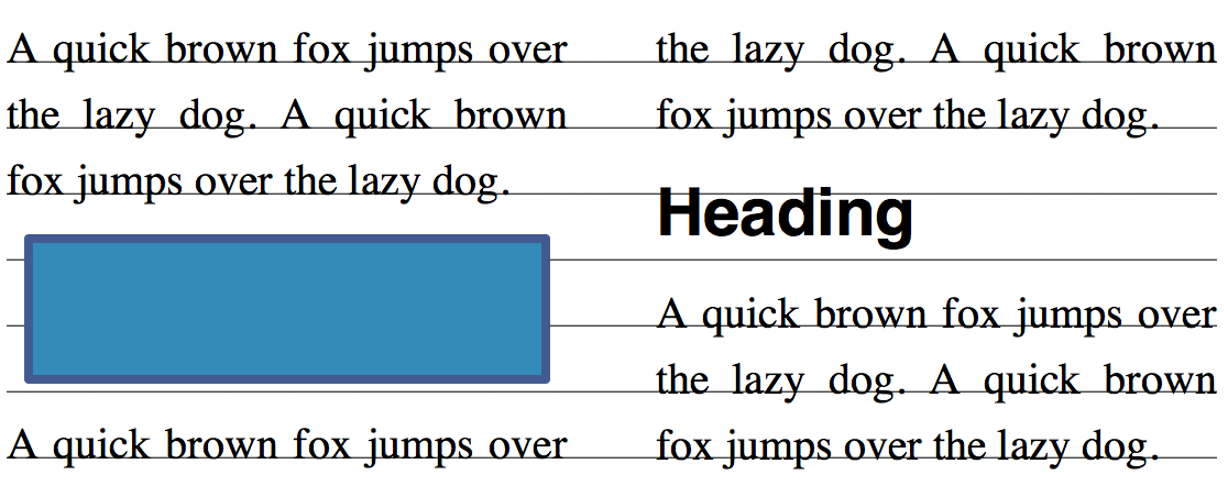
Vertical rhythm kept through pictures and different size of text in a multi-column document.
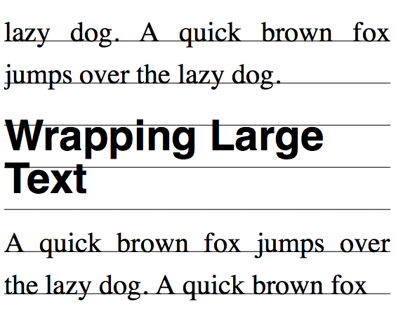
Large text wraps within line grids.
When a different size of text, such as a headings wraps, it is usually aligned to grids as a block and the lines within the block do not align.
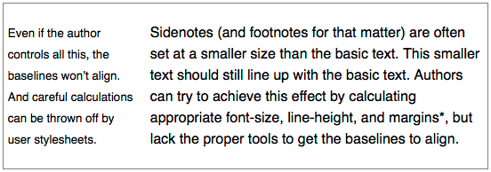
Sidenotes (and footnotes for that matter) are often set at a smaller size than the basic text. This smaller text should still line up with the basic text. Authors can try to achieve this effect by calculating appropriate font-size, line-height, and margins*, but lack the proper tools to get the baselines to align.
Even if the author controls all this, the baselines won’t align. And careful calculations can be thrown off by user stylesheets.
Sidenotes are set at a smaller size, and baselines don’t align.
East Asian layouts may require width be a multiple of em without fractions.
East Asian layouts may require grid-like features in inline progression direction as well.
It is often desirable in East Asian layouts to make the line width a multiple of em without fractions. Because most East Asian characters have 1em advance and most East Asian documents are justified, this minimizes cases where justification needs to expand character spacing.
This module provides the following capabilities:
- Defining grids in the line progression direction.
- Controlling how lines and blocks align to the grids.
It is important to control these capabilities independently, so that, for example, aligning to grids can be turned off for tables, but can then be turned back on for aligning the following text to the grids.
1.2. Module Interactions
This module extends the line box model defined in [CSS2] sections 9.4.2 and 10.8.
1.3. Value Definitions
This specification follows the CSS property definition conventions from [CSS2] using the value definition syntax from [CSS-VALUES-3]. Value types not defined in this specification are defined in CSS Values & Units [CSS-VALUES-3]. Combination with other CSS modules may expand the definitions of these value types.
In addition to the property-specific values listed in their definitions, all properties defined in this specification also accept the CSS-wide keywords as their property value. For readability they have not been repeated explicitly.
2. Defining a Line Grid: the line-grid property
| Name: | line-grid |
|---|---|
| Value: | match-parent | create |
| Initial: | match-parent |
| Applies to: | block, flex and grid containers |
| Inherited: | no |
| Percentages: | N/A |
| Computed value: | specified keyword |
| Canonical order: | per grammar |
| Animation type: | discrete |
Specifies whether this box creates a new baseline grid for its descendants or uses the same baseline grid as its parent. (Each box always has an associated line grid. However, whether a box or its contents snap to a line grid is determined by line-snap and box-snap.)
The values of this property have the following meanings:
- match-parent
- Box assumes the line grid of its parent if its writing mode is the same as its parent. If the box has a writing mode that is different than its parent, then the box creates a new line grid as create below.
- create
- Box creates a new line grid using its own font and line layout settings, including any adjustment to the line height caused by the line-height-step property. The line grid consists of a series of horizontal lines corresponding to all the baselines (alphabetic, text-top, text-bottom, mathematic, central, hanging, etc.) and to the line-over and line-under edges, positioned where they would fall if the contents of this element consisted entirely of line boxes filled with text (no sub-elements) using the first available font. If the box is paginated, the line grid is restarted on each page; since line boxes cannot be fragmented, no page begins with the bottom part of a line’s grid.
The initial containing block establishes a line grid using the font and line layout settings of the root element. If the root element (which has no parent) has a value of match-parent, then it adopts the line grid of the initial containing block.
In paged media, if the page context applying to a particular page specifies line-grid: create, then a line grid for that page is established using the page context’s font and line layout settings applied to the page box (including its margins), and for layout within that page the initial containing block is assumed to have adopted this line grid.
It is sometimes appropriate for the line grid to begin with the content, after the root element’s margins/padding/border and/or other header content. To do this, the root element (or some other element) can be told to establish the line grid.
main { line-grid: create; }
If this line grid is then paginated, the line grid will start at the top of each page area after the first.
In other cases, it’s desirable for all pages of a document share a common line grid, even if page margins, border and/or padding change. The following rule will instead fill the page box area including the page margin/padding/borders with the line grid:
@page { line-grid: create; }
As this line grid is paginated, it will start at the top of each page box after the first; however it might not align to the top of the page area (where the content would normally begin).
The names of these values is currently up for debate. Current suggestions for match-parent include match-parent and normal; those for create include create and new.
The original proposal for line grids allowed an element to create a named grid. This property could still be extended to do this in the future.
There might need to be an offset for more complicated designs. How to set this offset is problematic: usually it’s not a fixed length, but the distance to clear some header content. This could be added to a later level of css-line-grid.
3. Snapping to a Grid
The line-snap and box-snap properties cause line boxes and block boxes to shift position in order to align to the line grid. Shifting boxes in this way affects layout – it is not merely a display translation. If a line box is shifted, then subsequent line boxes will be laid out using the new shifted position as input to their line stacking rules. If a block box is shifted, then subsequent boxes will be laid out using the new shifted position as input.
3.1. Snapping Line Boxes: the line-snap property
| Name: | line-snap |
|---|---|
| Value: | none | baseline | contain |
| Initial: | none |
| Applies to: | block container elements |
| Inherited: | yes |
| Percentages: | N/A |
| Computed value: | specified keyword |
| Canonical order: | per grammar |
| Animation type: | discrete |
This property applies to all the line boxes directly contained by the element, and, when not none, causes each line box to shift (usually downward, possibly by zero) until it snaps to the line grid specified by line-grid. (The unshifted position is the position that would be determined by normal line stacking rules, with consideration of any new controls defined by other modules such as [CSS3LINE].)
Values have the following meanings:
- none
- Line boxes do not snap to the grid; they stack normally.
- baseline
- The dominant baseline snaps with the matching baseline on the line grid applying to the element.
- contain
- Two baselines are used to align the line box: the line box is snapped so that its central baseline is centered between one of the line grid’s text-over-edge baselines and a subsequent (but not necessarily consecutive) text-under-edge baseline.
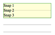
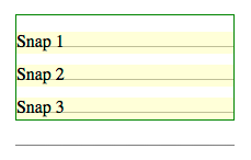
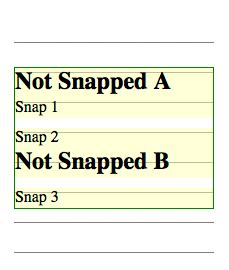
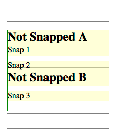
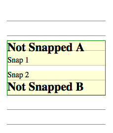
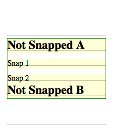
Line boxes almost always shift downward (towards the block-end direction) when snapping to a line grid. Here there are three lines with 20px line-height and line-snap:baseline that should snap to a 30px line grid. Each line box shifts down so that the baselines align with the grid lines.
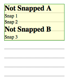
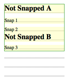
In the figures below, there are two additional lines from h3 elements with line-snap:none. These lines do not shift to align to the grid, but their positions can change based on the shifting of lines around them. In this example, lines 1 2 and 3 shift down to snap their baselines to the grid lines, and line B has normal line box placement just below the line above.
3.2. Snapping Block Boxes: the box-snap property
This is a rough draft of trying to solve the box-snapping problem.
Some optional box values (margin-box, border-box) could be added to the before and after values to allow snapping various box model edges to the line grid.
An auto value could be useful - one that defaults to center, but snaps to before if it’s the first block in a fragment container, and snaps to after if it’s the last block in a fragment container.
| Name: | box-snap |
|---|---|
| Value: | none | block-start | block-end | center | baseline | last-baseline |
| Initial: | none |
| Applies to: | block-level boxes and internal table elements except table cells |
| Inherited: | yes |
| Percentages: | N/A |
| Computed value: | as specified |
| Canonical order: | per grammar |
| Animation type: | discrete |
Specifies how the block is snapped to the baseline grid.
Values have the following meanings:
- none
- The block is not snapped to any grid.
- block-start
- The block-start edge is snapped to the nearest grid line.
- block-end
- The block-end edge is snapped to the nearest grid line.
- center
- The block is centered between one of the baseline grid’s text-over baselines and a subsequent (but not necessarily consecutive) text-under baseline.
- baseline
- The first line box’s dominant baseline is snapped to the nearest grid line.
- last-baseline
- The last line box’s dominant baseline is snapped to the nearest grid line.
Snapping block boxes always uses the line grid of the box parent (a block’s own line grid has no effect on box snapping). If the box is an empty block that could be collapsed through, then this property has no effect. [CSS2]
To snap a block-level element to a grid line, take the unsnapped result of layout (including margin collapsing, clearance, etc.) as the block’s initial position, then shift the block downward (towards the block-end direction) until it snaps to the line grid.
For the block-start and block-end values, either the text-over-edge or text-under-edge baseline is chosen: whichever one is on the matching side of the central baseline. For example, when snapping the block-start edge in horizontal writing mode, the text-over-edge is chosen. In some cases the text-under-edge might be used instead for the block-start edge: for example, when the writing mode of the line grid doesn’t match that of the affected element, or when due to the text-orientation settings the text-under-edge corresponds to the block-start edge.
When applied to table row group and table row boxes, box-snap only affects the before and after edges, and only if those edges are not at the beginning or end of the table, respectively. To snap a before edge on a table row or row group, the preceding row’s height is increased. To snap an after edge on a table row or row group, the affected row’s height is increased.
When applied to table column group and table column boxes, box-snap only affects the start and end edges, and only if those edges are not at the start or end of the table, respectively. How the space is redistributed among columns to satisfy snapping constraints is not defined, however:
- In an auto-sized table no column may be smaller than its minimum content width.
- The resulting table must not exceed its original measure if it had a non-auto measure.
- The adjusted widths must not cause the table to overflow its containing block any more than it would with box-snap: none.
To satisfy these constraints, some column edges may remain unsnapped.
box-snap
  +- block-snap
  |     +- block-snap-edge
  |     |     +- block-start-snap-edge: <shape-box>
  |     |     +- block-end-snap-edge: <shape-box>
  |     +- block-snap-align: <content-position>
  |     +- block-snap-grid: text-grid | <custom-ident> /* name of grid/gridlines */
  +- inline-snap
        +- inline-snap-edge
        |     +- inline-start-snap-edge: <shape-box>
        |     +- inline-end-snap-edge: <shape-box>
        +- inline-snap-align: <content-position>
        +- inline-snap-grid: text-grid | <custom-ident> /* name of grid/gridlines */

where <shape-box> includes
  margin-box | border-box | half-border-box | padding-box | content-box
and <content-position> includes
  start | end | stretch | first-baseline | last-baseline | center
4. Snapping Details
4.1. Interacting with other alignments
An element can have additional block layout constraints (such as centering or box-snap) that can complicate line snapping. In these cases, implementations must produce the same result as the steps below:
- Line snap as if the layout constraint does not apply
- Apply the layout constraint to the block
- Adjust exactly one line box shift or space at the beginning or end of the block such that all of the snapping lines meet the line grid while maintaining the block layout constraint. The single adjustment chosen must be the smallest shift needed to achieve the result without causing overflow.
A block containing lines to snap might not be top-aligned within its container. In the figures below, the block containing the elements is centered. In a centered situation, you have to align baselines while maintaining centering. This can be done in two shift-and-center steps.
First, shift the snapping lines as if the block was top-aligned (as in figure 9 above), then remove the shift for the very first snapping line. After removing the first shift, try centering the block. This is almost certain to throw the baseline alignment off. You can see one such result in the partial shifting figure below.
Second, measure the distance from the first snapped line’s baseline to the grid lines above and below, looking for the closest grid line to that baseline.
If the closest grid line is in the block-start direction, then add space below the last line in the block equal to twice that distance. Then the block is centered again, which will align all of the snapped lines to the grid.
If the closest grid line is in the block-end direction, then the first snapped line is shifted downward by twice that distance. Then the block is centered again, which will again align all of the snapped lines to the grid.
An end-aligned block also uses two steps, but is simpler than the centered case.
First, shift the snapping lines as if there were no end-alignment (as in figure 9 above), then end-align the block.
Second, shift the entire block contents upwards until the last snapped line aligns to a grid line. In this example, the shift is very minor.
4.2. Leading adjustments
In some cases lines of equal line height will not align perfectly to a baseline grid: this happens, for example, when fonts (of the same size) with different baseline tables are mixed on a line. In these cases, removing top half-leading can sometimes be the correct thing to do, but must be limited to the amount of baseline discrepancy so as not to trigger in other cases.
Details to follow. It’s complicated when you have more than one font-size or line-height in a single line box.
Acknowledgments
This module was made possible by the advice and contributions of Tab Atkins, Dave Cramer, Dave Hyatt, Bem Jones-Bey, Håkon Wium Lie, Shinyu Murakami, Liam Quin, and the CSS Working Group members.
Change Log
Since September 16th 2014
- Refined ICB/root/@page grid creation
- Added flex and grid container applicability for line-grid
- Added normative text for line-snap examples
- Added @page and root element line grid handling
- Made the dependency on line-height-step explicit
- match-parent creates new line grid for orthogonal flows
Since April 3rd 2014
- Added line-snapping examples
- Modified box-snap values
- Removed line-slack
- Removed grid offset
- Removed grid units
- Removed 2d box snapping
- Removed rounding functions
Privacy Considerations
No new privacy considerations have been reported on this specification.
Security Considerations
No new security considerations have been reported on this specification.