1. Introduction
In CSS Levels 1 and 2, image values, such as those used in the background-image property, could only be given by a single URL value. This module introduces additional ways of representing 2D images, for example as a gradient.
This module also defines several properties for manipulating raster images and for sizing or positioning replaced elements such as images within the box determined by the CSS layout algorithms. It also defines in a generic way CSS’s sizing algorithm for images and other similar replaced elements.
This subsection (above) is not normative.
1.1. Module Interactions
This module defines and extends the <image> value type defined in [CSS-VALUES-3]. It also replaces the <url> type with <image> in the background-image, cursor, and list-style-image definitions in CSS1 and CSS2 and adds <image> as an alternative to <url> in the content property’s value. It is presumed that CSS specifications beyond CSS2.1 will use the <image> notation in place of <url> where 2D images are expected. (See e.g. [CSS3BG].)
None of the properties defined in this module, only image-rendering applies to ::first-line and ::first-letter.
1.2. Value Definitions
This specification follows the CSS property definition conventions from [CSS2]. using the value definition syntax from [CSS-VALUES-3]. Value types not defined in this specification are defined in CSS Level 2 Revision 1 [CSS2]. Other CSS modules may expand the definitions of these value types: for example [CSS-VALUES-3], when combined with this module, adds the initial keyword as a possible property value.
In addition to the property-specific values listed in their definitions, all properties defined in this specification also accept the CSS-wide keywords as their property value. For readability they have not been repeated explicitly.
2. Image Values: the <image> type
The <image> value type denotes a 2D image. It can be a url reference or a color gradient. Its syntax is:
<image> = <url> | <gradient>
An <image> can be used in many CSS properties, including the background-image, list-style-image, cursor properties [CSS2] (where it replaces the <url> component in the property’s value).
In some cases an image is invalid, such as a <url> pointing to a resource that is not a valid image format or that has failed to load. An invalid image is rendered as a solid-color transparent image with no natural dimensions. However, invalid images can trigger error-handling clauses in some contexts. For example, an invalid image in list-style-image it is treated as none, allowing the list-style-type to render in its place. [CSS2]
While an image is loading, is a loading image. Loading images are not invalid images, but have similar behavior: they are rendered as a solid-color transparent image with no natural dimensions, and may trigger fallback rendering in contexts that offer it, but must not trigger loading of fallback resources. Alternately, if a loading image happens to be replacing an already-loaded image (for example due to changes in the document or style sheet) and the UA is tracking this information, it may continue to render the already-loaded image in place of the loading image.
Partially-loaded images (whose natural dimensions are known, but whose image data is not fully loaded) may be either treated as loading images or as loaded images rendered with partial data. For example, a UA may render an interlaced GIF in place as soon as its first pass of pixel data has loaded or even as soon as the image header (which contains sizing data) has parsed and refresh the rendering as more data loads; or it may wait until the entire image has loaded before using it.
A computed <image> value is the specified value with any <url>s, <color>s, and <length>s computed.
2.1. Image References: the url() notation
The simplest way to indicate an image is to reference an image file by URL. This can be done with the url() notation, defined in [CSS-VALUES-3].
background-image: url(wavy.png);
If the UA cannot download, parse, or otherwise successfully display the contents at the URL as an image (i.e. if the image is not fully fully decodable) it must be treated as an invalid image.
2.1.1. Ambiguous Reference-or-Image URLs
URLs are used in many contexts for many types of resources, and therefore can be interpreted in many ways. Usually the context the URL appears in makes it clear how to interpret the resource, but in some instances it can be ambiguous. For example, a mask-image <url> value pointing to an SVG file could be interpreted as a reference to an element in the file or as an <image>.
An ambiguous image URL is
a <url> value that can be interpreted
as either an <image> or an element reference.
If an ambiguous image URL is a fragment-only URL,
then it must be treated as an element reference.
Otherwise, if the ambiguous image URL has a fragment
that references an element in the resource
that is an appropriate type of element for the context in which the <url> appears
(such as a mask element for the mask-image property),
it is interpreted as an element reference.
Otherwise, it is treated as an <image>.
Specs using the ambiguous image URL concept must define what elements are valid references for the URL, and any additional conditions that might apply.
<mask id="foo"> element in the SVG document, or be pointing to a <g id="foo"> element
and depending on the :target pseudo-class to change how it renders as an image.
When this occurs,
the "icon.svg" file is loaded up and examined;
if the #foo element is indeed a mask,
the url() is treated as a reference to that element;
otherwise,
it’s interpreted as an image.
2.1.2. Image Metadata
Images can contain metadata such as color space, resolution and orientation which specifies how to render the image. Some image formats are flexible in where this metadata can be placed in the file; however, if the metadata occurs after the actual image data, it harms the UA’s ability to “progressively decode” the image and display it as the image’s data streams in.
To reduce the impact of this issue:
-
If the choice exists for a given image format, authors must produce their images so that such metadata occurs before the image data in the image. (Note: This is the default for most images already.)
-
User agents should ignore any layout-impacting metadata (such as orientation or resolution) that occurs after the image data begins.
If a user agent cannot ignore the metadata based its location in the image (for example, if the decoder being used does not report where in the image the metadata was located), it must use the metadata in all cases. (In particular, it is not valid to use the metadata only when the image is "small" and the entire image is downloaded quickly, but to ignore it if the image is large and the metadata isn’t downloaded until well after the image starts being displayed.)
3. Gradients
A gradient is an image that smoothly fades from one color to another. These are commonly used for subtle shading in background images, buttons, and many other things. The gradient functions described in this section allow an author to specify such an image in a terse syntax, so that the UA can generate the image automatically when rendering the page. The syntax of a <gradient> is:
<gradient> =
  <linear-gradient()> | <repeating-linear-gradient()> |
  <radial-gradient()> | <repeating-radial-gradient()>
As with the other <image> types defined in this specification, gradients can be used in any property that accepts images. For example:
-
background: linear-gradient(white, gray); -
list-style-image: radial-gradient(circle, #006, #00a 90%, #0000af 100%, white 100%)
A gradient is drawn into a box with the dimensions of the concrete object size, referred to as the gradient box. However, the gradient itself has no natural dimensions.
Gradients are specified by defining the starting point and ending point of a gradient line (which, depending on the type of gradient, may geometrically be a line, or a ray, or a spiral), and then specifying colors at points along this line. The colors are smoothly blended to fill in the rest of the line, and then each type of gradient defines how to use the color of the gradient line to produce the actual gradient.
3.1. Linear Gradients: the linear-gradient() notation
A linear gradient is created by specifying a straight gradient line, and then several colors placed along that line. The image is constructed by creating an infinite canvas and painting it with lines perpendicular to the gradient line, with the color of the painted line being the color of the gradient line where the two intersect. This produces a smooth fade from each color to the next, progressing in the specified direction.
3.1.1. linear-gradient() syntax
The linear-gradient() notation specifies a linear gradient in CSS. Its syntax is as follows:
<linear-gradient()> = linear-gradient( [ <linear-gradient-syntax> ] )

<linear-gradient-syntax> = [ <angle> | to <side-or-corner> ]? , <color-stop-list>

<side-or-corner> = [left | right] || [top | bottom]
The first argument to the function specifies the gradient line, which gives the gradient a direction and determines how color-stops are positioned. It may be omitted; if so, it defaults to to bottom.
The gradient line’s direction may be specified in two ways:
- using <angle>
-
For the purpose of this argument, 0deg points upward, and positive angles represent clockwise rotation, so 90deg point toward the right.
The unit identifier may be omitted if the <angle> is zero.
- using keywords
-
If the argument is to top, to right, to bottom, or to left, the angle of the gradient line is 0deg, 90deg, 180deg, or 270deg, respectively.
If the argument instead specifies a corner of the box such as to top left, the gradient line must be angled such that it points into the same quadrant as the specified corner, and is perpendicular to a line intersecting the two neighboring corners of the gradient box. This causes a color-stop at 50% to intersect the two neighboring corners (see example).
Starting from the center of the gradient box, extend a line at the specified angle in both directions. The ending point is the point on the gradient line where a line drawn perpendicular to the gradient line would intersect the corner of the gradient box in the specified direction. The starting point is determined identically, but in the opposite direction.
Note: It is expected that the next level of this module will provide the ability to define the gradient’s direction relative to the current text direction and writing-mode.
![[An image showing a box with a background shading gradually from white in the bottom-left corner to black in the top-right corner. There is a line, illustrating the gradient line, angled at 45 degrees and passing through the center of the box. The starting point and ending point of the gradient line are indicated by the intersection of the gradient line with two additional lines that pass through the bottom-left and top-right corners of the box.]](images/gradient-diagram.png)
-
A the angle (in any quadrant) defining the gradient line’s direction such that 0 degrees points upwards and positive angles represent clockwise rotation,
-
W the width of the gradient box,
-
H the height of the gradient box,
The length of the gradient line (between the starting point and ending point) is:
abs(W * sin(A)) + abs(H * cos(A))
The gradient’s color stops are typically placed between the starting point and ending point on the gradient line, but this isn’t required: the gradient line extends infinitely in both directions. The starting point and ending point are merely arbitrary location markers, the starting point defining where 0%, 0px, etc are located when specifying color-stops, and the ending point defines where 100% is located. Color-stops are allowed to have positions before 0% or after 100%.
The color of a linear gradient at any point is determined by finding the unique line passing through that point that is perpendicular to the gradient line. The point’s color is the color of the gradient line at the point where this line intersects it.
3.1.2. Linear Gradient Examples
All of the following linear-gradient() examples are presumed to be backgrounds applied to a box that is 200px wide and 100px tall.
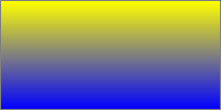
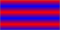
linear-gradient(yellow, blue);
linear-gradient(to bottom, yellow, blue);
linear-gradient(180deg, yellow, blue);
linear-gradient(to top, blue, yellow);
linear-gradient(to bottom, yellow 0%, blue 100%);
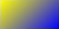
linear-gradient(135deg, yellow, blue);
linear-gradient(-45deg, blue, yellow);
This demonstrates a 3-color gradient, and how to specify the location of a stop explicitly:
linear-gradient(yellow, blue 20%, #0f0);
linear-gradient(to top right, red, white, blue)
3.2. Radial Gradients: the radial-gradient() notation
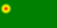
In a radial gradient, rather than colors smoothly fading from one side of the gradient box to the other as with linear gradients, they instead emerge from a single point and smoothly spread outward in a circular or elliptical shape.
The radial-gradient() notation specifies a radial gradient by indicating the center of the gradient (where the 0% ellipse will be) and the size and shape of the ending shape (the 100% ellipse). Color stops are given as a list, just as for linear-gradient(). Starting from the gradient center and progressing towards (and potentially beyond) the ending shape, uniformly-scaled concentric ellipses are drawn and colored according to the specified color stops.
3.2.1. radial-gradient() Syntax
The radial gradient syntax is:
<radial-gradient()> = radial-gradient( [ <radial-gradient-syntax> ] )

<radial-gradient-syntax> =
  [ <radial-shape> || <radial-size> ]? [ at <position> ]? ,
  <color-stop-list>

<radial-size> = <radial-extent> | <length [0,∞]> | <length-percentage [0,∞]>{2}

<radial-extent> = closest-corner | closest-side | farthest-corner | farthest-side

<radial-shape> = circle | ellipse
radial-gradient(5em circle at top left, yellow, blue)
Note: A future level may add the ability to move the focus of the gradient, as in the original -webkit-gradient() function. See proposal tracked in Issue 1575 for "from <position>" and "from offset <offset>".
The arguments are defined as follows:
- <position>
- Determines the center of the gradient. The <position> value type (which is also used for background-position) is defined in [CSS-VALUES-3], and is resolved using the center-point as the object area and the gradient box as the positioning area. If this argument is omitted, it defaults to center.
- <radial-shape>
- Can be either circle or ellipse; determines whether the gradient’s ending shape is a circle or an ellipse, respectively. If <radial-shape> is omitted, the ending shape defaults to a circle if the <radial-size> is a single <length>, and to an ellipse otherwise.
- <radial-size>
-
Determines the size of the gradient’s ending shape.
If omitted it defaults to farthest-corner.
It can be given explicitly or by keyword.
For the purpose of the keyword definitions,
consider the gradient box edges as extending infinitely in both directions,
rather than being finite line segments.
If the ending-shape is an ellipse, its axises are aligned with the horizontal and vertical axises.
Both circle and ellipse gradients accept the following <radial-extent> values:
- closest-side
- The ending shape is sized so that it exactly meets the side of the gradient box closest to the gradient’s center. If the shape is an ellipse, it exactly meets the closest side in each dimension.
- farthest-side
- Same as closest-side, except the ending shape is sized based on the farthest side(s).
- closest-corner
- The ending shape is sized so that it passes through the corner of the gradient box closest to the gradient’s center. If the shape is an ellipse, the ending shape is given the same aspect-ratio it would have if closest-side were specified.
- farthest-corner
- Same as closest-corner, except the ending shape is sized based on the farthest corner. If the shape is an ellipse, the ending shape is given the same aspect ratio it would have if farthest-side were specified.
If <radial-shape> is specified as circle or is omitted, the <radial-size> may be given explicitly as:
- <length [0,∞]>
-
Gives the radius of the circle explicitly.
Negative values are invalid.
Note: Percentages are not allowed here; they can only be used to specify the size of an elliptical gradient, not a circular one. This restriction exists because there is are multiple reasonable answers as to which dimension the percentage should be relative to. A future level of this module may provide the ability to size circles with percentages, perhaps with more explicit controls over which dimension is used.
If <radial-shape> is specified as ellipse or is omitted, <radial-size> may instead be given explicitly as:
- <length-percentage [0,∞]>{2}
- Gives the size of the ellipse explicitly. The first value represents the horizontal radius, the second the vertical radius. Percentages values are relative to the corresponding dimension of the gradient box. Negative values are invalid.
radial-gradient() = radial-gradient(
  [ [ circle               || <length [0,∞]> ]                          [ at <position> ]? , |
    [ ellipse              || <length-percentage [0,∞]>{2} ]            [ at <position> ]? , |
    [ [ circle | ellipse ] || <radial-extent> ]                     [ at <position> ]? , |
    at <position> ,
  ]?
  <color-stop-list>
)
3.2.2. Placing Color Stops
Color-stops are placed on a gradient line shaped like a ray (a line that starts at one point, and extends infinitely in a one direction), similar to the gradient line of linear gradients. The gradient line’s starting point is at the center of the gradient, and it extends toward the right, with the ending point on the point where the gradient line intersects the ending shape. A color-stop can be placed at a location before 0%; though the negative region of the gradient line is never directly consulted for rendering, color stops placed there can affect the color of non-negative locations on the gradient line through interpolation or repetition (see repeating gradients). For example, radial-gradient(red -50px, yellow 100px) produces an elliptical gradient that starts with a reddish-orange color in the center (specifically, #f50) and transitions to yellow. Locations greater than 100% simply specify a location a correspondingly greater distance from the center of the gradient.
The color of the gradient at any point is determined by first finding the unique ellipse passing through that point with the same center, orientation, and ratio between major and minor axises as the ending-shape. The point’s color is then the color of the positive section of the gradient line at the location where this ellipse intersects it.
3.2.3. Degenerate Radial Gradients
Some combinations of position, size, and shape will produce a circle or ellipse with a radius of 0. This will occur, for example, if the center is on a gradient box edge and closest-side or closest-corner is specified or if the size and shape are given explicitly and either of the radiuses is zero. In these degenerate cases, the gradient must be rendered as follows:
- If the ending shape is a circle with zero radius:
-
Render as if the ending shape was a circle whose radius was an arbitrary very small number greater than zero. This will make the gradient continue to look like a circle.
- If the ending shape has zero width (regardless of the height):
-
Render as if the ending shape was an ellipse whose height was an arbitrary very large number and whose width was an arbitrary very small number greater than zero. This will make the gradient look similar to a horizontal linear gradient that is mirrored across the center of the ellipse. It also means that all color-stop positions specified with a percentage resolve to 0px.
- Otherwise, if the ending shape has zero height:
-
Render as if the ending shape was an ellipse whose width was an arbitrary very large number and whose height was an arbitrary very small number greater than zero. This will make the gradient look like a solid-color image equal to the color of the last color-stop, or equal to the average color of the gradient if it’s repeating.
3.2.4. Radial Gradient Examples
All of the following examples are applied to a box that is 200px wide and 100px tall.
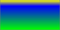
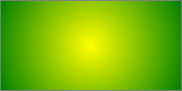
radial-gradient(yellow, green);
radial-gradient(ellipse at center, yellow 0%, green 100%);
radial-gradient(farthest-corner at 50% 50%, yellow, green);
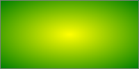
radial-gradient(circle, yellow, green);
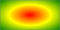
radial-gradient(red, yellow, green);
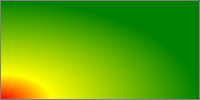
radial-gradient(farthest-side at left bottom, red, yellow 50px, green);
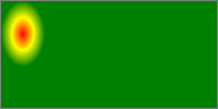
radial-gradient(closest-side at 20px 30px, red, yellow, green);
radial-gradient(20px 30px at 20px 30px, red, yellow, green);
radial-gradient(closest-side circle at 20px 30px, red, yellow, green);
radial-gradient(20px 20px at 20px 30px, red, yellow, green);
3.3. Repeating Gradients: the repeating-linear-gradient() and repeating-radial-gradient() notations
In addition to linear-gradient() and radial-gradient(), this specification defines repeating-linear-gradient() and repeating-radial-gradient() values. These notations take the same values and are interpreted the same as their respective non-repeating siblings defined previously.
<repeating-linear-gradient()> = repeating-linear-gradient( [ <linear-gradient-syntax> ] )
<repeating-radial-gradient()> = repeating-radial-gradient( [ <radial-gradient-syntax> ] )
When rendered, however, the color-stops are repeated infinitely in both directions, with their positions shifted by multiples of the difference between the last specified color-stop’s position and the first specified color-stop’s position. For example, repeating-linear-gradient(red 10px, blue 50px) is equivalent to linear-gradient(..., red -30px, blue 10px, red 10px, blue 50px, red 50px, blue 90px, ...). Note that the last color-stop and first color-stop will always coincide at the boundaries of each group, which will produce sharp transitions if the gradient does not start and end with the same color.
repeating-linear-gradient(red, blue 20px, red 40px)
repeating-radial-gradient(red, blue 20px, red 40px)
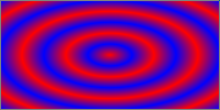
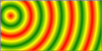
repeating-radial-gradient(circle closest-side at 20px 30px, red, yellow, green 100%, yellow 150%, red 200%)
If the distance between the first and last color-stops is non-zero, but is small enough that the implementation knows that the physical resolution of the output device is insufficient to faithfully render the gradient, the implementation must find the average color of the gradient and render the gradient as a solid-color image equal to the average color.
If the distance between the first and last color-stops is zero (or rounds to zero due to implementation limitations), the implementation must find the average color of a gradient with the same number and color of color-stops, but with the first and last color-stop an arbitrary non-zero distance apart, and the remaining color-stops equally spaced between them. Then it must render the gradient as a solid-color image equal to that average color.
If the width of the ending shape of a repeating radial gradient is non-zero and the height is zero, or is close enough to zero that the implementation knows that the physical resolution of the output device is insufficient to faithfully render the gradient, the implementation must find the average color of the gradient and render the gradient as a solid-color image equal to the average color.
Note: The Degenerate Radial Gradients section describes how the ending shape is adjusted when its width is zero.
To find the average color of a gradient, run these steps:
-
Define list as an initially-empty list of premultiplied RGBA colors, and total-length as the distance between first and last color stops.
-
For each adjacent pair of color-stops, define weight as half the distance between the two color-stops, divided by total-length. Add two entries to list, the first obtained by representing the color of the first color-stop in premultiplied sRGBA and scaling all of the components by weight, and the second obtained in the same way with the second color-stop.
-
Sum the entries of list component-wise to produce the average color, and return it.
Note: As usual, implementations may use whatever algorithm they wish, so long as it produces the same result as the above.
rgb(75%,50%,75%)):
repeating-linear-gradient(red 0px, white 0px, blue 0px);
The following gradient would render the same as the previous under normal circumstances (because desktop monitors can’t faithfully render color-stops 1/10th of a pixel apart), but would render as a normal repeating gradient if, for example, the author applied "zoom:100;" to the element on which the gradient appears:
repeating-linear-gradient(red 0px, white .1px, blue .2px);
3.4. Defining Gradient Color
The colors in gradients are specified using color stops (a <color> and a corresponding position on the gradient line) and color transition hints (a position between two color stops representing the halfway point in the color transition) which are placed on the gradient line, defining the color at every point of the line. (Each gradient function defines the shape and length of the gradient line, along with its starting point and ending point; see above.)
Colors throughout the gradient field are then determined by tying them to specific points along the gradient line as specified by the gradient function. UAs may “dither” gradient colors slightly (randomly alternate individual pixels with nearby colors on the gradient line) to effect a smoother gradient.
3.4.1. Color Stop Lists
Color stops and transition hints are specified in a color stop list, which is a list of two or more color stops interleaved with optional transition hints:
<color-stop-list> =
  <linear-color-stop> , [ <linear-color-hint>? , <linear-color-stop> ]#
<linear-color-stop> = <color> <length-percentage>?
<linear-color-hint> = <length-percentage>
Percentages are resolved against the length of the gradient line between the starting point and ending point, with 0% being at the starting point and 100% being at the ending point. Lengths are measured along the gradient line from the starting point in the direction of the ending point.
Color stop and transition hint positions are usually placed between the starting point and ending point, but that’s not required: the gradient line extends infinitely in both directions, and positions can be specified anywhere on the gradient line.
When the position of a color stop is omitted, it is automatically assigned a position. The first or last color stop in the color stop list is assigned the gradient line’s starting point or ending point (respectively). Otherwise, it’s assigned the position halfway between the two surrounding stops. If multiple stops in a row lack a position, they space themselves out equally between the surrounding positioned stops. See § 3.4.3 Color Stop “Fixup” for details.
3.4.2. Coloring the Gradient Line
At each color stop position, the gradient line is the color of the color stop. Before the first color stop, the gradient line is the color of the first color stop, and after the last color stop, the gradient line is the color of the last color stop. Between two color stops, the gradient line’s color is interpolated between the colors of the two color stops, with the interpolation taking place in premultiplied RGBA space.
By default, this interpolation is linear—at 25%, 50%, or 75% of the distance between two color stops, the color is a 25%, 50%, or 75% blend of the colors of the two stops.
However, if a transition hint was provided between two color stops, the interpolation is non-linear, and controlled by the hint:
- Determine the location of the transition hint as a percentage of the distance between the two color stops, denoted as a number between 0 and 1, where 0 indicates the hint is placed right on the first color stop, and 1 indicates the hint is placed right on the second color stop. Let this percentage be H.
- For any given point between the two color stops, determine the point’s location as a percentage of the distance between the two color stops, in the same way as the previous step. Let this percentage be P.
- Let C, the color weighting at that point,
be equal to
PlogH(.5). - The color at that point is then a linear blend between the colors of the two color stops,
blending
(1 - C)of the first stop and C of the second stop.
Note: The transition hint specifies where the “halfway color”—the 50% blend between the colors of the two surrounding color stops—should be placed. When the hint is exactly halfway between the two surrounding color stops, the above interpolation algorithm happens to produce the ordinary linear interpolation. If the hint is placed anywhere else, it produces a smooth exponential curve between the surrounding color stops, with the “halfway color” occurring exactly where the hint specifies.
Add a visual example of a color hint being used.
If multiple color stops have the same position, they produce an infinitesimal transition from the one specified first in the list to the one specified last. In effect, the color suddenly changes at that position rather than smoothly transitioning.
What does “pre-multiplied” mean?
A “pre-multiplied” color
is written in a form
where the alpha channel
is multiplied into the color channels,
rather than being processed independently.
For example, a partially-transparent blue may be given as [0, 0, 127.5, .5] in its premultiplied representation.
Interpolating colors using the premultiplied representations rather than the plain rgba representations tends to produce more attractive transitions, particularly when transitioning from a fully opaque color to fully transparent.
Note that transitions where either the transparency or the color are held constant
(for example, transitioning between
linear-gradient(90deg, red, transparent, blue)
With premultiplied colors, transitions to or from "transparent" always look nice:
On the other hand, if a gradient were to incorrectly transition in non-premultiplied space, the center of the gradient would be a noticeably grayish color, because "transparent" is actually a shorthand for rgba(0,0,0,0), or transparent black, meaning that the red transitions to a black as it loses opacity, and similarly with the blue’s transition:
3.4.3. Color Stop “Fixup”
When resolving the used positions of each color stop, the following steps must be applied in order:
- If the first color stop does not have a position, set its position to 0%. If the last color stop does not have a position, set its position to 100%.
- If a color stop or transition hint has a position that is less than the specified position of any color stop or transition hint before it in the list, set its position to be equal to the largest specified position of any color stop or transition hint before it.
- If any color stop still does not have a position, then, for each run of adjacent color stops without positions, set their positions so that they are evenly spaced between the preceding and following color stops with positions.
After applying these rules, all color stops and transition hints will have a definite position and color and they will be in ascending order.
Note: It is recommended that authors exercise caution when mixing different types of units, such as px, em, or %, as this can cause a color stop to unintentionally try to move before an earlier one. For example, the rule background-image: linear-gradient(yellow 100px, blue 50%) wouldn’t trigger any fix-up while the background area is at least 200px tall. If it was 150px tall, however, the blue color stop’s position would be equivalent to 75px, which precedes the yellow color stop, and would be corrected to a position of 100px. Additionally, since the relative ordering of such color stops cannot be determined without performing layout, they will not interpolate smoothly in animations or transitions.
1. linear-gradient(red, white 20%, blue)
   =1=>
   linear-gradient(red 0%, white 20%, blue 100%)

2. linear-gradient(red 40%, white, black, blue)
   =1,3=>
   linear-gradient(red 40%, white 60%, black 80%, blue 100%)

3. linear-gradient(red -50%, white, blue)
   =1,3=>
   linear-gradient(red -50%, white 25%, blue 100%)

4. linear-gradient(red -50px, white, blue)
   =1,3=>
   linear-gradient(red -50px, white calc(-25px + 50%), blue 100%)

5. linear-gradient(red 20px, white 0px, blue 40px)
   =2=>
   linear-gradient(red 20px, white 20px, blue 40px)

6. linear-gradient(red, white -50%, black 150%, blue)
   =1,2=>
   linear-gradient(red 0%, white 0%, black 150%, blue 150%)

7. linear-gradient(red 80px, white 0px, black, blue 100px)
   =2,3=>
   linear-gradient(red 80px, white 80px, black 90px, blue 100px)
4. Sizing Images and Objects in CSS
Images used in CSS may come from a number of sources: from binary image formats (such as gif, jpeg, etc), dedicated markup formats (such as SVG), and CSS-specific formats (such as the linear-gradient() value type defined in this specification). As well, a document may contain many other types of objects, such as video, plugins, or nested documents. These images and objects (just objects hereafter) may offer many types of sizing information to CSS, or none at all. This section defines generically the size negotiation model between the object and the CSS layout algorithms.
4.1. Object-Sizing Terminology
In order to define this handling, we define a few terms, to make it easier to refer to various concepts:
- natural dimensions
-
The term natural dimensions refers to the set of
the natural height, natural width,
and natural aspect ratio (the ratio between the width and height),
each of which may or may not exist for a given object.
These natural dimensions represent the preferred sizing intrinsic to the object itself;
that is, they are not a function of the context in which the object is used.
CSS does not define how the natural dimensions are found in general.
Raster images are an example of an object with all three natural dimensions. SVG images designed to scale might have only an natural aspect ratio; SVG images can also be created with only an natural width or height. CSS gradients, defined in this specification, are an example of an object with no natural dimensions at all. Another example of this is embedded documents, such as the
iframeelement in HTML. Many objects, such as most images, cannot have only two natural dimensions, as any two automatically define the third. However some types of replaced elements, such as form controls, can have a natural width and a natural height, but no natural aspect ratio.If an object has a degenerate natural aspect ratio (at least one part being zero or infinity), it is treated as having no natural aspect ratio.
If an object (such as an icon) has multiple sizes, then the largest size (by area) is taken as its natural dimensions. If it has multiple aspect ratios at that size, or has multiple aspect ratios and no size, then the aspect ratio closest to the aspect ratio of the default object size is used. Determine this by seeing which aspect ratio produces the largest area when fitting it within the default object size using a contain constraint fit; if multiple sizes tie for the largest area, the widest size is chosen as its natural dimensions.
The natural width and natural height are collectively referred to the natural sizes.
- specified size
- The specified size of an object is given by CSS, such as through the width and height or background-size properties. The specified size can be a definite width and height, a set of constraints, or a combination thereof.
- concrete object size
- The concrete object size is the result of combining an object’s natural dimensions and specified size with the default object size of the context it’s used in, producing a rectangle with an absolute width and height.
- default object size
- The default object size is a rectangle with an absolute height and width used to determine the concrete object size when both the natural dimensions and specified size are missing dimensions.
4.2. CSS⇋Object Negotiation
Objects in CSS are sized and rendered by the object size negotiation algorithm as follows:
-
When an object is specified in a document, such as through a url() value in a background-image property or a
srcattribute on animgelement, CSS queries the object for its natural dimensions. -
Using the natural dimensions, the specified size, and the default object size for the context the object is used in, CSS then computes a concrete object size. (See the following section.) This defines the size and position of the region the object will render in.
-
CSS asks the object to render itself at the concrete object size. CSS does not define how objects render when the concrete object size is different from the object’s natural dimensions. The object may adjust itself to match the concrete object size in some way, or even render itself larger or smaller than the concrete object size to satisfy sizing constraints of its own.
-
Unless otherwise specified by CSS, the object is then clipped to the concrete object size.
4.3. Concrete Object Size Resolution
Currently the rules for sizing objects are described in each context that such objects are used. This section defines some common sizing constraints and how to resolve them so that future specs can refer to them instead of redefining size resolution in each instance.
4.3.1. Default Sizing Algorithm
The default sizing algorithm is a set of rules commonly used to find an object’s concrete object size. It resolves the simultaneous constraints presented by the object’s natural dimensions and either an unconstrained specified size or one consisting of only a definite width and/or height.
Some object sizing rules (such as those for list-style-image) correspond exactly to the default sizing algorithm. Others (such as those for border-image) invoke the default sizing algorithm but also apply additional sizing rules before arriving at a final concrete object size.
The default sizing algorithm is defined as follows:
-
If the specified size is a definite width and height, the concrete object size is given that width and height.
-
If the specified size is only a width or height (but not both) then the concrete object size is given that specified width or height. The other dimension is calculated as follows:
-
If the object has a natural aspect ratio, the missing dimension of the concrete object size is calculated using that aspect ratio and the present dimension.
-
Otherwise, if the missing dimension is present in the object’s natural dimensions, the missing dimension is taken from the object’s natural dimensions.
-
Otherwise, the missing dimension of the concrete object size is taken from the default object size.
-
-
If the specified size has no constraints:
-
If the object has a natural height or width, its size is resolved as if its natural dimensions were given as the specified size.
-
Otherwise, its size is resolved as a contain constraint against the default object size.
-
4.3.2. Cover and Contain Constraint Sizing
Two other common specified sizes are the contain constraint and the cover constraint, both of which are resolved against a specified constraint rectangle using the object’s preferred aspect ratio:
-
A contain constraint is resolved by setting the concrete object size to the largest rectangle that has the object’s natural aspect ratio and additionally has neither width nor height larger than the constraint rectangle’s width and height, respectively.
-
A cover constraint is resolved by setting the concrete object size to the smallest rectangle that has the object’s natural aspect ratio and additionally has neither width nor height smaller than the constraint rectangle’s width and height, respectively.
In both cases, if the object doesn’t have a natural aspect ratio, the concrete object size is the specified constraint rectangle.
4.4. Examples of CSS Object Sizing
- background-image
- The rules for calculating the concrete object size of a background are defined in CSS2.1§14.2.1 and CSS3BG§3.9. CSS2.1 uses the default sizing algorithm with no specified size and the background positioning area as the default object size. [CSS2] In CSS3, background-size property can give a sizing constraint, invoking either the default sizing algorithm or one of the contain or cover constraints. The concrete object size is further adjusted in later steps if background-repeat has a round value. [CSS3BG]
- list-style-image
- The rules for calculating the concrete object size of a list-style image are defined in CSS2.1§12.5.1. They use the default sizing algorithm with no specified size and a default object size of 1em square.
- border-image
- Border images are sized twice: first the entire image is sized to determine the slice points, then the slices are sized to decorate the border. The first sizing operation is defined in CSS3BG§6.2 and uses the default sizing algorithm with no specified size, and the border image area as the default object size. The second operation is defined in CSS3BG§6.2: the default sizing algorithm is used to determine an initial size for each slice with the corresponding border image area part as the default object size. By default the specified size matches this default object size; however the border-image-repeat property can drop the specified size in one or more directions and may also apply an additional rounding step. [CSS3BG]
- cursor
- The rules for calculating the concrete object size of a cursor are defined in CSS2.1 § 18.1: Cursors. The default object size is a UA-defined size that should be based on the size of a typical cursor on the UA’s operating system. [CSS2]
- content
- Objects inserted via the CSS2.1 content property are anonymous replaced elements, and are sized the same way. [CSS2] Note that such anonymous elements have all their non-inherited properties (including width, height, etc.) set to their initial values.
- replaced elements
- CSS 2.1 defines the sizing of replaced elements (including those inserted as generated content via content) in sections 10.3.2, 10.4, 10.6.2, and 10.7. [CSS2] The object-fit property defined below defines how the concrete object size corresponds to the element’s used width and height; by default they coincide.
4.5. Sizing Objects: the object-fit property
| Name: | object-fit |
|---|---|
| Value: | fill | contain | cover | none | scale-down |
| Initial: | fill |
| Applies to: | replaced elements |
| Inherited: | no |
| Percentages: | n/a |
| Computed value: | specified keyword |
| Canonical order: | per grammar |
| Animation type: | discrete |
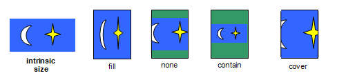
The object-fit property specifies how the contents of a replaced element should be fitted to the box established by its used height and width.
- fill
- The replaced content is sized to fill the element’s content box: the object’s concrete object size is the element’s used width and height.
- contain
- The replaced content is sized to maintain its natural aspect ratio while fitting within the element’s content box: its concrete object size is resolved as a contain constraint against the element’s used width and height.
- cover
- The replaced content is sized to maintain its natural aspect ratio while filling the element’s entire content box: its concrete object size is resolved as a cover constraint against the element’s used width and height.
- none
- The replaced content is not resized to fit inside the element’s content box: determine the object’s concrete object size using the default sizing algorithm with no specified size, and a default object size equal to the replaced element’s used width and height.
- scale-down
-
Size the content as if none or contain were specified,
whichever would result in a smaller concrete object size.
Note: Both none and contain respect the content’s natural aspect ratio, so the concept of "smaller" is well-defined.
If the content does not completely fill the replaced element’s content box, the unfilled space shows the replaced element’s background. Since replaced elements always clip their contents to the content box, the content will never overflow. See the object-position property for positioning the object with respect to the content box.
Note: The object-fit property has similar semantics to
the fit attribute in [SMIL10] and the <meetOrSlice> parameter
on the preserveAspectRatio attribute in [SVG11].
Note: Per the object size negotiation algorithm,
the concrete object size (or, in this case, the size of the content)
does not directly scale the object itself -
it is merely passed to the object as information about the size of the visible canvas.
How to then draw into that size is up to the image format.
In particular, raster images always scale to the given size,
while SVG uses the given size as the size of the "SVG Viewport"
(a term defined by SVG)
and then uses the values of several attributes on the root <svg> element to determine how to draw itself.
4.6. Positioning Objects: the object-position property
| Name: | object-position |
|---|---|
| Value: | <position> |
| Initial: | 50% 50% |
| Applies to: | replaced elements |
| Inherited: | no |
| Percentages: | refer to width and height of element itself |
| Computed value: | as for background-position |
| Canonical order: | the horizontal component of the <position>, followed by the vertical component |
| Animation type: | as for background-position |
The object-position property determines the alignment of the replaced element inside its box. The <position> value type (which is also used for background-position) is defined in [CSS-VALUES-3], and is resolved using the concrete object size as the object area and the content box as the positioning area.
Note: Areas of the box not covered by the replaced element will show the element’s background.
5. Image Processing
5.1. Orienting an Image on the Page: the image-orientation property
If a picture is taken with a camera turned on its side, or a document isn’t positioned correctly within a scanner, the resultant image may be "sideways" or even upside-down. The image-orientation property provides a way to apply an "out-of-band" rotation to image source data to correctly orient an image.
| Name: | image-orientation |
|---|---|
| Value: | from-image | none | [ <angle> || flip ] |
| Initial: | from-image |
| Applies to: | all elements |
| Inherited: | yes |
| Percentages: | n/a |
| Computed value: | the specified keyword, or an <angle>, rounded and normalized (see text), plus optionally a flip keyword |
| Canonical order: | per grammar |
| Animation type: | discrete |
This property is optional for implementations.
This property specifies an orthogonal rotation
to be applied to the element’s images
before they are used in the document.
It applies to content images
(e.g. replaced elements and generated content)
and image sources referenced by SVG elements
(such as feImage),
as well as to decorative images applied via CSS rules
(such as background-image and other <image> properties).
It does not apply to the rendering of images outside the document,
e.g. favicons in the UA’s navigation toolbars or menus, etc.
Note: This property is not intended to specify layout transformations such as arbitrary rotation or flipping the image in the horizontal or vertical direction. (See [CSS-TRANSFORMS-1] for a feature designed to do that.) It is also not needed to correctly orient an image when printing in landscape versus portrait orientation, as that rotation is done as part of layout. (See [CSS3PAGE].) It should only be used to correct incorrectly-oriented images.
Values have the following meanings:
- none
- No additional rotation is applied: the image is oriented as encoded.
- from-image
-
If the image has an orientation specified in its metadata,
such as EXIF,
this value computes to the angle that the metadata specifies is necessary to correctly orient the image.
If necessary, this angle is then rounded and normalized as described above for an <angle> value.
If there is no orientation specified in its metadata,
this value computes to none.
Note: § 2.1.2 Image Metadata imposes some restrictions on what metadata can be used.
- <angle> || flip
-
Positive <angle> values cause the image to be rotated to the right
(in a clockwise direction),
while negative values cause a rotation to the left.
If the <angle> is omitted, it defaults to 0deg.
If flip is specified, after rotation the image is flipped horizontally.
This value only applies to content images; decorative images continue to behave as from-image. This value is deprecated and is optional for implementations except those conforming to [CSS-PRINT].
Note: This value allows all 8 possible EXIF orientations that from-image can produce to be manually reproduced.
The computed value of the property is calculated by rounding the <angle> to the nearest quarter turn, rounding towards positive infinity when that’s ambiguous, then moduloing the value by 1turn (so that it lies in the half-open range [0turn, 1turn)).
Values other than none and from-image are optional to implement and deprecated in CSS.
All CSS layout and rendering processes use the image after rotation, exactly as if the image were originally encoded in its rotated form. This implies, for example:
-
The natural height and width are derived from the rotated rather than the original image dimensions.
-
The height (width) property applies to the vertical (horizontal) dimension of the image, after rotation.
-
The hotspot coordinates of an image cursor are relative to the image after rotation.
-
Border images (see border-image) are sliced after rotation.
-
Other transformations, such as those in [CSS-TRANSFORMS-1], are applied to the image after image-orientation is applied.
img.ninety     { image-orientation: 90deg }
...
<img class="ninety" src=...>
The same effect could be achieved with, for example, an angle of -270deg or 450deg.
Note: This property previously used none as its initial value. It is believed that using from-image as the initial value will produce a generally better user experience, and minimal breakage, but future compat data as UAs attempt to make the change will confirm that. If that is confirmed, then it is likely that this property will be removed from CSS unless use cases other than “correct for incorrect orientation” are raised for its other values.
5.2. Determining How To Scale an Image: the image-rendering property
| Name: | image-rendering |
|---|---|
| Value: | auto | smooth | high-quality | pixelated | crisp-edges |
| Initial: | auto |
| Applies to: | all elements |
| Inherited: | yes |
| Percentages: | n/a |
| Computed value: | specified keyword |
| Canonical order: | per grammar |
| Animation type: | discrete |
The image-rendering property provides a hint to the user-agent about what aspects of an image are most important to preserve when the image is scaled, to aid the user-agent in the choice of an appropriate scaling algorithm. When specified on an element, it applies to all images given in properties for the element, such as background images, list-style images, or the content of replaced elements when they represent an image that must be scaled. The values of the image-rendering property are interpreted as follows:
- auto
- The scaling algorithm is UA-dependent.
- smooth
- The image should be scaled with an algorithm that maximizes the appearance of the image. In particular, scaling algorithms that "smooth" colors are acceptable, such as bilinear interpolation. This is intended for images such as photos.
- high-quality
-
Identical to smooth, but with a preference for higher-quality scaling. If system resources are constrained, images with high-quality should be prioritized over those with any other value, when considering which images to degrade the quality of and to what degree.
This value does not prevent the image quality from being degraded when the system resources are constrained. It merely expresses a preference that these images should receive extra scaling resources relative to the auto images. If all images on the page have high-quality applied, it’s equivalent to all of them having auto applied—they’re all treated the same.To get the most value out of high-quality, only apply it to the most important images on the page.
- pixelated
-
The image is scaled in a way that preserves the pixelation of the original as much as possible, but allows minor smoothing as necessary to avoid distorting the image when the target size is not a clean multiple of the original.
For each axis independently, first determine the integer multiple of its natural size that puts it closest to the target size and is greater than zero. Scale it to this integer-multiple-size using nearest neighbor, then scale it the rest of the way to the target size as for smooth.
Note: At integer multiples of the natural size, this gives the same results as crisp-edges. At non-integer multiples, this usually gives better visual results, even for pixel art, but it does incur a performance penalty due to the "two-step" rendering requirement.
- crisp-edges
-
The image is scaled in a way that preserves contrast and edges, and which avoids smoothing colors or introducing blur to the image in the process. This is intended for images such as line drawings.
The image may be scaled using nearest neighbor or any other UA-chosen algorithm that does not blur edges or blend colors from the source image. It can, however, detect diagonal or curved lines and render them as such (rather than as jagged-looking “giant pixels”).
Note: If the new size is not an integer multiple of the original size, the nearest neighbor algorithm can introduce significant “aliasing” bugs; lines that were the same thickness in the original image might be a pixel thinner or thicker in the scaled image depending on where they appear, etc. For most purposes, pixelated will produce a more suitable rendering than nearest neighbor.
Other than the first step of pixelated, this property does not dictate any particular scaling algorithm to be used. For example, with image-rendering: auto, a user agent could scale images with bilinear interpolation by default, switch to nearest-neighbor interpolation in high-load situations, and switch to a higher-quality scaling algorithm like Lanczos interpolation for static images that aren’t moving or changing.
Scaling it up 3x might look like the following, depending on the value of image-rendering:
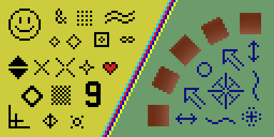
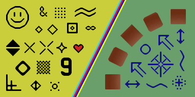
(Interpreting as nearest neighbor would give the same results as pixelated in this case.)
For example, using nearest neighbor to scale up an image by 2.5x will result in each pixel of the source image being used for two or three pixels of the destination image, in an alternating fashion, while scaling an image down to 0.5x will skip every second pixel in the source image.
The pixelated version maintains the overall look of simply scaling the pixels up, at the cost of slight blurring, though much less blurring than the smooth scaling gives. Meanwhile, nearest neighbor avoids introducing any blurring at all, at the cost of aliasing artifacts making the “pixels” look irregularly sized.
This property previously accepted the values optimizeSpeed and optimizeQuality. These are now deprecated; a user agent must accept them as valid values but must treat them as having the same behavior as crisp-edges and smooth respectively, and authors must not use them.
6. Interpolation
Interpolation of <image> values is not defined in this level. Implementations must abruptly transition them (at 50% transition progress, like other unsupported interpolations), unless otherwise defined by a future specification.
Note: CSS Images Level 4 is expected to define specialized interpolation for gradients, and define that all other images interpolate by cross-fading.
7. Serialization
This section describes the serialization of all new properties and value types introduced in this specification, for the purpose of interfacing with the CSS Object Model [CSSOM].
To serialize any function defined in this module, serialize it per its individual grammar, in the order its grammar is written in, omitting components when possible without changing the meaning, joining space-separated tokens with a single space, and following each serialized comma with a single space.
Linear-Gradient( to bottom, red 0%,yellow,black 100px)
must serialize as:
linear-gradient(red, yellow, black 100px)
Privacy Considerations
This specification introduces no new privacy concerns.
Security Considerations
This specification allows rendering of cross-origin images by default, which exposes some information of those images programmatically—specifically, the natural dimensions and resolution of those images.
Acknowledgments
Thanks to the Webkit team, Brad Kemper, Brian Manthos, and Alan Gresley for their contributions to the definition of gradients; to Melinda Grant for her work on object-fit, object-position, and image-orientation; and to L. David Baron, Kang-Hao Lu, Leif Arne Storset, Erik Dahlstrom, and Øyvind Stenhaug for their careful review, comments, and corrections.
Changes
Changes Since the 10 October 2019 Candidate Recommendation
Significant changes since the 17 December 2020 CRD:
-
Remove && which allows reordering from <linear-color-stop>. (Issue 8021)
-
Specify pixelated to use smooth scaling from a nearest neighbor scale to the nearest pixel multiple, in order to avoid distortion. (Issue 5837)
-
Explicitly allow nearest neighbor as the implementation for crisp-edges, since this is what implementations currently do. (Issue 6038)
-
Various editorial / typo fixes in grammar productions.
Significant changes since the 10 October 2019 CR:
-
Define handling of degenerate aspect ratios (Issue 4572)
-
Define that layout-affecting metadata occurring after the image data should be ignored (Issue 5165)
-
Explicitly allow dithering in gradients (Issue 4793)
-
Define that image-orientation applies to both decorative and content images (Issue 5245)
-
Rename “intrinsic dimensions” to natural dimensions to avoid confusion with intrinsic sizes. (Issue 4961)
Changes Since the 17 April 2012 Candidate Recommendation
Major changes include:
-
The image() notation has been deferred to Level 4.
-
The image-resolution property has been deferred to Level 4.
-
The image-orientation property has been marked as deprecated, optional, and at-risk. Additionally:
-
Added the from-image and none keywords
-
Added the flip values
-
-
Added the image-rendering property.
-
Moved the <resolution> type to [CSS-VALUES-3].
-
Better defined the handling of invalid and partially-loaded images.
-
Defined the general computed form of <image>.
-
Defined concept and handling of URLs that are ambiguous between being images or element references.
-
Defined that the unit can be omitted for zero angles in linear-gradient() due to compat.
-
Slightly clarified handling of degenerate repeating radial gradients.
-
Added transition hints to <color-stop-list>, and editorially rewrote section on gradient color stops to better accommodate the new prose.
-
Added "Canonical Order" and "Animation Type" to all property definition tables.
-
Defined interpolation and serialization of <image> values.
-
Various minor clarifications.
A Disposition of Comments is available.