1. Introduction
This section is normative.
CSS takes a source document organized as a tree of elements (which can contain a mix of other elements and text nodes) and text nodes (which can contain text), and renders it onto a canvas such as your screen, a piece of paper, or an audio stream. Although any such source document can be rendered with CSS, the most commonly used type is the DOM. [DOM] (Some of these more complex tree types might have additional types of nodes, such as the comment nodes in the DOM. For the purposes of CSS, all of these additional types of nodes are ignored, as if they didn’t exist.)
To do this, it generates an intermediary structure, the box tree, which represents the formatting structure of the rendered document. Each box in the box tree represents its corresponding element (or pseudo-element) in space and/or time on the canvas, while each text sequence in the box tree likewise represents the corresponding contents of its text nodes.
To create the box tree, CSS first uses cascading and inheritance, to assign a computed value for each CSS property to each element and text node in the source tree. (See [CSS-CASCADE-3].)
Then, for each element, CSS generates zero or more boxes as specified by that element’s display property. Typically, an element generates a single box, the principal box, which represents itself and contains its contents in the box tree. However, some display values (e.g. display: list-item) generate more than one box (e.g. a principal block box and a child marker box). And some values (such as none or contents) cause the element and/or its descendants to not generate any boxes at all. Boxes are often referred to by their display type—e.g. a box generated by an element with display: block is called a “block box” or just a “block”.
A box is assigned the same styles as its generating element, unless otherwise indicated.
In general, inherited properties are assigned to the principal box,
and then inherit through the box tree
to any other boxes generated by the same element.
Non-inherited properties default to applying to the principal box,
but when the element generates multiple boxes,
are sometimes defined to apply to a different box:
for example, the border properties applied to a table element
are applied to its table grid box,
not to its principal table wrapper box.
If the value computation process alters the styles of those boxes,
and the element’s style is requested
(such as through getComputedStyle()),
the element reflects,
for each property,
the value from the box to which that property was applied.
Similarly, each contiguous sequence of sibling text nodes generates a text sequence containing their text contents, which is assigned the same styles as the generating text nodes. If the sequence contains no text, however, it does not generate a text sequence.
In constructing the box tree, boxes generated by an element are descendants of the principal box of any ancestor elements. In the general case, the direct parent box of an element’s principal box is the principal box of its nearest ancestor element that generates a box; however, there are some exceptions, such as for run-in boxes, display types (like tables) that generate multiple container boxes, and intervening anonymous boxes.
An anonymous box is a box that is not associated with any element. Anonymous boxes are generated in certain circumstances to fix up the box tree when it requires a particular nested structure that is not provided by the boxes generated from the element tree. For example, a table cell box requires a particular type of parent box (the table row box), and will generate an anonymous table row box around itself if its parent is not a table row box. (See [CSS2] § 17.2.1.) Unlike element-generated boxes, whose styles inherit strictly through the element tree, anonymous boxes (which only exist in the box tree) inherit through their box tree parentage.
In the course of layout, boxes and text sequences can be broken into multiple fragments. This happens, for example, when an inline box and/or text sequence is broken across lines, or when a block box is broken across pages or columns, in a process called fragmentation. It can also happen due to bidi reordering of text (see Applying the Bidirectional Reordering Algorithm in CSS Writing Modes) or higher-level display type box splitting, e.g. block-in-inline splitting (see CSS2§9.2) or column-spanner-in-block splitting (see CSS Multi-column Layout). A box therefore consists of one or more box fragments, and a text sequence consists of one or more text fragments. See [CSS-BREAK-3] for more information on fragmentation.
Note: Many of the CSS specs were written before this terminology was ironed out, or refer to things incorrectly, so view older specs with caution when they’re using these terms. It should be possible to infer from context which term they really mean. Please report errors in specs when you find them, so they can be corrected.
Note: Further information on the “aural” box tree and its interaction with the display property can be found in the CSS Speech Module. [CSS-SPEECH-1]
1.1. Module interactions
This module replaces and extends the definition of the display property defined in [CSS2] section 9.2.4.
None of the properties in this module apply to the ::first-line or ::first-letter pseudo-elements.
1.2. Value Definitions
This specification follows the CSS property definition conventions from [CSS2] using the value definition syntax from [CSS-VALUES-3]. Value types not defined in this specification are defined in CSS Values & Units [CSS-VALUES-3]. Combination with other CSS modules may expand the definitions of these value types.
In addition to the property-specific values listed in their definitions, all properties defined in this specification also accept the CSS-wide keywords as their property value. For readability they have not been repeated explicitly.
2. Box Layout Modes: the display property
| Name: | display |
|---|---|
| Value: | [ <display-outside> || <display-inside> ] | <display-listitem> | <display-internal> | <display-box> | <display-legacy> |
| Initial: | inline |
| Applies to: | all elements |
| Inherited: | no |
| Percentages: | n/a |
| Computed value: | a pair of keywords representing the inner and outer display types plus optional list-item flag, or a <display-internal> or <display-box> keyword; see prose in a variety of specs for computation rules |
| Canonical order: | per grammar |
| Animation type: | not animatable |
User agents are expected to support this property on all media, including non-visual ones. The display property defines an element’s display type, which consists of the two basic qualities of how an element generates boxes:
-
the inner display type, which defines (if it is a non-replaced element) the kind of formatting context it generates, dictating how its descendant boxes are laid out. (The inner display of a replaced element is outside the scope of CSS.)
-
the outer display type, which dictates how the principal box itself participates in flow layout.
Text sequences have no display type.
Some display values have additional side-effects: such as list-item, which also generates a ::marker pseudo-element, and none, which causes the element’s entire subtree to be left out of the box tree.
Values are defined as follows:
<display-outside>  = block | inline | run-in
<display-inside>   = flow | flow-root | table | flex | grid | ruby
<display-listitem> = <display-outside>? && [ flow | flow-root ]? && list-item
<display-internal> = table-row-group | table-header-group |
                     table-footer-group | table-row | table-cell |
                     table-column-group | table-column | table-caption |
                     ruby-base | ruby-text | ruby-base-container |
                     ruby-text-container
<display-box>      = contents | none
<display-legacy>   = inline-block | inline-table | inline-flex | inline-grid
The following informative table summarizes the values of display:
Note: Following the precedence rules of “most backwards-compatible, then shortest”, serialization of equivalent display values uses the “Short display” column. [CSSOM]
2.1. Outer Display Roles for Flow Layout: the block, inline, and run-in keywords
The <display-outside> keywords specify the element’s outer display type, which is essentially its principal box’s role in flow layout. They are defined as follows:
- block
- The element generates a box that is block-level when placed in flow layout. [CSS2]
- inline
- The element generates a box that is inline-level when placed in flow layout. [CSS2]
- run-in
- The element generates an run-in box, which is a type of inline-level box with special behavior that attempts to merge it into a subsequent block container. See § 5 Run-In Layout for details.
Note: Outer display types do affect replaced elements.
If a <display-outside> value is specified but <display-inside> is omitted, the element’s inner display type defaults to flow.
2.2. Inner Display Layout Models: the flow, flow-root, table, flex, grid, and ruby keywords
The <display-inside> keywords specify the element’s inner display type, which defines the type of formatting context that lays out its contents (assuming it is a non-replaced element). They are defined as follows:
- flow
-
The element lays out its contents using flow layout (block-and-inline layout).
If its outer display type is inline or run-in, and it is participating in a block or inline formatting context, then it generates an inline box.
Otherwise it generates a block container box.
Depending on the value of other properties (such as position, float, or overflow) and whether it is itself participating in a block or inline formatting context, it either establishes a new block formatting context for its contents or integrates its contents into its parent formatting context. See CSS2.1 Chapter 9. [CSS2] A block container that establishes a new block formatting context is considered to have a used inner display type of flow-root.
- flow-root
- The element generates a block container box, and lays out its contents using flow layout. It always establishes a new block formatting context for its contents. [CSS2]
- table
- The element generates a principal table wrapper box that establishes a block formatting context, and which contains an additionally-generated table grid box that establishes a table formatting context. [CSS2]
- flex
- The element generates a principal flex container box and establishes a flex formatting context. [CSS-FLEXBOX-1]
- grid
-
The element generates a principal grid container box,
and establishes a grid formatting context. [CSS-GRID-1]
(Grids using subgrid might not generate a new grid formatting context; see [CSS-GRID-2] for details.)
- ruby
- The element generates a ruby container box and establishes a ruby formatting context in addition to integrating its base-level contents into its parent formatting context (if it is inline) or generating a wrapper box of the appropriate outer display type (if it is not). [CSS-RUBY-1]
If a <display-inside> value is specified but <display-outside> is omitted, the element’s outer display type defaults to block—except for ruby, which defaults to inline.
2.3. Generating Marker Boxes: the list-item keyword
The list-item keyword causes the element to generate a ::marker pseudo-element [CSS-PSEUDO-4] with the content specified by its list-style properties (CSS 2.1§12.5 Lists) [CSS2] together with a principal box of the specified type for its own contents.
If no inner display type value is specified, the principal box’s inner display type defaults to flow. If no outer display type value is specified, the principal box’s outer display type defaults to block.
Note: In this level, as restricted in the grammar, list-items are limited to the Flow Layout display types (block/inline/run-in with flow/flow-root inner types). This restriction may be relaxed in a future level of this module.
2.4. Layout-Internal Display Types: the table-* and ruby-* keywords
Some layout models, such as table and ruby, have a complex internal structure, with several different roles that their children and descendants can fill. This section defines those “layout-internal” display values, which only have meaning within that particular layout mode.
Unless otherwise specified, both the inner display type and the outer display type of elements using these display values are set to the given keyword.
When the display property of a replaced element computes to one of the layout-internal values, it is handled as having a used value of inline. White space collapsing and anonymous box generation must happen around those replaced elements based on that inline value, as if they never had a layout-internal display value applied to them.
Authors should not assign a layout-internal display value to replaced elements.
The <display-internal> keywords are defined as follows:
- table-row-group, table-header-group, table-footer-group, table-row, table-cell, table-column-group, table-column
-
The element is an internal table element.
It generates the appropriate internal table box which participates in a table formatting context.
See CSS2§17.2 [CSS2].
table-cell boxes have a flow-root inner display type.
- table-caption
-
The element generates a table caption box,
which is a block box with special behavior with respect to table and table wrapper boxes.
See CSS2§17.2 [CSS2].
table-caption boxes have a flow-root inner display type.
-
- ruby-base, ruby-text, ruby-base-container, ruby-text-container
-
The element is an internal ruby element.
It generates the appropriate internal ruby box which participates in a ruby formatting context. [CSS-RUBY-1]
ruby-base and ruby-text have a flow inner display type.
Boxes with layout-specific display types generate anonymous wrapper boxes around themselves when placed in an incompatible parent, as defined by their respective specifications.
If it is misparented, like so:
< div style = "display:block;" > < div style = "display:table-cell" > ...</ div > </ div >
It will generate wrapper boxes around itself, producing a structure like:
block box
└anonymous table box
 └anonymous table-row-group box
  └anonymous table-row box
   └table-cell box
Even if the parent is another internal table element, if it’s not the correct one, wrapper boxes will be generated. For example, in the following markup:
< div style = "display:table;" > < div style = "display:table-row" > < div style = "display:table-cell" > ...</ div > </ div > </ div >
Anonymous wrapper box generation will produce:
table box
└anonymous table-row-group box
 └table-row box
  └table-cell box
This "fix-up" ensures that table layout has a predictable structure to operate on.
2.5. Box Generation: the none and contents keywords
While display can control the types of boxes an element will generate, it can also control whether an element will generate any boxes at all.
The <display-box> keywords are defined as follows:
- contents
-
The element itself does not generate any boxes,
but its children and pseudo-elements still generate boxes and text sequences as normal.
For the purposes of box generation and layout,
the element must be treated as if it had been replaced in the element tree by its contents
(including both its source-document children and its pseudo-elements,
such as ::before and ::after pseudo-elements,
which are generated before/after the element’s children as normal).
Note: As only the box tree is affected, any semantics based on the document tree, such as selector-matching, event handling, and property inheritance, are not affected. As of writing, however, this is not implemented correctly in major browsers, so using this feature on the Web must be done with care as it can prevent accessibility tools from accessing the element’s semantics.
This value computes to display: none on replaced elements and other elements whose rendering is not entirely controlled by CSS; see Appendix B: Effects of display: contents on Unusual Elements for details.
Note: Replaced elements and form controls are treated specially because removing only the element’s own generating box is a more-or-less undefined operation. As this behavior may be refined if use cases (and more precise rendering models) develop, authors should use display: none rather than display: contents on such elements for forward-compatibility.
- none
-
The element and its descendants generate no boxes or text sequences.
Similarly, if a text node is defined to behave as display: none, it generates no text sequences.
Elements with either of these values do not have inner or outer display types, because they don’t generate any boxes at all.
Note: As these values cause affected elements to not generate a box, anonymous box generation rules will ignore the elided elements entirely, as if they did not exist in the box tree.
Markup-based relationships, however, are not affected by these values,
as they are solely rendering-time effects. For example,
although they may affect which table cell appears in a column,
they do not affect which table cell is associated with a particular column element.
Similarly, they cannot affect which HTML summary element is associated with a particular table
or whether a legend is considered to be labelling the contents of a particular fieldset.
2.6. Precomposed Inline-level Display Values
CSS level 2 used a single-keyword syntax for display, requiring separate keywords for block-level and inline-level variants of the same layout mode. These <display-legacy> keywords map as follows:
- inline-block
- Computes to inline flow-root.
- inline-table
- Computes to inline table.
- inline-flex
- Computes to inline flex.
- inline-grid
- Computes to inline grid.
Note: Although these keywords and their equivalents compute to the same value, their specified values remain distinct.
Note: The getComputedStyle() serialization rules
will always output these precomposed keywords
rather than the equivalent two-keyword pairs
due to the shortest, most backwards-compatible serialization principle.
2.7. Automatic Box Type Transformations
Some layout effects require blockification or inlinification of the box type, which sets the box’s computed outer display type to block or inline (respectively). (This has no effect on display types that generate no box at all, such as none or contents.) Additionally:
-
If a block box (block flow) is inlinified, its inner display type is set to flow-root so that it remains a block container.
-
If an inline box (inline flow) is inlinified, it recursively inlinifies all of its in-flow children, so that no block-level descendants break up the inline formatting context in which it participates.
-
For legacy reasons, if an inline block box (inline flow-root) is blockified, it becomes a block box (losing its flow-root nature). For consistency, a run-in flow-root box also blockifies to a block box.
-
If a layout-internal box is blockified, its inner display type converts to flow so that it becomes a block container. Inlinification has no effect on layout-internal boxes. (However, placement in such an inline context will typically cause them to be wrapped in an appropriately-typed anonymous inline-level box.)
Note: There are two methods used to fix up box types when a box is mismatched to its context. One is transformation of the computed value of display, such as blockification and inlinification described here. The other, taking place during box tree construction (after computed values have been determined), is the creation of intermediary anonymous boxes, such as happens in tables, ruby, and flow layout.
- Absolute positioning or floating an element blockifies the box’s display type. [CSS2]
- Containment in a ruby container inlinifies the box’s display type, as described in [CSS-RUBY-1].
- A parent with a grid or flex display value blockifies the box’s display type. [CSS-GRID-1] [CSS-FLEXBOX-1]
2.8. The Root Element’s Principal Box
The root element’s display type is always blockified, and its principal box always establishes an independent formatting context. This box’s containing block is the initial containing block.
Additionally, a display of contents computes to block on the root element.
3. Display Order: the order property
| Name: | order |
|---|---|
| Value: | <integer> |
| Initial: | 0 |
| Applies to: | flex items and grid items |
| Inherited: | no |
| Percentages: | n/a |
| Computed value: | specified integer |
| Canonical order: | per grammar |
| Animation type: | by computed value type |
Boxes are generally displayed and laid out in the same order as they appear in the source document. In some formatting contexts, the order property can be used to rearrange the order of boxes to deliberately create a divergence of the logical order of elements and their spatial arrangement on the 2D visual canvas. (See § 3.1 Reordering and Accessibility.)
Specifically, the order property controls the order in which flex items or grid items appear within their container, by assigning them to ordinal groups. It takes a single <integer> value, which specifies which ordinal group the item belongs to.
article.sale-item{ display : flex; flex-flow : column; } article.sale-item > img{ order : -1 ; /* Shift image before other content (in layout order) */ align-self: center; }
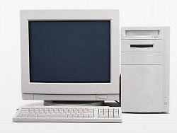
< article class = "sale-item" > < h1 > Computer Starter Kit</ h1 > < p > This is the best computer money can buy, if you don’t have much money.< ul > < li > Computer< li > Monitor< li > Keyboard< li > Mouse</ ul > < img src = "images/computer.jpg" alt = "You get: a white desktop computer with matching peripherals." > </ article >
Computer Starter Kit
This is the best computer money can buy, if you don’t have much money.
- Computer
- Monitor
- Keyboard
- Mouse
Flex and grid containers lay out their contents in order-modified document order, starting from the lowest numbered ordinal group and going up. Items with the same ordinal group are laid out in the order they appear in the source document. This also affects the painting order [CSS2], exactly as if the flex/grid items were reordered in the source document. Absolutely-positioned children of a flex/grid container are treated as having order: 0 for the purpose of determining their painting order relative to flex/grid items.
Unless otherwise specified by a future specification, this property has no effect on boxes that are not flex items or grid items.
3.1. Reordering and Accessibility
The order property does not affect ordering in non-visual media
(such as speech).
Likewise, order does not affect
the default traversal order of sequential navigation modes
(such as cycling through links, see e.g. tabindex [HTML]).
Authors must use order only for spatial, not logical, reordering of content. Style sheets that use order to perform logical reordering are non-conforming.
Note: This is so that non-visual media and non-CSS UAs, which typically present content linearly, can rely on a logical source order, while order is used to tailor the layout order. (Since visual perception is two-dimensional and non-linear, the desired layout order is not always logical.)
In order to preserve the author’s intended ordering in all presentation modes, authoring tools—including WYSIWYG editors as well as Web-based authoring aids—must reorder the underlying document source and not use order to perform reordering unless the author has explicitly indicated that the spatial order should be out-of-sync with the underlying document order (which determines speech and navigation order).
Since most of the time, reordering should affect all screen ranges as well as navigation and speech order, the tool would perform drag-and-drop reordering at the DOM layer. In some cases, however, the author may want different layouts per screen size. The tool could offer this functionality by using order together with media queries, but also tie the smallest screen size’s ordering to the underlying DOM order (since this is most likely to be a logical linear presentation order) while using order to define the visual presentation order in other size ranges.
This tool would be conformant, whereas a tool that only ever used order to handle drag-and-drop reordering (however convenient it might be to implement it that way) would be non-conformant.
Note: User agents, including browsers, accessible technology, and extensions, may offer spatial navigation features. This section does not preclude respecting the order property when determining element ordering in such spatial navigation modes; indeed it would need to be considered for such a feature to work. But order is not the only (or even the primary) CSS property that would need to be considered for such a spatial navigation feature. A well-implemented spatial navigation feature would need to consider all the layout features of CSS that modify spatial relationships.
4. Invisibility: the visibility property
| Name: | visibility |
|---|---|
| Value: | visible | hidden | collapse |
| Initial: | visible |
| Applies to: | all elements |
| Inherited: | yes |
| Percentages: | N/A |
| Computed value: | as specified |
| Canonical order: | per grammar |
| Animation type: | discrete |
| Media: | visual |
The visibility property specifies whether the box is rendered. Invisible boxes still affect layout. (Set the display property to none to suppress box generation altogether.). Values have the following meanings:
- visible
- The generated box is visible, as normal.
- hidden
- Any boxes generated by the element are invisible. Descendants of the element can, however, be visible if they have visibility: visible.
- collapse
- Indicates that the box is collapsed, which can cause it to take up less space than otherwise in a formatting-context–specific way. See dynamic row and column effects in tables [CSS2] and collapsed flex items in flex layout [CSS-FLEXBOX-1]. In all other cases, however, (i.e. unless otherwise specified) this simply makes the box invisible, just like hidden.
Note: Currently, many user agents and/or accessibility tools don’t correctly implement the accessibility implications of visible elements with semantic relationships to invisible elements, so, for example, making parent elements with special roles (such as table rows) invisible while leaving child elements with special roles (such as table cells) visible can be problematic for users of those tools. Authors should avoid creating these situations until the tooling situation improves.
Invisible boxes are not rendered (as if they were fully transparent), cannot be interacted with (and behave as if they had pointer-events: none), are removed from navigation (similar to display: none), and are also not rendered to speech (except when speak is always [CSS-SPEECH-1]). However, as with display: contents, their semantic role as a container is not affected, to ensure that any visible descendants are properly interpreted.
Note: If speak is always, an otherwise invisible box is rendered to speech, and may be interacted with using non-visual/spatial methods.
For example, here is a (deliberately simplified) possible implementation of a "spoiler" element that can be revealed by clicking on the hidden text:
< p > The symbolism earlier in the movie becomes obvious at the end, when it's revealed that< spoiler-text >< span > Luke is his own father</ span ></ spoiler-text > , making the wizard's cryptic riddles meaningful.< style > spoiler-text { border-bottom : 1 px solid ; } spoiler-text > span { visibility : hidden ; } spoiler-text . shown > span { visibility : visible ; } </ style > < script > [... document. querySelectorAll( "spoiler-text" )]. forEach( el=>{ el. addEventListener( "click" , e=> el. classList. toggle( "shown" )); }); </ script >
This example is deliberately significantly simplified. It is missing a number of accessibility and UX features that a well-designed spoiler element would have to show off the visibility usage more plainly. Don’t copy this code for a real site.
5. Run-In Layout
A run-in box is a box that merges into a block that comes after it, inserting itself at the beginning of that block’s inline-level content. This is useful for formatting compact headlines, definitions, and other similar things, where the appropriate DOM structure is to have a headline preceding the following prose, but the desired display is an inline headline laying out with the text.
<dl class='dict'>
  <dt>dictionary
  <dd>a book that lists the words of a language in alphabetical
      order and gives their meaning, or that gives the equivalent
      words in a different language.
  <dt>glossary
  <dd>an alphabetical list of terms or words found in or relating
      to a specific subject, text, or dialect, with explanations; a
      brief dictionary.
</dl>
<style>
.dict > dt {
  display: run-in;
}
.dict > dt::after {
  content: ": "
}
</style>
Which is formatted as:
dictionary: a book that lists the words of a language
in alphabetical order and explains their meaning.

glossary: an alphabetical list of terms or words found
in or relating to a specific subject, text, or dialect,
with explanations; a brief dictionary.
A run-in box behaves exactly as any other inline-level box, except:
- A run-in box with a flow inner display type inlinifies its contents.
-
If a run-in sequence is immediately followed by a block box
that does not establish a new block formatting context,
it is inserted as direct children of that block box:
after its ::marker pseudo-element’s boxes (if any),
but preceding any other boxes generated by the contents of the block
(including the box generated by the ::before pseudo-element, if any).
This re-parenting recurses if possible
(so that the run-in effectively becomes
part of the deepest subsequent “paragraph” in its formatting context,
collecting newly-adjacent run-ins as it goes).
The reparented content is then formatted as if originally parented there. Note that only layout is affected, not inheritance, because property inheritance for non-anonymous boxes is based only on the element tree.
- Otherwise (if the run-in sequence is not followed by such a block), an anonymous block box is generated around the run-in sequence and all immediately following inline-level content (up to, but not including, the next run-in sequence, if any).
A run-in sequence is a maximal sequence of consecutive sibling run-in boxes and intervening white space and/or out-of-flow boxes.
Note: This statement implies that out-of-flow boxes are reparented if they are between two run-in boxes. Another alternative would be to leave behind the intervening out-of-flow boxes, or to have out-of-flow boxes impede the running-in of earlier boxes. Implementers and authors are encouraged to contact the CSSWG if they have a preferred behavior, as this one was picked somewhat at random.
This fixup occurs before the anonymous block and inline box fixup described in CSS2§9.2, and affects the determination of the first formatted line of the affected elements as if the run-in sequence were originally in its final location in the box tree.
Note: As the earliest run-in represents the first text on the first formatted line of its containing block, a ::first-letter pseudo-element applied to that block element selects the first letter of the run-in, rather than the first letter of its own contents.
Note: This run-in model is slightly different from the one proposed in earlier revisions of [CSS2].
Appendix A: Glossary
The following terms are defined here for convenience:
- root element
- The element at the root of the document tree.
In a document tree produced under the DOM,
this is the document element;
in HTML it is the
htmlelement. [DOM] [HTML] - principal box
-
When an element generates one or more boxes,
one of them is the principal box,
which contains its descendant boxes and generated content,
and is also the box involved in any positioning scheme.
Some elements may generate additional boxes in addition to the principal box (such as list-item elements, which generate an additional marker box, or table elements, which generate a principal table wrapper box and an additional table grid box). These additional boxes are placed with respect to the principal box.
- inline-level
- Content that participates in inline layout. Specifically, inline-level boxes and text sequences.
- block-level
- Content that participates in block layout. Specifically, block-level boxes.
- inline box
- A non-replaced inline-level box whose inner display type is flow. The contents of an inline box participate in the same inline formatting context as the inline box itself.
- inline
- Used as a shorthand for inline box or inline-level box where unambiguous, or as an adjective meaning inline-level. The latter usage is deprecated.
- atomic inline
-
An inline-level box that is replaced (such as an image)
or that establishes a new formatting context (such as an inline-block or inline-table)
and cannot split across lines
(as inline boxes and ruby containers can).
Any inline-level box whose inner display type is not flow establishes a new formatting context of the specified inner display type.
- block container
-
A block container either contains only inline-level boxes
participating in an inline formatting context,
or contains only block-level boxes
participating in a block formatting context (possibly generating anonymous block boxes to ensure this constraint,
as defined in CSS2§9.2.1.1).
A block container that contains only inline-level content establishes a new inline formatting context. The element then also generates a root inline box which wraps all of its inline content. Note, this root inline box concept effectively replaces the "anonymous inline element" concept introduced in CSS2§9.2.2.1.
A block container establishes a new block formatting context if its parent formatting context is not a block formatting context; otherwise, when participating in a block formatting context itself, it either establishes a new block formatting context for its contents or continues the one in which it participates, as determined by the constraints of other properties (such as overflow or align-content).
Note: A block container box can both establish a block formatting context and an inline formatting context simultaneously.
- block box
-
A block-level box that is also a block container.
Note: Not all block container boxes are block-level boxes: non-replaced inline blocks and non-replaced table cells, for example, are block containers but not block-level boxes. Similarly, not all block-level boxes are block containers: block-level replaced elements (display: block) and flex containers (display: flex), for example, are not block containers.
- block
- Used as a shorthand for block box, block-level box, or block container box, where unambiguous.
- replaced element
-
An element whose content is outside the scope of the CSS formatting model,
such as an image or embedded document. For example, the content of the HTML
imgelement is often replaced by the image that itssrcattribute designates.Replaced elements often have natural dimensions. For example, a bitmap image has a natural width and a natural height specified in absolute units (from which the natural ratio can obviously be determined). On the other hand, other objects may not have any natural dimensions (for example, a blank HTML document). See [css-images-3].
User agents may consider a replaced element to not have any natural dimensions if it is believed that those dimensions could leak sensitive information to a third party. For example, if an HTML document changed natural size depending on the user’s bank balance, then the UA might want to act as if that resource had no natural dimensions.
The content of replaced elements is not considered in the CSS formatting model; however, their natural dimensions are used in various layout calculations. Replaced elements always establish an independent formatting context.
A non-replaced element is one that is not replaced, i.e. whose rendering is dictated by the CSS model.
- containing block
-
A rectangle that forms the basis of sizing and positioning
for the boxes associated with it.
Notably, a containing block is not a box (it is a rectangle),
however it is often derived from the dimensions of a box.
Each box is given a position with respect to its containing block,
but it is not confined by this containing block;
it can overflow.
The phrase “a box’s containing block” means
“the containing block in which the box lives,”
not the one it generates.
In general, the edges of a box act as the containing block for descendant boxes; we say that a box “establishes” the containing block for its descendants. If properties of a containing block are referenced, they reference the values on the box that generated the containing block. (For the initial containing block, values are taken from the root element unless otherwise specified.)
See [CSS2] Section 9.1.2 and Section 10.1 and CSS Positioned Layout 3 § 2.1 Containing Blocks of Positioned Boxes for details.
- containing block chain
- A sequence of successive containing blocks that form an ancestor-descendant chain through the containing block relation. For example, an inline box’s containing block is the content box of its closest block container ancestor; if that block container is an in-flow block, then its containing block is formed by its parent block container; if that grandparent block container is absolutely positioned, then its containing block is the padding edges of its closest positioned ancestor (not necessarily its parent), and so on up to the initial containing block.
- initial containing block
- The containing block of the root element. The initial containing block establishes a block formatting context, and takes the principal writing mode of the document (see CSS Writing Modes 4 § 8.1 Propagation to the Initial Containing Block). In continuous media, it has the dimensions of the small viewport size and is anchored at the canvas origin. In paged media, see [CSS-PAGE-3] for its position and dimensions.
- formatting context
-
A formatting context is the environment
into which a set of related boxes are laid out.
Different formatting contexts lay out their boxes
according to different rules.
For example, a flex formatting context lays out boxes according to the flex layout rules [CSS-FLEXBOX-1],
whereas a block formatting context lays out boxes according to the block-and-inline layout rules [CSS2].
Additionally, some types of formatting contexts interleave and co-exist:
for example, an inline formatting context exists within
and interacts with the block formatting context of the element that establishes it,
and a ruby container overlays a ruby formatting context over the inline formatting context in which its ruby base container participates.
A box either establishes a new independent formatting context or continues the formatting context of its containing block. In some cases, it might additionally establish a new (non-independent) co-existing formatting context. Unless otherwise specified, however, establishing a new formatting context creates an independent formatting context. The type of formatting context established by the box is determined by its inner display type. E.g. a grid container establishes a new grid formatting context, a ruby container establishes a new ruby formatting context, and a block container can establish a new block formatting context and/or a new inline formatting context. See the display property.
- independent formatting context
-
When a box establishes an independent formatting context
(whether that formatting context is of the same type as its parent or not),
it essentially creates a new, independent layout environment:
except through the sizing of the box itself,
the layout of its descendants is (generally)
not affected by the rules and contents of
the formatting context outside the box, and vice versa.
For example, in a block formatting context, floated boxes affect the layout of surrounding boxes. But their effects do not escape their formatting context: the box establishing their formatting context grows to fully contain them, and floats from outside that box are not allowed to protrude into and affect the contents inside the box.
As another example, margins do not collapse across formatting context boundaries.
Exclusions are able to affect content across independent formatting context boundaries. (At time of writing, they are the only layout feature that can.) [CSS3-EXCLUSIONS]
Certain properties can force a box to establish an independent formatting context in cases where it wouldn’t ordinarily. For example, making a box out-of-flow causes it to blockify as well as to establish an independent formatting context. As another example, certain values of the contain property can cause a box to establish an independent formatting context. Turning a block into a scroll container will cause it to establish an independent formatting context; however turning a subgrid into a scroll container will not—it continues to act as a subgrid, with its contents participating in the layout of its parent grid container.
A block box that establishes an independent formatting context establishes a new block formatting context for its contents. In most other cases, forcing a box to establish an independent formatting context is a no-op—either the box already establishes an independent formatting context (e.g. flex containers), or it’s not possible to establish a totally independent new formatting context on that type of box (e.g. non-replaced inline boxes).
- block formatting context
- inline formatting context
- Block and inline formatting contexts are defined in CSS 2.1 Section 9.4. Inline formatting contexts exist within (are part of their containing) block formatting contexts; for example, line boxes belonging to the inline formatting context interact with floats belonging to the block formatting context.
- block layout
- The layout of block-level boxes, performed within a block formatting context.
- block formatting context root
- A block container that establishes a new block formatting context.
- BFC
-
Abbreviation for block formatting context or block formatting context root.
Has various informal definitions referring to boxes which
contain internal floats, exclude external floats, and suppress margin collapsing,
and may therefore refer specifically to one of:
-
a block container that establishes a new block formatting context for its contents
-
a block box (i.e. a block-level block container) that establishes a block formatting context for its contents (as distinguished from a block box which does not)
-
(very loosely) any block-level box that establishes a new formatting context (other than an inline formatting context)
-
- out-of-flow
- in-flow
-
A box is out-of-flow if it is
extracted from its expected position and interaction with surrounding content
and laid out using a different paradigm
outside the normal flow of content in its parent formatting context.
This occurs if the box is floated (via float)
or absolutely positioned (via position).
A box is in-flow if it is not out-of-flow.
Note: Some formatting contexts inhibit floating, so that an element with float: left is not necessarily out-of-flow.
- document order
- The order in which boxes or content occurs in the document (which can be different from the order in which it appears for rendering). For the purpose of determining the relative order of pseudo-elements, the box-tree order is used, see CSS Pseudo-Elements 4 § 4 Tree-Abiding Pseudo-elements.
See [CSS2] Chapter 9 for a fuller definition of these terms.
Appendix B: Effects of display: contents on Unusual Elements
This section is (currently) non-normative.
Some elements aren’t rendered purely by CSS box concepts;
for example, replaced elements (such as img),
many form controls (such as input),
and SVG elements.
This appendix defines how they interact with display: contents.
HTML Elements
brwbrmeterprogresscanvasembedobjectaudioiframeimgvideoframeframesetinputtextareaselect-
display: contents computes to display: none.
legend-
Per HTML, a
legendwith display: contents is not a rendered legend, so it does not have magical display behavior. (Thus, it reacts to display: contents normally.) buttondetailsfieldset-
These elements don’t have any special behavior; display: contents simply removes their principal box, and their contents render as normal.
- any other HTML element
-
Behaves as normal for display: contents.
SVG Elements
- An
svgelement that has CSS box layout (this includes allsvgwhose parent is an HTML element, as well as document root elements) -
display: contents computes to display: none.
- All other SVG container elements that are also renderable elements
- SVG text content child elements
use - SVG text content child elements
-
display: contents strips the element from the formatting tree, and hoists its contents up to display in its place. These contents include the shadow-DOM content for
use. - any other SVG elements
-
display: contents computes to display: none.
For example, text content and text formatting elements in SVG
require a text element context;
if you remove a text,
its child text content and elements are no longer valid.
For that reason, display: contents on text prevents the entire text element from being rendered.
In contrast, any valid content inside a tspan or textPath is also valid content inside the parent text formatting context,
so the hoisting behavior applies for these elements.
Similarly, if hoisting would convert the children from non-rendered elements (e.g., a shape inside a pattern or symbol)
to rendered elements (e.g., a shape that is a direct child of the svg),
that is an invalid change of rendering context.
Never-rendered container elements therefore cannot be "un-boxed"
by display: contents.
When an element is stripped from the formatting tree, then any SVG attributes on that element that control layout and visual formatting are ignored when rendering the contents. However, SVG presentation attributes—which map to CSS properties—continue to affect value processing and inheritance [CSS-CASCADE-3]; thus such attributes can affect the layout and visual formatting of the element’s descendants by influencing the values of such properties on those descendants.
MathML Elements
For all MathML elements, display: contents computes to display: none.
Appendix C: Box Construction Guidelines for Spec Authors
This section is non-normative guidance for specification authors.
-
A box cannot be blockified and inlinified at the same time; if such a thing would occur, define which wins over the other.
-
Non-principal non-anonymous boxes can’t be blockified: blockification affects the element’s computed values and thus determines the type of its principal box.
-
Boxes which blockify their contents can’t directly contain inline-level content; any boxes or text sequences generated within such an element must be blockified or wrapped in an anonymous block container.
-
Boxes which inlinify their contents can’t directly contain block-level boxes; any boxes generated within such an element must be inline-level.
-
Boxes that fundamentally cannot establish an independent formatting context (such as non-replaced inlines) must not be asked to establish an independent formatting context. Blockify them first, or otherwise change their box type to one that can establish an independent formatting context.
Acknowledgments
We would like to thank the many people who have attempted to separate out the disparate details of box generation over the years, most particularly Bert Bos, whose last attempt with display-model and display-role didn’t get anywhere, but primed us for the current spec; Anton Prowse, whose relentless assault on CSS2.1 Chapter 9 forced some order out of the chaos; and Oriol Brufau, who teased apart dozens of fine distinctions and errors in this spec. Honorable mentions also go to David Baron, Mats Palmgren, Ilya Streltsyn, and Boris Zbarsky for their feedback.
Changes
Changes Since 2023 Candidate Recommendation Snapshot
Changes since the 30 March 2023 Candidate Recommendation Snapshot include:
- Inlined the CSS2.1 definition of the initial containing block for continuous media, cross-referenced its writing mode propagation as defined in [CSS-WRITING-MODES-4], and clarified that it refers to the small viewport size. (Issue 6453)
Changes Since 2020 Candidate Recommendation
A Disposition of Comments since the 19 May 2020 Candidate Recommendation is available.
Changes since the 19 May 2020 Candidate Recommendation include:
- Renamed “text run” to “text sequence”. (Issue 7768)
- Defined root element and clarified its layout as a block-level in § 2.8 The Root Element’s Principal Box and the definition of initial containing block. (PR 8095, Issue 7207, Issue 6480, Issue 7786)
- Pulled in the order property definition from [CSS-FLEXBOX-1], since it also applies to grid items. (Issue 5865)
- Imported the visibility property definition from [CSS2] and updated it to be more thorough and complete. (Issue 6123)
- Defined that replaced elements with a layout-internal display are treated as display: inline. (Issue 6000)
-
Clarified that the <display-legacy> values actually compute to the same value as their two-keyword equivalents.
(Issue 5575)
- inline-…
-
Behaves asComputes to inline ….
Note: Although these keywords and their equivalents compute to the same value, their specified values remain distinct.
Note: The
getComputedStyle()serialization rules will always output these precomposed keywords rather than the equivalent two-keyword pairs due to the shortest, most backwards-compatible serialization principle. -
Clarified that blockification and inlinification are computed value changes.
(Issue 6251)
Some layout effects require blockification or inlinification of the box type, which sets the box’s computed outer display type to block or inline (respectively).
- Added definition for block layout to glossary, for convenience.
- Updated references to CSS Grid Layout.
- Various minor editorial clarifications and cross-linking improvements.
Changes Since 2019 Candidate Recommendation
Changes since the 11 July 2019 Candidate Recommendation include:
- Merged in additional prose from [CSS2] into the definition of containing block.
-
Clarified that, for the purpose of CSS, DOM nodes other than elements and text are ignored.
(Some source documents start from more complex trees, such as the DOM, which can have comment nodes and other types of things. For the purposes of CSS, all of these additional types of nodes are ignored, as if they didn’t exist.)
- Improved/moved glossary definitions relating to absolute positioning.
Changes since the 28 August 2018 Candidate Recommendation include:
- Defined box tree parentage; see parent box.
- Added definition of absolutely positioned to the glossary; copied from CSS2 for easier referencing.
- Added cross-references to various forms of fragmentation in § 1 Introduction.
- Renamed “table box” to “table grid box” to more easily distinguish from “table wrapper box”.
- Added “unless otherwise specified” to root → initial containing block propagation,
since there are some regrettable special exceptions for the HTML
bodyelement.
Changes Prior to Candidate Recommendation Status
A Disposition of Comments is available.
Changes since the 20 April 2018 Working Draft include:
- Elements with display: contents that behave as display: none now compute to display: none. (Issue 2755)
- Distinguished “new” formatting context from independent formatting context since certain formatting contexts layer. (Issue 2597, Issue 1457)
- Defined that block boxes that establish an independent formatting context have a used display of flow-root, to provide an easier point of reference. (Issue 1550)
- Clarified that display is not animatable (as opposed to discretely animatable). (Issue 2938)
- Minor editorial fixes.
Changes since the 20 July 2017 Working Draft include:
-
Tightened up rules for the blockification of inline-block / inline flow-root to ensure compatibility with CSS2. (Issue 1246) Updated handling of run-in flow-root to match. (Issue 1715)
-
Adjusted grammar of display to list the list-item keyword last. This affects the expected serialization order. (Issue 1621)
-
Added better definition of interaction between block formatting contexts and inline formatting contexts in block containers that establish inline formatting contexts. (Issue 1553)
-
More clearly defined the way property values are reflected between an element and its boxes (in the case of an element generating multiple boxes). (Issue 1643)
-
Clarified that empty text objects are ignored for CSS rendering. (Issue 1808)
-
Clarified that display has no effect on document semantics, since this is a common bug in UAs. (Issue 2355)
-
Fixed error in definition of display’s computed value (which is definitely not “as specified”, due to blockification and inlinification rules triggered by various properties). (Issue 1716)
-
Added definition for document order.
-
Added missing SVG elements to Appendix B’s details on display: contents (Issue 2118), clarified effect of SVG attributes (Issue 2502), and defined behavior for MathML (Issue 2167).
-
Added some guidance to future spec authors of anonymous box construction rules. (Issue 1643)
-
Pushed the section about “becoming a formatting context” back to CSS Containment where it is used.
-
Various minor wording fixes and clarifications.
Changes since the 26 January 2017 Working Draft include:
-
Remove inline-list-item value that is equivalent to inline list-item.
-
Added the notion of “text nodes” to the element tree, and “text runs” to the box tree to define behavior in the context of display: contents. (Issue 19, Issue 32)
-
Defined that the root element is “in flow”. (Issue 3)
-
Defined interaction of ::first-line/::first-letter and run-in. (Issue 5, Issue 42)
-
Clarified that block/inline/run-in only dictates behavior in flow layout; it is ignored in other contexts.
-
Run-ins are a type of inline box, not just "like" an inline box.
-
Fixed the lack of recursion in of run-in’s box-tree munging. (Issue 45)
-
Added an appendix on how display: contents works on “unusual elements”. (Issue 8, Issue 18)
-
Fix blockification and inlinification rules, particularly handling of layout-internal types. (Issue 35, Issue 57)
-
Clarified interaction of various box tree fixups. (Issue 38, Issue 48)
-
Added the definition of “becoming a formatting context”.
-
Miscellaneous minor fixes and minor clarifications.
A Disposition of Comments is also available.
Changes since the 15 October 2015 Working Draft include:
- Deferred the box-suppress/display-or-not property to the next level of Display, in order to provide time for further discussion of use cases.
- Specified the effects of display: contents on unusual elements such as replaced elements and form controls.
- Clarified that an element’s ::before and ::after pseudo-elements still exist if its own box is not generated due to display: contents.
- Clarified that event bubbling is not affected by display: contents.
- Clarified interaction of run-ins with out-of-flow elements and ::first-letter.
- Switched table-caption and table-cell to use flow-root as their inner display type, since they always form a formatting context root.
- Closed off remaining issues and added at-risk list.
Changes since the 21 July 2015 Working Draft include:
- Added definitions for in-flow and out-of-flow to glossary.
Changes since the 11 September 2014 Working Draft include:
- Removed display-inside, display-outside, and display-extras longhands, in favor of just making display multi-value. (This was done to impose constraints on what can be combined. Future levels of this specification may relax some or all of those restrictions if they become unnecessary or unwanted.)
- Created the flow and flow-root inner display types to better express flow layout display types and to create an explicit switch for making an element a BFC root. (This should eliminate the need for hacks like ::after { clear: both; } and overflow: hidden that are intended to accomplish this purpose.)
Privacy Considerations
This specification introduces no new privacy considerations.
Security Considerations
This specification introduces no new security considerations.
Self-Review Questionnaire
Per the Self-Review Questionnaire: Security and Privacy: Questions to Consider
-
Does this specification deal with personally-identifiable information?
No.
-
Does this specification deal with high-value data?
No.
-
Does this specification introduce new state for an origin that persists across browsing sessions?
No.
-
Does this specification expose persistent, cross-origin state to the web?
No.
-
Does this specification expose any other data to an origin that it doesn’t currently have access to?
No.
-
Does this specification enable new script execution/loading mechanisms?
No.
-
Does this specification allow an origin access to a user’s location?
No.
-
Does this specification allow an origin access to sensors on a user’s device?
No.
-
Does this specification allow an origin access to aspects of a user’s local computing environment?
No.
-
Does this specification allow an origin access to other devices?
No.
-
Does this specification allow an origin some measure of control over a user agent’s native UI?
No.
-
Does this specification expose temporary identifiers to the web?
No.
-
Does this specification distinguish between behavior in first-party and third-party contexts?
No.
-
How should this specification work in the context of a user agent’s "incognito" mode?
No differently.
-
Does this specification persist data to a user’s local device?
No.
-
Does this specification have a "Security Considerations" and "Privacy Considerations" section?
Yes.
-
Does this specification allow downgrading default security characteristics?
No.