| Test |
Author |
Reviewer |
Status |
Description |
Issue |
 animate-dom-01-f.svg animate-dom-01-f.svg |
CM |
DAS |
accepted |
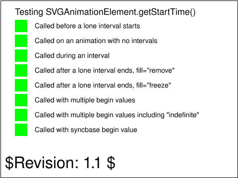
This tests the return value required for the
SVGAnimationElement.getStartTime() method, as described in
section 19.5 DOM Interfaces.
|
 animate-dom-02-f.svg animate-dom-02-f.svg |
CM |
DAS |
accepted |
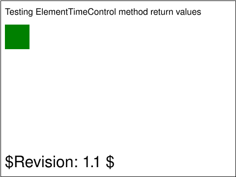
This tests that the methods on the ElementTimeControl
interface return the undefined value, since the IDL
operations are declared to return void.
After the loading the document, a rectangle is shown
indicating whether all four methods from the ElementTimeControl
interface returned undefined when invoked. The rectangle
is black if the test did not run, red if the test failed
and green if the test succeeded.
|
 animate-elem-02-t.svg animate-elem-02-t.svg |
Jon Ferraiolo |
SVGWG |
accepted |
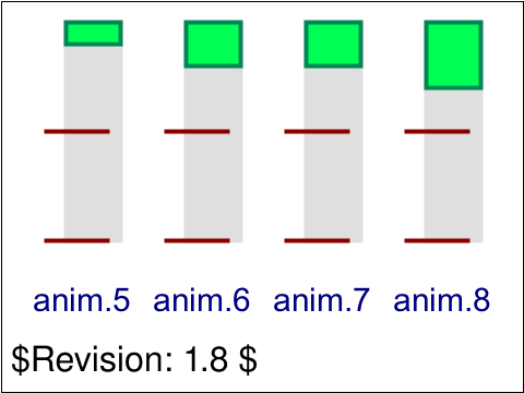
Test 'additive' and 'accumulate' attributes.
The four pictures show the effect with the four possible combinations of
'additive' (either 'replace' or 'sum') and 'accumulate' (either 'none' or 'sum').
Because two animations are animating the height, the effects of 'additive' and
'accumulate' are sometimes different than when there is only a single animation.
|
 animate-elem-03-t.svg animate-elem-03-t.svg |
Jon Ferraiolo |
SVGWG |
accepted |
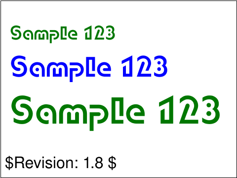
Test inheritance of animated properties.
Three colored text strings appear. All three are inside of the same
'g' element. The 'g' element has its 'font-size' animated from 30 to
40, and its 'fill' from #00f (blue) to #070 (green).
The first colored 'text' element has the font-size set, so the
animation of the parent 'g' only affects the fill color. The second
has the fill set and font-size set, so no inherited values are
used. The font-size and fill color stay constant. The third colored
'text' element has neither of these properties specified and thus
inherits both animated values - the fill color changes and the text
grows in size.
|
 animate-elem-04-t.svg animate-elem-04-t.svg |
Jon Ferraiolo |
SVGWG |
accepted |
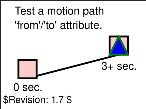
Test different ways of defining a motion path.
An animation moves a triangle along a path. Reference rectangles, lines and text
are provided to help show what the correct behavior is.
This animation uses the 'from' and 'to' attributes to define the motion path.
|
 animate-elem-05-t.svg animate-elem-05-t.svg |
Jon Ferraiolo |
SVGWG |
accepted |
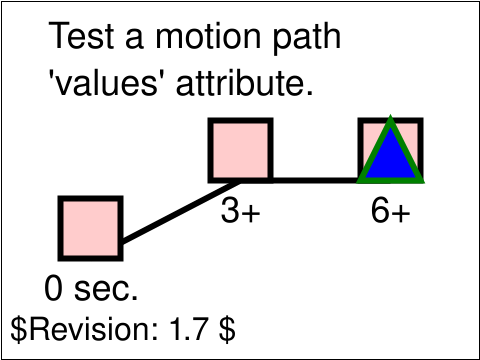
Test different ways of defining a motion path.
An animation moves a triangle along a path. Reference rectangles, lines and text
are provided to help show what the correct behavior is.
This animation uses the 'values' attribute to define the motion path, with a linear calcMode.
|
 animate-elem-06-t.svg animate-elem-06-t.svg |
Jon Ferraiolo |
SVGWG |
accepted |
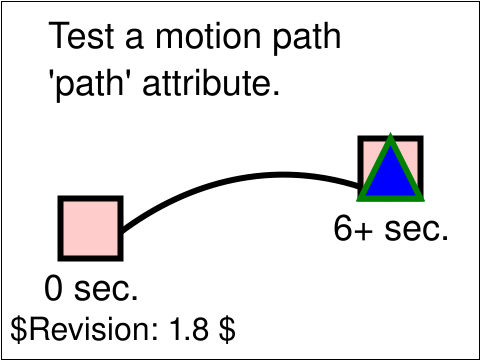
Test different ways of defining a motion path.
An animation moves a triangle along a path. Reference rectangles, lines and text
are provided to help show what the correct behavior is.
This animation uses the 'path' attribute to define the motion path.
|
 animate-elem-07-t.svg animate-elem-07-t.svg |
Jon Ferraiolo |
SVGWG |
accepted |
Test different ways of defining a motion path.
An animation moves a triangle along a path. Reference rectangles, lines and text
are provided to help show what the correct behavior is.
This animation uses the 'mpath' sub-element to define the motion path.
|
 animate-elem-08-t.svg animate-elem-08-t.svg |
Jon Ferraiolo |
SVGWG |
accepted |
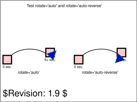
Test rotate='auto' and rotate='auto-reverse'.
Two animations have been defined that move a triangle along a path. The first animation specifies rotate='auto', which causes
the object to be rotated along the curve of the path. The second animation specifies rotate='auto-reverse', which causes the
object to be flipped and then rotated along the curve of the path.
|
 animate-elem-09-t.svg animate-elem-09-t.svg |
Jon Ferraiolo |
SVGWG |
accepted |
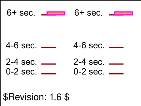
Test possible values for 'calcMode="discrete"'.
Two animations have been defined. For each animation, ruler lines and text are provided to help show what the correct behavior is.
The black text and ruler lines help show the sizes and movement of the rectangles over time.
The discrete animations should show stair-stepping animations, with quantum-level jumps every two seconds in these tests. The linear
animations change constantly with each keyframe to keyframe section, with the result that the change is faster when there is a larger
change within a given amount of time. The paced animations change constantly over the entire animation, regardless of the values at
particular keyframes. For calcMode='spline' in this test case, the initial rate of change is defined to be the same as linear, but the
last jump has an ease-in/ease-out effect where the change is slower at the start and end but faster in the middle.
|
 animate-elem-10-t.svg animate-elem-10-t.svg |
Jon Ferraiolo |
SVGWG |
accepted |
Test possible values for 'calcMode="linear"'.
Two animations have been defined. For each animation, ruler lines and text are provided to help show what the correct behavior is.
The black text and ruler lines help show the sizes and movement of the rectangles over time.
The linear animations change constantly with each keyframe to keyframe section, with the result that the change is faster when there is a larger
change within a given amount of time.
|
 animate-elem-11-t.svg animate-elem-11-t.svg |
Jon Ferraiolo |
SVGWG |
accepted |
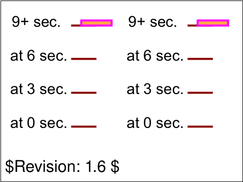
Test possible values for 'calcMode="paced"'.
Two animations have been defined. For each animation, ruler lines and text are provided to help show what the correct behavior is.
The black text and ruler lines help show the sizes and movement of the rectangles over time.
The paced animations change constantly over the entire animation, regardless of the values at
particular keyframes.
|
 animate-elem-12-t.svg animate-elem-12-t.svg |
Jon Ferraiolo |
SVGWG |
accepted |
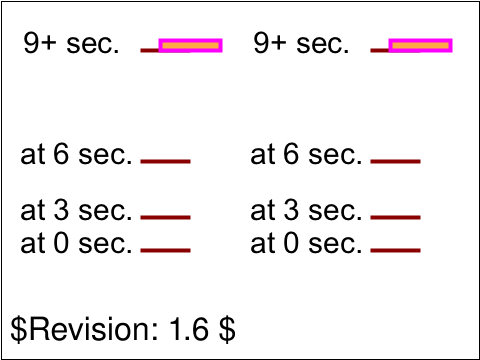
Test possible values for 'calcMode="spline"'.
Two animations have been defined. For each animation, ruler lines and text are provided to help show what the correct behavior is.
The black text and ruler lines help show the sizes and movement of the rectangles over time.
For calcMode='spline' in this test case, the initial rate of change is defined to be the same as linear, but the
last jump has an ease-in/ease-out effect where the change is slower at the start and end but faster in the middle.
|
 animate-elem-13-t.svg animate-elem-13-t.svg |
Jon Ferraiolo |
SVGWG |
accepted |
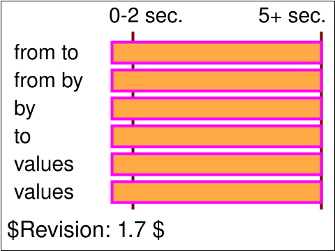
Test 'from', 'by', 'to' and 'values'.
Six animations have been defined. All six animations define the same simultaneous behavior, but use different combinations of
attributes 'from', 'by', 'to' and 'values'. In all cases, from time 2 seconds to time 5 seconds, the rectangle should change
from a width of 30 to a width of 300.
The text on each line shows the attributes that were used for that particular animation.
|
 animate-elem-14-t.svg animate-elem-14-t.svg |
Jon Ferraiolo |
SVGWG |
accepted |
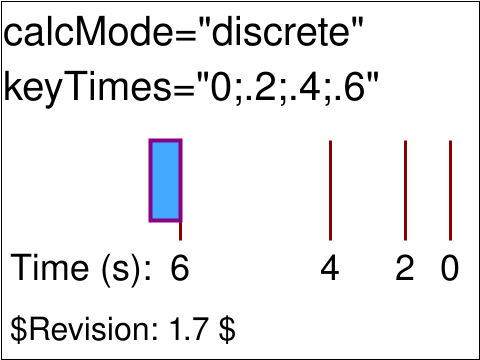
Test 'calcMode'=discrete.
One animation has been defined to animate the height of a rectangle. Ruler lines and text are provided
to help show what the correct behavior is. The headline text shows the values for the 'calcMode' and 'keyTimes' attributes. The
black text and ruler lines help show the size and movement of the rectangle over time.
This test shows an animation with calcMode="discrete" (i.e., a jumping animation).
|
 animate-elem-15-t.svg animate-elem-15-t.svg |
Jon Ferraiolo |
SVGWG |
accepted |
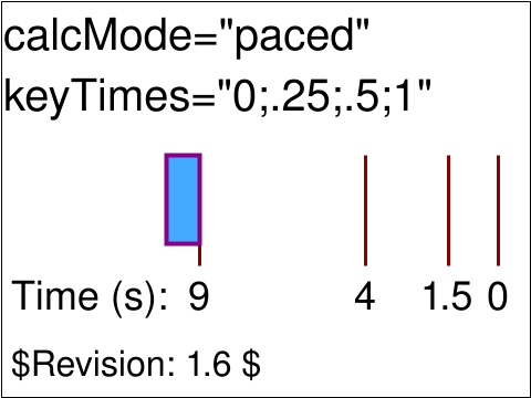
Test 'calcMode'=paced.
One animation has been defined to animate the width of a rectangle. Ruler lines and text are provided
to help show what the correct behavior is. The headline text shows the values for the 'calcMode' and 'keyTimes' attributes. The
black text and ruler lines help show the size and movement of the rectangle over time.
This test shows calcMode="paced" for an animation that has constant velocity, thus showing how 'values'
and 'keyTimes' are ignored.
|
 animate-elem-17-t.svg animate-elem-17-t.svg |
Jon Ferraiolo |
SVGWG |
accepted |
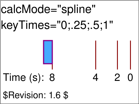
Test 'calcMode'=spline.
One animation has been defined to animate the height of a rectangle. Ruler lines and text are provided
to help show what the correct behavior is. The red text shows the values for the 'calcMode' and 'keyTimes' attributes. The
black text and ruler lines help show the size and movement of the rectangle over time.
This animation shows calcMode="spline". Between time 4 seconds and 8 seconds, the animation displays an ease-in/ease-out approach
instead of a constant linear approach which would have been the case if calcMode had been linear instead.
|
 animate-elem-19-t.svg animate-elem-19-t.svg |
Jon Ferraiolo |
SVGWG |
accepted |
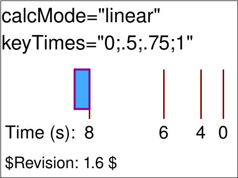
Test 'calcMode'=linear.
One animation has been defined to animate the width of a rectangle. Ruler lines and text are provided
to help show what the correct behavior is. The red text shows the values for the 'calcMode' and 'keyTimes' attributes. The
black text and ruler lines help show the size and movement of the rectangle over time.
This test shows an animation with calcMode="linear".
|
 animate-elem-20-t.svg animate-elem-20-t.svg |
Chris lilley |
SVGWG |
accepted |
Test hyperlinking rules as they relate to resolved start times.
|
 animate-elem-21-t.svg animate-elem-21-t.svg |
Chris lilley |
SVGWG |
accepted |
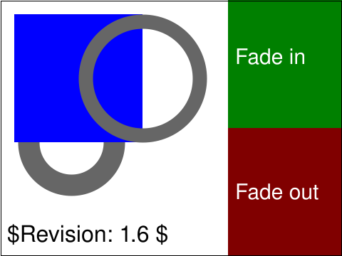
Test for chained animations.
The assumption is that you will first click on "fade in" and
then click on "fade out", each exactly once. The first time you
select the link 'fade in', you should see a blue square appearing,
gradually and smoothly fading from white to blue over the
course of three seconds. This square is in front of and thus
obscures the lower left circle, but is behind the upper right
circle. The fill color of these circles is also animated, from white to
grey. The animations are triggered by the start of the corresponding
animation of the blue square.
With the second click on "fade in", however, the behavior might
be different. In the case of having a first click on "fade in",
waiting three seconds, and then immediately perform a first click
on "fade out", waiting three seconds, and then immediately perform
a second click on "fade in", you should see the following. After
the first click on "fade in", the blue square goes from white to blue.
After the first click on "fade out", the blue square goes
from blue to white. After the second click on "fade in",
however, the blue square goes from white to blue, and then
goes back from blue to white. This is because of the
hyperlinking rules as they relate to resolved start times in the
SMIL Animation specification.
|
 animate-elem-22-b.svg animate-elem-22-b.svg |
Jon Ferraiolo |
SVGWG |
accepted |
Test which verifies that the basic facilities of declarative
animation are working.
This test uses the following element : 'animate'
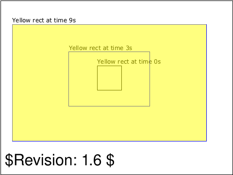
The test is a nine second animation with no repeats. It shows
a rectangle growing from small (37.5% width, 33.3% height) to
big (100% width, 100% height)
The file includes various guides that can be used to verify the
correctness of the animation. Outlines exist for the rectangle
size and location at times 0s, 3s and 9s.
|
 animate-elem-23-t.svg animate-elem-23-t.svg |
Jon Ferraiolo |
SVGWG |
accepted |
Test which verifies that the basic facilities of declarative
animation are working.
This test uses the following elements : 'set',
and 'animateColor'.
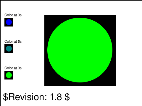
The test is a nine second animation with no repeats. It shows a circle
changing color from 3s to 9s.
The file includes various guides that can be used to verify the
correctness of the animation.
Boxes on the left show the correct circle color values at times
3s, 6s and 9s.
|
 animate-elem-24-t.svg animate-elem-24-t.svg |
Jon Ferraiolo |
CL |
accepted |
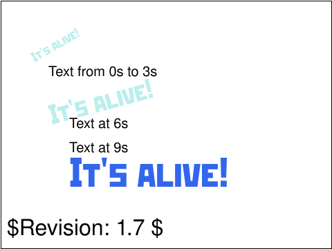
Test which verifies that the basic facilities of declarative
animation are working.
This test uses the following elements : 'animateMotion' and
'animateTransform'
The test is a nine second animation with no repeats. It shows
the text string "It's alive" moving, rotating and growing from
time 3s to 9s.
|
 animate-elem-25-t.svg animate-elem-25-t.svg |
Jon Ferraiolo |
SVGWG |
accepted |
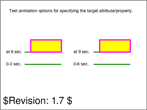
Test animation options for specifying the target attribute/property.
The left-hand rectangle animates an XML attribute without
specifying a value for 'attributeType'. The right-hand rectangle
animates an XML attribute and does set 'attributeType' to 'XML'.
The left rectangle animates its height from 100 to 50,
starting at time 3 seconds and ending at 6 seconds.
The right rectangle animates its height from 100 to 50,
starting at time 6 seconds and ending at 9 seconds.
|
 animate-elem-26-t.svg animate-elem-26-t.svg |
Jon Ferraiolo |
SVGWG |
accepted |
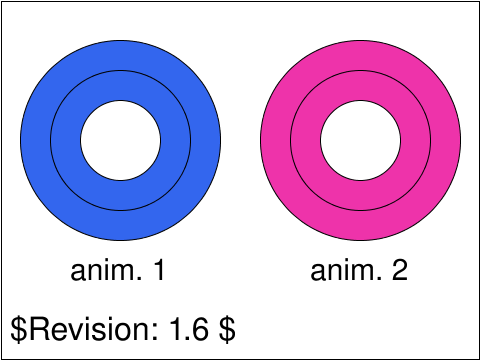
Test animation options for specifying the target attribute/property.
On the left, a circle animates the stroke-width property without
specifying a value for 'attributeType'. On the right,
a circle animates the stroke-width property and does set 'attributeType' to 'CSS'.
For each circle, guides shows what
the stroke-width looks like initially and
what it looks like at the end of the animation.
|
 animate-elem-27-t.svg animate-elem-27-t.svg |
Jon Ferraiolo |
SVGWG |
accepted |
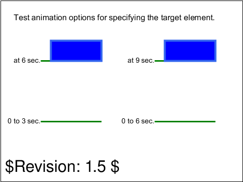
Test animation options for specifying the target element.
The leftmost rectangle verifies the use of the 'xlink:href'
attribute to indicate the target element to be animated.
The rightmost rectangle verifies animating the parent of
the 'animate' element (in this case, a 'rect' element)
(i.e., the implicit parent of the 'animate' element).
At time 0, two rectangles filled with blue and stroked with
light blue appear, each with width=100 and height=160. Starting at
time 3 seconds and ending at time 6 seconds, the height of
the leftmost rectangle decreases from 160 to 40. Starting at
time 6 seconds and ending at time 9 seconds, the rightmost
rectangle decreases from 160 to 40. Annotations on the picture
show the correct positions at particular times.
|
 animate-elem-28-t.svg animate-elem-28-t.svg |
Benoit Bezaire |
SVGWG |
accepted |
Test inheritance of animated properties.
|
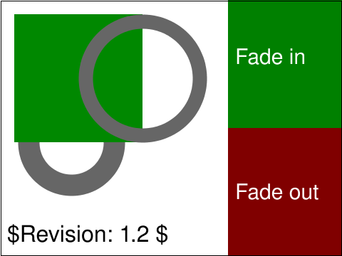 animate-elem-29-b.svg animate-elem-29-b.svg |
Chris Lilley |
SVGWG |
accepted |
Test compositing of animated fill opacity.
|
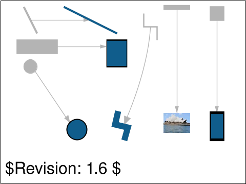 animate-elem-30-t.svg animate-elem-30-t.svg |
OA |
VH |
accepted |
The purpose of this test is to test animated <use> where
the referenced <defs> also is animated.
The test shows 6 different elements, each element defined in a
<defs> and referenced with a <use>. All the elements are
animated between 0-3 seconds. The expected animation transform is
indicated with a gray silhouette showing the border values (0 and 3 seconds)
and an arrow indicating the movement in between.
For the two elements with a color animation, the colors goes from white to
blue (the same blue color used for all elements).
|
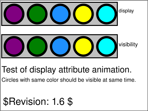 animate-elem-31-t.svg animate-elem-31-t.svg |
OA |
VH |
accepted |
The purpose of this test is to test animation of the display attribute.
The test shows two gray rectangles which are filled with colored circles during the length of the animation (8 sec).
The circles in the top rectangle are displayed/hidden by animating the display attribute.
The circles in the bottom rectangle are serving as the reference and are displayed/hidden by animating the visibility attribute.
A correct implementation should display/hide circles with the same color from the top and bottom rectangle at the same time.
In total there are 6 different circles (purple, green, dodgerblue, blue, yellow, cyan) in 5 positions (blue and yellow share position) that should be displayed during the test.
|
 animate-elem-32-t.svg animate-elem-32-t.svg |
SH |
CN |
accepted |
Tests the animation to and from the degenerate cases of the basic shapes.
The shapes are drawn within the black rectangles.
|
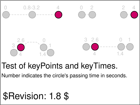 animate-elem-33-t.svg animate-elem-33-t.svg |
OA |
VH |
accepted |
The purpose of this test is to test animateMotion with keyPoints and keyTimes.
The test consists of 4 sub-tests. Each test has a purple circle which moves along a path. The path is indicated with a dashed line and sample points where the circle should pass a certain position on the path is indicated with gray circles. On top of each gray circle is a number which indicates the passing time in seconds. In the cases where the purple circle should pass the gray circle two times the first passing time is written above the gray circle and the second passing time is written below.
Section 19.2.12 in the spec. states that a motion path is defined by the path attribute or by values or from/to attributes. So in the animateMotion case, values is just used for defining the motionPath and the number of values do not have to relate to the number of keyTimes.
|
 animate-elem-34-t.svg animate-elem-34-t.svg |
OA |
VH |
accepted |
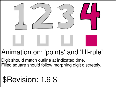
The purpose of this test is to test animation of attributes points and fill-rule.
The test consists of 2 sub-tests. The first test is a polygon shaped as a digit. The polygon
has an animation on its vertex points which morphs the polygon between the numbers 1, 2, 3
and 4. The gray outlines indicates the expected position of the polygon at 1, 2, 3 and 4s.
The second test is 4 paths in a u-shape. They have animated fill-rules. Their initial
fill-rules are, from left to right, nonzero, evenodd, nonzero (by default value, no fill-rule attribute set)
and nonzero (by default value, no fill-rule attribute set). This means, that the second path is
initially u-shaped, and all other paths are initially rect-shaped. All four animations are set to evenodd as a last stage.
The further expected result is that one path at a time is filled. The other three paths are not filled but have the u-shape.
The fourth animation from evenodd to nonzero happens by going back to the initial state,
because the fill attribute is not set to freeze. Which path that should be filled at
which time is indicated by the number above it (indicating time in seconds). To enhance the
difference between the filled path and the rest, the filled path should always have the
same color as the morphing polygon. This is achieved by a discrete color animation.
|
 animate-elem-35-t.svg animate-elem-35-t.svg |
OA |
VH |
issue |
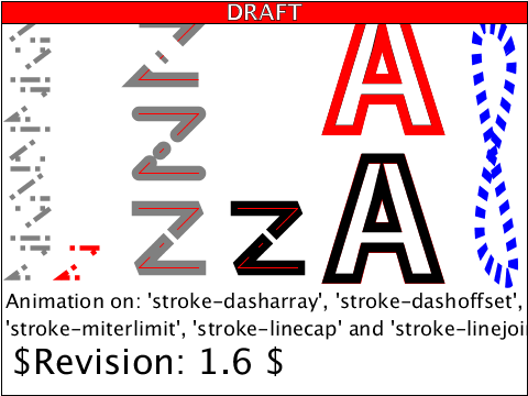
The purpose of this test is to test animation of attributes stroke-dasharray,
stroke-dashoffset, stroke-miterlimit, stroke-linecap and stroke-linjoin.
|
usesred |
 animate-elem-36-t.svg animate-elem-36-t.svg |
VH |
CN |
accepted |
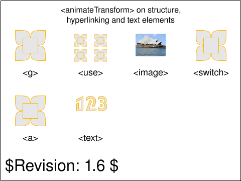
This test validates the animation of the transform attribute on structure
elements, hyperlinks and text elements.
The test applies an <animateTransform> on various element types: <g>,
<use>, <image>, <switch>, <a> and <text>. In all
cases, the type is a rotation and all the elements should rotate together about
their centers, for 3s, starting at the document's load time.
|
 animate-elem-37-t.svg animate-elem-37-t.svg |
OA |
VH |
accepted |
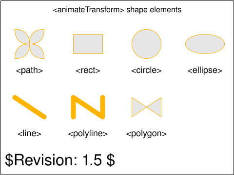
This test validates the animation of the transform attribute shape elements.
The test applies an <animateTransform> on various element
types: <g>, <use>, <image>, <switch>,
<a> and <text>.
In all cases the animation should run for 3s, starting at the document's load time.
The <circle> has a scale animation, and all the rest of the elements should rotate together about their centers.
|
 animate-elem-38-t.svg animate-elem-38-t.svg |
OA |
VH, ED |
accepted |
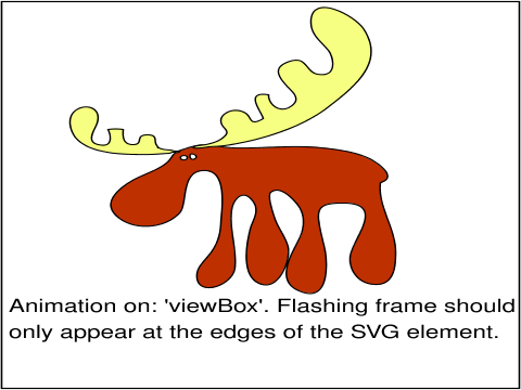
The purpose of this test is to test animation of the viewBox attribute.
|
 animate-elem-39-t.svg animate-elem-39-t.svg |
VH |
CN |
accepted |
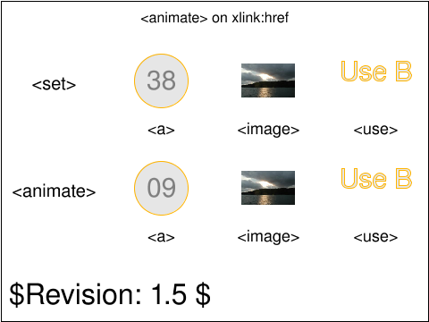
This test validates that the xlink:href attribute can be animated on
the <a>, <image> and <use> elements, using the <animate>
or <set> animation elements.
For the <a> animation, showing on the left-most column, the number
indicates the number of the animation test currently linked by the xlink:href
attribute. For example, when the xlink:href animated value is "animate-elem-38-t.svg",
the text displays "38". When the user clicks on the displayed number, the user
agent should open the corresponding link. For example, if the user clicks on 38,
then the "animate-elem-38-t.svg" URI should be followed. If the user clicks on 02,
then the "animate-elem-02-t.svg" URI should be followed.
For the <image> animations, the image xlink:href attribute cycles through
two values showing a sun set and a picture of the sydney opera. The image should
change every second and the images shown by the <set> and <animate>
animations should always match.
For the <use> animations, the use xlink:href attribute cycles through
values "#useA" and "#useB" which reference text elements displaying values
"Use A" and "Use B". The change should happen every second and the text shown
for the two animations (<set> and <animation>) should always
match.
|
 animate-elem-40-t.svg animate-elem-40-t.svg |
VH |
CN |
accepted |
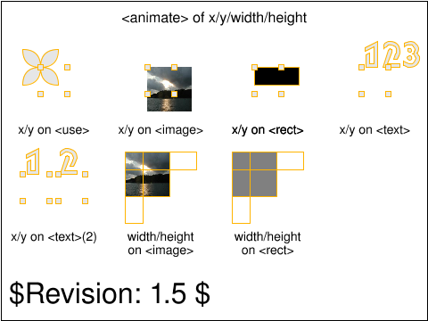
This test validates that the x and y attributes can be animated on
<use>, <image>, <rect> and <text> elements.
The test also validates that the width and height attributes can
be animated on <image> and <rect>
For x and y animation, each test shows the reference positions at
specific points in the animation. These markers are highlighted
at the time the target element's x/y position should match that of
the marker. For the <text> element, there are two tests. The
first one tests animating a single value on the text's x and y attributes.
The second one tests animating x, y values where there are values for each
of the text's characters. For that test (bottom left), there is a set of
reference markers for each of the characters ('1' and '2').
For width and height animation (the two tests on the bottom right), the
outline showing the expected width and height at given points in the animation
is highlighted at the time the marker's width and height should match that
of the target element.
|
 animate-elem-41-t.svg animate-elem-41-t.svg |
VH |
CN, CM |
accepted |
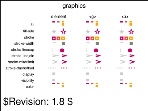
This test validates the operation of the animate element on the various graphics
properties. This test is very similar to animate-elem-78-t which uses the set element
instead of the animate element to modify graphics properties.
For each of the graphics properties, there are three tests. One animates the graphics
property directly on an element (such as a rect or a line) which uses the
property. The other two tests apply the animation on a container element (g and
a), and validate that the animated property is inherited by elements which
are child of the container.
|
 animate-elem-44-t.svg animate-elem-44-t.svg |
SH |
OA |
accepted |
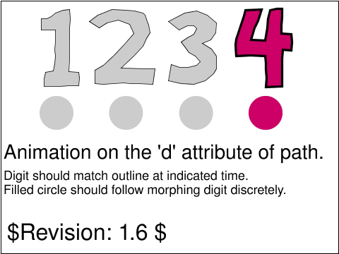
The purpose of this test is to test animation of the d
attribute of the path element.
This test consists of a path, specified as a series of
lineto commands, whose d attribute is animated.
The path morphs between the numbers 1, 2, 3, and 4.
The gray outlines indicates the expected position of the polygon at 1, 2, 3 and 4s.
The test contains an animated circle that indicates where
the path should be at a given time.
|
 animate-elem-46-t.svg animate-elem-46-t.svg |
VH |
CN |
accepted |
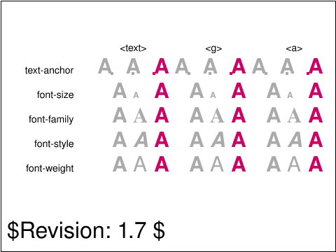
This test validates the operation of the animate element on the various
text and font properties. This test is very similar to animate-elem-77-t.svg
which uses the set element instead of the animate element to modify graphics
properties.
For each text or font properties, there are three tests. One animates the text or font
property directly on a text element which uses the
property. The other two tests apply the animation on a container element (g and
a), and validate that the animated property is inherited by children text elements.
For each animation test, the element on which the animation is applied is also
translated by an animation so that the various states of the animation can
be checked more easily. There is a gray reference marker which shows
the expected animation state at the begining of the animation, mid-way, or at the
end of the animation.
|
 animate-elem-52-t.svg animate-elem-52-t.svg |
OA |
VH |
accepted |
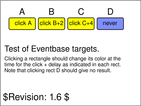
The purpose of this test is to test eventbase targets.
The test consists of 4 rectangles named A, B, C, D. The D rectangle contains
three animations changing the color of the animation target.
Each animation applies to one of the other rectangles
by using xlink:href. Clicking on rect A should change it's
color immediately, clicking B changes its color after 2 seconds,
clicking C changes its color after 4 seconds and clicking D shows no visible change
(although D contains the animations the event target for each
animation is the referenced rectangle, this rectangle is also the
animation target.)
The following sections in the SMIL Animation spec (http://www.w3.org/TR/smil-animation/)
are relevant as confirmation of this test:
The SMIL spec(3.6.7 subsection "Event Values") states that "If the
Eventbase-element term is missing, the event-base element is defined to
be the target element of the animation"
The SMIL spec (3.1 subsection "The target element") says that the
animation target may be defined explicitly thru the targetElement IDREF
or href URI.
So in this test, the animation target is defined through
xlink:href and the event base per definition is then also this
referenced element.
|
 animate-elem-53-t.svg animate-elem-53-t.svg |
OA |
VH |
issue |
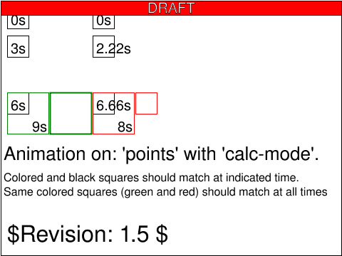
The purpose of this test is to test animation of points and calcmode.
|
usesred |
 animate-elem-60-t.svg animate-elem-60-t.svg |
VH |
CN |
accepted |
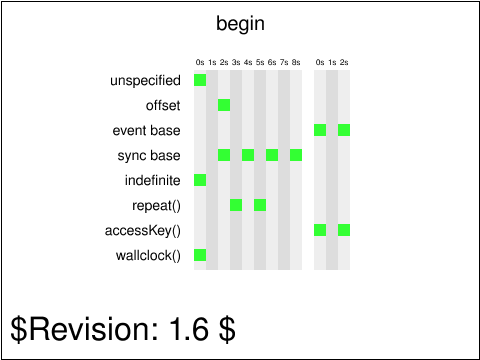
This test performs basic test on the begin attribute,
assuming support for the <set> element and setting the
fill attribute on a <rect> element.
The test validates the various possibilities for the begin attribute
value: no specified value, offset value, event base value, sync base
value, indefinite value, repeat value, accessKey value and wallclock.
There is one or several <set> elements for each of the possible begin
values. For each test, the <set> element(s) has (or have) an indefinite
duration and no other timing attribute specified other than begin
and dur.
There are two sets of vertical markers which help check that the test
is handled properly by the user agent. The first set, on the left, shows
markers from 0s to 8s, where the times are offset from the document's load time.
The rectangles in that area should turn green at the time corresponding
to the column they are in. From example, the first rectangle (going left to right)
on the "sync base" line should turn green 2 seconds after the document's load.
The second set of time vertical markers shows offset from a particular event.
For example, for the event base, the markers show an offset to the time
the first event base rectangle (the left-most one) is clicked on. For the
accessKey line, the times show offsets from the time the 'a' key is pressed
and the document has focus.
The first <set> has an unspecified begin attribute. That value
defaults to an offset of 0s so the animation should apply as soon as
the document is loaded.
The second <set> has its begin attribute set to '2s'. So its
target rectangle should turn green two seconds after the document is
loaded.
The third <set> has its begin attribute set to an event base
value 'click'. The user has to click on the left-most target red rectangle
to make the <set> target turn green. There are two rectangles
with associated <set> elements. The left most ones has a simple
value (no offset) and the second one is offset from the event time by 2 seconds.
The fourth <set> elements have their begin attributes set to a sync base
value. The first two rectangles have <set> elements synchronized on their sync base
begin. The left-most one has no offset and the following one has a 2 seconds offset.
The last two rectangles have <set> elements synchronized on their sync base end.
The first one (i.e., the third from left to right on that line), has a 2 seconds
negative offset. The second one (i.e., the last one on the line) has no offset and should
begin at the time its sync base ends.
The fifth <set> has its begin attribute set to indefinite and
should not turn red and stay green.
The sixth <set>s have their begin attributes have their begin attributes
based on the repeat() function. The repeat they are synchronized on happens
at 3s. The first <set>, which has no offset, should begin at 3s. The
second <set>, which has a 2 seconds offset, should start at 5s.
The seventh <set>s have their begin attributes set to 'accessKey(a)'.
The first one has no offset and should become active (and turn the rectangle
green), as soon as the key 'a' is pressed in the user agent. The second <set>
has a 2s offset and should become active 2 seconds after the 'a' key is pressed in
the user agent.
The eight's <set> target has its begin attribute set to
'wallclock()'. Therefore, the target should turn red because the
target wallclock time is in the past. The SMIL specification states the following about wallclock values in the past:
"When a begin time is resolved to be in the past (i.e., before the current presentation time), the element begins immediately,
but acts as though it had begun at the specified time (playing from an offset into the media)." (http://www.w3.org/TR/2001/REC-smil-animation-20010904/#AnimFuncTiming).
|
 animate-elem-61-t.svg animate-elem-61-t.svg |
VH |
VH |
accepted |
This tests validates multiple begin conditions in the begin attribute,
assuming support for the <set> element and setting the
fill attribute on a <rect> element.
The test validates the various possibilities for the begin attribute
value: multiple offset values, multiple event base values, multiple sync base
values, multiple repeat values, and multiple accessKey values. Finally,
the test validates that begin values of different kinds can be mixed.
The test shows 6 rows where a red rectangle' s x attribute is animated
with <set> elements.
On the first three rows, the red rectangles should show on the left from
0 to 1s. From 1 to 2s, the rectangles should show on the right. Then
the rectangles should show on the left from 2 to 4s, then on the right
again from 4 to 5s and come back to the left position and stay there
after 5s.
On the fourth row, the rectangle's begin condition is event based
and requires a user click. After the user clicks on the rectangle,
the rectangle should move to the right position for 1s, then move
back to the left position for 3 seconds, move again to the right
position for 1 second before going back to the left position.
On the fifth row, the rectangle's begin condition is accessKey based
and requires a user to press the 'a' key. After the user presses that key
the rectangle should move to the right position for 1s, then move
back to the left position for 3 seconds, move again to the right
position for 1 second before going back to the left position.
The last row's rectangle has a begin condition with two offset values
(1s;4s) and should behave like the rectangles of the first three
rows for the first 5 seconds of the document's timeline. In addition,
the begin condition has a click event base and thus, the rectangle
should move to the right position for one second every time the user
clicks on it. Finally, the begin condition also has an accessKey condition
for the 'b' character. Thus, the rectangle should move to the right
position every time the user presses the 'b' key.
|
 animate-elem-62-t.svg animate-elem-62-t.svg |
VH |
CN |
accepted |
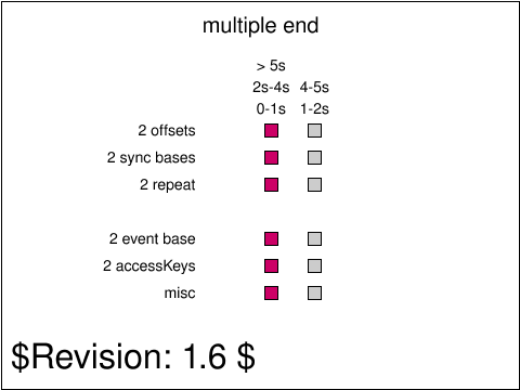
This test performs basic test on the end attribute,
assuming support for the <set> element and setting the
fill attribute on a <rect> element.
The test validates the various possibilities for the end attribute
value: no specified value, offset value, event base value, sync base
value, indefinite value, repeat value, accessKey value and wallclock.
There are one or several <set> elements for each of the possible end
values. For each test, the <set> element(s) has (or have) an indefinite
duration and no other timing attribute specified other than end
and dur.
There are two sets of vertical markers which help check that the test
is handled properly by the user agent. The first set, on the left, shows
markers from 0s to 8s, where the times are offset from the document's load time.
The rectangles in that area should turn green at the time corresponding
to the column they are in. From example, the first rectangle (going left to right)
on the "sync base" line should turn green 2 seconds after the document's load.
The second set of time vertical markers shows offset from a particular event.
For example, for the event base, the markers show an offset to the time
the first event base rectangle (the left-most one) is clicked on. For the
accessKey line, the times show offsets from the time the 'a' key is pressed
and the document has focus.
The first <set> has no end attribute and an indefinite duration.
Since there are no constraints on the active duration (no end attribute) the
active duration is the same as the simple duration (indefinite). This
means that the animation begins at 0s and has an indefinite end time.
The second <set> has its end attribute set to '2s'. So its
target rectangle should turn green two seconds after the document is
loaded.
The third <set> has its end attribute set to an event base
value 'click'. The user has to click on the left-most target red rectangle
to make the <set> target turn green. There are two rectangles
with associated <set> elements. The left most ones has a simple
value (no offset) and the second one is offset from the event time by 2 seconds.
The fourth <set> elements have their end attributes set to a sync base
value. The first two rectangles have <set> elements synchronized on their sync base
end. The left-most one has no offset and the following one has a 2 seconds offset.
The last two rectangles have <set> elements synchronized on their sync base end.
The first one (i.e., the third from left to right on that line), has a 2 seconds
negative offset. The second one (i.e., the last one on the line) has no offset and should
end at the time its sync base ends.
The fifth <set> has its end attribute set to indefinite and
should not turn red and stay green.
The sixth <set>s have their end attributes have their end attributes
based on the repeat() function. The repeat they are synchronized on happens
at 3s. The first <set>, which has no offset, should end at 3s. The
second <set>, which has a 2 seconds offset, should start at 5s.
The seventh <set>s have their end attributes set to 'accessKey(a)'.
The first one has no offset and should become active (and turn the rectangle
green), as soon as the key 'a' is pressed in the user agent. The second <set>
has a 2s offset and should become active 2 seconds after the 'a' key is pressed in
the user agent.
The eight's <set> target has its end attribute set to
'wallclock()'. The result depends on the presentation time.
If the document is viewed completely before 2200-06-10T12:34:56Z,
the rectangle has to be always green. begin is not explicitely set, therefore
it is zero, dur is indefinite and end is in the future.
If the document is viewed completely after 2200-06-10T12:34:56Z, the only end
value is before the implicitely given only begin value and therefore the set
does not start, the rectangle remains red. If the document is viewed in a time interval started before
2200-06-10T12:34:56Z and ended after this date, the rectangle will start green at the beginning, change to red at
2200-06-10T12:34:56Z and will remain red until the end of presentation.
|
 animate-elem-63-t.svg animate-elem-63-t.svg |
VH |
CN |
accepted |
This tests validates multiple end conditions in the end attribute,
assuming support for the <set> element and setting the
dur attribute to 'indefinite'.
The test validates the various possibilities for the end attribute
value: multiple offset values, multiple event base values, multiple sync base
values, multiple repeat values, and multiple accessKey values. Finally,
the test validates that end values of different kinds can be mixed.
The test shows 6 rows where a red rectangle's x attribute is animated
with <set> elements.
On the first three rows, the red rectangles should show on the left from
0 to 1s. From 1 to 2s, the rectangles should show on the right. Then
the rectangles should show on the left from 2 to 4s, then on the right
again from 4 to 5s and come back to the left position and stay there
after 5s.
On the fourth row, the rectangle's end condition is event based
and requires a user click. One of the end condition is defined
to be 5 seconds prior to the click and one is defined to be 5
seconds after the click. If the user clicks on the rectangle
before 5 seconds (in document time), the red rectangle we move
to the left position 5 seconds after the click (because the
'click - 5s' end time resolves to a time prior to the begin
time). If the user clicks after 5 seconds (in document time),
then the red rectangle moves to the left position immediately because
the 'click - 5s' time resolves to a time after the begin time.
On the fifth row, the rectangle's end condition is accessKey based
and requires a user to press the 'a' key. The behavior is exactly the
same as for the previous row, except that the triggering event
is the 'a' key press.
The last row's rectangle has a end condition with two offset values
(1s;4s) and should behave like the rectangles of the first three
rows for the first 5 seconds of the document's timeline. In addition,
the end condition has a click event base and thus, the rectangle
should immediately move to the left position if the user everytime the user
clicks clicks on the rectangle when it is on the right position.
Finally, the end condition also has an accessKey condition
for the 'b' character. Thus, the rectangle should move to the left
position every time the user presses the 'b' key and the rectangle is
on the right position.
|
 animate-elem-64-t.svg animate-elem-64-t.svg |
VH |
CN |
accepted |
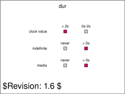
This tests performs basic tests on the dur attribute.
The first row shows a red rectangle subject to a <set> animation
with no begin attribute, no end attribute and a dur attribute set to
'2s'. Therefore, the animation should be active from 0 to 2 seconds and
then terminate. Consequently, the rectangle should show on the right
for the first two seconds, and then move to the left position.
The second row shows a red rectangle subject to a <set> animation
with no begin attribute, no end attribute and a dur attribute set to
'indefinite'. Therefore, the animation should stay active indefinitely
and the rectangle should always be on the right position, never on the
left position.
Finally, the third row shows red rectangle subject to a <set> animation
with no begin attribute, no end attribute and a dur attribute set to
'media'. In the context of SVG 1.1, this is equivalent to an 'indefinite'
value. Therefore, the animation should stay active indefinitely
and the rectangle should always be on the right position, never on the
left position.
|
 animate-elem-65-t.svg animate-elem-65-t.svg |
VH |
CN |
accepted |
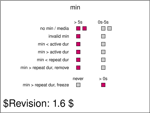
This tests performs basic tests on the min attribute. The test is based
on the SMIL specification at:
http://www.w3.org/TR/smil20/smil-timing.html#Timing-MinMax.
Each row in the test shows different rectangles subject to <set>
animations with different configurations with regards to the min
attribute. For each row but the last one, the animation should be active
during the first 5 seconds of the animations where the red rectangle
should show in the right column. At five seconds into the animation,
all the rectangles should move to their left position.
On the first row, the first <set> animation (left rectangle) has an end value of 5s,
and no min attribute. The active duration resulting from the end attribute is 5s.
The first row shows a second rectangle with a <set> animation with
the same configuration except that the min attribute value is set to
'media'. Because the <set> element does not define a media, the
behavior should be as if the attribute was not specified. The active duration (5s)
of the second <set> animation is therefore not constrained.
On the second row, the <set> animation has an end value of 5s,
and a -6s min attribute. The active duration resulting from the end attribute is 5s.
The negative min value is invalid and, as per the specification, the behavior should be
as if the attribute was not specified. The active duration (5s) is therefore not constrained.
On the third row, the <set> animation has an end value of 5s,
and a 3s min attribute. The active duration resulting from the end attribute is 5s.
The min value is less than the active duration, so the min attribute does not actually
constrain the active duration.
On the fourth row, the <set> animation has a dur value of indefinite, an end value of 2s,
and a 5s min attribute. The active duration resulting from the end attribute would be 2s.
Because this is less than the min value (2s < 5s) the (min constrained) active duration
has to be corrected to 5s, despite a simple duration (indefinite) that is greater than the min value.
On the fifth row, the <set> animation has a dur value of 1s, an end value of 2s,
a repeatCount of 7 and a 5s min attribute. The active duration resulting from dur, end and repeatCount
would be 2s. Because this is less than the min value (2s < 5s)
the (min constrained) active duration has to be corrected to 5s.
On the sixth row, the <set> animation has a dur value of 1s, an end
value of 2s, a repeatCount of 5 and a 8s min attribute value.
The active duration resulting from dur, end and repeatCount
would be 2s, because this is less than the min value (2s < 8s)
the active duration has to be corrected to 8s. As the
fill attribute is set to 'remove' on the <set> animation, this
remove is applied at 5s, the end of the repeatCount.
Note, that if the end of active duration would have been used as a
syncbase-value for another animation, the corrected end event at
(begin + min) = 8s has to be used.
On the seventh row, the <set> animation has a dur value of 1s, an end
value of 2s, a repeatCount of 5 and a 8s min attribute value.
The active duration resulting from dur, end and repeatCount
would be 2s, because this is less than the min value (2s < 8s)
the active duration has to be corrected to 8s. As the fill attribute
is set to 'freeze' on the <set> animation, the animation is frozen at
5s, the end of the repeatCount, the <set> applies indefinitely.
Note, that if the end of active duration would have been used as a
syncbase-value for another animation, the corrected end event at
(begin + min) = 8s has to be used.
|
 animate-elem-66-t.svg animate-elem-66-t.svg |
VH |
CN |
accepted |
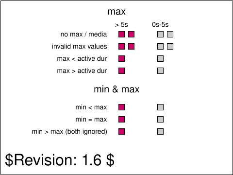
This tests performs basic tests on the max attribute and on
combinations of the min and max attributes. The test is based
on the SMIL specification at:
http://www.w3.org/TR/smil20/smil-timing.html#Timing-MinMax.
Each row in the test shows different rectangles subject to <set>
animations with different configurations with regards to the max and min
attributes. For each row, the animation should be active
during the first 5 seconds of the animations where the red rectangle
should show in the right column. At five seconds into the animation,
all the rectangles should move to their left position.
On the first row, the <set> animation has a (0s <= t < 5s) active duration
and no max attribute so the actual active duration is (0s <= t < 5s).
The first row shows a second rectangle with a <set> animation with
the same configuration except that the max attribute value is set to
'media'. Because the <set> element does not define a media, the
behavior should be as if the attribute was not specified.
On the second row, the <set> animation has a (0s <= t < 5s) active duration
and a min attribute set to '-6s' for the first rectangle and to 'foo' for the
second one. These values are invalid for max and, as
per the specification, the behavior should be as if the attribute was not
specified. Consequently, the behavior is as for the previous row and
the actual active duration is (0s <= t < 5s).
On the third row, the <set> animation has a (0s <= t < 8s) initial active duration
and a max attribute set to '5s'. The max value is less than the active
duration, so the max attribute constrains the active duration to (0s <= t < 5s).
On the fourth row, the <set> animation has a (0s <= t < 5s) initial active duration,
an indefinite simple duration (dur is set to indefinite) and a max attribute set to '8s'.
Because the initial active duration is less than the max attribute the active
duration is not constrained and is unchanged at (0s <= t < 5s).
On the fifth row, the <set> animation has a (0s <= t < indefinite) initial active duration,
a min of 2s and a max of 5s. Because the min value is less than the max value, both apply
and the computed active duration is (0s <= t < 5s).
On the sixth row, the <set> animation has a (0s <= t < indefinite) initial active duration,
a min of 5s and a max of 5s. Because the min value is equal to the max value, both apply
and the computed active duration is (0s <= t < 5s).
On the seventh row, the <set> animation has a [0s, 5s[[ initial active duration,
a min of 8s and a max of 2s. Because the min value is greater than the max value, both are
ignored and the computed active duration is [0s, 5s[.
|
 animate-elem-67-t.svg animate-elem-67-t.svg |
VH |
CN |
accepted |
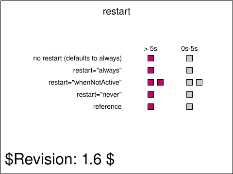
This tests performs basic tests on restart attribute.
Each row in the test shows different rectangles subject to <set>
animations with different configurations with regards to the restart
attribute. For each row, the animation should be active
during the first 5 seconds of the animations where the red rectangle
should show in the right column. At five seconds into the animation,
all the rectangles should move to their left position.
On the first row, the <set> animation has a begin attribute set to
'0s;1s' and a dur attribute set to 4s. This should result in a first
interval of (0s <= t < 4s) which should be superceeded, at 1s, by a new interval
of (1s <= t < 5s) because the default restart behavior is 'always'.
Consequently, the rectangle should be in the right position during the
(0s <= t < 5s) interval and move to the left position at 5s.
On the second row, the <set> animation has a begin attribute set to
'0s;1s', a dur attribute set to 4s and a restart attribute set to always.
The behavior should be the same as for the first row.
On the third row, the first (left most) rectangle's <set> animation
has a begin attribute set to '0s;1s', a dur set to 5s and a restart attribute
set to whenNotActive. Because of the rules for computing intervals, the
animation's interval is (0s <= t < 5s) and is not superseded by a (1s <= t < 6s) interval
because of the restart value.
The second (right most) red rectangle's <set> animation has a begin
attribute set to '0s;2.5s' and a dur attribute set to 2.5s. This results in
a first interval (0s <= t < 2.5s) which is followed by a (2.5s <= t < 5s) interval. Consequently,
the rectangle stays on its right position for the first five seconds before it definitively
moves to the left position.
On the fourth row, the <set> animation has a begin attribute set to
'0s;5s' and a dur attribute set to 5s. This results in a first interval of (0s <= t < 5s).
Because the restart attribute is set to 'never', the following possible interval,
(5s <= t < 10s) does not apply and the animation is only active for the first 5 seconds.
The fifth row shows a simple animated red rectangle which lasts for 5 seconds. It shows
a reference of how the other animations should behave visually: all red rectangles should
have the same horizontal position as the one on the reference row, at any time during the
animation.
|
 animate-elem-68-t.svg animate-elem-68-t.svg |
VH |
CN |
accepted |
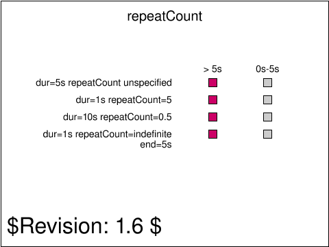
This tests performs basic tests on the repeatCount attribute.
Each row in the test shows different rectangles subject to <set>
animations with different configurations with regards to the repeatCount
attribute. For each row, the animation should be active
during the first 5 seconds of the animations where the red rectangle
should show in the right column. At five seconds into the animation,
all the rectangles should move to their left position.
On the first row, the <set> animation has its dur attribute set to
'5s' and its repeatCount unspecified. Consequently, its only interval
is (0s <= t < 5s).
On the second row, the <set> animation has its dur attribute set to
1s and its repeatCount set to 5. Consequently, its only interval is
(0s <= t < 5s (1s*5)).
On the third row, the <set> animation has its dur attribute set to
10s and its repeatCount set to 0.5. Consequently, its only interval is
(0s <= t < 5s (10s*0.5))
On the fourth row, the <set> animation has its dur attribute set to
1s and its repeatCount set to indefinite. It also has an end attribute
set to 5s. Consequently, the repeat duration is indefinite, but the active
duration is limited by the end attribute and the active interval is (0s <= t < 5s).
|
 animate-elem-69-t.svg animate-elem-69-t.svg |
VH |
CN |
accepted |
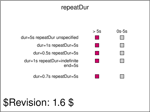
This tests performs basic tests on the repeatDur attribute.
Each row in the test shows different rectangles subject to <set>
animations with different configurations with regards to the repeatDur
attribute. For each row, the animation should be active
during the first 5 seconds of the animations where the red rectangle
should show in the right column. At five seconds into the animation,
all the rectangles should move to their left position.
On the first row, the <set> animation has its dur attribute set to
'5s' and its repeatDur unspecified. Consequently, its only interval
is (0s <= t < 5s).
On the second row, the <set> animation has its dur attribute set to
1s and its repeatDur set to 5s. Consequently, its only interval is
(0s <= t < 5s).
On the third row, the <set> animation has its dur attribute set to
0.5s and its repeatDur set to 5s. Consequently, its only interval is
(0s <= t < 5s).
On the fourth row, the <set> animation has its dur attribute set to
1s and its repeatDur set to indefinite. It also has an end attribute
set to 5s. Consequently, the repeat duration is indefinite, but the active
duration is limited by the end attribute and the active interval is (0s <= t < 5s).
On the fifth row, the <set> animation has its dur attribute set to
0.7s and its repeatDur set to 5s. Consequently, its only interval is
(0s <= t < 5s). The difference with the 3rd row is that there is a fractional
number of simple durations in the active duration (7.1428) where there
is a whole number of simple durations in the third row (10).
|
 animate-elem-70-t.svg animate-elem-70-t.svg |
VH |
CN |
accepted |
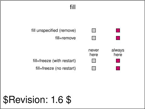
This tests the animation's SMIL fill attribute.
On the first row, the <set> animation has its dur
attribute set to '1s' and its begin attribute set to '0s;
firstSet.end + 1s'. The fill attribute is unspecified, so
the effect is as if it was set to 'remove', because 'remove' is
the default value for fill.
Consequently, the first interval is (0s <= t < 1s), the second is
(2s <= t < 3s), the third, (4s <= t < 5s) etc.. The red rectangle starts on the
right position, moves to the left position for one second, moves
to the right for 1 second, and so on.
On the second row, the <set> animation
with the identifier 'firstSet' has its dur attribute
set to 1s and its begin attribute set to '0s; firstSet.end'. The fill attribute
is set to 'remove'. The behavior should be exactly the same as for the previous
row, and the rectangle moves from the right position to the left position
every second.
On the third row, the <set> animation has its dur attribute set to
1s and its begin attribute set to '0s; firstSet.end'. The fill attribute
is set to 'freeze'. The first interval should be (0s <= t < 1s), the second (2s <= t < 3s),
the third, (4s <= t < 5s), etc. Between interval, the fill behavior should be applied,
so the red rectangle should stay on the right position and never go to the
left position.
On the fourth row, the <set> animation has its dur attribute set to
1s and its begin attribute set to '0s'. The fill attribute
is set to 'freeze'. The first interval should be (0s <= t < 1s) and there is no
following interval. Because of the fill behavior, the <set> should
apply the last (and only) animation value after 1s. Consequently, the
red rectangle should stay on the right position and never go to the
left position.
|
 animate-elem-77-t.svg animate-elem-77-t.svg |
NR |
CN |
accepted |
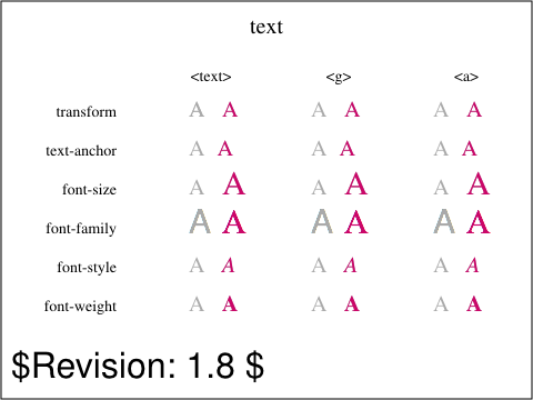
Tests the inheritance of animated values on text.
This test demonstrates how <set> elements change
text properties on a <text> element. For
each of the text properties being tested, 3
<set> elements are set. The first <set>
element acts directly on the <text> element. The
second <set> element acts on a <g> containing
children. The third <set> element acts on an <a>
containing children. In each case the test validates that
the animated value set on the <g> and <a>
elements is inherited by the <text> element.
All the <set> elements have a begin attribute
set to 0s with an offset of 1s after end.
So, the animation will apply 1s after the document is loaded
and will repeat every 1s after the animation ends.
The first <set> validates the transform property. When
applied to the <text> element, the letter A will be
translated to the right every 1s, in the <text> column.
When applied to the <g> element, the letter A inherits the
transform value and is translated to the right every 1s, as
seen in the <g> column. When applied to the <a>
element, the letter A inherits the transform value and is
translated to the right every 1s, as seen in <a> column.
The second <set> validates the text-anchor attribute.
When applied to the <text> element, the anchor position
of letter A is moved from start to end. When applied to the
<g> and <a> element, the property is inherited
and hence the anchor position of letter A is moved from start
to end in the second row.
The third <set> validates the font-size attribute.
The font size of letter A is changed from 20 to 30.
When applied to <g> and <a> elements, the letter
A inherits the font-size and hence in row 3, letter A has a
font-size of 30 in all 3 right columns of row 3.
The fourth <set> validates the font-family attribute.
The font-family is changed from default to serif.
When applied to <g> and <a> elements, the letter
A inherits the font-family attribute and hence in row 4,
letter A has serif font-family in all 3 columns.
The fifth <set> validates the font-style attribute.
The font-style is changed from normal to italic.
When applied to <g> and <a> elements, the letter
A inherits the font-style attribute and hence in row 5,
letter A is animated to italic in all 3 columns.
The sixth <set> validates the font-weight attribute.
The font-weight is changed from normal to bold.
When applied to <g> and <a> elements, the letter
A inherits the font-weight attribute and hence in row 6,
letter A is changed to bold on the right.
|
 animate-elem-78-t.svg animate-elem-78-t.svg |
NR |
CN |
accepted |
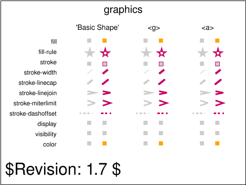
This test demonstrates how <set> elements change
graphics properties on elements from the 'Basic Shapes' chapter. For
each of the graphics properties being tested, 3
<set> elements are set. The first <set>
element acts directly on the 'Basic Shape' element. The
<set> element acts on a <g> containing
children. The third <set> element acts on an <a>
containing children. In each case the test validates that
the animated value set on the <g> and <a>
elements is inherited by the 'Basic Shape' element.
All the <set> elements have a begin attribute
set to 0s with an offset of 1s after end.
So, the animation will apply 1s after the document is loaded
and will repeat every 1s after the animation ends.
The first <set> validates the fill property, with
fill set to orange. When applied directly to the 'Basic Shape'
element, the <rect> fill value will change to orange
when it is translated to the right every 1s. When applied
to the <g> and <a> elements, the <rect>
inherits the fill value and is orange.
The second <set> validates the fill-style property,
with fill-style set to evenodd. When applied to the
'Basic Shape' element, the <polyline> fill-style is
changed from nonzero to evenodd. When applied to the
<g> and <a> elements, the <polyline> inherits
the evenodd fill-style.
the third <set> validates the stroke property.
In this case fill is set to none. When stroke is applied
to the 'Basic Shape' element, the <rect> on the right
appears with the stroke color. When applied to the <g> and
<a> elements, the <rect> inherits the stroke property.
the fourth <set> validates the stroke-width property,
with stroke-width set to 4. When stroke-width is applied
to the 'Basic Shape' element, the <line> on the right
has a width of 4. When applied to the <g> and
<a> elements, the <line> inherits the stroke-width.
the fifth <set> validates the stroke-linecap property,
with stroke-linecap set to round. When stroke-linecap is applied
to the 'Basic Shape' element, the <line> stroke-linecap
value switches from butt to round. When applied to the <g>
and <a> elements, the <line> inherits the
square stroke-linecap.
the sixth <set> validates the stroke-linejoin property,
with stroke-linejoin set to bevel. When stroke-linejoin is applied
to the 'Basic Shape' element, the <line> stroke-linejoin
value switches from miter to bevel. When applied to the <g>
and <a> elements, the <line> inherits the
bevel stroke-linejoin.
the seventh <set> validates the stroke-miterlimit property,
with stroke-miterlimit set to 10. When stroke-miterlimit
is applied to the 'Basic Shape' element, the miter-length to
stroke-width ratio exceeds the miter-limit and the
<polyline> switches from bevel to miter.When applied
to the <g> and <a> elements,the <line>
inherits the stroke-miterlimit.
the eighth <set> validates the stroke-dashoffset property,
with stroke-dashoffset set to 5.5. When stroke-dashoffset is applied
to the 'Basic Shape' element, the <line> has a different
dashing pattern. When applied to the <g> and <a>
elements, the <line> inherits the property.
the ninth <set> validates the display property,
with display set to none. When display is applied
to the 'Basic Shape' element, the <rect> does not
appear on the right. When applied to the <g> and <a>
elements, the <line> inherits the display property and
hence is not seen.
the tenth <set> validates the visibility property,
with visibility set to hidden. When visibility is applied
to the 'Basic Shape' element, the <rect> is hidden
on the right. When applied to the <g> and <a>
elements, the <line> inherits the visibility property
and hence is not seen.
the eleventh <set> validates the color property,
with color set to blue. When color is applied to the
'Basic Shape' element, the <rect> on the right
switches from default color of black to blue. When
applied to the <g> and <a>
elements, the <line> inherits the color property.
The eleventh <set> validates the color property, with
color set to orange. When applied directly to the 'Basic Shape'
element, the <rect> fill value will change to orange
when it is translated to the right every 1s. When applied
to the <g> and <a> elements, the <rect>
inherits the color value, and via its fill="currentColor"
becomes orange.
|
 animate-elem-80-t.svg animate-elem-80-t.svg |
VH |
CN |
accepted |
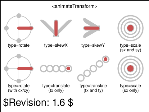
This test demonstrates validates the operation of the
animateTransform element and validates the operation
of the different type attribute values.
There are 5 possible values for the type attribute and
there is one animateTransform for each type and two for
the translate type.
For each transform type, the test has a corresponding animateTransform.
The test uses references to show what the expected transform should be
at different points in the animation. For example, the top left
animateTransform, for type=rotate, shows circular markers which turn
orange at the time of corresponding transform value should be set by the
animateTransform.
The marker elements show the expected transform value on reference
markers in the test.
|
 animate-elem-81-t.svg animate-elem-81-t.svg |
VH |
CN |
accepted |
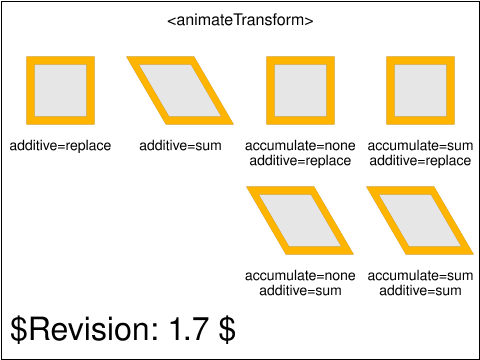
This test tests the operation of the animateTransform's
additive behavior.
The first two rectangles, on the top row, show the effect of the
additive attribute on animateTransform. The left-most
animateTransforms have their additive attribute set to replace,
so the effect of the two transform animation is as if only the
highest priority one applied because it replaces the underlying
value. The second animateTransforms (from left to right) have
their additive attribute set to sum, which means the transforms
they produce are concatenated.
The last two rectangles, on the top row, show the effect of the
accumulate attribute on animateTransform. For the left one
(third on the row, from left to right), the accumulate attribute
is set to none. There are two repeats for the
animateTransform. Therefore, the transform goes twice from a
scale(1,1) to a scale(2,2). For the right-most animateTransform,
the accumulate attribute is set to sum. There are two repeats
and the animation goes from scale(0,0) to scale(2,2) for the
first iteration and then from scale(2,2) to scale(4,4) (because
the result of the second iteration is added to the
scale(2,2) result of the previous, first iteration).
The rectangles on the bottom row show the combination of
additive and cumulative behavior. The left rectangle's
animateTransform accumulate behavior is set to none but its
additive behavior is set to sum. Therefore, the transform's
underlying value (skewX(30)) is always pre-concatenated to the
animateTransform's result, which goes from "skewX(30)
scale(1,1)" to "skewX(30) scale(2,2)" in each of its two
iterations. The right rectangle's animateTransform accumulate
behavior is set to sum and the additive behavior is also set to
sum. Therefore, the transform's underlying value is always
pre-concatenated, and repetitions of the scale animation
get added together. Consequently, the transform goes from "skewX(30)
scale(0,0)" to "skewX(30) scale(2,2)" for the first iteration
and then from "skewX(30) scale(2,2)" to "skewX(30)
scale(4,4)" for the second iteration.
|
 animate-elem-82-t.svg animate-elem-82-t.svg |
VH |
CN |
accepted |
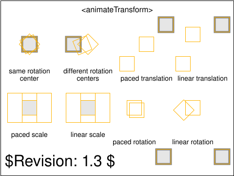
This test demonstrates validates the operation of
animateTransform with regards to the rotation center
and with regards to paced animation.
The following descriptions describe the various animations,
going top bottom, left to right. For each animation, orange
rectangle markers show the expected position for the animated rectangle
halfway through the animation. The markers are drawn with a thick
stroke for 0.2s, starting at the time when they reflect the
expected position.
The first animateTransform has type='rotate' and goes from
45 degrees to 90 degrees over a period of 3s. The rotation
center for the from and to values is 0, 0. At 0 seconds, the
expected transform should be rotate(45). At 1.5 seconds, the
expected transform is rotate(0.5 * (90 + 45)) = rotate(67.5).
At 3s, the expected transform is rotate(90).
The second animateTransform has type='rotate' but has a
rotation center that varies between the from and to values.
The rotation goes from rotate(45,0,0) to rotate(90,-15,-15).
At 0s, the expected transform is rotate(45,0,0).
At 1.5s, the expected transform is rotate(67.5, -7.5, -7.5).
At 3s, the expected transform is rotate(90, -15, -15).
The third animateTransform has type='translate' and calcMode='paced'.
The animation goes from translate(-40,40) to translate(-20,20) to
translate(40,-40).
At 0s, the expected transform is translate(-40,40).
At 1.5s, the expected transform is translate(0,0).
At 3s, the expected transform is translate(40,-40).
The fourth animateTransform has type='translate' and calcMode='linear'.
The animation goes from translate(-40,40) to translate(-20,-20) to
translate(40,-40).
At 0s, the expected transform is translate(-40,40).
At 1.5s, the expected transform is translate(-20,-20).
At 3s, the expected transform is translate(40,-40).
The fifth animateTransform has type='scale' and calcMode='paced'.
The animation goes from scale(1,2) to scale(3,2) to
scale(1,1).
At 0s, the expected transform is scale(1,2).
At 1.5s, the expected transform is scale(3,2).
At 3s, the expected transform is scale(1,1).
The sixth animateTransform has type='scale' and calcMode='linear'.
The animation goes from scale(1,2) to scale(3,2) to
scale(1,1).
At 0s, the expected transform is scale(1,2).
At 1.5s, the expected transform is scale(3,2).
At 3s, the expected transform is scale(1,1).
The seventh animateTransform has type="rotate" and calcMode='paced'.
The animation goes from rotate(0,0,0) to rotate(45,-15,-20) to
rotate(180,30,50). The total length along the rotation angle component
is (45 - 0) + (180 - 45) = 180. The total length along the rotation
center along the x axis is (0 - (-15)) + (30 - (-15)) = 45 + 15 = 60.
The total length along the rotation center along the y axis is
(0 - (-20)) + (50 - (-20)) = 20 + 70 = 90.
At 0s, the expected transform is rotate(45,-15,-20).
At 1.5s, the expected transform is rotate(90,0,5) to achieve constant
velocity along the rotation angle component, the x-axis rotation center
component and the y-axis rotation center component. At 1.5s, half the
distance has been run on each component. For the rotation angle, this
means that 45 has been reached and that 45 more degrees in the (45 <= r < 180)
interval have been consumed. For the x-axis rotation center, this means
that 30 units have been run: the (0 >= x > -15) interval has been fully consumed
(15 units long) and 15 units on the (-15 <= x < 30) interval have been consumed,
which explains the computed 0 value. For the y-axis rotation center, this
means that 45 units have been run: the (0 >= y > -20) interval has been fully
consumed and 25 units have been consumed in the (-20 <= y < 50) interval, which
explains the computed 5 value.
At 3s, the expected transform is rotate(180,30,50).
|
 animate-elem-83-t.svg animate-elem-83-t.svg |
VH |
CN |
accepted |
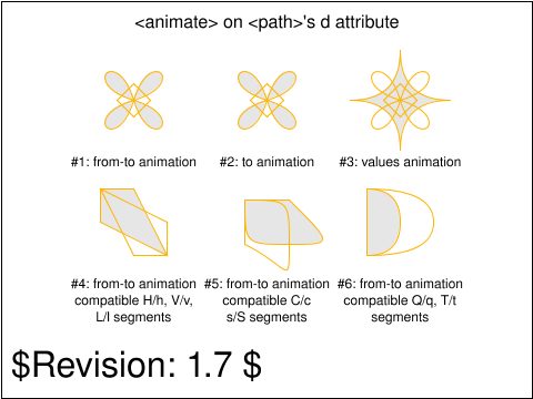
This test validates the operation of the animate element
on the <path> element's d attribute.
The following descriptions references to the tests by number. The first test
is the one showing on the top left. The last, sixth test is the one showing
at the bottom right. Test numbers are alocated from left to right and from
top to bottom.
For each test, there are reference outline markers which show the expected
animated shape at different times in the animation. At the time of the expected
shape, the outline of the expected shape is drawn with a thick stroke for 0.2s
so the test user can visually check that the shapes are matching at the
expected times.
The first test validates a simple from-to animation on a path's d attribute
made of M, C and Z commands where both the from and to attributes are specified.
The attributes are compatible with the path element's d attribute.
The second test validates a simple to-animation on a path's d attribute
made of M, C and Z commands where the to attribute is specified.
The attribute is compatible with the path element's d attribute.
The third test validates a simple values-animation on a path's d attribute
made of M, C and Z commands where the values attribute is specified and
specifies three seperate values.
The attribute is compatible with the path element's d attribute.
The fourth, fifth and sixth tests validate that interpolation between compatible
path values (i.e., path values which normalize to the compatible values) is
supported.
The fourth tests interpolation between a path value containing H, V and L commands
(in the from value) and a path value containing compatible h, v and l commands
(in the to value).
The fifth tests interpolation between a path value containing C and S commands
(in the from value) and a path value containing compatible c and s commands
(in the to value).
The sixth tests interpolation between a path value containing Q, T and A commands
(in the from value) and a path value containing compatible q, t and a commands
(in the to value).
|
 animate-elem-84-t.svg animate-elem-84-t.svg |
CL |
CC |
accepted |
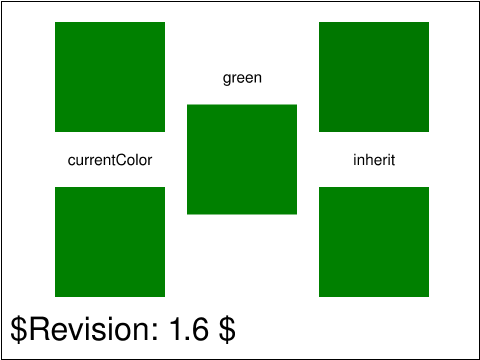
Test animation of color keywords that resolve to animatable RGB values.
|
 animate-elem-85-t.svg animate-elem-85-t.svg |
CL |
DJ |
issue |
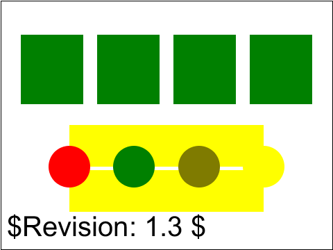
The first subtest tests animateColor with 'to' and 'from' values including
currentColor. The second subtest checks that the value of currentColor is the
current animated value of the color property, by animating the color property
at the same time as animating fill with a 'from' or 'to' value of currentColor.
|
 animate-elem-86-t.svg animate-elem-86-t.svg |
ED |
[empty] |
created |
[[Describe which section and what specific assertion is being tested
by the test. If the test has a number of sub tests, multiple
"testComponent" elements can be specified within the "testDescription"
element.]]
|
usesred |
 animate-elem-87-t.svg animate-elem-87-t.svg |
CM |
[reviewer] |
created |
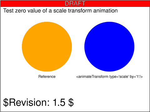
This tests that the underlying value of a scale transformation
is 0. Since SMIL defines a by animation as being equivalent
to an additive values animation where the first value is zero and
the second value is the by value, such an animation would
begin by post-multiplying a scale(0) transformation to
the element's underlying transform list.
|
usesred |
 animate-elem-88-t.svg animate-elem-88-t.svg |
CM |
CL |
accepted |
This tests that any which space before semicolon separators in
a values="" attribute on an animation element is ignored.
The test consists of a single rectangle whose height is animated
with a values=" 0 ; 50 " attribute.
|
 animate-elem-89-t.svg animate-elem-89-t.svg |
CL |
CM |
accepted |
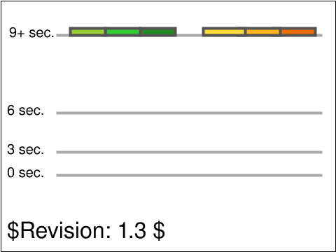
Tests clarification of value spacing of keySpline syntax; whitespace, or commas with optional whitespace, are allowed.
Test possible values for 'calcMode="spline"', with both commas, whitespace, and mixed separators
Six animations (three sets of two) have been defined. The three green ones on the left show rectangles which get smaller. The three orange ones on the right show rectangles of constant size, which move.
The black text and grey ruler lines help show the sizes and movement of the rectangles over time.
|
 animate-elem-90-b.svg animate-elem-90-b.svg |
CL |
ED |
accepted |
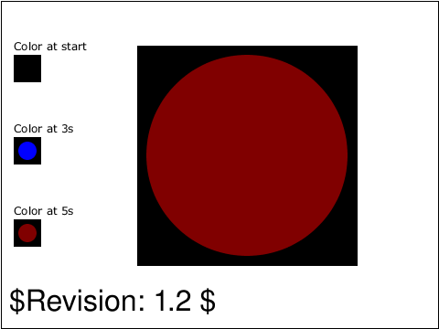
Test that the class attribute is animatable and that style
sheets select on the animated value.
|
 animate-elem-91-t.svg animate-elem-91-t.svg |
CM |
[reviewer] |
created |
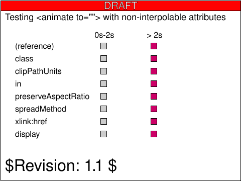
This tests that to-animations on attributes whose values cannot be
interpolated are treated as discrete animations.
|
usesred |
 animate-elem-92-t.svg animate-elem-92-t.svg |
CM |
ED |
accepted |
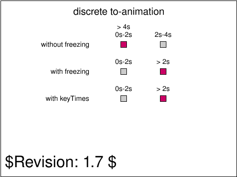
This tests checks the behavior of discrete to-animations.
|
 animate-interact-events-01-t.svg animate-interact-events-01-t.svg |
ASl |
AE |
accepted |
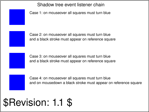
Tests 'mouseover' event on SVGElementInstance
What each case tests is as follows.
Case 1: mouseover event on SVGElementInstance. Referenceing an element that contains an event.
Case 2: mouseover event on referencing element. Event bubbling from SVGElementInstance to referencing element.
Case 3: mouseover event on parent of referencing element. Event bubbling from SVGElementInstance to referencing element ancestors.
Case 4: mousedown event on referencing element. SVGElementInstance is not effected by event listener on referencing element.
|
 animate-interact-pevents-01-t.svg animate-interact-pevents-01-t.svg |
ED |
SVGWG |
accepted |
This test tests 'pointer-events' on text. Initially you should see four big rects with black stroke.
In the uppermost rect there should be 10 'O':s with black fill.
In the second rect from the top there should be 10 'O':s with no fill but with black stroke.
In the third and fourth rects there should be no visible 'O':s at all.
In the fourth rect there should be two green rects, and in each of the other three rects there should be one green rect.
|
 animate-interact-pevents-02-t.svg animate-interact-pevents-02-t.svg |
AE |
DOH |
accepted |
Testing pointer-events and rendering order
|
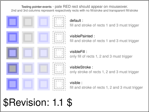 animate-interact-pevents-03-t.svg animate-interact-pevents-03-t.svg |
AE |
DOH |
accepted |
Tests the pointer-events attribute with different 'visible' values
The 2nd and 3rd columns represent respectively rects with no fill/stroke and transparent fill/stroke.
The 4th column (most right column) has a non activatable pointer event as the visibility of the column
is set to hidden.
The first row tests the default value for pointer-event, i.e. visible fill and stroke will trigger an event.
The second row tests pointer-events="visiblePainted", i.e. visible fill and stroke will trigger an event.
The third row tests pointer-events="visibleFill", i.e. visible fill only an event.
The fourth row tests pointer-events="visibleStroke", i.e. visible stroke only an event.
The fifth row tests pointer-events="visible", i.e. visible fill and stroke will trigger an event.
|
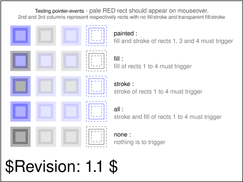 animate-interact-pevents-04-t.svg animate-interact-pevents-04-t.svg |
AE |
DOH |
accepted |
Tests the pointer-events attribute with different painting values
The 2nd and 3rd columns represent respectively rects with no fill/stroke and transparent fill/stroke.
The 4th column has visibility set to hidden.
The first row tests pointer-events="painted", i.e. event on fill and stroke that are set.
The second row tests pointer-events="fill", i.e. event on a fill that is set.
The third row tests pointer-events="stroke", i.e. even on a stroke that is et.
The fourth row tests pointer-events="all", i.e. event on fill and stroke that are set.
The fifth row tests pointer-events="none", i.e. no event.
|
 animate-pservers-grad-01-b.svg animate-pservers-grad-01-b.svg |
CC |
ED |
accepted |
This test shows rectangles filled with animated gradient which inherits some of their properties: stop-color, stop-opacity.
|
 animate-script-elem-01-b.svg animate-script-elem-01-b.svg |
CM |
CL |
accepted |
This tests that the 'xlink:href' attribute on the 'script' element is not animatable.
After loading the test and waiting one second, two rectangles
will appear, indicating the result of two sub-tests. The
upper rectangle reflects the result of testing that an
attempt to animate 'xlink:href' on 'script' does not affect
the .href.animVal of the element. The lower rectangle reflects
the result of testing that the animation attempt does not
cause a new script to be loaded and executed. Black indicates
that the sub-test did not run, red that it failed and green
that it passed.
|
 animate-struct-dom-01-b.svg animate-struct-dom-01-b.svg |
CM |
CL |
accepted |
This tests that calling SVGSVGElement.getCurrentTime() before the
document timeline has begun returns 0, and that
calling SVGSVGElement.setCurrentTime() before the document timeline
has begun will queue a seek to that time once the timeline
does begin.
After loading the test, two rectangles will be shown.
The left rectangle indicates whether SVGSVGElement.getCurrentTime()
correctly returned 0 before the document timeline had begun.
The right rectangles indicates whether a call to
SVGSVGElement.setCurrentTime() was acted upon once the timeline
did begin. For each rectangle, red indicates that the sub-test
failed and green indicates that the sub-test passed.
|
 color-prof-01-f.svg color-prof-01-f.svg |
Tim Thompson |
CL |
issue |
The purpose of this test is to determine if an application can apply ICC
color profiles to raster images. The same image is displayed twice; a color profile
is applied to one by the SVG, so that the colors change.
|
usesred |
 color-prop-01-b.svg color-prop-01-b.svg |
Chris Lilley |
SVGWG |
accepted |
This tests the 'color' property and the 'currentColor' value on fill, stroke, and stop-color properties.
|
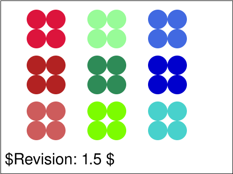 color-prop-02-f.svg color-prop-02-f.svg |
Chris Lilley |
SVGWG |
accepted |
Tests if the color datatype is supported. There are multiple syntaxes for
specifying the same color, such as #37F and #3377FF. This test is focussed on the
X11 color names, which are not part of the tiny profile.
Each group of circles uses four forms - 6-digit hex, rbg() integer form, rgb() percentage form,
and named ('X11') colors. It does not use 3-digit hex, because the colors used in this test
cannot be represented in three digit form.
|
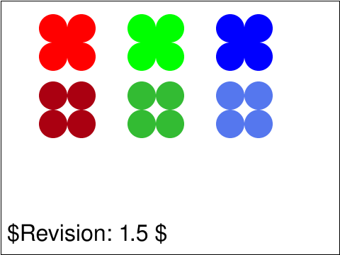 color-prop-03-t.svg color-prop-03-t.svg |
Chris Lilley |
SVGWG |
accepted |
Tests if the color datatype is supported. There are multiple syntaxes for
specifying the same color, such as #37F and #3377FF.
For each of the six groups shown here,
each of the circles in the group uses one of the syntactical forms
The first row uses five forms - 3-digit hex, 6-digit hex, rbg() integer form, rgb() percentage form,
and the 'HTML' subset of the name ('X11') colors.
The second row uses only four forms - 3-digit hex, 6-digit hex, rbg() integer form, rgb() percentage form -
as there are no HTML or X11 names for those colors.
|
usesred |
 color-prop-04-t.svg color-prop-04-t.svg |
CL |
[reviewer] |
accepted |
This tests the 'system' colors.
|
 color-prop-05-t.svg color-prop-05-t.svg |
CN |
CL |
accepted |
Tests the color that is used for the currentColor value in the fill
attribute when more than one color is specified.
This is illustrated using a single rectangle that is a child of a group
element. A fill is specified for the group element but not the
rectangle. Colour is specifed for the rectangle and the group element.
|
 paths-data-01-t.svg paths-data-01-t.svg |
Lofton Henderson |
CL |
accepted |
Test that the viewer can read gzipped content.
|
 conform-viewers-02-f.svg conform-viewers-02-f.svg |
ED |
CL |
issue |
Test that the viewer can read gzipped content in data uri.
|
 conform-viewers-03-f.svg conform-viewers-03-f.svg |
ED |
DS |
accepted |
This test checks that namespace prefixes are handled correctly.
First, a random 20-character string is generated. The string only contains characters that are valid NCName letters.
This string is then used as a custom prefix for an 'href' attribute in the XLink namespace.
An 'image' element is created and two image references are added, one is in the "http://www.this.is.not.an/xlink" namespace,
and one is in the XLink namespace. Only the attribute with the 20-character prefix is actually in the XLink namespace,
which means that that link should be the one that is used when rendering the 'image' element. This first subtest is
using the setAttributeNS method.
|
 coords-coord-01-t.svg coords-coord-01-t.svg |
CN |
DJ |
accepted |
Tests the default initial coordinate system used by renderer.
Should be 0,0 if not specified. This is illustrated by comparing blue boxes that are
missing a coordinate or all coordinates with yellow boxes that have the
correct coordinates specified.
|
 coords-coord-02-t.svg coords-coord-02-t.svg |
CN |
DJ |
accepted |
Tests the default units used for the initial coordinate system. This is
illustrated by comparing blue boxes that have no units specified for their
coordinates, with yellow boxes that have px units specified for their
coordinates.
|
 coords-dom-01-f.svg coords-dom-01-f.svg |
ED |
CM |
accepted |
Tests the liveness of SVGTransform.matrix.
|
 coords-dom-02-f.svg coords-dom-02-f.svg |
ED |
CM |
accepted |
Tests the liveness of SVGTransform.matrix, that the SVGTransform object is updated when the SVGTransform.matrix object is changed.
|
 coords-dom-03-f.svg coords-dom-03-f.svg |
CM |
ED |
accepted |
This tests that SVGTransformList.createSVGTransformFromMatrix(),
SVGSVGElement.createSVGTransformFromMatrix() and SVGTransform.setMatrix()
all do not track changes to the SVGMatrix passed to them.
After loading the test, three rectangles will be presented. The
upper rectangle indicates the result of testing whether
SVGTransformList.createSVGTransformFromMatrix() behaved correctly,
the middle rectangle indicates the status for SVGSVGElement.createSVGTransformFromMatrix(),
and the bottom rectangle for SVGTransform.setMatrix().
|
 coords-dom-04-f.svg coords-dom-04-f.svg |
ED |
CL |
accepted |
The test checks the SVGTransformList.consolidate method.
|
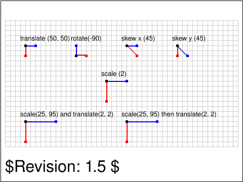 coords-trans-01-b.svg coords-trans-01-b.svg |
Vincent Hardy |
SVGWG |
accepted |
This test verifies the implementation of transforms. It tests elementary transforms
and transform nesting.
Note that for layout purposes, this test uses nesting of translation with the elementary transforms.
The test uses the rect element, the fill color (solid primary colors) and transforms.
|
usesred |
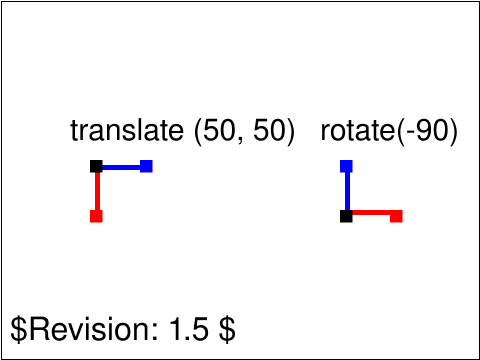 coords-trans-02-t.svg coords-trans-02-t.svg |
Vincent Hardy |
SVGWG |
accepted |
This test verifies the implementation of transforms. It tests elementary transforms
and transform nesting.
Note that for layout purposes, this test uses nesting of translation with the elementary transforms.
The test uses the rect element, the fill color (solid primary colors) and transforms.
|
usesred |
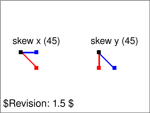 coords-trans-03-t.svg coords-trans-03-t.svg |
Vincent Hardy |
SVGWG |
accepted |
This test verifies the implementation of transforms. It tests elementary transforms
and transform nesting.
Note that for layout purposes, this test uses nesting of translation with the elementary transforms.
The test uses the rect element, the fill color (solid primary colors) and transforms.
|
usesred |
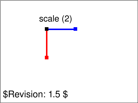 coords-trans-04-t.svg coords-trans-04-t.svg |
Vincent Hardy |
SVGWG |
accepted |
This test verifies the implementation of transforms. It tests elementary transforms
and transform nesting.
Note that for layout purposes, this test uses nesting of translation with the elementary transforms.
The test uses the rect element, the fill color (solid primary colors) and transforms.
|
usesred |
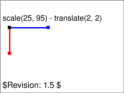 coords-trans-05-t.svg coords-trans-05-t.svg |
Vincent Hardy |
SVGWG |
accepted |
This test verifies the implementation of transforms. It tests elementary transforms
and transform nesting.
Note that for layout purposes, this test uses nesting of translation with the elementary transforms.
The test uses the rect element, the fill color (solid primary colors) and transforms.
|
usesred |
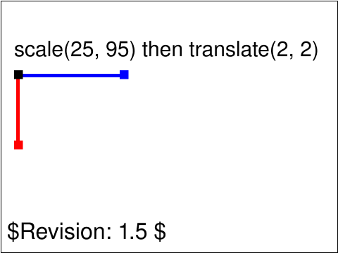 coords-trans-06-t.svg coords-trans-06-t.svg |
Vincent Hardy |
SVGWG |
accepted |
This test verifies the implementation of transforms. It tests elementary transforms
and transform nesting.
Note that for layout purposes, this test uses nesting of translation with the elementary transforms.
The test uses the rect element, the fill color (solid primary colors) and transforms.
|
usesred |
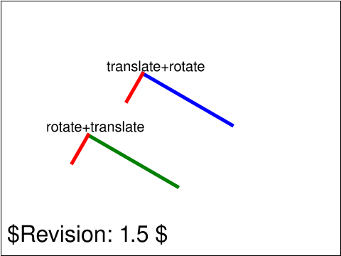 coords-trans-07-t.svg coords-trans-07-t.svg |
CN |
OA |
accepted |
This test verifies the implementation of transforms. It tests elementary transforms
and transform nesting.
Note that for layout purposes, this test uses nesting of translation with the elementary transforms.
The test uses the rect element, the fill color (solid primary colors) and transforms.
|
usesred |
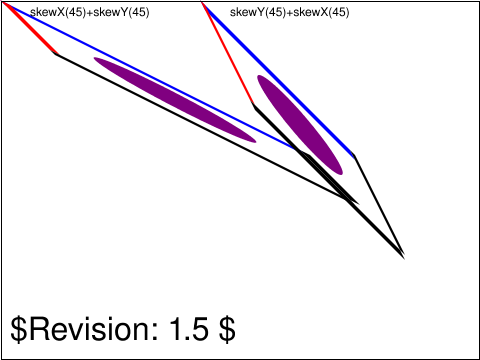 coords-trans-08-t.svg coords-trans-08-t.svg |
CN |
OA |
accepted |
This test verifies the implementation of transforms. It tests elementary transforms
and transform nesting.
Note that for layout purposes, this test uses nesting of translation with the elementary transforms.
This test will check if the transfomations performed are carried out in the proper order. The result should differ depending on which transformation comes first.
|
usesred |
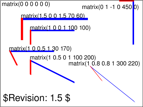 coords-trans-09-t.svg coords-trans-09-t.svg |
CN |
OA |
accepted |
This test verifies the implementation of transforms. It tests elementary transforms
and transform nesting.
Note that for layout purposes, this test uses nesting of translation with the elementary transforms.
This test will check if the various matrix operations work
|
usesred |
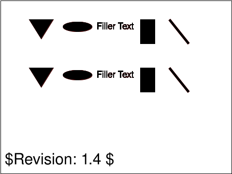 coords-trans-10-f.svg coords-trans-10-f.svg |
Microsoft |
CL |
accepted |
Translation is equivalent to the matrix [1 0 0 1 tx ty], where 'tx'
and 'ty' are the distances to translate coordinates in X and Y
respectively. The test overlays a group of black graphics elements
with a 'translate' transform specified on top of an identical group
of red elements with the equivalent 'matrix' transform and vice
versa.
|
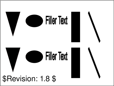 coords-trans-11-f.svg coords-trans-11-f.svg |
Microsoft |
CL |
accepted |
Scaling is equivalent to the matrix [sx 0 0 xy 0 0], where one unit in the X and Y directions in the new coordinate system equals 'sx' and 'sy' units in the previous coordinate system respectively.The test overlays a group of black graphics elements with a 'scale' transform specified on top of an identical group of red elements
with the equivalent 'matrix' transform and vice versa.
|
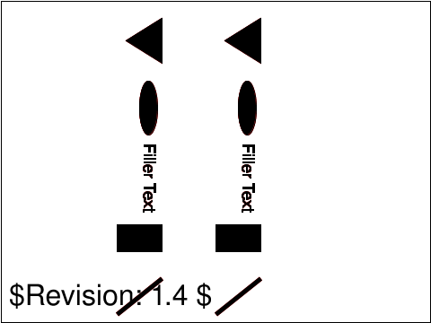 coords-trans-12-f.svg coords-trans-12-f.svg |
Microsoft |
CL |
accepted |
Rotation about the origin is equivalent to the matrix [cos(a) sin(a) -sin(a) cos(a) 0 0], which has the effect of rotating the coordinate system axes by angle 'a'. The test overlays a group of black graphics elements with a 'rotate' transform specified on top of an identical group of red elements
with the equivalent 'matrix' transform and vice versa.
|
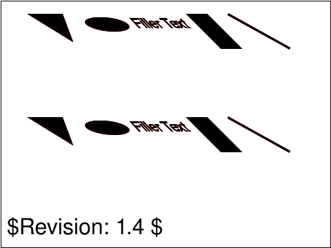 coords-trans-13-f.svg coords-trans-13-f.svg |
Microsoft |
CL |
accepted |
A skew transformation along the x-axis is equivalent to the matrix [1 0 tan(a) 1 0 0], which has the effect of skewing X coordinates by angle 'a'.
The test overlays a group of black graphics elements with a 'skewX' transform specified on top of an identical group of red elements
with the equivalent 'matrix' transform and vice versa.
|
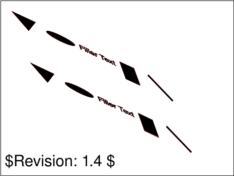 coords-trans-14-f.svg coords-trans-14-f.svg |
Microsoft |
CL |
accepted |
A skew transformation along the y-axis is equivalent to the matrix [1 tan(a) 0 1 0 0], which has the effect of skewing Y coordinates by angle 'a'.
The test overlays a group of black graphics elements with a 'skewY' transform specified on top of an identical group of red elements
with the equivalent 'matrix' transform and vice versa.
|
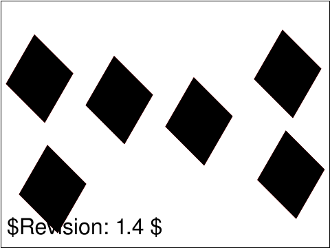 coords-transformattr-01-f.svg coords-transformattr-01-f.svg |
Microsoft |
CL |
accepted |
Tests that separating transform definitions by whitespace and/or a comma is supported. The test draws a red 'rect' element with a valid, non-delimited transform list. It overlays it with an identical black rectangle with
equivalent transform list delimted by commas and numerical Unicode references of space (U+0020), tab (U+0009), carriage
return (U+000D), line feed (U+000A), and combination of all five,
so that no red is visible.
|
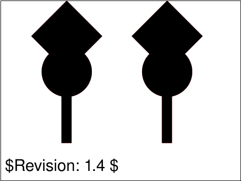 coords-transformattr-02-f.svg coords-transformattr-02-f.svg |
Microsoft |
CL |
accepted |
If a list of transforms is provided, then the net effect is as if each transform had been specified separately in the order provided.
The test overlays a black 'rect' with transform list on top of an equivalent red 'rect' with equivalent nested transforms, and vice
versa, so that there is no red visible on the page.p>
|
 coords-transformattr-03-f.svg coords-transformattr-03-f.svg |
Microsoft |
CL |
accepted |
If 'ty' is not specified for a 'translate' transform, it is assumed to be zero.
Specify a series of various red graphics elements. Specify an equivalent series of black graphics elements that are defined to have positions
that are shifted '10' user units to the right of the red graphics elements. Specify a 'transform' value of 'translate' with only the 'tx' value
specified (i.e., 'translate(10)'). If the 'ty' parameter takes the default value of '0' user units, there will be no red on the page.
|
 coords-transformattr-04-f.svg coords-transformattr-04-f.svg |
Microsoft |
CL |
accepted |
If 'sy' is not specified for a 'scale' transform, it is assumed to be equal to 'sx'.
Specify a series of various red graphics elements. Specify an equivalent series of black graphics elements that are defined to have dimensions
that are half the size as the red elements. Specify a 'transform' value of 'scale' with only the 'sx' value specified (i.e., 'scale(2)'). If the 'sy'
parameter takes the same value as the 'sx', there will be no red on the page.
|
 coords-transformattr-05-f.svg coords-transformattr-05-f.svg |
Microsoft |
CL |
accepted |
If 'cx' and 'cy' are not specified for a 'rotate' transform, the rotation is about the origin of the current user coordinate system and thus corresponds to the matrix [cos(a) sin(a) -sin(a) cos(a) 0 0].
Specify a series of various black graphics elements inside a 'g' element with 'transform' set to a 'rotate' value with unspecified 'cx'
and 'cy' parameters (i.e., 'rotate(15)'). Specify an equivalent series of red graphics elements inside a 'g' element with 'transform' set
to a 'matrix' value which would rotate the elements 15 degrees about the point (0,0) of the current user coordinate system. If the 'g' element containing the black elements correctly rotates its content by 15 degrees around the origin of the current user coordinate system, there will be no red on the page.
|
 coords-units-01-b.svg coords-units-01-b.svg |
Vincent Hardy |
SVGWG |
accepted |
Verify the conversion processing of percentage and fraction values relative to
object bounding boxes. This is used when defining linear and radial gradients
as well as patterns.
The test validates conversion for coordinates, width, height and length. The first
test defines three corresponding linear gradients, which specify coordinates
using percentages for one, fractions for the second and user coordinates for the
third. The second test defines three corresponding radial gradients, which specify
a length (radius) using percentages for the first, fractions for the second and
user space for the third. Finally, the third test defines three corresponding patterns,
which specify their width and height using percentages for the first, fractions for the
second and user space coordinates for the last one.
The test also assumes that linear and radial gradients,
as well as patterns are implemented.
|
 coords-units-02-b.svg coords-units-02-b.svg |
Vincent Hardy |
SVGWG |
accepted |
Verify the conversion processing of CSS units and percentage values for both
coordinates and length values. Note that the test uses the CSS px unit to be usable
in all pixel resolutions. Hence, the conversion from other CSS units to CSS px is
left out of the test.
There are six atomic tests in this test. For each, the approach is to draw two similar
elements (circles or rects) with coordinates specified in user space for one and in
CSS units or percentage for the other. Each test is such that these two values (or
value pairs) should match.
|
 coords-units-03-b.svg coords-units-03-b.svg |
Vincent Hardy |
SVGWG |
accepted |
This test verifies both the initial viewport size and the support for the various
unit specifiers.
The units in SVG can be: user coordinate and CSS units: em, ex, px, pt, pc, cm, mm,
in and percentages. The test does not check the absolute length accuracy as this
can only be truly validated with a ruler. However, it validates that the different
units are supported by drawing multiple elements who have the same length specified
in different units.
The viewport is the "finite rectangular region" where rendering occurs in SVG.
Hence, nothing should be rendered outside the viewport (paragraph 7.1). Furthermore,
when no positioning properties are set on the top svg element, the initial viewport
size should have the value of the top svg element's "width" and "height" attributes.
To check this behavior, the test does not define positioning properties on the top
svg element but defines its "width" and "height" properties. Then it fills a red
rectangle that is bigger than the viewport size. Then, a rectangle, the size of the
viewport is drawn in white. If rendering is limited to the viewport area, none of the
red should show.
The line showing the "ex" units will not necessarily appear with the same length
as shown in the reference image because the X-height of a font is not
necessarily half of the font size (which is assumed in the reference image where
1ex is considered to be .5em).
|
 coords-viewattr-01-b.svg coords-viewattr-01-b.svg |
Vincent Hardy |
SVGWG |
accepted |
This test verifies the implementation of the viewBox and the
preserveAspectRatio attribute. This is a modified version of the sample
file included in the SVG specification. It exercises the various
preserveAspectRatio values and uses a general entity definition in order
to make reading of the SVG source easier.
|
 coords-viewattr-02-b.svg coords-viewattr-02-b.svg |
Vincent Hardy |
SVGWG |
accepted |
This test verifies the implementation of the preserveAspectRatio attribute on <image>
referencing raster content.
|
 coords-viewattr-03-b.svg coords-viewattr-03-b.svg |
BB |
CL |
accepted |
This file tests the allowed syntax of the viewBox attribute. The viewBox attribute is a list of
four numbers min-x, min-y, width and height, separated by whitespace and/or a comma.
|
 coords-viewattr-04-f.svg coords-viewattr-04-f.svg |
ED |
[reviewer] |
created |
This test verifies the implementation of the preserveAspectRatio attribute on <image>
referencing svg content.
|
usesred |
 extend-namespace-01-f.svg extend-namespace-01-f.svg |
Jon Ferraiolo |
SVGWG |
accepted |
Test mixing a business data namespace with elements in SVG namespace.
The test case uses a different namespace to hold fake sales data.
Using ECMAScript to make calls to the DOM, the test case extracts
the sales data and then makes calls to the SVG DOM to build up
a 'path' element and a 'text' element for each individual pie slice.
|
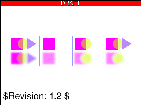 filters-background-01-f.svg filters-background-01-f.svg |
ED |
[reviewer] |
created |
Test background image processing.
The first subtest enables background image processing and adds an empty ‘g’ element
which invokes the ShiftBGAndBlur filter. This filter takes the current accumulated
background image (i.e., the entire reference graphic) as input, shifts its offscreen
down, blurs it, and then writes the result to the canvas. Note that the offscreen for
the filter is initialized to transparent black, which allows the already rendered
rectangle, circle and triangle to show through after the filter renders its own
result to the canvas.
The second subtest enables background image processing and instead invokes the
ShiftBGAndBlur filter on the inner ‘g’ element. The accumulated background at the
time the filter is applied contains only the rectangle. Because the children
of the inner ‘g’ (i.e., the circle and triangle) are not part of the inner ‘g’ element's
background and because ShiftBGAndBlur ignores SourceGraphic, the children of the inner ‘g’
do not appear in the result.
The third subtest enables background image processing and invokes the ShiftBGAndBlur on the
‘polygon’ element that draws the triangle. The accumulated background at the time the filter
is applied contains the rectangle plus the circle ignoring the effect of the ‘opacity’
property on the inner ‘g’ element. (Note that the blurred circle at the bottom does not
let the rectangle show through on its left side. This is due to ignoring the effect of
the ‘opacity’ property.) Because the triangle itself is not part of the accumulated background
and because ShiftBGAndBlur ignores SourceGraphic, the triangle does not appear in the result.
The fourth subtest is the same as the third except that filter ShiftBGAndBlur_WithSourceGraphic is
invoked instead of ShiftBGAndBlur. ShiftBGAndBlur_WithSourceGraphic performs the same effect as
ShiftBGAndBlur, but then renders the SourceGraphic on top of the shifted, blurred background
image. In this case, SourceGraphic is the blue triangle; thus, the result is the same as in
the fourth case except that the triangle now appears.
|
usesred |
 filters-blend-01-b.svg filters-blend-01-b.svg |
Jon Ferraiolo |
SVGWG |
accepted |
Verify correct operation of the five compositing modes
of the feBlend filter primitive. Seven rectangles are
blended into a gradient, with text strings identifying
which of the the five feBlend modes were used.
All rectangles but the fourth one have a blue fill, although the
blend mode will adjust this color. The fourth has a yellow fill.
The third and fourth rectangles are grouped and the filter is applied to the group.
|
usesred |
 filters-color-01-b.svg filters-color-01-b.svg |
Jon Ferraiolo |
SVGWG |
accepted |
Test which verifies the basic facilities of
feColorMatrix.
This test uses the following elements : a nested
<svg> with a viewBox attribute, <linearGradient>,
<filter>, <feColorMatrix>, <feComposite>.
The test case shows five rectangles filled with a
gradient showing the effects of feColorMatrix: an
unfiltered rectangle acting as a reference, use of the
feColorMatrix matrix option to convert to grayscale,
use of the feColorMatrix saturate option, use of the
feColorMatrix hueRotate option, and use of the
feColorMatrix luminanceToAlpha option.
The test is somewhat self-explanatory as the strings
document the type of feColorMatrix operation that is
being used.
|
 filters-color-02-b.svg filters-color-02-b.svg |
AG |
CM |
accepted |
Tests the default behaviour of feComponentTransfer
The test displays two rects with the same gradient fill. The gradient
fill has the stops red, green, blue and black all of which are evenly
spaced.
The first rect with the 'Reference' label beneath it has an
feComponentTransfer filter applied to it. This filter specifies a
'linear' transform for the Red component such that Red is transformed to
Black. The Green component is specified as an 'identity' transform. The
remaining components (Green, Alpha) are unspecified and by default
must be treated as 'identity' transforms.
The second rect with the 'Default' label beneath it has an
feComponentTransfer filter applied to it. This filter specifies a
multiple transforms from the Red component. The last transform
specified for the Red component is a 'linear' transform that shifts Red
to Black. This is the transform that should be used by a conforming
implementation. There are no other components specified for the filter
of the second rect. A conforming implementation should treat
unspecified components in an feComponentTransfer as 'identity'.
|
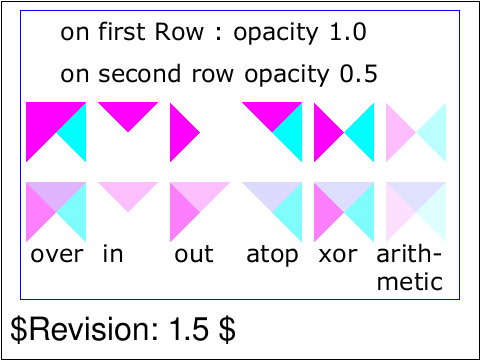 filters-composite-02-b.svg filters-composite-02-b.svg |
Jon Ferraiolo |
SVGWG |
accepted |
Test which verifies the basic facilities of feComposite.
This test uses the following elements: <path>, <filter>
<feImage> <feComposite>.
The test case shows six pairs of overlapping triangles
depicting the six different feComposite operators. The
first row shows compositing when both triangles have
opacity=1. The second row shows compositing when both
triangles have opacity=.5. The six columns illustrate the
six types of compositing operations.
|
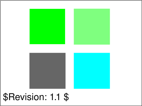 filters-composite-03-f.svg filters-composite-03-f.svg |
ED |
CL |
accepted |
Tests the arithmetic operator in feComposite.
|
 filters-composite-04-f.svg filters-composite-04-f.svg |
[author] |
[reviewer] |
empty |
Test feComposite and the arithmetic operator to implement a simple dissolve operation.
|
usesred |
 filters-composite-05-f.svg filters-composite-05-f.svg |
ED |
[reviewer] |
created |
Testing the feComposite element and that the 'k2' and 'k3' attributes
are animatable. The result is an animated dissolve between two images.
|
usesred |
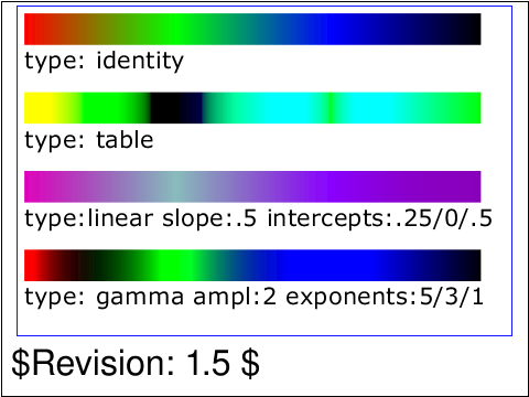 filters-comptran-01-b.svg filters-comptran-01-b.svg |
Jon Ferraiolo |
SVGWG |
accepted |
Test which verifies the basic facilities of
feComponentTransfer.
This test uses the following elements : a nested <svg>
with a viewBox attribute, <linearGradient>, <filter>,
<feComponentTransfer>.
The test case shows four rectangles filled with a
gradient showing the effects of feComponentTransfer: an
identity function acting as a reference, use of the
feComponentTransfer table option, use of the
feComponentTransfer linear option, and use of the
feComponentTransfer gamma option.
The test is somewhat self-explanatory as the strings
document the type of feComponentTransfer operation that
is being used.
|
usesred |
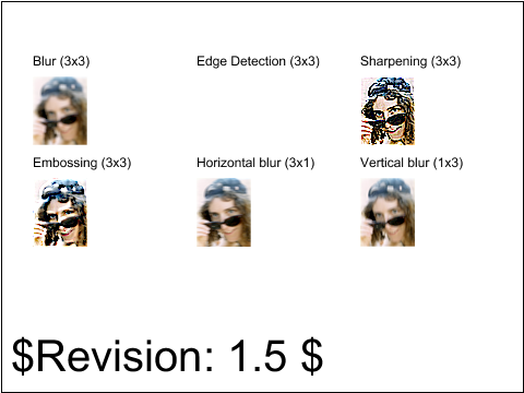 filters-conv-01-f.svg filters-conv-01-f.svg |
Vincent Hardy |
SVGWG |
accepted |
Test which verifies the basic facilities of
feConvolveMatrix.
This test defines six filters that exercise traditional
convolutions: uniform blur, vertical and horizontal
blurs, edge detection, embossing and sharpening. Note
that the edge detection filter produces a fully
transparent image because the alpha channel is convolved
and produces 0 values.
|
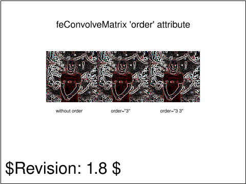 filters-conv-02-f.svg filters-conv-02-f.svg |
ED |
CM |
accepted |
Tests feConvolveMatrix with different values for the 'order' attribute.
|
usesred |
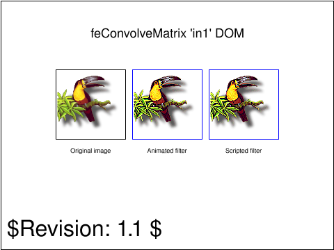 filters-conv-03-f.svg filters-conv-03-f.svg |
|
CM |
accepted |
Tests the 'in1' DOM attribute on 'feConvolveMatrix'.
Load the testcase, you should see three nearly identical images that say "FAIL".
After 3 seconds all three images should be replaced by the same image of a bird.
The two images to the right have filters applied, while the one on the left is always unfiltered.
|
usesred |
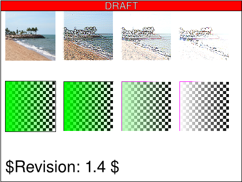 filters-conv-04-f.svg filters-conv-04-f.svg |
|
ED |
created |
Tests the 'bias' attribute on 'feConvolveMatrix'.
The test uses a raster image and a vector graphic to test the effect
that the 'bias' attribute on 'feConvolveMatrix' has.
The first row of images in the test are four identical raster images.
The first image is the original unfiltered image. The second has the
filter kernel applied with no bias value specified. The third and fourth
images both have a bias value specified for the filter.
The second row of images in the test are four rectangle objects with a
gradient fill. The gradient fill transitions from opaque green to
transparent green. The first image is the original unfiltered graphic. The
second graphic has a filter kernel applied with no bias value specified.
The third and forth images both have a bias value specified for the
filter.
Behind each filter result there's a checkerboard pattern placed, to help
verify that there's transparency in the lower row, but not in the upper.
|
usesred |
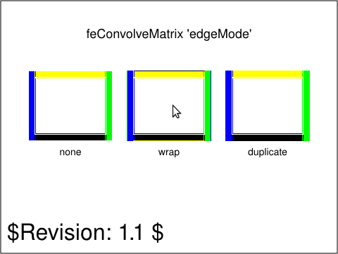 filters-conv-05-f.svg filters-conv-05-f.svg |
ED |
CM |
empty |
Tests feConvolveMatrix and the 'edgeMode' attribute.
|
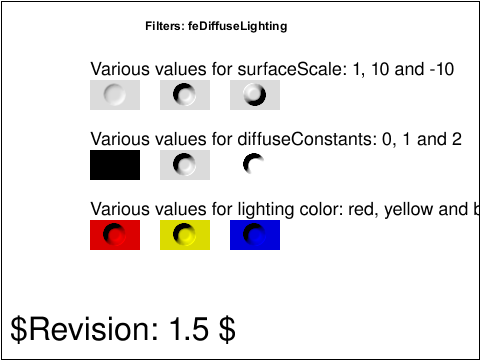 filters-diffuse-01-f.svg filters-diffuse-01-f.svg |
Vincent Hardy |
SVGWG |
accepted |
Verify the basic operation of the feDiffuseLighting
element. The test shows three rows of 3 images. Each
rows tests a different aspect of the filter and shows
the result of the filtering operation.
The first row shows the result of varying the
surfaceScale attribute. The second row shows the result
of varying the diffuse constant (kd) attribute. The last
row shows the result of varying the lighting-color
property.
|
usesred |
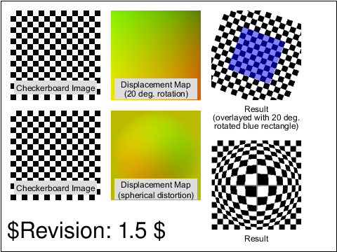 filters-displace-01-f.svg filters-displace-01-f.svg |
Peter Graffagnino |
SVGWG |
accepted |
Verify the basic capability to handle the feDisplacementMap filter
node. Six images should appear in 2 rows of 3. On the left in each
row a test image of a checker board is displayed. In the middle
column is the displacement map. In the right-hand column is the
result. All displacement maps are generated as png files with gamma
1.0 and must be interpreted linearly for the proper geometric
displacement to occur.
The top row tests a displacement map which displaces each pixel by an
amount equivalent to a rotation of 20 degrees around the center of the
image. A blue reference rectangle is drawn on the result using an svg
transform attribute to mimick the same 20 degree rotation. The edges
of the blue rectangle should be parallel to the grid lines in the
displaced image. Distortion of the grid pattern such that the grid
lines are slightly curved is indicative of improper gamma handling in
the viewer.
The bottom row tests a displacement map which distorts the image
spherically.
In addition to feDisplacementMap, this test uses the 'feImage' and
'rect' elements. Figure labeling uses the text element. The
reference blue rectangle uses fill, fill-opacity, and transform.
|
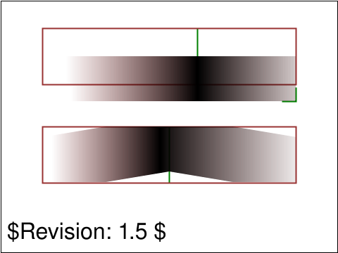 filters-displace-02-f.svg filters-displace-02-f.svg |
CL |
ED |
accepted |
This tests feDisplacementMap without feImage. The input geometry is also used as the displacement map.
The bottom subtest tests that not specifying the 'xChannelSelector' attribute has the same effect as if 'A' was specified.
In both cases the filter input image consists of a gradient that is rendered using the default 'color-interpolation' which is 'sRGB'.
The default colorspace for filter primitives is 'linearRGB'. The filtering operation happens in 'linearRGB' space and the
result is then transformed back to 'sRGB' space for display.
|
 filters-example-01-b.svg filters-example-01-b.svg |
Jon Ferraiolo |
SVGWG |
accepted |
A single filter that uses a combination of filter
primitives. You should see a gray rectangle that
contains a green outer ring and a green inner button
with "SVG" on it, both having a 3D appearance.
Verify that a typical usage of filtering is operation.
This test case creates a 3D lighting effect and requires
that several filters are working: feGaussianBlur, feOffset,
feSpecularLighting, feComposite and feMerge. The graphic
consisting of the string "SVG" sitting on top of oval
filled in green and surrounded by an oval outlined in green.
The test uses a nested 'svg' element, 'rect' element,
'path' element, as well as basic fill (solid
colors), stroke (solid colors with stroke-width
lines), font-family (Verdana and Arial) and font-size properties.
|
 filters-felem-01-b.svg filters-felem-01-b.svg |
CL |
BB |
accepted |
Test which verifies null filters and filter regions.
Four subtests each consist of a small red circle overdrawn with a larger green circle.
Filters are applied to three of the red circles, hiding them and showing the green circle.
The top left subtest has no filter applied to the circle, so the green circle is visible and the red one is not.
The top right subtest applies a filter to the red circle, but there is no corresponding filter element.
Thus, a null filter is applied and the red circle is not shown, allowing the green circle to be seen.
The bottom left subtest applies an empty filter element with the default filterRegion, and the bottom right
subtest applies an empty filter with a non-default filterRegion. In both cases where empty filters are applied,
the result of the filter is a transparent black offscreen, thus showing the green circle underneath.
|
 filters-felem-02-f.svg filters-felem-02-f.svg |
ED |
TB |
accepted |
This tests the 'primitiveUnits' attribute and how it affects other attribute values.
|
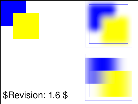 filters-gauss-01-b.svg filters-gauss-01-b.svg |
Tim Thompson |
SVGWG |
accepted |
In the upper left corner of the output are blue and yellow rectangles that overlap,
they appear normally, no gaussianBlur has been applied.
In the upper right the same rectangles are displayed with a blur filter applied,
the standard deviation is the same for both the x and y axis.
In the lower right corner the rectangles appear again,
this time the standard deviation is different along the x (20) and y (1) axis.
On top of the rectangles in the upper right and lower right, thin (half-pixel-wide) blue
lines are drawn to show the outline of the object bounding box (the inside lines) and the
outline of the filter region (the outside lines). The blur effect should be clipped
to the bounds of the filter region.
The test uses the 'rect' element, as well as basic fill (solid primary colors),
stroke (black 1-pixel and blue half-pixel lines), font-family (Arial) and font-size properties.
|
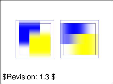 filters-gauss-02-f.svg filters-gauss-02-f.svg |
ED |
TB |
accepted |
Test that when 'stdDeviation' is zero in one of X or Y the filter input image is
blurred only in the non-zero direction.
|
 filters-gauss-03-f.svg filters-gauss-03-f.svg |
ED |
TB |
accepted |
Test that when 'stdDeviation' is zero the result is a non-blurred image.
|
 filters-image-01-b.svg filters-image-01-b.svg |
Tim Thompson |
SVGWG |
accepted |
An image should be displayed in the middle of the view area.
|
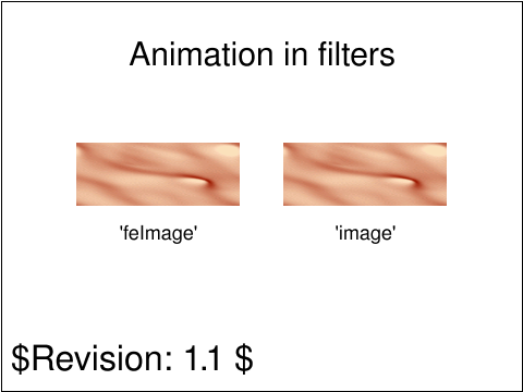 filters-image-02-b.svg filters-image-02-b.svg |
ED |
CM |
accepted |
Tests the animatability of 'xlink:href' on the 'feImage' element.
The test will first show two blue images that should look exactly the same,
then after two seconds both images should simultaneously change to show two
pink images that also look exactly the same.
|
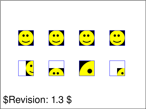 filters-image-03-f.svg filters-image-03-f.svg |
ED |
TB |
accepted |
This tests the feImage element with a number of different filter primitive subregion values.
|
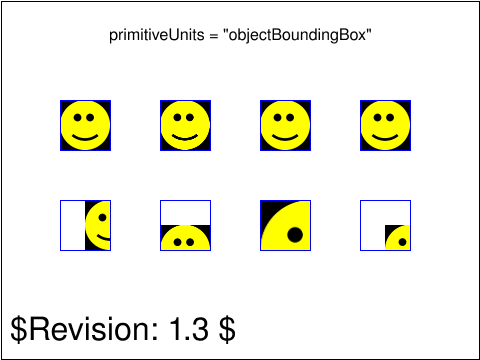 filters-image-04-f.svg filters-image-04-f.svg |
TB |
ED |
accepted |
This tests the feImage element with a number of different filter primitive subregion values.
|
 filters-image-05-f.svg filters-image-05-f.svg |
Tavmjong Bah |
ED |
accepted |
This test verifies the implementation of the preserveAspectRatio attribute on <feImage>
referencing raster content.
|
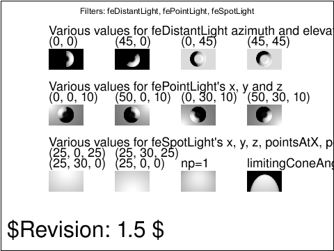 filters-light-01-f.svg filters-light-01-f.svg |
Vincent Hardy |
SVGWG |
accepted |
Verify the basic operation of the different lights used in the feDiffuseLighting
and feSpecularLighting elements. The test uses the same feDiffuseLighting filter,
using different lights.
The first row shows different settings for feDistantLight. The second row shows
different settings for fePointLight. The last row shows different settings for
feSpotLight.
|
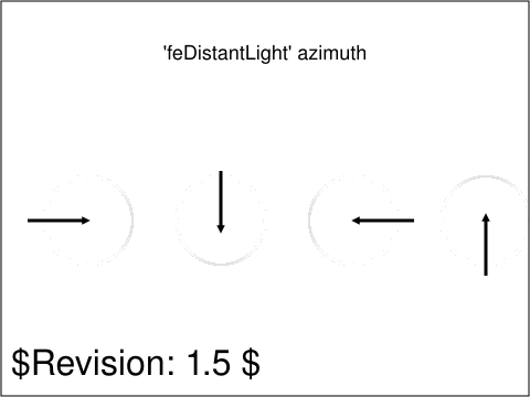 filters-light-02-f.svg filters-light-02-f.svg |
ED |
CM |
accepted |
This test verifies that the 'azimuth' attribute is interpreted as a clockwise value in degrees.
The test should show four arrows, indicating the direction of the incoming distant light.
As the four circles are lit by a specular lighting filter a faint shaded arc should appear.
The middle of each such arc should be where the corresponding arrow points.
|
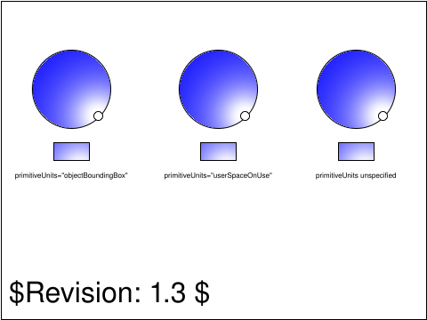 filters-light-03-f.svg filters-light-03-f.svg |
ED |
CL |
accepted |
Test resolving of 'primitiveUnits' on the 'z' attribute of 'fePointLight'.
You should see some shapes that have a black border, three circles and three rectangles.
The fill of these shapes should look the same.
|
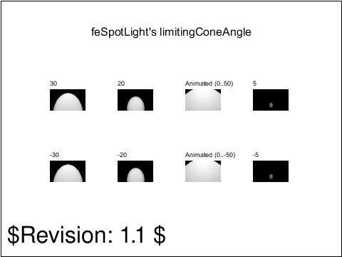 filters-light-04-f.svg filters-light-04-f.svg |
ED |
CL |
accepted |
Test various values for limitingConeAngle in feSpotLight.
There should be four rects in two rows. Each of the rects has a different filter applied,
and each of those filters uses different values for limitingConeAngle.
|
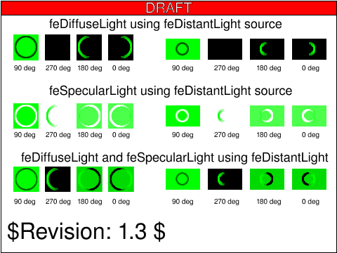 filters-light-05-f.svg filters-light-05-f.svg |
AG |
ED |
reviewed |
This test verifies that the 'elevation' attribute is interpreted as a
complementary value to the z-axis in degrees.
The test shows four different elevation angles that can be used for feDistantLight source.
The four different feDistantLight light sources are used in three different filter cases; feDiffuseLight, feSpecularLight
and feMerge which merges both feDiffuseLight and feSpecularLight to form a single filter. Using four different elevation values
in three different filter cases gives twelve different filters. All twelve filter cases are applied to a vector graphic and
then to a raster graphic. The vector graphic results are shown to the left and the raster graphic results are shown to the right.
|
usesred |
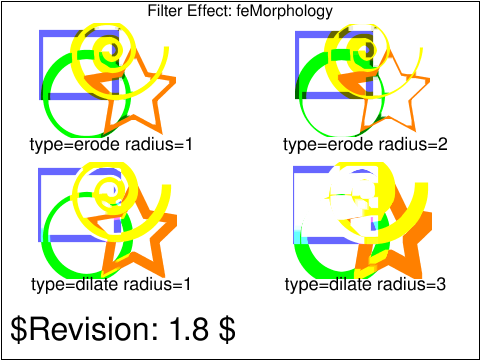 filters-morph-01-f.svg filters-morph-01-f.svg |
Jon Ferraiolo |
SVGWG |
accepted |
Test which verifies the basic facilities of feMorphology.
The test shows the same graphics filtered with four different feMorphology
settings. The top two have the type erode and a radius of 1(left) and 2(right).
The bottom two have the type dilate and a radius of 1(left) and 3(right).
|
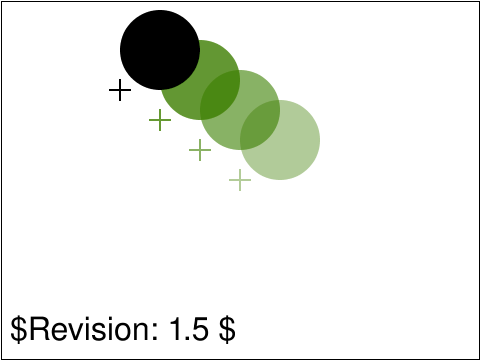 filters-offset-01-b.svg filters-offset-01-b.svg |
Peter Graffagnino |
SVGWG |
accepted |
The target crosshairs should align with
lower left bounds of the associated circle.
The color of each crosshair should match
the associated circle.
Verify the basic capability to handle the feOffset, feMerge and
feFlood filter nodes. Four copies of a filled circle should appear at
various offsets and colors. For each circle a reference crosshair is
drawn at the lower left of the circle to indicate the expected color,
opacity and position for the filtered element. The targets are drawn
with the standard svg path element.
In addition to feFlood, feMerge, and feOffset, this test uses
'feComposite' to recolor the SourceGraphic with the feFlood color.
The source graphic uses 'circle'. The target cross hairs are drawn
with 'path' and use 'fill' and 'fill-opacity'.
|
 filters-offset-02-b.svg filters-offset-02-b.svg |
ED |
[reviewer] |
created |
Tests primitiveUnits="objectBoundingBox" and relative values.
There should be three green rectangles with thick black stroke.
|
usesred |
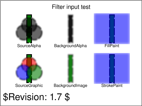 filters-overview-01-b.svg filters-overview-01-b.svg |
BB |
CL |
accepted |
The purpose of this file is to test the 'in' attribute on filter primitives.
|
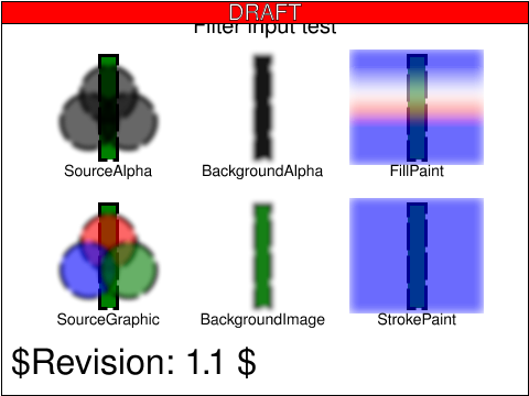 filters-overview-02-b.svg filters-overview-02-b.svg |
BB |
CL |
created |
The purpose of this file is to test the 'in' attribute on filter primitives.
This test is the same as filters-overview-01-b.svg but uses gradients with gradientUnits="userSpaceOnUse" instead for the
FillPaint/StrokePaint.
|
usesred |
 filters-overview-03-b.svg filters-overview-03-b.svg |
BB |
CL |
created |
The purpose of this file is to test the 'in' attribute on filter primitives.
|
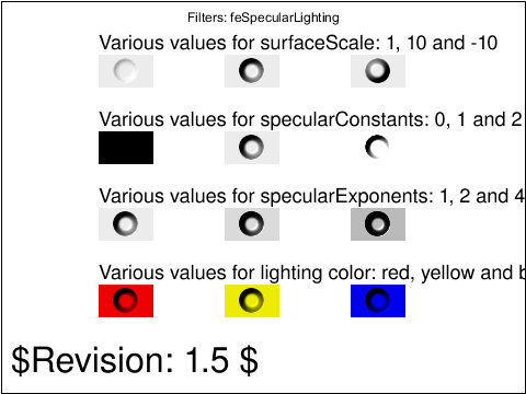 filters-specular-01-f.svg filters-specular-01-f.svg |
Vincent Hardy |
SVGWG |
accepted |
Verify the basic operation of the feSpecularLighting element. The test shows
four rows of 3 images. Each row tests a different aspect of the filter and
shows the result of the filtering operation.
The first row shows the result of varying the surfaceScale attribute. The second
row shows the result of varying the specular constant (ks) attribute. The third
row shows the result of varying the specular exponent (np) attribute. The last
row shows the result of varying the lighting-color property.
|
usesred |
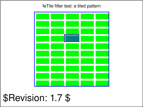 filters-tile-01-b.svg filters-tile-01-b.svg |
Rick Graham |
SVGWG |
accepted |
The test case constructs a filter that uses feTile to tile the entire specified filter region.
The tile consists of a green rectangle over a larger transparent rectangle.
The green rectangle is created with feFlood and feOffset. There is also a semi-transparent
blue rectangle that should exactly cover one of the tiled rectangles, creating a purple
tile with a black stroke (4 tiles down and 3 across).
The test uses the 'rect' element, feTile, feFlood, feOffset, feMerge, fill style, stroke,
font-family and font-size properties.
|
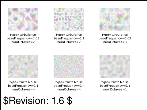 filters-turb-01-f.svg filters-turb-01-f.svg |
Jon Ferraiolo |
SVGWG |
accepted |
Test which verifies the basic facilities of feTurbulence. Six rectangular areas showing the
effects of various parameter settings for feTurbulence. The sample image indicates the
parameter settings to produce the given image.
|
 filters-turb-02-f.svg filters-turb-02-f.svg |
ED |
CM |
accepted |
This tests the 'seed' attribute on 'feTurbulence'.
|
 fonts-desc-01-t.svg fonts-desc-01-t.svg |
CN |
CN |
issue |
This tests case show the behaviour of CSS font matching
based on the font-size attribute.
|
usesred |
 fonts-desc-02-t.svg fonts-desc-02-t.svg |
CN |
CN |
accepted |
This tests the behaviour of CSS font matching based on font-variant attribute.
The first line of text tests that the small-caps font is used for the second text element.
The second line of text tests that the order of font specification does not effect the selection
of these fonts.
The third line of text tests that the correct font is selected when a font in the list does not support
the variant required. Note that the fonts provide no x-height so scaling
(allowed by CSS) cannot be used to simulate a small cap from a regular font.
The last line tests if small-caps are synthesized.
|
 fonts-desc-03-t.svg fonts-desc-03-t.svg |
CN |
CL |
accepted |
This test demonstrates CSS font matching based on the
font-weight attribute.
The first line tests selecting a bold font.
The second line tests that order of font definition does not
effect selection.
The last line tests basic font-weight selection using
font-weight numbers.
|
 fonts-desc-04-t.svg fonts-desc-04-t.svg |
CN |
CL |
reviewed |
This test demonstrates CSS font matching based on the
font-style attribute.
The first line of text tests selecting an italic font.
The second line tests that order of font definition
does not effect correct matching.
The third line tests selecting an italic and an oblique font.
Italic can match against oblique or italic, but all other values must match exactly.
The letter 'a' will be an UA-dependent default font-family,
it should be oblique, possiblely a transformation of a
normal font.
|
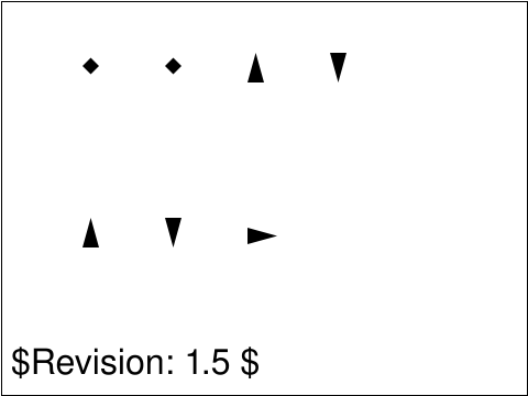 fonts-desc-05-t.svg fonts-desc-05-t.svg |
CN |
CL |
reviewed |
This tests a combination of font attribute matching.
|
 fonts-elem-01-t.svg fonts-elem-01-t.svg |
Dean Jackson |
SVGWG |
accepted |
This is a basic test for embedded SVG fonts. The font "Comic Sans"
(available from Microsoft) has been converted into an SVG font and embedded
in the SVG file. The test contains two text areas, each with the character
string "AyÖ@ç" drawn at the same font size.
The upper area contains the glyphs from the embedded font placed in
the SVG file as path elements. Each glyph is placed at the location it
would be if rendered using normal text rendering (ie. the horizontal
advance between characters has been preserved).
The lower area contains the text string rendered using the embedded
SVG font. It should appear exactly the same as the upper text area,
ie. font size, character baseline and horizontal advance should be
the same.
|
 fonts-elem-02-t.svg fonts-elem-02-t.svg |
Dean Jackson |
SVGWG |
accepted |
This is an accuracy test for embedded SVG fonts. The font "Comic Sans"
(available from Microsoft) has been converted into an SVG font and embedded
in the SVG file. The test contains two text areas, each with the character
string "AyÖ@ç" drawn at the same font size.
The upper area has the placed glyphs as path elements filled with
white over a solid black background (creating a white cutout). The
embedded SVG font text is then drawn over the cutout.
The lower area is the reverse of the upper area, with the placed
black glyphs filling the cutout created by white SVG font text.
An implementation that passes this test should completely fill the
cutout, leaving a solid black area (some slight antialiasing effects
may remain).
|
 fonts-elem-03-b.svg fonts-elem-03-b.svg |
Dean Jackson |
SVGWG |
accepted |
This is a basic test for external SVG fonts. The font "Comic Sans"
(available from Microsoft) has been converted into an SVG font and placed
in an external SVG file referenced by a font-face-src element.
The test contains two text areas, each with the character
string "AyÖ@ç" drawn at the same font size.
The upper area contains the glyphs from the font placed in
the SVG file as path elements. Each glyph is placed at the location it
would be if rendered using normal text rendering (ie. the horizontal
advance between characters has been preserved).
The lower area contains the text string rendered using the external
SVG font. It should appear exactly the same as the upper text area,
ie. font size, character baseline and horizontal advance should be
the same.
|
 fonts-elem-04-b.svg fonts-elem-04-b.svg |
Dean Jackson |
SVGWG |
accepted |
This is a basic test for external SVG fonts. The font "Comic Sans"
(available from Microsoft) has been converted into an SVG font and placed
in an external SVG file referenced by a CSS stylesheet with an @font-face rule.
The test contains two text areas, each with the character
string "AyÖ@ç" drawn at the same font size.
The upper area contains the glyphs from the font placed in
the SVG file as path elements. Each glyph is placed at the location it
would be if rendered using normal text rendering (ie. the horizontal
advance between characters has been preserved).
The lower area contains the text string rendered using the external
SVG font. It should appear exactly the same as the upper text area,
ie. font size, character baseline and horizontal advance should be
the same.
|
 fonts-elem-05-t.svg fonts-elem-05-t.svg |
VH |
CN |
accepted |
This tests the horiz-origin-x attributes on the font and glyph elements.
|
 fonts-elem-06-t.svg fonts-elem-06-t.svg |
VH |
CN |
accepted |
This test validates that the font element's horiz-adv-x is used as
the default glyph's advance when there is no glyph advance specified.
All fonts have a units-per-em of 1000.
The first row shows a layout with a default advance of 1000.
Glyphs have no advance so the 1000 default should be used.
The second row shows a layout with a default advance of 2000.
Glyphs have no advance so the 2000 default should be used.
The last row shows a layout with a default advance of 0.
Glyphs have a specified advance so the 0 default should be ignored.
Blue reference markers show the expected glyph positions.
|
 fonts-elem-07-b.svg fonts-elem-07-b.svg |
CL |
BB |
accepted |
This is a basic test for embedded SVG fonts. The font "Comic Sans"
(available from Microsoft) has been converted into an SVG font and embedded
in the SVG file. The test contains two text areas, each with the character
string "AyÖ@ç" drawn at the same font size.
The upper area contains the glyphs from the embedded font placed in
the SVG file as path elements. Each glyph is placed at the location it
would be if rendered using normal text rendering (ie. the horizontal
advance between characters has been preserved).
The lower area contains the text string rendered using the embedded
SVG font, referenced with a CSS @font-face declaration. The SVG font does not have a font-family attribute, so the reference is via the @font-face block which points to a font element by ID. It should appear
exactly the same as the upper text area,
ie. font size, character baseline and horizontal advance should be
the same.
|
 fonts-glyph-02-t.svg fonts-glyph-02-t.svg |
CN |
CL |
accepted |
The first subtest tests the arabic-form attribute on the glyph element,
the second subtest is the same, but with glyphs for the letter khah.
It should match the reference image.
|
 fonts-glyph-03-t.svg fonts-glyph-03-t.svg |
CN |
CL |
issue |
ISSUE: http://www.w3.org/2011/02/27-svg-irc#T22-20-51 - unapprove test for now
This files tests the lang attribute support of the glyph
element. The test should produce an upward-triangle for
the first (en) test element and a square for the second (fr)
and third (fr-ca) text element. In the third case, a glyph for
fr is also suitable for a more specific language text fr-ca.
In the fourth case, no suitable language specific or general
glyph is provided by the test so a fallback font for the letter
'a' should be used. A triangle or square must not be
displayed in the fourth case.
|
 fonts-glyph-04-t.svg fonts-glyph-04-t.svg |
CN |
CL |
accepted |
This tests that glyph selection is done in the
order in the definition of the font element.
The first line of text should be represented by
two triangles and an 'l'. The second line should
be represented by a square.
|
 fonts-kern-01-t.svg fonts-kern-01-t.svg |
VH |
CN |
accepted |
This test validates handling of the hkern element.
In all instances, a text element matching a font with hkern
is displayed along with reference markers showing the expected
glyph positioning.
The 'fontA' cell shows the string "12" with "fontA" for which there
in a kerning pair defined with u1="1" and u2="2".
The 'fontB' cell shows the string "12" with "fontB" for which there
in a kerning pair defined with g1="gl_1" and g2="gl_2",
where "gl_1" has unicode="1" and "gl_2" has unicode="2".
The 'fontC' cell shows the string "1234" with "fontC" were the same kerning pair
uses u1/u2 to match "12" and g1/g2 to match "34".
The 'fontD' cell shows the string "1234" with "fontD" were the same kerning pair
uses u1/u2 to match "12" and "34" (u1/u2 are lists of character vales).
The 'fontE' cell shows the string "1234" with "fontE" were the same kerning pair
uses g1/g2 to match "12" and "34" (g1/g2 are lists of names).
The 'fontF' cell shows the string "1234" with "fontF" were the same kerning pair
uses u1/u2 to match "12" and "34" (u1/u2 are unicode ranges).
The 'fontG' cell shows the string "12" with "fontG" were for which there
is a kerning pair with u1 matching "1" and g2 matching "gl_2".
|
usesred |
 fonts-overview-201-t.svg fonts-overview-201-t.svg |
CL |
AE |
accepted |
This tests a range of values for the 'units per em' attribute.
The same glyph is defined three times in three fonts, but with different values
for units-per-em - 1,000, 10, and 10,000 - and with the other numerical values
that depend on units-per-em scaled accordingly. Text using these fonts must all be displayed at the same size,
because the same font-size is used throughout.
|
 imp-path-01-f.svg imp-path-01-f.svg |
Microsoft |
CL |
reviewed |
Tests that markers are drawn on zero-length 'path' and 'line' segments.
|
 interact-cursor-01-f.svg interact-cursor-01-f.svg |
Chris Lilley |
SVGWG |
accepted |
Purpose of test is to determine if the cursor property and cursor element are
supported.
|
 interact-dom-01-b.svg interact-dom-01-b.svg |
Vincent Hardy |
SVGWG |
accepted |
Verify basic support for DOM event listener registration. The root svg element
has an onload handler where a click event listener is registered on group element 'Start Button'.
If UI events listener registration is supported (and UI events),
when the user clicks on the button a text node is inserted reading "Event Listeners supported".
At the end of the test, the start test button is changed to green,
and the click event listener is removed from the the start button.
Subsequent clicks on the start button should cause no effect if
the event listener has been removed successfully.
If additional lines of text appear in the document that say "Event Listeners supported",
then the implementation has not successfully removed the event listener.
|
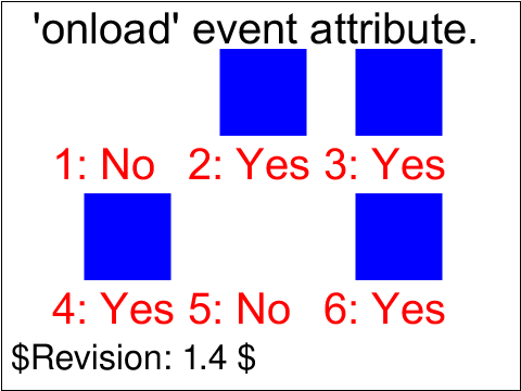 interact-events-01-b.svg interact-events-01-b.svg |
Jon Ferraiolo |
SVGWG |
accepted |
Test 'onload' event attribute.
Six blue rectangles have been defined, each initially defined with
'visibility:hidden'. 'onload' event attributes are assigned in
a variety of ways, usually to set 'visibility:visible'.
The red text indicates the correct behavior
(whether a given rectangle should appear in the visual result).
The first rectangle has no associated 'onload' event so it remains invisible.
The second rectangle has an 'onload' event on itself, which invokes a script
which sets 'visibility:visible', so it should appear.
The third rectangle has an 'onload' event on its parent 'g', which invokes a script
which sets 'visibility:visible' on the rectangle, so it should appear.
The fourth rectangle has an 'onload' event on an ancestor 'svg', which invokes a script
which sets 'visibility:visible' on the rectangle, so it should appear.
The fifth rectangle has an 'onload' event both itself and its parent 'g'.
The rectangle's script sets 'visibility:visible' on the rectangle
but the parent's script sets 'visibility:hidden' on the rectangle,
which should happen afterwards, so the rectangle should not appear.
The sixth rectangle has an 'onload' event on the outermost 'svg', which invokes a script
which sets 'visibility:visible' on the rectangle, so it should appear.
|
usesred |
 interact-events-02-b.svg interact-events-02-b.svg |
CM |
ED |
accepted |
This tests that the SVGLoad event does not bubble.
After loading the tests, two rectangles are displayed.
The left rectangle indicates whether the SVGLoad event
dispatched to the root 'svg' element did not bubble
and the right rectangle indicates whether the SVGLoad
event dispatched to an 'image' element did not bubble.
Each rectangle is red if the sub-test failed or green
if it passed.
|
 interact-events-202-f.svg interact-events-202-f.svg |
ASl |
AE |
accepted |
Testing event bubbling through 'use' element.
|
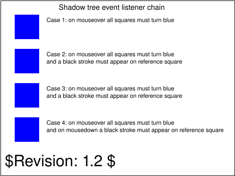 interact-events-203-t.svg interact-events-203-t.svg |
ASl |
AE |
accepted |
Tests 'mouseover' event on SVGElementInstance
What each case tests is as follows.
Case 1: mouseover event on SVGElementInstance. Referenceing an element that contains an event.
Case 2: mouseover event on referencing element. Event bubbling from SVGElementInstance to referencing element.
Case 3: mouseover event on parent of referencing element. Event bubbling from SVGElementInstance to referencing element ancestors.
Case 4: mousedown event on referencing element. SVGElementInstance is not effected by event listener on referencing element.
|
 interact-order-01-b.svg interact-order-01-b.svg |
Jon Ferraiolo |
SVGWG |
accepted |
Test event bubbling of event attributes, part a.
The two circles test whether event bubbling is occurring
to parents of the target object, and whether the target object
is able to prevent bubbling. The supplemental text next to
the circles describes what should occur.
|
 interact-order-02-b.svg interact-order-02-b.svg |
Jon Ferraiolo |
SVGWG |
accepted |
Test event bubbling of event attributes, part b.
The two circles test whether events are handled in the
proper order. Events listeners and event attributes are processed
before hyperlink processing, which is processed before text selection.
|
 interact-order-03-b.svg interact-order-03-b.svg |
Jon Ferraiolo |
SVGWG |
accepted |
Test event bubbling of event attributes, part c.
The three strings tests event handling behavior on text.
Text selection only is available after event listeners and event
attributes have been processed, and after hyperlink processing
has occurred.
|
 interact-pevents-01-b.svg interact-pevents-01-b.svg |
ED |
SVGWG |
accepted |
This test tests 'pointer-events' on text. Initially you should see four big rects with black stroke.
In the uppermost rect there should be 10 'O':s with black fill.
In the second rect from the top there should be 10 'O':s with no fill but with black stroke.
In the third and fourth rects there should be no visible 'O':s at all.
In the fourth rect there should be two green rects, and in each of the other three rects there should be one green rect.
For UA debugging purposes it's possible to click the "Toggle freeze" button before running the test.
That will reset the visibility, fill and stroke on each 'O' as the cursor moves over them so that it's
possible to trigger the change more than once. If the "Toggle freeze" button is clicked once again that
means the change will remain after the cursor moves out.
|
 interact-pevents-03-b.svg interact-pevents-03-b.svg |
ED |
SVGWG |
accepted |
Tests that pointer events are not delivered to text elements when the pointer is
over any white space due to letter-spacing.
|
 interact-pevents-04-t.svg interact-pevents-04-t.svg |
ED |
SVGWG |
accepted |
Tests where text is considered intersected by the cursor when letter-spacing is used.
The first two lines should look the same, but the second line is using a slightly different svgfont that defines an empty path for the space glyph.
The third line doesn't have any spaces, just letter-spacing, so there are no glyphs in between the letters. Hovering the whitespace between the letters should not highlight the line.
The fourth line has a space glyph between the other glyphs, and letter-spacing.
The fifth line has no spaces only letter-spacing.
|
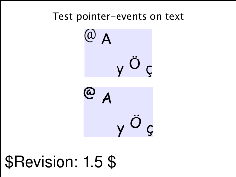 interact-pevents-05-b.svg interact-pevents-05-b.svg |
ED |
SVGWG |
accepted |
Tests when text is considered hit by pointer-events.
According to SVG 1.1 pointer-events on text is not supposed to use the text boundingbox, instead it should use the 'character cells'.
|
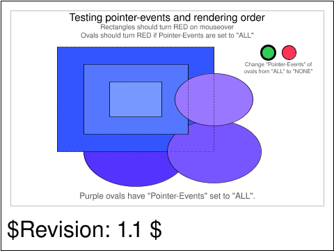 interact-pevents-07-t.svg interact-pevents-07-t.svg |
AE |
DOH |
accepted |
Testing pointer-events and rendering order
|
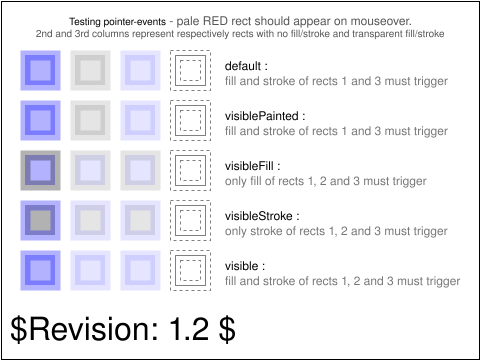 interact-pevents-08-f.svg interact-pevents-08-f.svg |
ED |
SVG |
accepted |
Tests the pointer-events attribute with different 'visible' values, same as the interact-pevents-201-t test but with script instead of declarative animation
The 2nd and 3rd columns represent respectively rects with no fill/stroke and transparent fill/stroke.
The 4th column (most right column) has a non activatable pointer event as the visibility of the column
is set to hidden.
The first row tests the default value for pointer-event, i.e. visible fill and stroke will trigger an event.
The second row tests pointer-events="visiblePainted", i.e. visible fill and stroke will trigger an event.
The third row tests pointer-events="visibleFill", i.e. visible fill only an event.
The fourth row tests pointer-events="visibleStroke", i.e. visible stroke only an event.
The fifth row tests pointer-events="visible", i.e. visible fill and stroke will trigger an event.
|
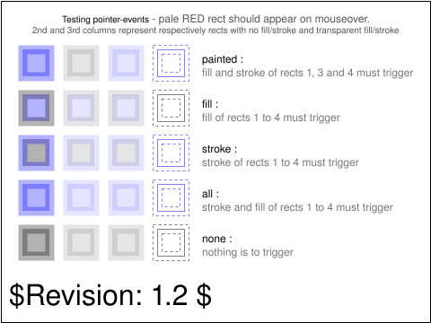 interact-pevents-09-f.svg interact-pevents-09-f.svg |
ED |
SVGWG |
accepted |
Tests the pointer-events attribute with different painting values, same as the interact-pevents-202-t test but with script instead of declarative animation
The 2nd and 3rd columns represent respectively rects with no fill/stroke and transparent fill/stroke.
The 4th column has visibility set to hidden.
The first row tests pointer-events="painted", i.e. event on fill and stroke that are set.
The second row tests pointer-events="fill", i.e. event on a fill that is set.
The third row tests pointer-events="stroke", i.e. even on a stroke that is et.
The fourth row tests pointer-events="all", i.e. event on fill and stroke that are set.
The fifth row tests pointer-events="none", i.e. no event.
|
 interact-pevents-10-f.svg interact-pevents-10-f.svg |
Microsoft |
ED |
accepted |
An element with 'display' set to 'none' or an element whose parent has 'display' set to 'none' is not a target of pointer events.
Stack a 'circle' element with 'display' equal to 'none' on another 'circle' element.
Specify an 'onclick' event handler on the 'circle' with 'display' set to 'none' that will change the 'visibility' of 'FAIL' text to 'visible'.
Verify that the event handler does not fire which clicking on the top 'circle' element.
Repeat with another set of 'circle' elements with the parent of one of the 'circle' elements having its 'display' set to 'none'.
|
 interact-pointer-01-t.svg interact-pointer-01-t.svg |
CM |
DAS |
accepted |
This tests that zero opacity pixels in a mask do not affect
hit testing for the purpose of pointer event targetting.
|
 interact-pointer-02-t.svg interact-pointer-02-t.svg |
CM |
DAS |
accepted |
This tests that clipped-out parts of shapes do not receive pointer events.
|
 interact-pointer-03-t.svg interact-pointer-03-t.svg |
CM |
DAS |
accepted |
This tests that the "painted" keyword for the pointer-events property
does not cause pointer events to be captured when a shape's fill falls
back to "none" because a referenced paint server was not available.
|
 interact-pointer-04-f.svg interact-pointer-04-f.svg |
Microsoft |
[reviewer] |
created |
|
usesred |
 interact-zoom-01-t.svg interact-zoom-01-t.svg |
CL |
CM |
accepted |
Verify correct handling by Dynamic (interactive) viewers for the
"zoomAndPan" attribute on the 'svg' element. This is the second of three
tests, and tests the default value.
The test consists of a set of black circles with a blue stroke.
|
 interact-zoom-02-t.svg interact-zoom-02-t.svg |
CL |
CM |
accepted |
Verify correct handling by Dynamic (interactive) viewers for the
"zoomAndPan" attribute on the 'svg' element. This is the second of three
tests, and tests the value "magnify".
The test consists of a set of black circles with a blue stroke.
|
 interact-zoom-03-t.svg interact-zoom-03-t.svg |
CL |
CM |
accepted |
Verify correct handling by Dynamic (interactive) viewers for the
"zoomAndPan" attribute on the 'svg' element. This is the third of three
tests, and tests the value "disable".
The test consists of a set of black circles with a blue stroke.
|
 linking-a-01-b.svg linking-a-01-b.svg |
Lofton Henderson |
SVGWG |
accepted |
This is the first of a set of three tests that verify the capability to
handle links into SVG content, using
each of the three fragment identifier forms permissible in SVG.
There is a colored arrow comprising the content of an 'a' element. The
link destination is in an auxiliary file, linkingCircle-f.svg, and
is expressed by xlink:href="linkingCircle-f.svg#fragmentValue".
The initial view of this test contains one pale blue arrow plus labelling text.
The (blue) arrow uses the "bare name" fragment identifier
form, "#circle-2", to target the circle with id "circle-2" in the external
file.
|
usesred |
 linking-a-03-b.svg linking-a-03-b.svg |
Lofton Henderson |
SVGWG |
accepted |
This is the third of a set of three tests that verify the capability to
handle links into SVG content, using
each of the three fragment identifier forms permissible in SVG.
There is a colored arrow comprising the content of an 'a' element. The
link destination is in an auxiliary file, linkingCircle-f.svg, and
is expressed by "xlink:href=linkingCircle-f.svg#fragmentValue".
The initial view of this test contains one green arrow plus labelling text.
The (green) arrow uses the SVG view specification form,
"linkingCircle-f.svg#svgView(viewBox(63,226,74,74))",
to target the circle with id "circle-2"
in the external file.
|
 linking-a-04-t.svg linking-a-04-t.svg |
Lee Klosterman |
SVGWG |
accepted |
Verify the capability to handle basic links out of SVG content
using the 'a' element, with the xlink:href attributes.
There are three subtests, in each of which one
of three colored arrows comprise the content of an 'a' element. The
link destination is expressed by "xlink:href=".
The initial view of this test contains the three arrows, a colored
circle, labelling text, and the usual template legend and frame.
There are several reference images associated with this test case. The first
illustrates the correct "start" or initial state of the rendered SVG file.
The second illustrates the correct image after the first link is activated
(to the linkingToc.svg file). The third (for browser-environment viewers)
should match the current image of the W3C home page, as viewed with a
conventional browser. (Note. This harness does not yet
provide access to multiple PNGs; the first, initial-state PNG is shown.)
The test uses the 'rect' and 'polygon' elements, as well as basic fill (solid simple colors),
stroke (black and colored wide and 1-pixel lines), font-family (Arial) and font-size properties.
|
 linking-a-05-t.svg linking-a-05-t.svg |
CN |
MI |
accepted |
Verify if the 'a' element properly accept the transform
attibute. There are three subtests, in each of which one
of three sets of colored arrows comprise the content of
an 'a' element. The link destination is expressed by
"xlink:href=" as in the test 'linking-a-04-t.svg'.
The arrows transformed is in the brighter color, and the
arrows before transformation is shown in the darker color.
The transformation parameters used for each 'a' element is
shown on the left side of each arrow.
The top-most arrow (yellow) is rotated for 20 degree.
The middle arrow (green) is skewed horizontally for
-30 degree, and the last arrow (cyan) is translated
for (-10, -20).
The test uses the 'rect' and 'polygon' elements, as well as basic fill (solid simple colors and RGB values),
stroke (black and colored wide and 1-pixel lines), font-family (Arial) and font-size properties.
|
 linking-a-07-t.svg linking-a-07-t.svg |
CL |
BB |
accepted |
Verify that the target attribute on the 'a' element takes precedence over the xlink:show attribute.
There are three subtests, in each of which two similarly
colored arrows comprise the content of an 'a' element. The arrow on the left, outlined
in blue, has no "target" attribute; the arrow on the right, outlined in red, has a
"target" attribute. The
link destination is expressed by "xlink:href=".
The initial view of this test contains the six arrows, labelling text, and the usual template legend and frame.
The top-most (yellow) arrows link to an external SVG file, which is
local (in the same directory). The target file contains SVG 'text' elements
which comprise a TOC and brief description of all of the test files
for Linking.
The middle (green) arrows links to the same external SVG file, but with xlink:show="new".
The bottom-most (blue) arrows links to the same external SVG file, but with xlink:show="replace".
|
usesred |
 linking-a-08-t.svg linking-a-08-t.svg |
CL |
ED |
accepted |
This is a simple test for links on text elements. The upper subtest has an 'a' element
inside a 'text' element; the lower subtest has the 'a' outside the 'text'.
|
 linking-a-09-b.svg linking-a-09-b.svg |
CL |
ED |
accepted |
This is a simple test for links on tspan elements. The upper subtest has an 'a' element
inside a 'tspan' element; the lower subtest has the 'a' outside the tspan.
|
 linking-a-10-f.svg linking-a-10-f.svg |
Microsoft |
CL |
accepted |
Test that the 'a' element supports various types of graphics and container elements as content.
|
 linking-frag-01-f.svg linking-frag-01-f.svg |
CL |
|
created |
Tests svgView(viewBox();transform()) syntax, with and without escaped semicolons.
|
usesred |
 linking-uri-01-b.svg linking-uri-01-b.svg |
Lee Klosterman |
SVGWG |
accepted |
Verify the capability to handle links to 'view' elements, and the
permissible attributes on those elements. All of the links in this
test case are internal, i.e., to 'view' elements in the same SVG file.
This test is identical to linking-uri-02-b except that the links there are external.
In the four quadrants of the initial picture are four graphical objects.
Clockwise from upper right, they are
a purple rectangle, blue ellipse, green polygon (pentagon), and yellow
circle. Each is labelled and tightly boxes with a rectangular frame.
These are identical to their counterparts in linking-uri-01-b.svg, in which
file each has an associated 'view' element, with attributes
per the labels in the initial picture.
In the center is a gray box with four lines of text, each of which says
"Go to" followed by Rectangle, Ellipse, Polygon, and Circle, respectively.
Each of these is contained within an 'a' element, whose xlink:href names
the respective 'view' element of the respective graphical object.
There are several reference images associated with this test case. The first
illustrates the correct initial state of the rendered SVG file, which should
also be the correct picture after the Rectangle link is executed.
The second, third, and fourth illustrate the correct images as described
above after respectively the Ellipse, Polygon, and Circle links are activated.
(Note. This harness does not yet provide access to multiple PNGs; the PNG for the
initial view is shown.)
The test uses the 'rect', 'circle', 'ellipse', and 'polygon' elements,
as well as basic fill (solid simple colors),
stroke (black and colored 1-pixel lines), font-family (Arial) and font-size properties.
|
 linking-uri-02-b.svg linking-uri-02-b.svg |
Lee Klosterman |
SVGWG |
accepted |
Verify the capability to handle links to 'view' elements, and the
permissible attributes on those elements. All of the links in this
test case are external, i.e., to 'view' elements in another SVG file.
That file is linking-uri-01-b.svg.
This test is identical to linking-uri-01-b except that the links here are external.
In the four quadrants of the initial picture are four graphical objects.
Clockwise from upper right, they are
a purple rectangle, blue ellipse, green polygon (pentagon), and yellow
circle. Each is labelled and tightly boxes with a rectangular frame.
These are identical to their counterparts in linking-uri-01-b.svg, in which
file each has an associated 'view' element, with attributes
per the labels in the initial picture.
In the center is a gray box with four lines of text, each of which says
"Go to" followed by Rectangle, Ellipse, Polygon, and Circle, respectively.
Each of these is contained within an 'a' element, whose xlink:href names
the respective 'view' element of the respective graphical object.
There are several reference images associated with this test case. The first
illustrates the correct initial state of the rendered SVG file, which should
also be the correct picture after the Rectangle link is executed.
The second, third, and fourth illustrate the correct images as described
above after respectively the Ellipse, Polygon, and Circle links are activated.
(Note. This harness does not yet provide access to multiple PNGs; the PNG for the
initial view is shown.)
The test uses the 'rect', 'circle', 'ellipse', and 'polygon' elements,
as well as basic fill (solid simple colors),
stroke (black and colored 1-pixel lines), font-family (Arial) and font-size properties.
|
 linking-uri-03-t.svg linking-uri-03-t.svg |
Lee Klosterman |
SVGWG |
accepted |
Verify the handling of the allowable xlink attributes on the 'a' element.
The initial view of this test contains a single green triangle, labelling text,
and the usual template legend and frame.
The purpose of the test is to
verify that viewers tolerate the presence of xlink attributes on the 'a'
element. The presence of the attributes should not change the behavior of
the test in any way.
There are two reference images associated with this test case. The first
illustrates the correct "start" or initial state of the rendered SVG file.
The second illustrates the correct image after the link is activated
(to the linkingToc-t.svg file). (Note. This harness does not yet
provide access to multiple PNGs; the first, initial-state PNG is shown.)
The test uses the 'rect' element, as well as basic fill (solid simple colors),
stroke (black and colored wide and 1-pixel lines), font-family (Arial) and font-size properties.
|
 masking-filter-01-f.svg masking-filter-01-f.svg |
CM |
AG |
accepted |
This tests that the 'filter' property does not apply to 'mask'.
The mask 'm' covers a rectangular area (200 x 200) except for a window
(100 x 100) in the top left hand corner. Initially the mask window is
set on top of the green square. Hence, the green square is shown and
the red square is covered. If filters are supported the window within
the mask will be shifted by an offset of 100,100 placing it on top of
the red square.
|
 masking-intro-01-f.svg masking-intro-01-f.svg |
BB |
CL |
accepted |
The rules are different regarding the geometry of a shape when clipping and masking.
For example, a clip-path does not take into account the stroke of the shape used for clipping.
It is however, used when masking.
|
 masking-mask-01-b.svg masking-mask-01-b.svg |
Haroon Sheikh |
SVGWG |
accepted |
Test to see if the masking features using the mask element and mask
property are available.
A red rectangle is displayed in the background to help view the result
of transparency and masking.
From top to bottom, the tests are as follows.
In the top test, a linear gradient is used inside the mask to change the opacity
of the rectangle from 1.0 (at the top) to 0.5 (at the bottom).
In the second test, a simple 50% opaque rectangle is used as a mask.
In the third test, no mask is used, but a rectangle is shown with 50% opacity.
The second and third test should look the same.
Lastly, a string of text has a mask applied to it. The mask only covers a partial
area of the text, so the text should only be half visible. Also the mask consists
of 4 rectangles with various levels of opacity.
|
usesred |
 masking-mask-02-f.svg masking-mask-02-f.svg |
Microsoft |
CL |
accepted |
If the 'mask' property references a 'mask' element containing no children, the element referencing it is not rendered.
|
 masking-opacity-01-b.svg masking-opacity-01-b.svg |
Haroon Sheikh |
SVGWG |
accepted |
Test to see the effect of applying an opacity property to a group.
A blue rectangle with a green rectangle on top are contained in a
group. This opacity of the group and the opacity of the rectangles are
changed in this test. A red rectangle is provided in the background so
that opacity changes are obvious visually.
From top to bottom, the tests are as follows.
In the top test, the opacities of the group and the individual rectangles are
all set to 1.
In the second test, the group is given an opacity of 0.5.
In the third test, the group maintains a group opacity of 1 whereas each individual
rectangle is given an opacity of 0.5 in the group.
Lastly, the group and individual rectangles are all given an opacity of 0.5.
|
usesred |
 masking-path-01-b.svg masking-path-01-b.svg |
LH |
CL |
accepted |
Test to see if the basic clipping works using the clipPath element
and the clip-path property.
This test uses the following elements : <clipPath> and the following
properties : clip-path.
|
 masking-path-02-b.svg masking-path-02-b.svg |
Haroon Sheikh |
SVGWG |
accepted |
Test to see if clipPathUnits attribute is handled properly on a
clipPath element. Only tests the userSpaceOnUse and
objectBoundingBox items of the clipPathUnits. userSpace has been
tested by the previous test as it is the default.
The test at the top shows a pink rectangle that has been clipped by a
rectangular clipping path. The clipping path is defined using clipPathUnits=objectBoundingBox.
The example at the bottom a rotated blue rectangle that has been clipped by a
rectangular clipping path. The clipping path is defined using clipPathUnits=userSpaceOnUse.
The rendered picture should match the reference image exactly, except for possible
variations in the labelling text (per CSS2 rules).
|
 masking-path-03-b.svg masking-path-03-b.svg |
Jon Ferraiolo |
SVGWG |
accepted |
Test 'overflow'/'clip' on outermost and inner 'svg' elements.
There are two parts to the test. The first part tests viewport clipping
on outermost 'svg' elements. The second part tests viewport clipping
on inner 'svg' elements.
The test case also tests the initial value of the 'overflow' property
to ensure that it is set to 'hidden' for all 'svg' elements.
Tester should zoom out and/or pan to check this.
To test clipping to the outermost 'svg' element,
a rectangle with a light blue interior, a light red border and a black
string that says "Clip to outer 'svg'" is painted four times such that
it will overflow each of the top, left, right and bottom
sides of the bounds of the outermost 'svg' element, respectively.
To test clipping to inner 'svg' elements, a rectangle with a light red
interior, a light blue border and a black string that says "Clip to
inner 'svg'" is painted four times such that it will overflow each of
the top, left, right and bottom sides of the bounds of an inner 'svg'
element, respectively.
Note that minor text layout differences, as are permissible under CSS2
rules, can lead to slightly different visual results regarding where
the text strings get clipped.
|
 masking-path-04-b.svg masking-path-04-b.svg |
Chris Lilley |
SVGWG |
accepted |
This test exercises basic user-specified clip paths, using a text
string (i.e., content of a 'text' element) as the clip path.
There is a rectangular image of a swirly blue pattern with large
yellow text, "Clip Test" superimposed. The image is a PNG file,
imported into the picture via the 'image' element.
The test uses the 'rect' element, as well as basic fill (solid primary
colors), stroke (black 1-pixel lines), font-family (Arial and
Impact) and font-size properties.
|
 masking-path-05-f.svg masking-path-05-f.svg |
Haroon Sheikh |
SVGWG |
accepted |
Test to see if clip-rule property has been implemented properly.
The test at the top shows a red rectangle that has been clipped by a
clipping path that overlaps itself.
The test at the bottom shows a blue rectangle that has been clipped by a
clipping path that overlaps itself.
The rendered picture should match the reference image exactly, except for possible
variations in the labelling text (per CSS2 rules).
|
 masking-path-06-b.svg masking-path-06-b.svg |
BB |
CL |
issue |
The intent of this file to test the 'clip' property. In this test, the clipped objects are
raster and SVG images.
|
usesred |
 masking-path-07-b.svg masking-path-07-b.svg |
ED |
CM |
accepted |
This tests that 'clipPath' elements can be used together and how the clipping paths are intersected.
There is a gray-white pattern as a background for the two subtest rectangles. This is to show that the holes that are cut out using clip-paths are transparent.
The first subtest verifies that when you use the 'clip-path' property on a child element inside a 'clipPath' element the child element is clipped correctly.
The second subtest verifies that when a 'clipPath' element has a 'clip-path' property the result is the intersection of the two clip paths.
|
 masking-path-08-b.svg masking-path-08-b.svg |
ED |
CM |
accepted |
This tests a few 'clip-path' cases to see that clipping paths are applied and constructed properly.
|
 masking-path-09-b.svg masking-path-09-b.svg |
CM |
DAS |
accepted |
This tests that a clip path applied to an element does not affect
bounding box computation.
|
 masking-path-10-b.svg masking-path-10-b.svg |
ED |
SVGWG |
accepted |
This tests a few 'mask' cases to see that masks are applied and constructed properly.
There are nine subtests in this test. There should be a big stroked rectangle with nine smaller rectangles inside. If all of the smaller rectangles are green the test has passed.
|
 masking-path-11-b.svg masking-path-11-b.svg |
ED |
CL |
accepted |
Test the mask element with child elements with white and black fills,
to create a mask that clips out some text in the middle.
|
 masking-path-12-f.svg masking-path-12-f.svg |
Microsoft |
CL |
accepted |
Properties inherit into the 'clipPath' element and its children.
|
 masking-path-13-f.svg masking-path-13-f.svg |
Microsoft |
CL |
accepted |
Test that the children of the 'clipPath' element are not rendered directly.
|
 masking-path-14-f.svg masking-path-14-f.svg |
Microsoft |
CL |
accepted |
The 'clipPath' element itself and its children elements do not inherit clipping paths from ancestors of the 'clipPath' element.
Overlay a red 'rect' with a black 'rect' of a larger size. Define a 'clipPath' with a 'rect' of the same size as the red 'rect', but different 'x' and 'y' offsets. Reference that 'clipPath' from a 'g' element containing another 'clipPath' element. In this latter 'clipPath', specify a 'rect' of the same size and same 'x' and 'y' offsets as the red 'rect', and reference it from the black 'rect' element. Reference the same 'clipPath' elements, but this time with a black 'rect' which overlays a red 'rect' of a larger size. If there is no red on the page, the first 'clipPath' was not inherited by the second 'clipPath'.
|
 metadata-example-01-t.svg metadata-example-01-t.svg |
Chris Lilley |
SVGWG |
accepted |
Check that metadata in a variety of namespaces, inside a metadata
element, does not affect rendering in any way. The file is not valid to
the SVG 1.1 DTD, but is well formed.
The diagram on the table is, by the way, a visualization of the
RDF metadata in the graphic.
|
 painting-control-01-f.svg painting-control-01-f.svg |
Microsoft |
CL |
accepted |
Elements are rendered when the 'display' attribute is set to any valid value other than 'none'.
For each valid 'display' value (except none), the test creates a 'rect' element with that 'display' value assigned. Under that
element, a red 'rect' is placed at the exact same 'x', 'y' position with the same height and width. Test passes if the 'rect'
with 'display' covers the red 'rect'.
|
 painting-control-02-f.svg painting-control-02-f.svg |
Microsoft |
CL |
accepted |
'Stroke' attributes affected by directionality start at the point at which the graphics element starts.
The test creates two 'path' elements that have the same 'stroke-dasharray' assignment. The paths will create the same visual shape,
but the start and end points will be opposite. Test passes if the 'stroke-dasharray' of each path is drawn differently.
Second subtest is the same but with stroke-dashoffset.
|
 painting-control-03-f.svg painting-control-03-f.svg |
Microsoft |
CL |
accepted |
Open polyline and path elements are filled as if they were closed with the last point linked to the first point.
The test specifies two polylines and two paths on the page with five points each. One polyline/path closes the shape with the fifth
point linking to the first. One polyline/path is open (no link from fifth point to first). Both polylines/paths are filled.
The open subpath is placed over the closed one. Test passes if the open subpath fills over the closed path.
|
 painting-control-04-f.svg painting-control-04-f.svg |
Microsoft |
CL |
accepted |
A zero length subpath with 'stroke-linecap' set to 'square' or 'round' is stroked, but not stroked when 'stroke-linecap' is set to 'butt'.
|
 painting-control-05-f.svg painting-control-05-f.svg |
Microsoft |
ED |
accepted |
This tests setting the 'display' property to 'none' on an element that is a child of a 'mask' or 'clipPath' element, which should cause the element to not be
included in the 'mask' or 'clip' region.
|
 painting-control-06-f.svg painting-control-06-f.svg |
Microsoft |
ED |
accepted |
Setting the 'visibility' property to 'hidden' on a 'g' tag will affect its children, unless the children of the 'g' tag override the parent setting.
Have a 'g' tag with an red filled shape as a child. Set 'visibility: hidden' on the 'g' tag. Verify no red is on the page.
Also, have a 'g' tag with a green filled shape as a child. Set 'visibility: hidden' on the 'g' tag. Set 'visibility: visible' on
the child tag. Verify that the green 'rect' renders on the page.
|
 painting-fill-01-t.svg painting-fill-01-t.svg |
Kevin McCluskey |
SVGWG |
accepted |
Verify the basic capability to handle the fill properties fill:none,
and fill with a color (fill:green)
|
 painting-fill-02-t.svg painting-fill-02-t.svg |
Kevin McCluskey |
SVGWG |
accepted |
The test uses the "currentColor" value for the "fill" attribute.
|
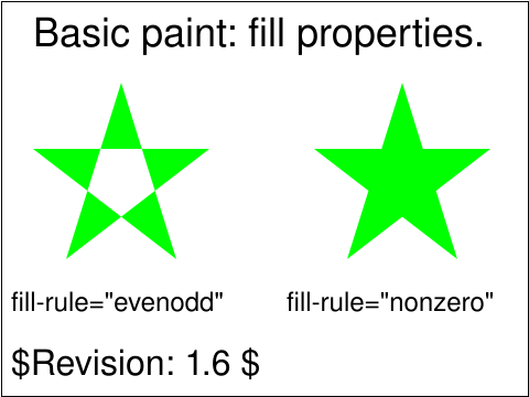 painting-fill-03-t.svg painting-fill-03-t.svg |
Kevin McCluskey |
SVGWG |
accepted |
Verify the basic capability to handle the fill rule properties evenodd and nonzero
|
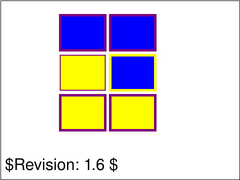 painting-fill-04-t.svg painting-fill-04-t.svg |
Tim Thompson |
SVGWG |
accepted |
This tests inheritance of three properties: "fill", "stroke" and "stroke-width". There is a "g" element (id="G1") which
sets fill="blue", stroke="purple", and stroke-width="5". The first two rectangles on top should inherit all those
properties. The middle left rectangle has fill="yellow" and stroke-width="2", it should inherit the stroke="purple"
from the parent container. The middle rectangle on the right has stroke="yellow", it should inherit fill and
stroke-width from the parent "g". The bottom two rectangles are in another "g" element (id="G2") which is a child
of "G1". "G2" sets fill="yellow". It should inherit the stroke and stroke width from the parent "G1". The two
bottom rectangles set no fill or stroke properties, they should inherit through the parents, stroke="purple"
and stroke-width="5".
|
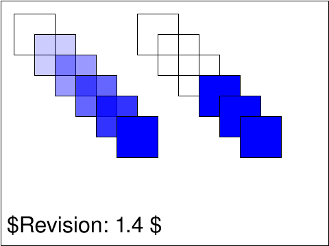 painting-fill-05-b.svg painting-fill-05-b.svg |
CN |
DJ |
accepted |
Test using "fill-opacity" values for "rect" element.
This test verifies that opacity is clamped to the
specified range.
|
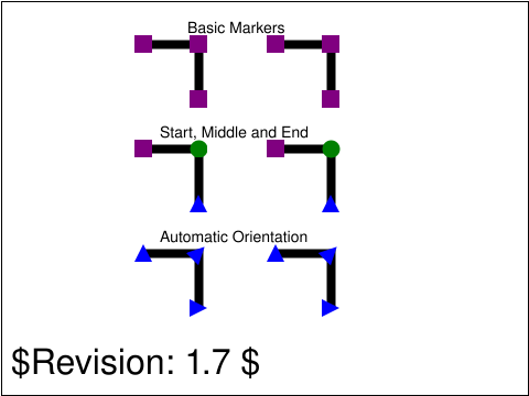 painting-marker-01-f.svg painting-marker-01-f.svg |
Dean Jackson |
SVGWG |
accepted |
Tests the basic support for markers.
The top test examines the basic support for the marker element and style. The markers are purple rectangles.
The middle test examines the support for the different styles of marker properties. The
"marker-start" property defines the marker to use at the first vertex of the marked path,
in this case a purple rectangle. The "marker-end" property defines the marker to use at the
last vertex of the marked path, in this case a blue triangle. The "marker-mid" property
defines the marker to use at all vertices, other than the first and last, of the marked path,
in this case a green circle.
The bottom test examines the support for marker orientation along the
path direction. The second vertex, the top right corner of the path, has a marker that
is rotated 45 degrees, since that is the average of the horizontal and vertical segments
each side. The last vertex, the bottom right corner of the path, has a marker rotated 90
degrees since that is the direction of the last path segment.
|
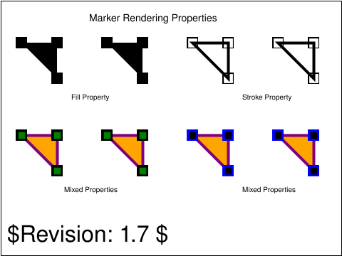 painting-marker-02-f.svg painting-marker-02-f.svg |
Dean Jackson |
SVGWG |
accepted |
Tests the rendering of markers, specifically property inheritance. For the four tests, there should
be two identical paths with markers drawn.
The top two tests examine the rendering of markers when the marker and the path
referencing it share the same parent and all painting properties are specfied on
that parent. The first test show inheritance of the 'fill' property and the
second the inheritance of the 'paint' property. In both tests, the marker
is painting using the same properties as the referencing object. Because of
scaling transformations on the marker, the stroke on the second test is thinner
than on the referencing object.
The third and fourth tests examine the rendering of markers in a situation where the
marker and referencing path do NOT share the same parent and painting
properties are specified both on the parent of the marked path and on the contents
of the marker itself. In both cases, the marker's parent specifies
fill="green" stroke="blue" stroke-width="8". For the third test, the marker contents
override with stroke="black". For the fourth test, the marker contents
override with fill="black". In neither case should you see
fill="orange" or stroke="blue" or "stroke="purple" on the markers as these properties
are specified on the ancestor of the referencing object or the referencing object itself
and thus shouldn't affect the marker.
|
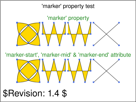 painting-marker-03-f.svg painting-marker-03-f.svg |
BB |
DJ |
accepted |
The SVG specification defines three properties to reference markers: marker-start, marker-mid,
marker-end. It also provides a shorthand property,marker. Using the marker property from a style sheet
is equivalent to using all three (start, mid, end). However, shorthand properties cannot be used as presentation attributes.
|
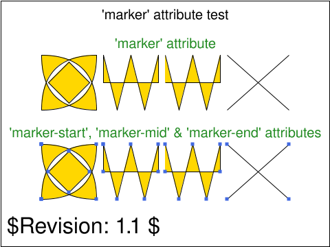 painting-marker-04-f.svg painting-marker-04-f.svg |
BB |
CL |
accepted |
The SVG specification defines three properties to reference markers: marker-start, marker-mid,
marker-end. It also provides a shorthand property,marker. Using the marker property from a style sheet
is equivalent to using all three (start, mid, end). However, shorthand properties cannot be used as presentation attributes.
|
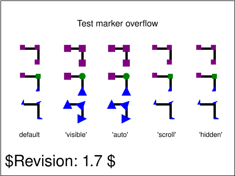 painting-marker-05-f.svg painting-marker-05-f.svg |
ED |
DOH |
accepted |
Test all the 'overflow' property values except 'inherit' on the 'marker' element.
Each column tests a value of the 'overflow' property.
The first row uses the 'marker' property to set the same marker on start-, mid- and end-points on the path.
The second row uses 'marker-start', 'marker-mid' and 'marker-end' to give each point its own marker.
The third row uses the 'marker' property like the first row, but here the marker has orient="auto" set.
|
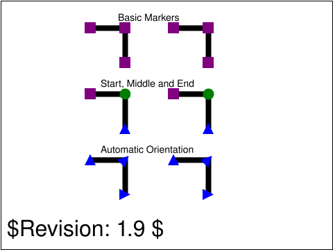 painting-marker-06-f.svg painting-marker-06-f.svg |
ED |
AG |
accepted |
Tests the basic support for markers. For the three tests, there
should be two identical paths with markers drawn. The path on the left is
rendered using the marker elements. The path on the right is rendered using
the equivalent SVG, showing what the marked path should look like.
This test is similar to the painting-marker-01-f.svg test, but has some viewBox attributes
that have a non-zero offset.
The top test examines the basic support for the marker element and style. The markers are purple rectangles.
The middle test examines the support for the different styles of marker properties. The
"marker-start" property defines the marker to use at the first vertex of the marked path,
in this case a purple rectangle. The "marker-end" property defines the marker to use at the
last vertex of the marked path, in this case a blue triangle. The "marker-mid" property
defines the marker to use at all vertices, other than the first and last, of the marked path,
in this case a green circle.
The bottom test examines the support for marker orientation along the
path direction. The second vertex, the top right corner of the path, has a marker that
is rotated 45 degrees, since that is the average of the horizontal and vertical segments
each side. The last vertex, the bottom right corner of the path, has a marker rotated 90
degrees since that is the direction of the last path segment.
|
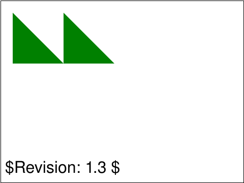 painting-marker-07-f.svg painting-marker-07-f.svg |
Microsoft |
CL |
accepted |
A 'marker' element with 'display' set to 'none' on that
element or any ancestor is rendered when referenced by another element.
|
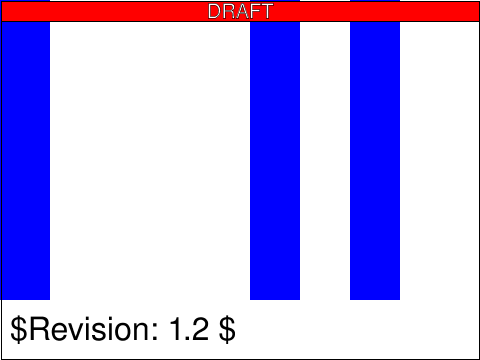 painting-marker-properties-01-f.svg painting-marker-properties-01-f.svg |
Microsoft |
[reviewer] |
created |
|
usesred |
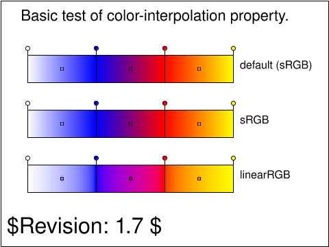 painting-render-01-b.svg painting-render-01-b.svg |
Tim Thompson |
SVGWG |
accepted |
This tests shows the same linear gradient used with different values for the
color-interpolation rendering property. The top bar is painted using the
default color-interpolation value, which should produce the same result as
sRGB. The middle bar is painted using the 'sRGB' color-interpolation and
should be the same as the top bar. Finally, the bottom bar is painted using
the linearRGB interpolation, which produces a result visibly different from
the top two bars: the white to blue ramp is whiter, the blue to red ramp
goes through a pinkish color and the red to yellow ramp turns orange before
the similar sRGB rampl.
|
usesred |
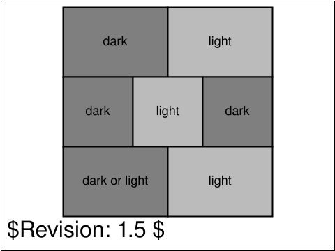 painting-render-02-b.svg painting-render-02-b.svg |
CM |
AG |
accepted |
This tests that the 'color-interpolation' property is honored when
alpha compositing is performed.
The test slide consists of seven rectangular regions,
each of which is filled with either a dark or light
shade of gray. The 'color-interpolation' property
is used on the rectangles to control whether a
dark or light shade of gray appears. Text inside each
rectangular region indicates whether the shade of gray
should be dark or light. The top two rectangular regions
are references against which the remaining five are to
be compared.
|
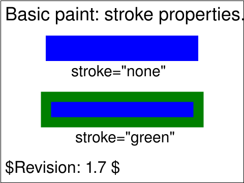 painting-stroke-01-t.svg painting-stroke-01-t.svg |
Kevin McCluskey |
SVGWG |
accepted |
Verify the basic capability to handle the stroke properties ("stroke")
in combination with the "rect" element .
The pair should be rendered as two blue rectangles,
the upper one without a stroke and the lower with a green stroke.
The test uses the "rect" element, as well as basic "fill" (solid primary colors),
"stroke", stroke="green", "font-family" and "font-size" attributes.
|
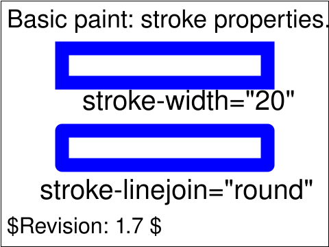 painting-stroke-02-t.svg painting-stroke-02-t.svg |
Kevin McCluskey |
SVGWG |
accepted |
Verify the basic capability to handle the stroke properties ("stroke", "stroke-width",
"stroke-linejoin") in combination with the "rect" element.
|
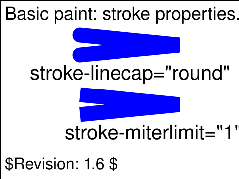 painting-stroke-03-t.svg painting-stroke-03-t.svg |
Kevin McCluskey |
SVGWG |
accepted |
This test checks the basic capability of handling the stroke properties ("stroke", "stroke-width"
"stroke-linejoin", "stroke-linecap", "stroke-miterlimit")
with straight-line path commands.
|
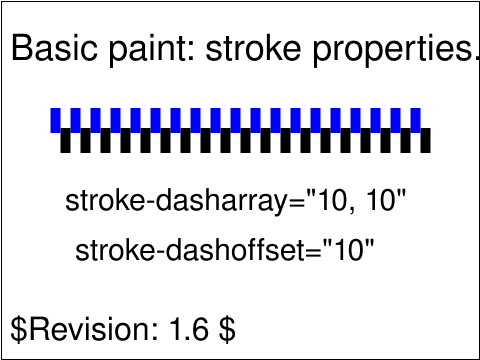 painting-stroke-04-t.svg painting-stroke-04-t.svg |
Kevin McCluskey |
SVGWG |
accepted |
This test checks the "stroke-dasharray" and "stroke-dashoffset" properties. Two lines are drawn, one blue
and one black. Both have a "stroke-dasharray" of "10,10" giving a dashed appearance
where the size of the gaps and the size of the dash is equal.
|
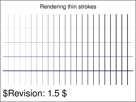 painting-stroke-05-t.svg painting-stroke-05-t.svg |
BB |
CL |
accepted |
User agents may render graphical primitives with different levels of accuracy.
This test is aimed at determining how a UA renders thin strokes.
The test file contains a number of vertical and horizontal lines.
The stroke width of the vertical lines increase from left to right.
The stroke width of the horizontal lines increase from top to bottom.
|
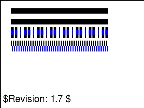 painting-stroke-06-t.svg painting-stroke-06-t.svg |
CN |
CL |
accepted |
Test default effects of stroke-dasharray.
This specifically tests the values of none and 0.
This also tests an odd number of values in a dash-array attribute
and in combination with an offset.
|
 painting-stroke-07-t.svg painting-stroke-07-t.svg |
CN |
CL |
accepted |
Test effect of different stroke-miterlimits. For this particular combination of
stroke width and angle, the cut off value of stroke-miterlimit is 18.028.
|
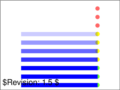 painting-stroke-08-t.svg painting-stroke-08-t.svg |
CN |
CL |
accepted |
Test effects of stroke-opacity range. Values
outside the range 0-1.0 must be clamped.
|
 painting-stroke-09-t.svg painting-stroke-09-t.svg |
CM |
CL |
accepted |
This tests that the "stroke-dasharray" property accepts values
that are separated by white space.
|
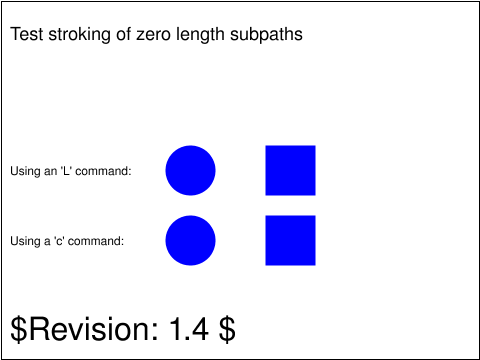 painting-stroke-10-t.svg painting-stroke-10-t.svg |
CM |
CL |
accepted |
This tests that stroking of zero length subpaths will result in
some rendering if the 'stroke-linecap' property is set to
'square' or 'round', but not if it is set to 'butt'.
Simply load the test. Two rows of shapes should be presented,
with a text label describing the row.
|
 paths-data-01-t.svg paths-data-01-t.svg |
Lofton Henderson |
SVGWG |
accepted |
Test that the viewer has the basic capability to handle the 'path'
element and its data (d) attribute in combination with the cubic
Bezier curveto commands, C, c, S, s (plus Mm and Zz).
There are 8 subtests, each composed from the cubic Bezier path commands per
the label by the subtest. On-curve control points (i.e., the curve position)
are marked by small blue squares. Subtests are filled, or stroked, or
both, using simple style properties and colors.
|
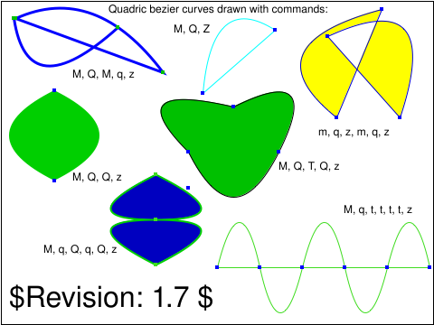 paths-data-02-t.svg paths-data-02-t.svg |
Lofton Henderson |
SVGWG |
accepted |
Test that the viewer has the basic capability to handle the 'path'
element and its data (d) attribute in combination with the quadratic
Bezier curveto commands, Q, q, T, t (plus Mm and Zz).
There are 7 subtests, each composed from the quadric Bezier path commands per
the label by the subtest. On-curve control points (i.e., the curve position)
are marked by small colored squares. Subtests are filled, or stroked, or
both, using simple style properties and colors.
|
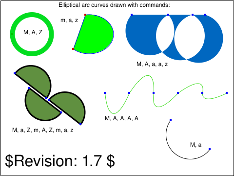 paths-data-03-f.svg paths-data-03-f.svg |
Lofton Henderson |
SVGWG |
accepted |
Test that the viewer has the basic capability to handle the 'path'
element and its data (d) attribute in combination with the elliptical
arc curveto commands, A, a (plus Mm and Zz).
There are 6 subtests, each composed from the elliptical arc path commands per
the label by the subtest. The curve positions
are marked by small colored squares. Subtests are filled, or stroked, or
both, using simple style properties and colors.
|
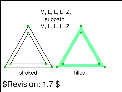 paths-data-04-t.svg paths-data-04-t.svg |
Lofton Henderson |
SVGWG |
accepted |
Verify the basic capability to handle the 'path' element, and its data attribute (d)
in combination with the straight-line path commands.
Two pairs of concentric equilateral triangles are drawn using respectively
M,L,Z and m,l,z. The shapes are identical, with one stroked and
one filled. The fill-mode default of "even-odd" means that
the inner triangle is hollow.
|
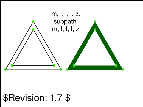 paths-data-05-t.svg paths-data-05-t.svg |
Lofton Henderson |
SVGWG |
accepted |
Verify the basic capability to handle the 'path' element, and its data attribute (d)
in combination with the straight-line path commands.
Two pairs of concentric equilateral triangles are drawn using respectively
M,L,Z and m,l,z. The shapes in each pair are identical, with one stroked and
one filled. The fill-mode default of "even-odd" means that
the inner triangle is hollow.
|
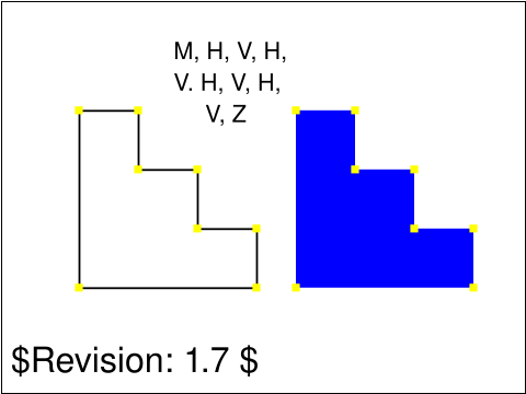 paths-data-06-t.svg paths-data-06-t.svg |
Lofton Henderson |
SVGWG |
accepted |
Verify the basic capability to handle the 'path' element, and its data attribute (d)
in combination with the straight-line path commands.
Two pairs of staircase figures are drawn using
respectively M,H,V,Z and m,h,v,z. The shapes in each pair are identical, with one stroked and
one filled.
|
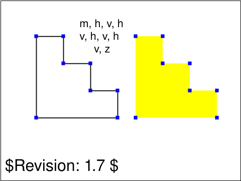 paths-data-07-t.svg paths-data-07-t.svg |
Lofton Henderson |
SVGWG |
accepted |
Verify the basic capability to handle the 'path' element, and its data attribute (d)
in combination with the straight-line path commands.
Two pairs of staircase figures are drawn using
respectively M,H,V,Z and m,h,v,z. The shapes in each pair are identical, with one stroked and
one filled.
|
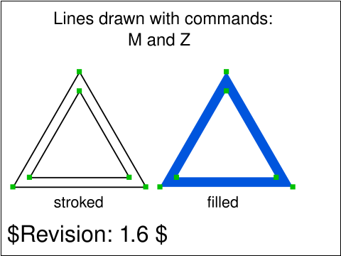 paths-data-08-t.svg paths-data-08-t.svg |
SH |
CN |
accepted |
Verify the basic capability to handle the 'path' element, and its data attribute (d)
in combination with the straight-line path commands.
Two pairs of concentric equilateral triangles are drawn using
M and Z. No L commands are used in this test as they are implied after
an M or Z command. The shapes are identical, with one stroked and
one filled. The fill-mode default of "even-odd" means that
the inner triangle is hollow.
|
 paths-data-09-t.svg paths-data-09-t.svg |
SH |
CN |
accepted |
Verify the basic capability to handle the 'path' element, and its data attribute (d)
in combination with the straight-line path commands.
Two pairs of concentric equilateral triangles are drawn using
m and z. No l commands are used in this test as they are implied after
an m or z command. The shapes are identical, with one stroked and
one filled. The fill-mode default of "even-odd" means that
the inner triangle is hollow.
|
 paths-data-10-t.svg paths-data-10-t.svg |
SH |
CN |
accepted |
Verify that the viewer renders the line caps and line joins for
open and closed paths properly.
Verify that the open triangular paths are stroked differently at
ends of the path than they are at their intermediate corners.
In contrast, the corners of a closed path should all appear the
same.
|
 paths-data-12-t.svg paths-data-12-t.svg |
CN |
ED |
accepted |
Test using multiple coord sets to build a polybeizer, and implicit values for initial S.
|
 paths-data-13-t.svg paths-data-13-t.svg |
CN |
ED |
accepted |
Test multiple coordinates for V and H.
|
 paths-data-14-t.svg paths-data-14-t.svg |
CN |
ED |
accepted |
Test implicit values for moveto. If the first command is 'm' it should be taken as an absolute moveto, plus implicit lineto.
|
 paths-data-15-t.svg paths-data-15-t.svg |
CN |
ED |
accepted |
Test using multiple coord sets to build a polybezier, then T with no preceding Q or T.
|
 paths-data-16-t.svg paths-data-16-t.svg |
CM |
ED |
accepted |
This tests that any implicit lineto commands that result from an
'M' or 'm' command with more than one pair of coordinates are absolute
if the moveto was specified with 'M' and relative if the moveto was
specified with 'm'.
|
 paths-data-17-f.svg paths-data-17-f.svg |
Microsoft |
ED |
accepted |
Test that the 'z' and 'Z' command have the same effect.
Specify four 'path' elements that each use three 'L' commands to draw three sides of a square. The fourth line of each
square is drawn via a 'closepath' command. A red square closed via 'z' is covered with a black square closed via 'Z' and
vice versa.
|
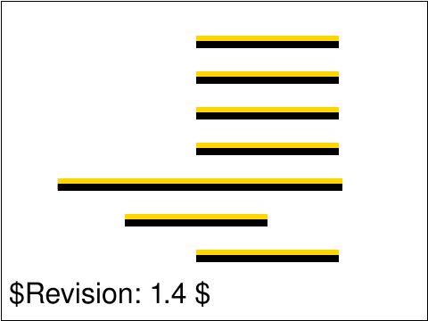 paths-data-18-f.svg paths-data-18-f.svg |
Microsoft |
CL |
accepted |
The 'path' element's 'd' attribute ignores additional whitespace, newline characters, and commas, and BNF processing consumes as much content as possible, stopping as soon as a character that doesn't satisfy the production is encountered.
Various black path segments are rendered that each demonstrate one of the parsing rules. Each path segment is placed on top
of a similar path segment that lacks the particular parsing rule that is being tested. Test passes if no red is visible.
|
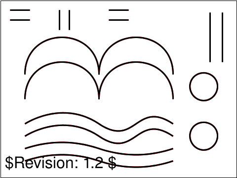 paths-data-19-f.svg paths-data-19-f.svg |
Microsoft |
ED |
accepted |
Test that additional parameters to pathdata commands are treated as additional calls to the most recent command.
Each of the applicable 'pathdata' commands are used in separate 'path' elements. Each command is repeated in red and
overlayed with another 'path' element with identical coordinates specified but without the repeated command in black.
Commands that do not render or do not take parameters are omitted.
|
 paths-data-20-f.svg paths-data-20-f.svg |
ED |
CL |
accepted |
Tests parsing of the elliptical arc path syntax.
|
 paths-dom-01-f.svg paths-dom-01-f.svg |
ED |
[reviewer] |
created |
Test the getTotalLength, getPointAtLength and getPathSegAtLength DOM methods.
The left green rect should have text around it. The text should start at 50 user units distance-along-the-path, which is the same as half the rect width.
The right green rect should also have text around it, but the text should start 50 units along the path relative to the provided pathLength. Since 50 is
half of the provided pathLength the text will start at the lower right-hand corner, and if the text is too long to fit it will be cut off when reaching
the upper left corner of the rect.
|
usesred |
 paths-dom-02-f.svg paths-dom-02-f.svg |
ED |
[reviewer] |
created |
This test is designed to test the PathSegList interface. At first a flower-like shape with 6 petals should be displayed.
The roundness and number of petals are then animated using script.
|
usesred |
 pservers-grad-01-b.svg pservers-grad-01-b.svg |
Haroon Sheikh |
SVGWG |
accepted |
Test that the viewer can handle the xlink:href attribute on
linear gradients. The top rectangle has a simple
blue (left) to lime (right) linear gradient. The lower one
has a different gradient definition, but
should look the same as the one above, because the gradient makes a
reference to the first gradient, without modifying any attribute.
|
 pservers-grad-02-b.svg pservers-grad-02-b.svg |
Haroon Sheikh |
SVGWG |
accepted |
Test that the viewer can handle the xlink:href attribute on
radial gradients.
There are two rectangles. The top one has
a radial gradient (black to orange) that should appear elliptical
to fit the aspect ratio of the rectangle. The units are
specified in objectBoundingBox space. The gradient
on the lower one
references the gradient of the top rectangle, but modifies
the units to use userSpace instead. So it is only using the
stops from the gradient to the left, with a different geometry. The radial gradient appears circular.
|
 pservers-grad-03-b.svg pservers-grad-03-b.svg |
Haroon Sheikh |
SVGWG |
accepted |
Test that the viewer can handle the xlink:href attribute on
patterns.
There are two rectangles with a pattern fill made
up of 4 rectangles. The pattern definition of the lower one references the pattern definition
of the upper one, using the xlink:href attribute. Because
the particular way that the patterns and rectangles are
defined in this test case, the two fills will appear the
same - the rectangles are positioned on pattern-size
boundaries, so that the offsets into the pattern at the left
edges of the respective rectangles is identical.
|
 pservers-grad-04-b.svg pservers-grad-04-b.svg |
Haroon Sheikh |
SVGWG |
accepted |
Test that checks the capability of the stop element in linear and radial
gradients.
The first rectangle has a linear gradient fill with a vector starting at top left
and going to bottom right. The stop colors are at 20% spacing apart and are in the
following order : violet, blue, lime, yellow, orange, green.
Because the gradient vector vector goes from (0,0) to (1,1) in object bounding box space
and because the object bounding box has a larger width than height, the gradient vector
is skewed off of a pure 45 degree angle. The gradient stripes are also skewed
so that they are no longer perpendicular to the gradient vector.
The next rectangle has a radial gradient fill with a multi-color stops from innermost
to outermost in the following order: black, yellow, orange, blue, white, green.
|
 pservers-grad-05-b.svg pservers-grad-05-b.svg |
Haroon Sheikh |
SVGWG |
accepted |
Test that checks the capability of the stop opacity in linear and radial
gradients.
There are two tests which contain rectangles with gradients using stop-opacity properties.
A cyan color text string "Background" is put behind both of the rectangles to help
demonstrate the opacity concept.
From top-down the appearance of objects is as follows.
The first rectangle has a linear gradient fill with a vector starting at top left
and going to bottom right. The stop colors are at 20% spacing apart and are in the
following order : violet, blue, lime, yellow, orange, black.
Also a stop opacity is given to the colors in the following order: 1, 0.2, 0.5, 0, 0.8, 1
Because the gradient vector vector goes from (0,0) to (1,1) in object bounding box space
and because the object bounding box has a larger width than height, the gradient vector
is skewed off of a pure 45 degree angle. The gradient stripes are also skewed
so that they are no longer perpendicular to the gradient vector.
The next rectangle has a radial gradient fill with a multi-color stops from innermost
to outermost in the following order: black, yellow, red, blue, white, green.
Also a stop opacity is given to the colors in the following order: 1, 0.2, 0.5, 0, 0.8, 1
|
 pservers-grad-06-b.svg pservers-grad-06-b.svg |
Haroon Sheikh |
SVGWG |
accepted |
Test that the viewer can handle the gradientTransform and the patternTransform
attribute on gradients and patterns respectively.
From top-down the appearance of objects is as follows.
The top rectangle has a linear gradient whose coordinate system has been scaled down by
a half. So the gradient travelling from left to right (from blue to green to lime) should
only occuply the left half the rectangle.
The next rectangle has radial gradient that has been translated to the center and skewed
in the positive X direction by 45 degrees. Therefore the gradient should appear
ellipltical and rotated around the center.
The last row contains a rectangle with pattern on the fill. The transformation on the
pattern moves the coordinate system to the top left of the rectangle and then scales it
by a factor of 2 and then skew's it in the X direction by 45 degrees. The pattern
consists of a 2 by 2 array of colored rectangles.
|
 pservers-grad-07-b.svg pservers-grad-07-b.svg |
Haroon Sheikh |
SVGWG |
accepted |
Test that the viewer has basic capability to handle linear gradients
on fills and stroke of objects and text.
This test uses the following elements : <linearGradient>, <stop>
and the following properties : stop-color, fill:url(# ), stroke(url# )
Both elements in this test use the same simple gradient. It is a linear gradient from
blue (left) to lime (right). From top-down the appearance of objects is as follows.
The top rectangle should be filled with the gradient.
The next rectangle has no fill, but has a thick stroke on which the gradient is
applied.
|
 pservers-grad-08-b.svg pservers-grad-08-b.svg |
Haroon Sheikh |
SVGWG |
accepted |
Test that the viewer has basic capability to handle linear gradients
on fills and stroke of text.
Both elements in this test use the same simple gradient. It is a linear gradient from blue (left) to lime (right). From top-down the appearance of objects is as follows.
The first item is a text string "Gradient on fill" with the gradient on the fill of the text.
The second item is a text string that is not filled. It has a 2 user unit stroke on which the gradient is applied.
|
 pservers-grad-09-b.svg pservers-grad-09-b.svg |
Haroon Sheikh |
SVGWG |
accepted |
Test that the viewer can handle the gradientUnits attribute on linear gradients.
It tests the following values of gradientUnits: default (userSpace), objectBoundingBox,
and userSpaceOnUse.
From top-down the appearance of objects is as follows.
The first rectangle uses the default attributes on the linearGradient element.
Therefore the linear gradient should default to objectBoundingBox. It should appear
from the left edge of the rectangle (blue) to the right edge of the rectangle (lime).
The rectangle is smaller than the viewport, because a previous version of the SVG spec had the default value be 'viewport'.
The test fails if only a portion of the gradient is shown.
The next rectangle uses gradientUnits=objectBoundingBox. The linear gradient should
travel from blue (top) to lime (bottom).
The last rectangle uses gradientUnits=userSpaceOnUse. The rectangle element is given it's
own transformation and the gradient is assumed to be in this user space.
The gradient should appear as a linear gradient from lime (left) to blue (right).
|
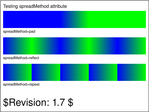 pservers-grad-10-b.svg pservers-grad-10-b.svg |
Haroon Sheikh |
SVGWG |
accepted |
Test that the viewer can handle the spreadMethod attribute on linear gradients.
|
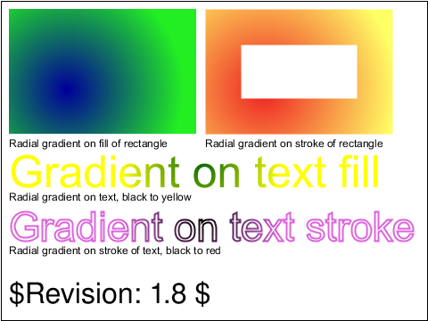 pservers-grad-11-b.svg pservers-grad-11-b.svg |
Haroon Sheikh |
SVGWG |
accepted |
Test that the viewer has basic capability to handle radial gradients
on fills and stroke of objects and text.
This test uses the following elements : <radialGradient>, <stop>
and the following properties : stop-color, fill:url(# ), stroke(url# )
From top-down (left to right) the appearance of objects is as follows.
The top left rectangle should be a radial gradient from dark blue (in) to lime (outside).
The gradient is applied to the fill of the rectangle.
The next rectangle has no fill, but has a thick stroke on which the gradient is
applied. The gradient goes from dark orange(in) to pale yellow (out).
The next item is a text with a radial gradient on the fill. The gradient goes
from green (in) to yellow (out).
The last item is a text with a 2 user unit stroke on which a black (in) to magenta
(out) linear gradient is applied.
|
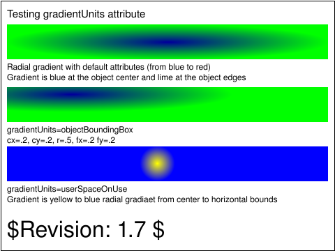 pservers-grad-12-b.svg pservers-grad-12-b.svg |
Haroon Sheikh |
SVGWG |
accepted |
Test that the viewer can handle the gradientUnits attribute on radial gradients.
It tests the following values of gradientUnits: default (objectBoundingBox), objectBoundingBox,
and userSpaceOnUse.
From top-down the appearance of objects is as follows.
The first rectangle uses the default attributes on the radialGradient element.
Therefore the radial gradient should be relative to the object bounding box. It should appear
from the center of the viewport (blue) to the edges of the viewport (lime).
The rectangle is wider than tall so it the gradient should be elliptical, not circular.
The next rectangle uses gradientUnits=objectBoundingBox. The radial gradient should
travel from a center of 20%, 20% of the rectangle with a radius of 50%.
The last rectangle uses gradientUnits=userSpaceOnUse. The rectangle element is given it's
own transformation and the gradient is assumed to be in this user space.
The gradient should appear in the center of the rectangle as a radial gradient from yellow (center) to blue (edge).
|
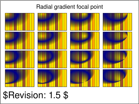 pservers-grad-13-b.svg pservers-grad-13-b.svg |
BB |
CL |
accepted |
The purpose of this file is to test several values for focal points of radial gradients.
|
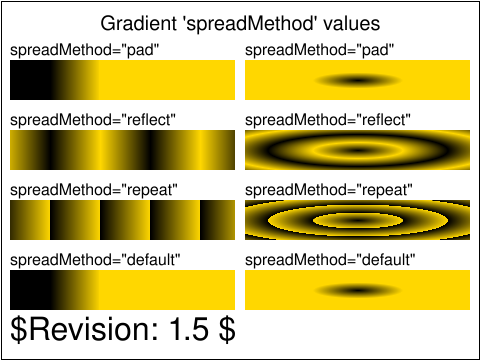 pservers-grad-14-b.svg pservers-grad-14-b.svg |
BB |
CL |
accepted |
The intent of this file is to test the 4 allowed spread methods for linear and radial gradients.
The 4 values (pad, reflect, repeat and default) are available for both types of gradients.
On the left side are the linear gradient results, and on the right, the radial results.
The UA should render a result equivalent to the reference image.
|
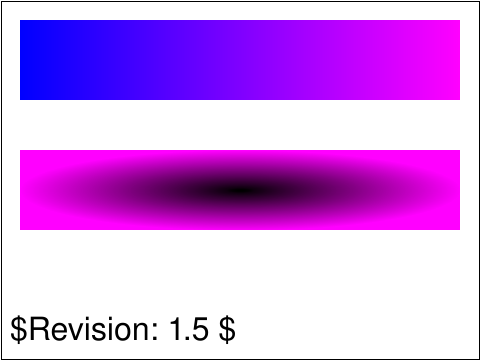 pservers-grad-15-b.svg pservers-grad-15-b.svg |
CN |
CL |
accepted |
Test linear and radial gradient defaults. Includes
testing defaults for linear grad x1,y1,y2 = 0%, x2 = 100%.
and testing defaults for radial grad cx,cy,r = 50%, fx,fy = cx,cy.
|
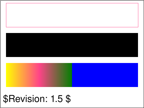 pservers-grad-16-b.svg pservers-grad-16-b.svg |
CN |
CL |
accepted |
Test gradient stop rules. Including:
No stops, like fill = none.
One stop, like fill = black.
If a stop less than all previous stops, it is set equal to the largest stop.
If two stops are equal the last stop controls the color at the overlap point.
|
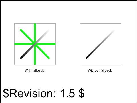 pservers-grad-17-b.svg pservers-grad-17-b.svg |
ED |
AE |
accepted |
This test has a gradient with gradientUnits='objectBoundingBox' which is a fade from black to white.
The gradient is used for the stroke of a line. Vertical and horizontal lines don't have a boundingbox,
since they are one-dimensional, even though the
stroke-width makes it look like they should have a boundingbox with non-zero width and height.
See the coordinate chapter, last paragraph of 7.11.
|
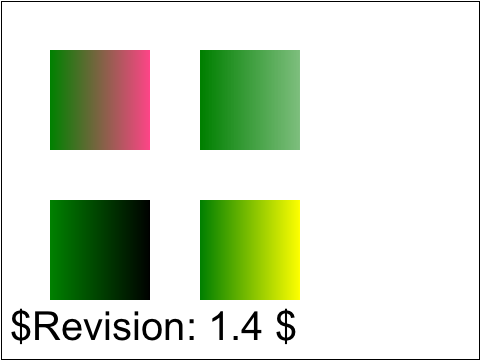 pservers-grad-18-b.svg pservers-grad-18-b.svg |
CC |
ED |
accepted |
This test shows rectangles filled with gradient.
Several gradients are defined, with two stops:
|
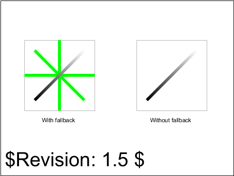 pservers-grad-20-b.svg pservers-grad-20-b.svg |
ED |
AG |
accepted |
This test has a gradient with gradientUnits='objectBoundingBox' which is a fade from black to white.
The gradient is used for the stroke of a line. Vertical and horizontal lines don't have a boundingbox, since they are one-dimensional, even though the
stroke-width makes it look like they should have a boundingbox with non-zero width and height.
See the coordinate chapter, last paragraph of 7.11.
|
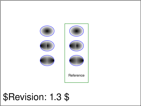 pservers-grad-21-b.svg pservers-grad-21-b.svg |
ED |
AG |
accepted |
Test the inheritance of radial gradient attributes. The test has six ellipses with blue stroke, each filled
with two gradients.
|
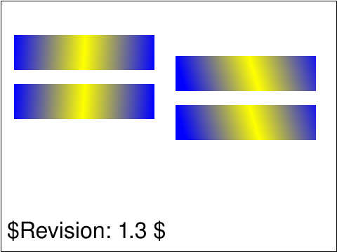 pservers-grad-22-b.svg pservers-grad-22-b.svg |
AG |
ED |
accepted |
Tests that transforms affect the rendering of a gradient.
|
 pservers-grad-23-f.svg pservers-grad-23-f.svg |
Microsoft |
[reviewer] |
created |
|
usesred |
 pservers-grad-24-f.svg pservers-grad-24-f.svg |
Microsoft |
CM |
reviewed |
Test that the 'linearGradient' and 'radialGradient' elements are neither rendered directly nor via the 'use' element.
The test defines 'linearGradient' and 'radialGradient' elements with a red 'stop' and references them from a 'use' element. 'linearGradient'
and 'radialGradient' elements with a red 'stop' are also specified outside of a 'defs' tag as if they were regular graphical elements.
|
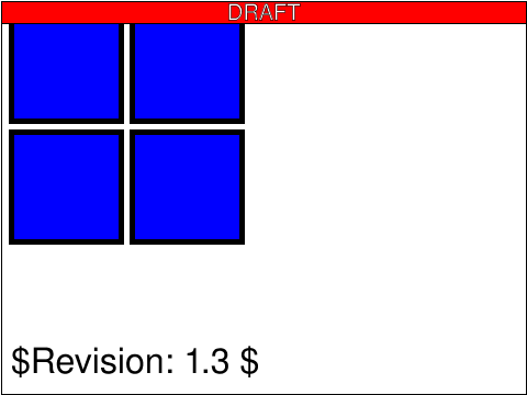 pservers-grad-stops-01-f.svg pservers-grad-stops-01-f.svg |
Microsoft |
CM |
reviewed |
Test that gradient offset values less than zero are rounded up to zero and values more than one are rounded down to one.
The test defines four gradients, each with a single stop where the 'stop-color' is set to 'blue'.
The four gradients have 'offset' set to '-1', '-1%', '101%' and '2'. Four rectangles reference
the gradients. All of these should render as if they have plain blue fills.
|
usesred |
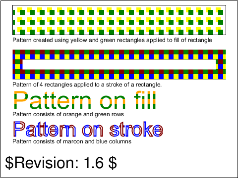 pservers-pattern-01-b.svg pservers-pattern-01-b.svg |
Haroon Sheikh |
SVGWG |
accepted |
Test that the viewer has basic capability to handle patterns
on fills and stroke of objects and text.
|
 pservers-pattern-02-f.svg pservers-pattern-02-f.svg |
ED |
CM |
accepted |
Test that the 'patternTransform' attribute has an effect on the 'pattern' element.
|
 pservers-pattern-03-f.svg pservers-pattern-03-f.svg |
ED |
[reviewer] |
created |
Test that empty patterns are not rendered, and that the fallback color is used instead.
|
usesred |
 pservers-pattern-04-f.svg pservers-pattern-04-f.svg |
Microsoft |
ED |
accepted |
Inherited attributes from a referenced 'pattern' are not applied if they are already defined on the referencing 'pattern' element.
Define a pattern 'pattern1' with circles that have red fill. Inherit 'pattern1' into 'pattern2' and add circles at different 'y'
attribute and with 'fill' set to 'lime' on 'pattern2'. Reference 'pattern1' from a square using 'fill' attribute. Reference 'pattern2'
from a different square using 'fill' attribute. Position the second square directly over the first square. Verify that there is green visible.
|
 pservers-pattern-05-f.svg pservers-pattern-05-f.svg |
Microsoft |
CM |
reviewed |
Test that a 'pattern' element can inherit attributes through multiple levels of
'xlink:href' referencing.
The test defines a pattern 'pattern1' with some attributes that scale the contents. The attributes on
'pattern1' are inherited into 'pattern2' and then inherited from 'pattern2'
into 'pattern3'. 'pattern3' has a green circle as its graphical content.
A 'rect' uses 'pattern3' as its fill, if the attributes are correctly inherited into
'pattern3', then the green circle will occlude a red circle in the same position.
|
usesred |
 pservers-pattern-06-f.svg pservers-pattern-06-f.svg |
Microsoft |
[reviewer] |
created |
|
 pservers-pattern-07-f.svg pservers-pattern-07-f.svg |
ED |
CM |
reviewed |
Test that an invalid xlink:href on a 'pattern' element has no effect on the pattern.
The pattern dimensions and coordinate-system are defined completely on the pattern that has the invalid xlink:href,
to test that they're not overridden by the non-existant pattern that is referenced.
|
 pservers-pattern-08-f.svg pservers-pattern-08-f.svg |
ED |
CM |
reviewed |
Test that an invalid xlink:href on a 'pattern' element has no effect on the pattern.
This test specifies only 'width' and 'height' on the pattern that is tested in order to catch
incorrectly overridden values from a non-existant pattern. The result is tested
with a reference pattern using slightly different syntax.
|
 pservers-pattern-09-f.svg pservers-pattern-09-f.svg |
ED |
[reviewer] |
created |
Test that an invalid xlink:href on a 'pattern' element has no effect on the pattern, and that the
pattern isn't rendered since the default 'width' and 'height' is 0.
A subtest that explicitly specifies 'width' and 'height' as 0 is added as a reference.
Both of these cases should result in the fallback color being used.
|
 render-elems-01-t.svg render-elems-01-t.svg |
Vincent Hardy |
SVGWG |
accepted |
Verifies that shapes can be filled.
|
 render-elems-02-t.svg render-elems-02-t.svg |
Vincent Hardy |
SVGWG |
accepted |
Verifies that shapes can be stroked.
|
 render-elems-03-t.svg render-elems-03-t.svg |
Vincent Hardy |
SVGWG |
accepted |
Verifies that shapes can be filled, stroked and the order of filling and stroking.
|
 render-elems-06-t.svg render-elems-06-t.svg |
Vincent Hardy |
SVGWG |
accepted |
Verifies that text can be filled.
|
 render-elems-07-t.svg render-elems-07-t.svg |
Vincent Hardy |
SVGWG |
accepted |
Verifies that text can be stroked. The
|
 render-elems-08-t.svg render-elems-08-t.svg |
Vincent Hardy |
SVGWG |
accepted |
Verifies that text can be stroked.
|
 render-groups-01-b.svg render-groups-01-b.svg |
Vincent Hardy |
SVGWG |
accepted |
Verifies implicit rendering order (paragraph 3.3) and grouping mechanism (paragraphs 3.4).
It also validates basic Shape, Image and text rendering.
|
 render-groups-03-t.svg render-groups-03-t.svg |
Vincent Hardy |
SVGWG |
accepted |
Verifies implicit rendering order (paragraph 3.3) and grouping mechanism (paragraphs 3.4).
It also validates basic Shape, Image and text rendering.
|
 script-handle-01-b.svg script-handle-01-b.svg |
Vincent Hardy |
SVGWG |
accepted |
Tests basic mouse event handler and DOM manipulation through
ECMAScript binding.
The test uses ECMAScript and initially displays a target with
a message asking the user to click on the target. Once the user
has done so, and if both event handling and DOM manipulation are
supported, then the target and initial text are hidden and a text
message indicating that the test was successful is displayed.
|
 script-handle-02-b.svg script-handle-02-b.svg |
Vincent Hardy |
SVGWG |
issue |
Resolved to unapproved this test because elements being
focusable and activatable is underdefined in the spec. ACTION-2977
Tests basic mouse event handlers.
The test shows a target that can be used to generate the various
kinds of events supported in SVG. Below the
target, the list of events is shown with red markers next to each.
If the test passes, all the markers should have turned to green
after the events have been triggered on the target. If any event
has not triggered, its marker will remain red.
|
 script-handle-03-b.svg script-handle-03-b.svg |
Vincent Hardy |
SVGWG |
accepted |
Tests basic mouse event handlers.
The test shows a target that can be used to generate the various
kinds of mouse events supported in SVG. Below the
target, the list of events is shown with red markers next to each.
If the test passes, all the markers should have turned to green
after the events have been triggered on the target. If any event
has not triggered, its marker will remain red.
|
 script-handle-04-b.svg script-handle-04-b.svg |
Vincent Hardy |
SVGWG |
accepted |
Tests basic mouse event handlers.
The test shows a target that can be used to generate the various
kinds of mouse events supported in SVG. Below the
target, the list of events is shown with red markers next to each.
If the test passes, all the markers should have turned to green
after the events have been triggered on the target. If any event
has not triggered, its marker will remain red.
|
 script-specify-01-f.svg script-specify-01-f.svg |
CL |
CM |
reviewed |
Tests the assertion that "The ‘contentScriptType’ attribute on the ‘svg’ element specifies the default scripting language" by setting it to an unknown value and checking the script is not executed.
The test uses an unknown (bogus) script language, which looks exactly like ECMAScript.
|
usesred |
 script-specify-02-f.svg script-specify-02-f.svg |
CL |
CM |
accepted |
Tests the assertion that "It is also possible to specify the scripting language for each individual ‘script’ element by specifying a ‘type’ on the ‘script’ element." by setting it to an unknown value and checking the script is not executed.
The test uses an unknown (bogus) script language, which looks exactly like ECMAScript.
|
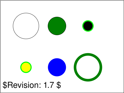 shapes-circle-01-t.svg shapes-circle-01-t.svg |
Lofton Henderson |
SVGWG |
accepted |
Tests the circle element
|
 shapes-circle-02-t.svg shapes-circle-02-t.svg |
CN |
DJ |
accepted |
Default attributes test with circle.
|
 shapes-ellipse-01-t.svg shapes-ellipse-01-t.svg |
Kelvin R |
SVGWG |
accepted |
Test the ellipse element.
|
 shapes-ellipse-02-t.svg shapes-ellipse-02-t.svg |
CN |
DJ |
accepted |
Defaults test with ellipse.
|
 shapes-ellipse-03-f.svg shapes-ellipse-03-f.svg |
Microsoft |
ED |
accepted |
The 'ellipse' element defines an ellipse which is axis-aligned with the current user coordinate system when it is not the initial user coordinate system.
The test shows an 'ellipse' element originating at (0,0) of the current user coordinate system, which has been altered via 'transform' from
the initial user coordinate system. Two perpendicular lines which also originate at (0,0) and advance along the x and y axes of
the current user coordinate system are shown. These lines overlap the top and left edges of the ellipse and verifies that the ellipse is
thus axis-aligned with its current user coordinate system.
|
 shapes-grammar-01-f.svg shapes-grammar-01-f.svg |
CL |
ED |
accepted |
Check that negative second coordinate in a coordinate pair does not need separating wsp-comma.
|
 shapes-intro-01-t.svg shapes-intro-01-t.svg |
SH |
CN |
accepted |
Tests the degenerate cases of the basic shapes. The shapes are positioned
within the black rectangles.
|
 shapes-intro-02-f.svg shapes-intro-02-f.svg |
Microsoft |
ED |
accepted |
Test that basic shape elements are equivalent to a 'path' element that constructs the same shape.
For each basic shape, a 'path' reference element that is red is created.
A basic shape is then placed on top of the 'path' element.
For each basic shape there's also a reverse test that uses the shape as a reference for the 'path' element.
|
 shapes-line-01-t.svg shapes-line-01-t.svg |
Lofton Henderson |
CL |
accepted |
Tests the line element.
|
 shapes-line-02-f.svg shapes-line-02-f.svg |
Microsoft |
CL |
accepted |
The 'fill' attribute has no effect on the 'line' element.
|
 shapes-polygon-01-t.svg shapes-polygon-01-t.svg |
Kelvin R |
SVGWG |
accepted |
This test draws six different polygons excercising portions of the path attribute.
|
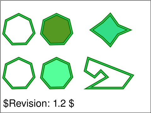 shapes-polygon-02-t.svg shapes-polygon-02-t.svg |
CL |
AG |
accepted |
Checks that polygons and the equivalent paths are indeed equivalent.
|
 shapes-polygon-03-t.svg shapes-polygon-03-t.svg |
Microsoft |
ED |
accepted |
Test that 'polyline' and 'polygon' elements with an odd number of coordinates render up to the invalid coordinate.
|
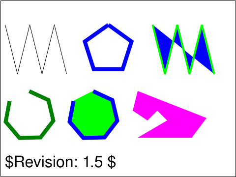 shapes-polyline-01-t.svg shapes-polyline-01-t.svg |
Lofton |
SVGWG |
accepted |
Tests the polyline element.
|
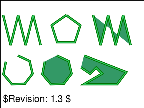 shapes-polyline-02-t.svg shapes-polyline-02-t.svg |
CL |
AG |
accepted |
Checks that polylines and the equivalent paths are indeed equivalent.
|
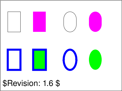 shapes-rect-01-t.svg shapes-rect-01-t.svg |
Kelvin R |
SVGWG |
accepted |
This is a simple test of the rect element.
|
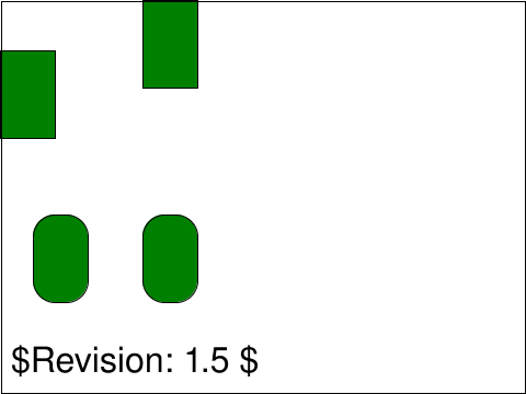 shapes-rect-02-t.svg shapes-rect-02-t.svg |
CN |
DJ |
accepted |
Test x, y, width, height, rx and ry default/lacuna values on a rect element.
|
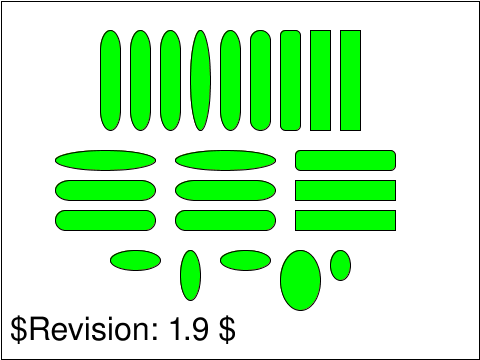 shapes-rect-03-t.svg shapes-rect-03-t.svg |
ED |
CM |
accepted |
Tests rx and ry clamping and aliasing.
|
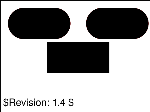 shapes-rect-04-f.svg shapes-rect-04-f.svg |
Microsoft |
CL |
accepted |
'Rect' elements with unspecified 'rx' and 'ry' attributes will use the specified 'rx' and 'ry' value if the other one is specified; if neither is specified, the 'rect' has square edges.
Creates one 'rect' element with an unspecified 'ry'. Places it over a red 'rect' element with both 'rx' and 'ry' specified. Repeat with unspecified 'rx'. Finally creates a 'rect' element that has neither 'rx' or
'ry' specified.
|
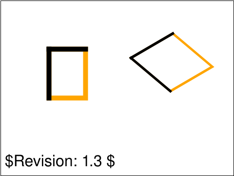 shapes-rect-05-f.svg shapes-rect-05-f.svg |
Microsoft |
CL |
accepted |
The 'rect' element defines a rect which is axis-aligned with the default user coordinate system when it is not the initial user coordinate system.
Draws a 'rect' element originating at (0,0) of the current user coordinate system, which has been altered via 'transform' from the
initial user coordinate system. Draws perpendicular lines which also originate at (0,0) and advance along the x and y axes of the
current user coordinate system. Verifies that the lines overlap the top and left edges of the rectangle and that the rectangle is
thus axis-aligned with its current user coordinate system.
|
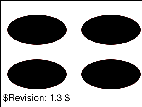 shapes-rect-06-f.svg shapes-rect-06-f.svg |
Microsoft |
CL |
accepted |
When 'rect' attributes 'rx' and 'ry' have a value greater than half of the width/height of the rectangle, they are treated as half the width/height of the rectangle.
The test creates one 'rect' element with 'rx' greater than 1/2 the 'rect' width. Underneath that element, it creates a red 'rect' element with
'rx' set to 1/2 the width. Repeats with 'ry' attribute.
|
 shapes-rect-07-f.svg shapes-rect-07-f.svg |
Microsoft |
CL |
accepted |
Checks that unspecified 'ry' and 'rx' attributes are copied from each other before their values are clamped.
|
 struct-cond-01-t.svg struct-cond-01-t.svg |
Tim Thompson |
SVGWGh |
accepted |
This test evaluates a switch statement.
The test uses the 'rect' element, as well as basic fill (solid primary colors),
stroke (black 1-pixel lines), font-family (Arial) and font-size properties.
|
 struct-cond-02-t.svg struct-cond-02-t.svg |
Chris Lilley |
SVGWG |
accepted |
This tests ability to use the 'systemLanguage' as a test attribute within a
switch element.
|
 struct-cond-03-t.svg struct-cond-03-t.svg |
VH |
CN |
accepted |
Tests the <switch> element with requiredFeatures.
|
 struct-cond-overview-02-f.svg struct-cond-overview-02-f.svg |
Microsoft |
CM |
reviewed |
Test that 'use' instances of elements with failing conditional processing attributes are not rendered.
Six blue 'rect' elements are defined. For each conditional processing attribute, a black 'rect' element is defined with that particular conditional
processing attribute set to an arbitrary string that would cause the attribute's requirement test to fail. Each of the black 'rect' elements is
positioned so that it would completely cover the blue 'rect' if it were visible. A corresponding 'use' element is defined for each black 'rect'
and is positioned such that it would cover the remaining three blue 'rect' elements. The six blue 'rect' elements should be visible.
|
 struct-cond-overview-03-f.svg struct-cond-overview-03-f.svg |
Microsoft |
CM |
reviewed |
Test that conditional processing attributes set to an empty string are evaluated as false.
Three blue 'rect' elements are in the document. For each of the
conditional processing attributes, a black 'rect' element is
specified with a conditional processing attribute set to an empty string.
The black 'rect' is positioned so that it would completely cover the
blue 'rect' if it were visible. The three blue 'rect'
elements should be visible.
|
usesred |
 struct-cond-overview-04-f.svg struct-cond-overview-04-f.svg |
Microsoft |
CM |
reviewed |
Test that elements with conditional processing attributes that evaluate to true do not render if their parent contains conditional processing attributes that evaluate to false.
The test has a 'g' element with its 'requiredFeatures' attribute set to an arbitrary feature string that would cause the attribute's requirement test to fail.
A red 'rect' element is a child node of the 'g' element. The 'rect' element has the 'requiredFeatures' attribute set to a supported feature string.
'http://www.w3.org/TR/SVG11/feature#ConditionalProcessing' was chosen as a valid feature string to reduce dependencies on other SVG features.
|
usesred |
 struct-cond-overview-05-f.svg struct-cond-overview-05-f.svg |
Microsoft |
[reviewer] |
created |
Elements whose parent elements have failing conditional processing attributes are able to be referenced and rendered by 'use' elements.
Define three 'rect' elements that have a 'g' parent with either an invalid 'requiredFeature', 'requiredExtension', or 'systemLanguage'.
Then define three 'use' elements that reference the 'rect' elements. Verify that the 'use' elements render.
|
usesred |
 struct-defs-01-t.svg struct-defs-01-t.svg |
Tim Thompson |
SVGWG |
accepted |
Test to verify that the defs element is used as a container correctly.
In this test a fill is created which is solid green. The view should be a solid green rectangle
centered in the viewport 100 pixels from from left,top and right,bottom. Also, in the
defs sections there are rectangle defined, one to paint over the entire canvas with
a red fill and the other to obscure most of the green rectangle.
|
 struct-dom-01-b.svg struct-dom-01-b.svg |
VH |
SVGWG |
accepted |
Verify the basic capability to handle the SVG DOM API.
The test is composed of a top
level svg element with an 'onload' event handler and a rect element. Both
the svg and the rect elements have an identifier. The 'onload' handler
invokes SVG-specific DOM API methods which use these identifiers.
First, the handler gets the SVG element owner of the rect element and checks it has
the expected identifier. Then, the handler accesses the coordinates of the rect element
and uses them to build a 'shadow' rectangle under the existing one. Finally, the 'shadow'
rectangle is created using the SVGSVGElement's createSVGRect method.
|
 struct-dom-02-b.svg struct-dom-02-b.svg |
Vincent Hardy |
ED |
accepted |
Verify the basic capability to handle the hasFeature DOMImplementation method.
The DOMImplementation instance is retrieved from the Document instance. Then,
its hasFeature method is invoked on the various SVG feature strings.
The test displays the set of SVG feature strings and, next to them, a text
string that shows whether the feature is supported or not.
Note that this test uses the 'onload' event on the root svg element.
|
 struct-dom-03-b.svg struct-dom-03-b.svg |
Vincent Hardy |
ED |
accepted |
Verify the basic capability to handle the hasFeature DOMImplementation method.
The DOMImplementation instance is retrieved from the Document instance. Then,
its hasFeature method is invoked on the various SVG feature strings.
The test displays the set of SVG feature strings and, next to them, a text
string that shows whether the feature is supported or not.
Note that this test uses the 'onload' event on the root svg element.
|
 struct-dom-04-b.svg struct-dom-04-b.svg |
Vincent Hardy |
SVGWG |
accepted |
Verify the basic capability to handle the hasFeature DOMImplementation method.
The DOMImplementation instance is retrieved from the Document instance. Then,
its hasFeature method is invoked on the various SVG feature strings.
The test displays the set of SVG feature strings and, next to them, a text
string that shows whether the feature is supported or not.
Note that this test uses the 'onload' event on the root svg element.
|
 struct-dom-05-b.svg struct-dom-05-b.svg |
Vincent Hardy |
SVGWG |
accepted |
Verify the basic capability to handle the hasFeature DOMImplementation method.
The DOMImplementation instance is retrieved from the Document instance. Then,
its hasFeature method is invoked on the various SVG feature strings.
The test displays the set of SVG feature strings and, next to them, a text
string that shows whether the feature is supported or not.
Note that this test uses the 'onload' event on the root svg element.
|
 struct-dom-06-b.svg struct-dom-06-b.svg |
Vincent Hardy |
SVGWG |
accepted |
Verify the basic capability to handle the DOM API. The test is composed of a top
level svg element with an onload event handler. This handler invokes core (i.e., non
SVG specific) DOM API methods to modify the document's content: it removes an element,
modifies an attribute and adds elements.
|
 struct-dom-07-f.svg struct-dom-07-f.svg |
ED |
AQ |
accepted |
The svg contains three use elements that each reference three rects from an svg element in the document.
Before the onload-script is run there should be 9 red rects visible. The script changes the fill of the rects to be green.
|
 struct-dom-08-f.svg struct-dom-08-f.svg |
CM |
DAS |
accepted |
This tests that SVGSVGElement.unsuspendRedraw() does not
throw an exception if the redraw suspend timeout has elapsed.
After loading the test, wait for one second. Some time
before the one second has elapsed, the rectangle should change
color to indicate the result of the test: black if the test
did not run, red if the test failed and green if the test
passed.
|
 struct-dom-11-f.svg struct-dom-11-f.svg |
CM |
ED |
accepted |
This tests that the getIntersectionList() and getEnclosureList()
methods return NodeLists that are not live.
After loading the test, two rectangles will be presented. The
upper rectangle indicates the result of testing whether
getIntersectionList() returns a non-live NodeList, while the
lower rectangle indicates so for getEnclosureList().
|
 struct-dom-12-b.svg struct-dom-12-b.svg |
AQ |
AN |
accepted |
This test checks two properties from the SVGElementInstance interface, correspondingElement and correspondingUseElement
|
 struct-dom-13-f.svg struct-dom-13-f.svg |
ED |
[reviewer] |
empty |
Test for checkIntersection and getIntersectionList.
|
usesred |
 struct-dom-14-f.svg struct-dom-14-f.svg |
ED |
SVGWG |
accepted |
Test SVGElementInstance.childNodes.
The test has an optional subtest that indicates whether SVGElementInstance.firstChild and
SVGElementInstance.childNodes.item(0) are strictly equal. The status of this subtest is
displayed by a circle in the middle of the testframe, it will be yellow if the objects are
not strictly equal, and green if they are.
|
 struct-dom-15-f.svg struct-dom-15-f.svg |
ED |
SVGWG |
accepted |
Test SVGElementInstance and EventTarget.dispatchEvent.
|
 struct-dom-16-f.svg struct-dom-16-f.svg |
Microsoft |
[reviewer] |
created |
The 'SVGSVGElement' interface allows for creation of references to various primitive SVG interface types with explicitly defined default values.
A reference to an 'SVGSVGElement' is obtained through an 'svg' element in the page's markup. Each of the 'CreateSVG*' methods is called from this
reference and initial values are verified. A counter is used to determine whether all conditions are satisfied. The word 'fail' in red via an SVG
'text' element is used to indicate failure and the word 'pass' in black is used to indicate passing.
|
usesred |
 struct-dom-17-f.svg struct-dom-17-f.svg |
Microsoft |
CM |
reviewed |
Tests that the 'getElementById' method for the 'SVGSVGElement' interface is scoped.
Two subtrees of 'svg' elements are used, each with 'rect' elements as children. A reference to the first 'svg' element is obtained via the
'document' element's 'getElementById' method. This reference is used to verify the presence of 'getElementId'. Next, 'getElementById' on
the 'SVGSVGElement' reference is used to locate its child element. Then, 'getElementById' attempts to get an element in a neighboring subtree.
Finally, an element at the sibling level is attempted to be accessed via 'getElementById'.
|
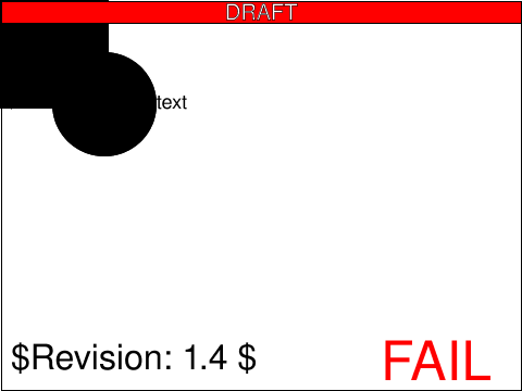 struct-dom-18-f.svg struct-dom-18-f.svg |
Microsoft |
[reviewer] |
created |
|
usesred |
 struct-dom-19-f.svg struct-dom-19-f.svg |
Microsoft |
CM |
reviewed |
Test that the 'SVGElementInstanceList' element's 'length' attribute correctly reflects the implied element hierarchy on recursive 'use' instances.
The test has a 'use' element referencing a 'g' element with another 'use' element referencing the 'use' element. The 'instanceRoot' of the
most indirect 'use' element is used to access the corresponding 'SVGElementInstance'. The test passes if the 'childNodes' attribute's 'length'
attribute for the most indirect 'SVGElementInstance' has a value of '1' and the 'childNodes' attribute's 'length' attribute for the most direct
'SVGElementInstance' has a value of '0'.
|
 struct-dom-20-f.svg struct-dom-20-f.svg |
ED |
[reviewer] |
created |
Test SVGElementInstance and EventTarget.dispatchEvent.
|
 struct-frag-01-t.svg struct-frag-01-t.svg |
Tim Thompson |
SVGWG |
accepted |
This is an empty SVG document.
|
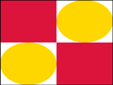 struct-frag-02-t.svg struct-frag-02-t.svg |
VH |
CN |
accepted |
This test validates the use of the preserveAspectRatio attribute on the
root svg element in an SVG Tiny document. In this document, preserveAspectRatio
is set to none and the width and height of the document set to 100%.
The document's viewBox is defined to be 100 by 100 with an origin
in (100, 100). The content is made of 2 red squares and 2
orange circles.
|
 struct-frag-03-t.svg struct-frag-03-t.svg |
VH |
CN |
accepted |
This test validates the use of the preserveAspectRatio attribute on the
root svg element in an SVG Tiny document. In this document, preserveAspectRatio
is set to 'xMidYMid meet' and the width and height of the document set to 100%.
The document's viewBox is defined to be 100 by 100 with an origin
in (100, 100). The content is made of 2 red squares and 2
orange circles.
|
 struct-frag-04-t.svg struct-frag-04-t.svg |
VH |
CN |
accepted |
This test validates the operation of the svg element when there is no
viewbox.
The document has x/y attributes set to (1000, 1000). Because
x/y are ignored on the root svg element, the x/y origin should have no
effect on the drawing.
The document contains squares and circles between the
(100,100) and (200, 200) coordinates.
|
 struct-frag-05-t.svg struct-frag-05-t.svg |
CL |
CN |
accepted |
This tests that XML Namespaces are correctly implemented, in that the tuple
of local name and namespace URI, rather than the prefix, is important.
The first subtest is a
group where the namespace prefix s is bound to the SVG namespace and an s:circle is drawn
in pale yellow. The same group declares the default namespace to be a non-SVG namespace; the
blue circle element in that namespace must not be drawn.
The second subtest puts the namespace declarations on the elements themselves. The
prefix toto is bound to the SVG namespace and the XLink namespace is made the default namespace.
Thus, the blue <toto:a href="uri">Valid</toto:a> is a valid link and must be traversable. Select this link,
then go back to the test.
The third subtest has no prefix on the element name 'a' and uses the usual xlink: prefix on the href
attribute. However, both the default namespace and the namespace bound to the xlink prefix are
dummy namespaces. Not only should the link not be traversable, it must not even display at all.
If the text 'Invalid' is displayed, the test fails.
|
 struct-frag-06-t.svg struct-frag-06-t.svg |
VH |
CL |
accepted |
This test adds testing of some basic XML features SVG User Agents
should support.
First, the test checks support for the default entities amp, lt, gt, apos
and quot. This is what the first line shows in gray.
Second, the test checks support for hexadecimal and decimal character
entities, as shown in the second line, again in gray
Finally, the last line shows usage of an entity defined in the
document's internal DTD subset. The same geometry (a path) is
reused twice, once filled in gray and ones stroked in gray.
|
 struct-group-01-t.svg struct-group-01-t.svg |
Tim Thompson |
SVGWG |
accepted |
The test checks to see that graphics elements (g) can be nested and that the like attributes can be passed to the children.
All the g elements for this test are in the g element whose id=allGs.
|
 struct-group-02-b.svg struct-group-02-b.svg |
Tim Thompson |
SVGWG |
accepted |
The purpose of this test is to check the nesting of SVG elements.
The test uses the 'rect' element, as well as basic fill (solid primary colors),
stroke (black 1-pixel lines), font-family and font-size properties.
There are 4 svg elements in the test.
The first defines the outer square at 480x360.
The second whose id is lowerRight defines a green rectangle which is 1/4 of the outer svg element.
The third svg whose id is upperLeft defines a region that is the upper 1/4 of the outer svg,
it is filled with a blue rectangle. It has a child svg element that defines an area
half again the size of its parent but sharing the same center point, it is filled with a yellow rectangle.
|
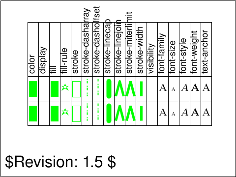 struct-group-03-t.svg struct-group-03-t.svg |
VH |
CN |
accepted |
This test validates that properties are inherited (or not, depending on
their defintion), from a group to its children.
|
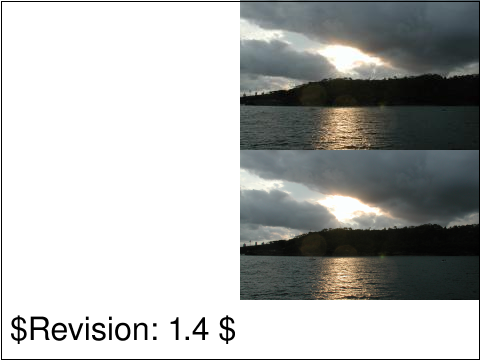 struct-image-01-t.svg struct-image-01-t.svg |
Tim Thompson |
SVGWG |
accepted |
The image test case checks to see if the required raster image formats are supported.
The upper right has an JPEG image, the lower right has a PNG image. They are
the same image.
Those positions are relative to the upper left of the entire canvas.
If any of the components are missing, then an image format is not being
properly supported.
|
 struct-image-02-b.svg struct-image-02-b.svg |
Tim Thompson |
SVGWG |
accepted |
To test the 9 structure elements and their relationships.
S1 tests the defs element and the rendering of an image via the use element.
S2 tests the defs element and the use element by creating an svg element
that contains a blue rectangle. S3 tests the nesting of an SVG element, a
separate graphics element is defined, its coords relative to the svg element.
S4 tests a switch statement, if there is not a green rectangle showing in
S4 there is probably a problem processing a switch.
The test uses the 'rect' element, as well as basic fill (solid primary colors),
stroke (black 1-pixel lines), font-family and font-size properties.
|
 struct-image-03-t.svg struct-image-03-t.svg |
Chris Lilley |
SVGWG |
accepted |
This test verifies the support for gamma correction of displayed PNG
images.
|
 struct-image-04-t.svg struct-image-04-t.svg |
Tim Thompson |
SVGWG |
accepted |
The image test case checks to see if the basic image formats allowed in
are supported using the data: URI schema and base64 encoding.
The upper right has an JPG image the lower right has a PNG image. They are
the same image.
Those positions are relative to the upper left of the entire canvas.
If any of the components are missing, then an image format is not being
properly supported.
|
 struct-image-05-b.svg struct-image-05-b.svg |
Ola Andersson |
SVGWG |
accepted |
The image test case checks to see if the svg image format are supported.
The test uses the 'rect' element, as well as basic fill (solid primary colors),
stroke (black 1-pixel lines), font-family and font-size properties.
|
 struct-image-06-t.svg struct-image-06-t.svg |
VH |
CN |
accepted |
Check that all the preserveAspectRatio values are supported
for the <image> element. In particular, check that
values which are not supported on the svg element's
preserveAspectRatio are supported for <image>.
|
 struct-image-07-t.svg struct-image-07-t.svg |
VH |
CN |
accepted |
This test validates that xml:base is properly handled on the
<image> element.
It shows the same image three times, with different xml:base and
xlink:href values.
|
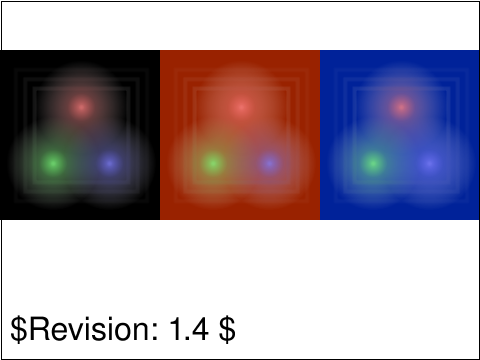 struct-image-08-t.svg struct-image-08-t.svg |
CL |
ED |
accepted |
Tests PNG images with alpha.
|
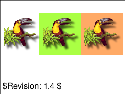 struct-image-09-t.svg struct-image-09-t.svg |
CL |
ED |
accepted |
Tests PNG images with pallete ransparency (tRNS chunk).
|
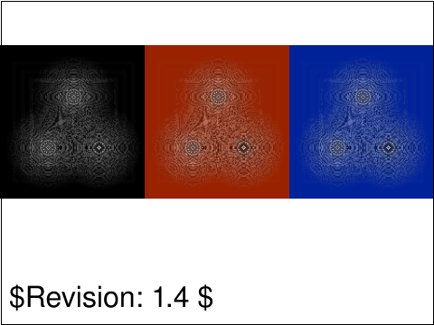 struct-image-10-t.svg struct-image-10-t.svg |
CL |
ED |
accepted |
Tests PNG greyscale images with alpha.
|
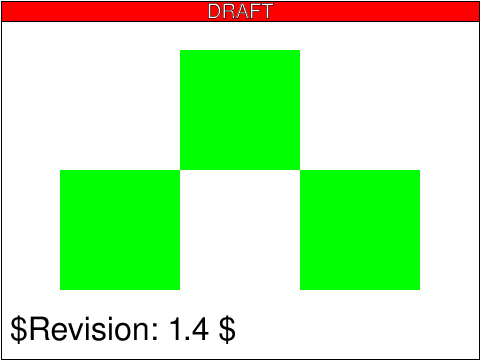 struct-image-11-b.svg struct-image-11-b.svg |
ED |
CM |
reviewed |
Test interactivity in an svg image referenced by an 'image' element.
This test requires support for CSS2 and referencing SVG and PNG images via the 'image' element.
|
usesred |
 struct-image-12-b.svg struct-image-12-b.svg |
ED |
[reviewer] |
empty |
[[Describe which section and what specific assertion is being tested
by the test. If the test has a number of sub tests, multiple
"testComponent" elements can be specified within the "testDescription"
element.]]
|
 struct-image-13-f.svg struct-image-13-f.svg |
CL |
ED |
accepted |
Tests that different PNG image types are correctly handled. These images are non-interlaced.
This test uses the
PNG Group test suite
created by Willem van Schaik.
|
usesred |
 struct-image-14-f.svg struct-image-14-f.svg |
CL |
ED |
accepted |
Tests that different PNG image types are correctly handled. These images are interlaced.
This test uses the
PNG Group test suite
created by Willem van Schaik.
|
usesred |
 struct-image-15-f.svg struct-image-15-f.svg |
CL |
ED |
accepted |
The first row tests that alpha PNG images are correctly displayed as part of an SVG image,
ignoring the background colour in the image which is only used to display the
PNG image stand-alone.
The second row tests indexed PNG transparency (tRNs), again checking that
the background color is ignored when displayed as part of an SVG image.
This test uses the
PNG Group test suite
created by Willem van Schaik.
|
 struct-image-16-f.svg struct-image-16-f.svg |
ED |
CM |
accepted |
Test that the 'image' element loads the same resources as when it's standalone.
|
 struct-image-17-b.svg struct-image-17-b.svg |
CM |
[reviewer] |
created |
Verifies that SVG images referenced from an <image> element
do not have any scripting or animation run.
The referenced SVG image has a green rectangle. If either animation or
script runs, it will turn the rectangle red.
|
usesred |
 struct-image-18-f.svg struct-image-18-f.svg |
ED |
[reviewer] |
created |
Test referencing an svg from an 'image' element, where the referenced
svg has no viewBox and a larger width and height than the 'image'
element viewport.
|
usesred |
 struct-image-19-f.svg struct-image-19-f.svg |
ED |
[reviewer] |
created |
Test referencing an svg from an 'image' element, where the referenced
svg has a viewBox and a larger width and height than the 'image'
element viewport.
The same image resource is reference twice, and will scale to fit the
viewport that is established by the 'image' element.
|
usesred |
 struct-svg-01-f.svg struct-svg-01-f.svg |
Microsoft |
CL |
accepted |
The default values for 'width' and 'height' are '100%' and 'x' and 'y' are '0' for the 'svg' element.
|
 struct-svg-02-f.svg struct-svg-02-f.svg |
ED |
CM |
reviewed |
Testing various interactions on the width attribute on an svg element.
The width attribute defaults to "100%" if it's not specified.
|
usesred |
 struct-svg-03-f.svg struct-svg-03-f.svg |
ED |
[reviewer] |
created |
Test nested svg elements.
|
usesred |
 struct-symbol-01-b.svg struct-symbol-01-b.svg |
Tim Thompson |
SVGWG |
accepted |
The purpose of the symbol test case is to create some symbols and then
have them rendered when instantiated by the use element.
This file contains 3 symbol definitions. Only two are ever rendered.
There is a viewport defined to be 0,0,1000,1000 on the svg element.
Each symbol has is own viewport of the same dimensions. The symbols are
scaled when they are instantiated by the use element, The first set
of symbols is 4 squares, blue and yellow in color they should appear
in the lower right of the view arranged in a checkerboard fashion.
The second symbol to be used is an image which should appear in the
upper left of the view area. The symbol that is not used and should
not be rendered is a large black rectangle. If the symbols don't
appear, there is something askew with the use statement, if they
appear but either overlap each other or in some way aren't in the
correct positions they have not honored either their viewport or
were not scaled when placed by the use element in the area defined by
it. If everything is black then perhaps a symbol was rendered that
should not have been.
|
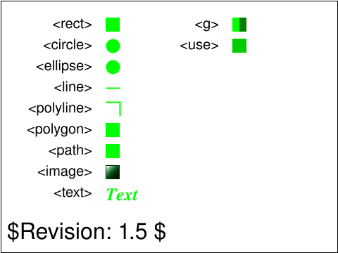 struct-use-01-t.svg struct-use-01-t.svg |
VH |
CN |
accepted |
The purpose of this test is to validate proper handling of
the use element. In particular, the test checks the proper inheritance
of properties through the shadow tree (rather than through the document
tree).
|
 struct-use-03-t.svg struct-use-03-t.svg |
VH |
CN |
accepted |
The purpose of this test is to validate proper handling of
the x/y attributes on the use element.
The test shows a <use> element displayed on the right.
On the left, a group built as described in section
5.6 of the SVG 1.1 specification validates that the
<use element is properly processed.
|
 struct-use-04-b.svg struct-use-04-b.svg |
BB |
CL |
accepted |
The intent of the file is to determine if the UA supports references to external SVG fragments.
|
 struct-use-05-b.svg struct-use-05-b.svg |
BB |
CL |
accepted |
This file is intented to test the computed values in external references.
Both files (referencing and referenced) define similar colors/gradients via 'color', 'linearGradient' and 'radialGradient'.
The ids of those definitions are the same but the actual appearance are different. These definitions are used to test the
property inheritance feature of SVG.
|
 struct-use-06-b.svg struct-use-06-b.svg |
ED |
[reviewer] |
created |
Test onlick handlers in externally referenced content.
There are two 'use' elements, each of them is referencing an external file showing a rectangle.
The rect elements in the external file have onclick attributes, and the handler will attempt to change the fill of the
referenced rect element to red.
|
usesred |
 struct-use-07-b.svg struct-use-07-b.svg |
ED |
CM |
reviewed |
This tests interactivity and event handlers on use elements. It also tests
that the SVGElementInstance.correspondingElement property and the
CSSStyleDeclaration.setProperty() method defined in
DOM Level 2 Style. By testing different ways of setting the fill on a rectangle
it verifies that the result is consistent, and that CSS properly overrides
the specified values.
|
usesred |
 struct-use-08-b.svg struct-use-08-b.svg |
ED |
[reviewer] |
empty |
[[Describe which section and what specific assertion is being tested
by the test. If the test has a number of sub tests, multiple
"testComponent" elements can be specified within the "testDescription"
element.]]
|
usesred |
 struct-use-09-b.svg struct-use-09-b.svg |
AN |
CM |
reviewed |
This tests the use element inside a symbol definition.
|
usesred |
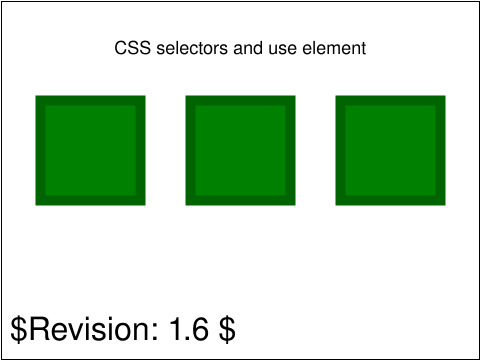 struct-use-10-f.svg struct-use-10-f.svg |
ED |
DOH |
accepted |
Properties are inherited according to the 'use' element rules, CSS selectors only apply to the original elements
and not the (conceptually) cloned DOM tree.
|
 struct-use-11-f.svg struct-use-11-f.svg |
Microsoft |
CL |
accepted |
CSS selectors that apply to an element referenced via 'use' also apply to the 'use' instance.
A 'style' block contains all CSS rules. Various CSS selectors are applied to 'circle' elements. A unique 'class' selector is
used for all cases to ensure that the selectors don't interfere with each other. For each 'circle', there is a corresponding
'use' instance. For structure-related rules, a 'g' tag is used.
|
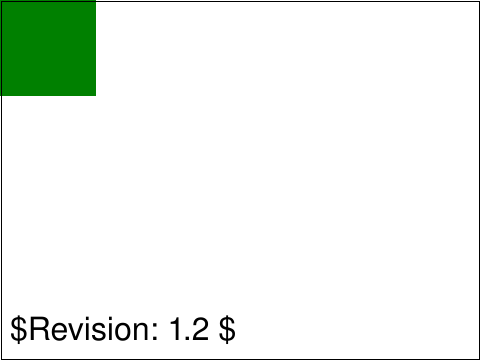 struct-use-12-f.svg struct-use-12-f.svg |
Microsoft |
CL |
accepted |
Tests that recursive 'use' instances do not block rendering.
Various scenarios that directly and indirectly create circular references via the 'use' tag. A 'g' element is used when
structural elements are necessary. None of the 'use' scenarios render anything. 'useLongCycle' tests a chain of recursive
'use' instances that eventually cycles back to the first element. In 'useNested' 'use' elements are nested, with the child
referring to the parent. In 'useNestedGroup' a 'use' instance references a parent 'g' element. In 'useIndirectNestedGroup'
a 'use' instance indirectly references its own parent 'g'. In 'useMultipleIndirectNestedGroup', two 'use' instances
reference their parent 'g' elements, and additional 'use' instances refer to these self-referencing 'use' elements. A green
'rect' is used to verify that rendering was processed up to that point.
|
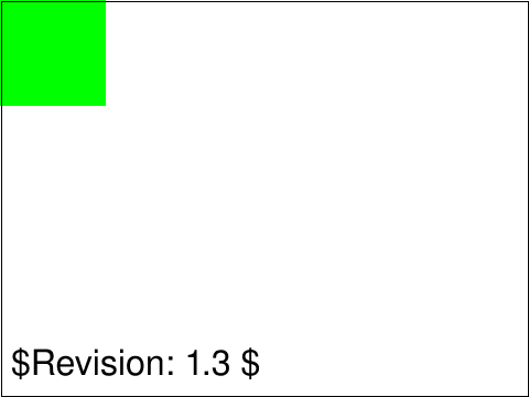 struct-use-13-f.svg struct-use-13-f.svg |
Microsoft |
ED |
accepted |
Test that 'use' elements are synchronized at run time with the elements they reference.
This test verifies visual synchronization during run time between 'use' instances and the elements they reference. A 'g' element containing
two 'rect' elements is referenced via 'use'. One 'rect' is red and the other has no fill specified. DOM synchronization is verified visually
by removing the red 'rect'. Presentation attribute synchronization is verified visually by setting the other rect's 'fill' attribute to 'lime'.
The 'g' that is referenced is inside of a 'defs' tag so only the 'use' instance is visible.
|
 struct-use-14-f.svg struct-use-14-f.svg |
Microsoft |
CM |
reviewed |
Test that the 'use' element's 'xlink:href' attribute referencing dynamically set 'id' attributes is supported.
The test defines a 'use' element with its 'xlink:href' attribute set to 'pass' which is an invalid element id. A green 'rect' element has its 'id'
attribute set to 'pass' via 'setAttribute'. The referenced 'rect' is a child of a 'defs' element so that it does not render, and it is wrapped with a 'g'
element in order to obtain a DOM reference to it.
|
 struct-use-15-f.svg struct-use-15-f.svg |
Microsoft |
CM |
reviewed |
Test that recursive 'use' elements are synchronized at run time with the originally referenced element.
Inside of a 'defs' element, a 'g' element containing two 'rect' elements is referenced via 'use'. Outside of the 'defs', a 'use' element references
the other 'use' element. One 'rect' is orange and the other has no fill specified. DOM synchronization is verified visually by removing the orange 'rect'.
Presentation attribute synchronization is verified visually by setting the other rect's 'fill' attribute to 'blue'. All elements are inside of a 'defs'
element except for the recursive 'use' element to ensure that it is the only element rendered. Verify that blue is visible and orange is not visible.
|
usesred |
 styling-class-01-f.svg styling-class-01-f.svg |
Microsoft |
CL |
accepted |
The 'class' attribute assigns one or more class names to an element, and shared class names among several element instances are supported.
Assigns a class to two elements and specify a 'fill: blue' style rule on the class. On one of the elements, also specify a
second class with a specified 'stroke: orange' style rule. Verify the 'fill' and 'stroke' styles applied appropriately.
|
 styling-css-01-b.svg styling-css-01-b.svg |
Chris lilley |
SVGWG |
accepted |
Test element and class selectors.
|
 styling-css-02-b.svg styling-css-02-b.svg |
Chris lilley |
SVGWG |
accepted |
Test ID and attribute selectors
|
 styling-css-03-b.svg styling-css-03-b.svg |
Chris lilley |
SVGWG |
accepted |
Test ancestor, child and sibling selectors.
|
 styling-css-04-f.svg styling-css-04-f.svg |
BB |
CL |
accepted |
This purpose of the file is to test some of the CSS2 selector syntax.
|
 styling-css-05-b.svg styling-css-05-b.svg |
CL |
ED |
accepted |
Tests the language selectors, :lang(c).
Note that a less specific language (such as fr) also matches a more specific
language (such as fr-CA) but a more specific language (such as en-GB) does not match a less specific language (such as en).
Also note that language tags,and thus language selectors are case-insensitive.
|
 styling-css-06-b.svg styling-css-06-b.svg |
CL |
ED |
accepted |
Tests the dynamic pseudoclasses :link, :visited, :active, :hover and :focus.
|
usesred |
 styling-css-07-f.svg styling-css-07-f.svg |
Microsoft |
CL |
accepted |
Tests that inline CSS styling (style attributes) is supported.
Specifies an inline 'visibility: hidden' style rule on a red element and verifies there is no red on the page.
|
 styling-css-08-f.svg styling-css-08-f.svg |
Microsoft |
ED |
accepted |
Test that CSS styling via the 'style' element is supported.
For each of a representative sampling of selectors, specify a 'visibility: hidden' style rule and add a corresponding red
element to the markup. A reference in green is shown for each shape.
|
 styling-css-09-f.svg styling-css-09-f.svg |
Microsoft |
CM |
reviewed |
Tests that CSS styling from an external style sheet is supported.
For each of a representative sampling of selectors, a 'visibility: hidden' style rule is specified
to match a corresponding element in the markup. Identically shaped and sized elements (but which are not
applicable to any of the style selectors) are placed beneath them and should be visible
if the style sheet was applied correctly.
|
usesred |
 styling-css-10-f.svg styling-css-10-f.svg |
CL |
CM |
reviewed |
Checks that stylesheets (style attributes, style elements,
external style sheets) are case-insensitive, unlike presentational attributes.
Subtest a checks that the invalid attribute
FiLl is ignored. Subtest b checks that the style attribute is
applied, the values being case-insensitive. Subtests c and d check
the same for style elements and imported external style sheets.
|
usesred |
 styling-elem-01-b.svg styling-elem-01-b.svg |
CM |
CL |
accepted |
This tests that the 'type' attribute on a 'style' element is
honored.
Once the test is loaded, two rectangles are presented,
the upper indicating the result of a sub-test that checks
whether the 'type' attribute on a 'style' element correctly
defaults to "text/css", and the lower indicating the result
of a sub-test that checks whether a bogus value for 'type'
does not cause the 'style' element contents to be interpreted
as CSS. Each rectangle is green if the sub-test is passed
or red if it failed.
|
 styling-inherit-01-b.svg styling-inherit-01-b.svg |
Chris Lilley |
SVGWG |
accepted |
Verify property inheritance as required by 6.15 "Property
inheritance". Since all implementations are required to do this, only
presentation attributes are used.
|
 styling-pres-01-t.svg styling-pres-01-t.svg |
Chris Lilley |
SVGWG |
accepted |
Tests that !important in a presentation attribute is an unsupported value
A fill attribute is set to red with !important. This is an unsupported attribute value,
consequently the fill attribute should be the lacuna value, which is black. Therefore, to pass, the rectangle should be filled with black.
A lime green border is also drawn, to check that rendering continues after the element with the unsupported value.
|
 styling-pres-02-f.svg styling-pres-02-f.svg |
CM |
CL |
accepted |
This tests that a presentation attribute that is not relevant
to a given element which is otherwise stylable is correctly stored
in the property collection for that element. In particular,
it tests the following presentation attributes:
fill on image
stop-opacity on tspan
font-size on rect
font-style on circle
stop-color on text
font-variant on ellipse
letter-spacing on polyline
flood-color on tref
flood-opacity on textPath
color-interpolation-filters on altGlyph
display on linearGradient
fill-rule on stop
visibility on radialGradient
lighting-color on clipPath
|
 styling-pres-03-f.svg styling-pres-03-f.svg |
Microsoft |
CM |
reviewed |
Presentation attributes have lower priority than internal CSS style rules.
|
usesred |
 styling-pres-04-f.svg styling-pres-04-f.svg |
Microsoft |
CM |
reviewed |
Presentation attributes have lower priority than other CSS style rules specified in an internal style sheet.
|
usesred |
 styling-pres-05-f.svg styling-pres-05-f.svg |
Microsoft |
CM |
reviewed |
Presentation attributes have lower priority than other CSS style rules specified in an external style sheet.
|
usesred |
 svgdom-over-01-f.svg svgdom-over-01-f.svg |
ED |
CM |
reviewed |
This tests how unspecified attributes affect the return values from the
SVG DOM methods related to attributes.
After loading the test, you should see a list of red or green rectangles followed by some text describing each subtest.
|
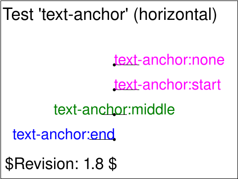 text-align-01-b.svg text-align-01-b.svg |
Jon Ferraiolo |
SVGWG |
accepted |
Test 'text-anchor' property (horizontal).
The three lines test the three values for property 'text-anchor': start, middle and end.
|
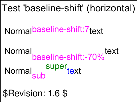 text-align-02-b.svg text-align-02-b.svg |
Jon Ferraiolo |
SVGWG |
accepted |
Test the 'baseline-shift' property (horizontal).
|
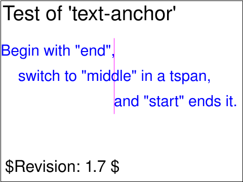 text-align-03-b.svg text-align-03-b.svg |
Lofton Henderson |
SVGWG |
accepted |
Test for viewer capibility to handle the basics of the 'textAnchor'
alignment property for 'text' and related elements.
This test verify that
the interpreter correctly handles and applies the text-anchor
properties when present on "chunks", which are comprised of tspan elements
with absolute positioning, within the containing 'text' element.
|
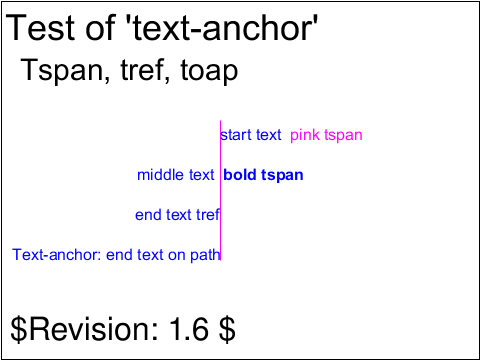 text-align-04-b.svg text-align-04-b.svg |
Lofton Henderson |
SVGWG |
accepted |
Test for viewer capibility to handle the basics of the 'text-anchor'
alignment property for 'text' and related elements.
The second group from the top contains sub-tests to verify that the
interpreter handles text-anchor when the text is comprised of other
text related elements, 'tspan', 'tref', and 'textPath'.
The text-anchor property is present on the containing 'text' element
in these cases, not on the contained child elements.
|
 text-align-05-b.svg text-align-05-b.svg |
Jon Ferraiolo |
SVGWG |
accepted |
Test 'text-anchor' property (vertical).
This tests the three values for property 'text-anchor': start, middle and end.
|
 text-align-06-b.svg text-align-06-b.svg |
Jon Ferraiolo |
SVGWG |
accepted |
Tests various ways that the 'baseline-shift' property (vertical) can be
altered.
The first sub test sets the 'baseline-shift' to an absolute unit. The
second sub test sets the 'baseline-shift' to a percentage. The third sub
test sets the 'baseline-shift' to "sub". The fourth sub test sets the
'baseline-shift' to "super".
|
 text-align-07-t.svg text-align-07-t.svg |
CN |
AG |
issue |
ISSUE - http://www.w3.org/2011/02/27-svg-irc#T22-20-51
Test horizontal baselines across script and font size changes.
Original test authored by Rodney Hardy at CISRA and modified by
Anthony Grasso.
|
 text-align-08-b.svg text-align-08-b.svg |
CN |
CL |
issue |
ISSUE - http://www.w3.org/2011/02/27-svg-irc#T22-20-51
Test horizontal baselines across script and font size changes. It uses an SVG Font, where
the Latin letter "a" is a rectangle, the Japanese letter "犜" is an upward-pointing triangle,
and the Devanagari letter "ण" is a downward-pointing triangle.
Original test authored by Rodney Hardy at CISRA.
|
 text-altglyph-01-b.svg text-altglyph-01-b.svg |
Jon Ferraiolo |
SVGWG |
accepted |
Test 'altGlyph' facilities and many-to-many chars to glyphs.
|
 text-altglyph-02-b.svg text-altglyph-02-b.svg |
CM |
AG |
accepted |
Test glyph selection using altGlyphDef and altGlyphItem elements.
|
 text-altglyph-03-b.svg text-altglyph-03-b.svg |
CM |
|
created |
Test glyph selection using altGlyphDef and altGlyphItem elements.
|
 text-bidi-01-t.svg text-bidi-01-t.svg |
ED |
[reviewer] |
created |
Test directional type, ltr context, arabic.
Assertion: In a left-to-right context, without markup, styling or special characters, a sequence of Arabic characters and spaces will progress from right to left.
You will need a font that allows you to distinguish Arabic characters.
|
usesred |
 text-deco-01-b.svg text-deco-01-b.svg |
Jon Ferraiolo |
SVGWG |
accepted |
Test the 'text-decoration' property.
|
 text-dom-01-f.svg text-dom-01-f.svg |
AN |
[reviewer] |
created |
This tests the methods and properties of the SVGTextContentElement interface on the text element with the id 'testText'
and the content 'This is a test of the interface SVGTextContentElement'. The word 'is' has two glyphs with different
rotation values defined with a <tspan/> element. There are 12 subtests testing the 9 methods and 2 properties.
Note that the numeric results of some methods may vary. The additional instructions state where the result may vary
and where it should have an exact value.
|
usesred |
 text-dom-02-f.svg text-dom-02-f.svg |
CM |
CL |
accepted |
This tests that methods on the SVGTextContentElement interface
that take an index to a character or a number of characters
actually interpret these as indexes to or numbers of UTF-16 code
units. To test this, a character from outside the Basic Multilingual Plane
(U+10000; LINEAR B SYLLABLE B008) is used in a text string.
This character is stored in UTF-16 as a surrogate pair.
The test consists of two sub-tests, which test those methods
on the SVGTextContentElement interface which do not rely on rendering. The result
of each sub-test is shown as a small rectangle: black
indicates that the sub-test did not run, red indicates that
the sub-test failed and green indicates that the sub-test
succeeded.
|
 text-dom-03-f.svg text-dom-03-f.svg |
CM |
DAS |
accepted |
This tests that SVGTextContentElement.getSubStringLength()
handles out-of-range charnum and nchars parameter values correctly.
The test consists of 5 sub-tests, which test the different
combinations of values passed to SVGTextContentElement.getSubStringLength().
The result of each sub-test is shown as a small rectangle: black
indicates that the sub-test did not run, red indicates that
the sub-test failed and green indicates that the sub-test
succeeded.
|
 text-dom-04-f.svg text-dom-04-f.svg |
ED |
AG |
reviewed |
This tests the SVGTextContentElement.getSubStringLength method.
|
 text-dom-05-f.svg text-dom-05-f.svg |
CM |
CL |
reviewed |
This tests that methods on the SVGTextContentElement interface
that take an index to a character or a number of characters
actually interpret these as indexes to or numbers of UTF-16 code
units. To test this, a character from outside the Basic Multilingual Plane
(U+10000; LINEAR B SYLLABLE B008) is used in a text string.
This character is stored in UTF-16 as a surrogate pair.
The test consists of 5 sub-tests, which test the methods
methods on the SVGTextContentElement interface. The result
of each sub-test is shown as a small rectangle: black
indicates that the sub-test did not run, red indicates that
the sub-test failed and green indicates that the sub-test
succeeded.
|
 text-fonts-01-t.svg text-fonts-01-t.svg |
Chris Lilley |
SVGWG |
accepted |
Purpose of test is to determine if the font family is being
correctly selected. The top two lines of text test serif fonts;
the top line in maroon tests the generic font family 'serif'
and the second line in black tests a selection of commonly
available named serif fonts. The next two lines of text test
sans-serif fonts;
the top line in maroon tests the generic font family 'sans-serif'
and the second line in black tests a selection of commonly
available named sans serif fonts. The following two lines
of text test monospaced fonts;
the top line in maroon tests the generic font family 'monospaced'
and the second line in black tests a selection of commonly
available named monospaced fonts. The lowercase 'i' and uppercase'W'
should be the same width,for monospaced fonts.
The seventh line of text, in green, tests for
three non-existent fonts (nonsense names). There is no fallback
generic font specified. The text must be displayed anyway.
|
 text-fonts-02-t.svg text-fonts-02-t.svg |
Chris lilley |
SVGWG |
accepted |
Purpose of test is to determine if the font weight is being
correctly rendered. A number of font families are specified. The
numerical weight values (100 to 900) should show the lighter weights
on the lower numbers and the heavier weights on the larger numbers.
Heavier is defined to mean 'no lighter'.
If only one font weight is available, they should all display at the
same weight. The transition from black to green figures shows the
correct light to bold transition for the common case where two
weights are available. If three or more weights are available, see
the CSS2 specification for how these are allocated to the nine
weight numbers.
The absolute keywords 'normal' and bold' are tested
by the first two lines on the right hand side of the test,
the third line of text tests the to 'bolder'
relative keyword and the fourth tests the
'lighter' relative keyword.
|
 text-fonts-03-t.svg text-fonts-03-t.svg |
MI |
CL |
accepted |
Testing font-family attribute.
Two SVG fonts are defined. Various text elements are then
used with varying values for the font-family attribute.
|
 text-fonts-04-t.svg text-fonts-04-t.svg |
MI |
CL |
accepted |
Testing font-family attribute.
Various text elements are
used with varying values for the font-family attribute.
|
 text-fonts-05-f.svg text-fonts-05-f.svg |
Microsoft |
[reviewer] |
created |
Test that the 'line-height' property has no effect on text layout.
|
usesred |
 text-fonts-202-t.svg text-fonts-202-t.svg |
|
DS |
accepted |
This tests the 'font-weight' property when multiple weights are available. A
font family with six weights is specified, with a fallback to 'serif'.
If only one font weight is available, they should all display at the same weight.
The transition from black to green figures shows the correct light to bold transition
for the common case where two weights are available. If three or more weights are
available, see the CSS2 specification for how these are allocated to the nine weight
numbers. The specified font has six weights.
The absolute keywords 'normal' and bold' are tested by the first two lines on the
right hand side of the test, the third line of text tests the to 'bolder' relative
keyword and the fourth tests the 'lighter' relative keyword.
|
 text-fonts-203-t.svg text-fonts-203-t.svg |
|
AG |
accepted |
This tests the 'font-weight' property when multiple weights are available. A
font family with five weights is specified, with a fallback to 'serif'.
The specified font family has five weights - 300, 400, 600, 700 and 800.
See the CSS3 Font specification
for how these are allocated to the nine weight numbers.
The absolute keywords 'normal' and bold' are tested by the first two lines on the
right hand side of the test, the third line of text tests the to 'bolder' relative
keyword and the fourth tests the 'lighter' relative keyword.
The fonts are SVG fonts convertted, with the author's explicit permission,
from Zalamander Caps
by Tim Ahrens of Just Another Foundry.
An ASCII subset has been generated for this test. The font names have been
obfuscated, to deter
user agent sniffing for keywords like "Ultrabold". All weights in this generated
family are multiples of 100 and greater or equal to 300.
|
 text-fonts-204-t.svg text-fonts-204-t.svg |
|
|
created |
This tests the 'font-weight' property when multiple weights are available. A
font family with five weights is specified, with a fallback to 'serif'.
The specified font family has five weights - 300, 400, 600, 700 and 800.
See the CSS3 Font specification
for how these are allocated to the nine weight numbers.
The absolute keywords 'normal' and bold' are tested by the first two lines on the
right hand side of the test, the third line of text tests the to 'bolder' relative
keyword and the fourth tests the 'lighter' relative keyword.
The fonts are WOFF fonts convertted, with the author's explicit permission,
from Zalamander Caps
by Tim Ahrens of Just Another Foundry.
The font names have been obfuscated, to deter
user agent sniffing for keywords like "Ultrabold". All weights in this generated
family are multiples of 100 and greater or equal to 300.
|
usesred |
 text-intro-01-t.svg text-intro-01-t.svg |
Jon Ferraiolo |
SVGWG |
accepted |
Test left-to-right aspect of internationalized text.
Various text strings in various languages appear. The main
purpose of the test is to verify that the correct characters
appear and that they appear in the correct order and orientation, even
though the first choice font does not have the right glyphs.
|
 text-intro-02-b.svg text-intro-02-b.svg |
Jon Ferraiolo |
SVGWG |
accepted |
Test various aspects of internationalized text, including
left-to-right, right-to-left, and the
following properties: 'writing-mode',
'direction' and 'unicode-bidi'.
Various text strings in various languages appear. Ttest of bidi algorithms and support of 'unicode-bidi' and
'direction' properties.
|
 text-intro-03-b.svg text-intro-03-b.svg |
Jon Ferraiolo |
SVGWG |
accepted |
Test top-to-bottom internationalized text and the
following properties: 'writing-mode',
'glyph-orientation-vertical', 'glyph-orientation-horizontal'.
Various text strings in various languages appear. The main
purpose of the test is to verify that the correct characters
appear and that they appear in the correct order and orientation.
Ensure that the two lines of
vertical Japanese text have the proper orientation
(test of 'glyph-orientation-vertical' property).
|
 text-intro-04-t.svg text-intro-04-t.svg |
Jon Ferraiolo |
SVGWG |
accepted |
Test basic aspect of internationalized text.
Various text strings in various languages appear. The main
purpose of the test is to verify that the correct characters
appear and that they appear in the correct order and orientation.
A future version of this test
might include all necessary glyphs as an SVG font.
|
 text-intro-05-t.svg text-intro-05-t.svg |
CL |
ED |
accepted |
Tests Arabic text using various platform fonts. If these fonts are not available,
a fallback font should be used that has Arabic glyphs. If such a font is not available,
the 'missing glyph' (typically an open rectangle) should be displayed. It is an error
to display the wrong Arabic glyphs, for example to display all isolate forms.
|
 text-intro-06-t.svg text-intro-06-t.svg |
CL |
AG |
accepted |
This test ensures that mandatory ligatures in Arabic are displayed.
This test uses WOFF fonts for rendering, with platform fonts for fallback.
There are two subtests. The first
requires an isolate lam-alef ligature and the second requires
a right-joining lam-alef ligature.
The first subtest has the word for 'tools', آلات
0622: آ ARABIC LETTER ALEF WITH MADDA ABOVE
0644: ل ARABIC LETTER LAM
0627: ا ARABIC LETTER ALEF
062A: ت ARABIC LETTER TEH
The second subtest has the word for 'three', ثلاثة
062B: ث ARABIC LETTER THEH
0644: ل ARABIC LETTER LAM
0627: ا ARABIC LETTER ALEF
062B: ث ARABIC LETTER THEH
0629: ة ARABIC LETTER TEH MARBUTA
|
 text-intro-07-t.svg text-intro-07-t.svg |
CL |
AG |
accepted |
This test ensures that mandatory ligatures in Arabic are displayed.
There are two subtests. The first requires an isolate lam-alef ligature
and the second requires a right-joining lam-alef ligature.
|
 text-intro-09-b.svg text-intro-09-b.svg |
Jon Ferraiolo |
SVGWG |
accepted |
Test various aspects of internationalized text, including
left-to-right, right-to-left, and the
following properties: 'writing-mode',
'direction' and 'unicode-bidi'.
Various text strings in various languages appear. Test of bidi algorithms and support of 'unicode-bidi' and
'direction' properties. Uses Webfonts.
This test uses Webfonts; both SVG and WOFF fonts are provided.
|
 text-intro-10-f.svg text-intro-10-f.svg |
CL |
|
created |
Tests Arabic text using various platform fonts. If these fonts are not available,
a fallback font should be used that has Arabic glyphs. If such a font is not available,
the 'missing glyph' (typically an open rectangle) should be displayed. It is an error
to display the wrong Arabic glyphs, for example to display all isolate forms.
This test uses writing-mode and direction to set the text as right-to-left.
|
 text-intro-11-t.svg text-intro-11-t.svg |
CL |
AG |
created |
This test ensures that mandatory ligatures in Arabic are displayed.
Three values for text-anchor are also tested;
middle,
start and
end.
This test uses platform fonts for rendering.
There are two subtests. The first
requires an isolate lam-alef ligature and the second requires
a right-joining lam-alef ligature.
The first subtest has the word for 'tools', آلات
0622: آ ARABIC LETTER ALEF WITH MADDA ABOVE
0644: ل ARABIC LETTER LAM
0627: ا ARABIC LETTER ALEF
062A: ت ARABIC LETTER TEH
The second subtest has the word for 'three', ثلاثة
062B: ث ARABIC LETTER THEH
0644: ل ARABIC LETTER LAM
0627: ا ARABIC LETTER ALEF
062B: ث ARABIC LETTER THEH
0629: ة ARABIC LETTER TEH MARBUTA
|
 text-intro-12-t.svg text-intro-12-t.svg |
CL |
|
created |
This test ensures that mandatory ligatures in Arabic are displayed.
This test uses downloaded WOFF fonts for rendering.
There are two subtests. The first
requires an isolate lam-alef ligature and the second requires
a right-joining lam-alef ligature.
The first subtest has the word for 'tools', آلات
0622: آ ARABIC LETTER ALEF WITH MADDA ABOVE
0644: ل ARABIC LETTER LAM
0627: ا ARABIC LETTER ALEF
062A: ت ARABIC LETTER TEH
The second subtest has the word for 'three', ثلاثة
062B: ث ARABIC LETTER THEH
0644: ل ARABIC LETTER LAM
0627: ا ARABIC LETTER ALEF
062B: ث ARABIC LETTER THEH
0629: ة ARABIC LETTER TEH MARBUTA
|
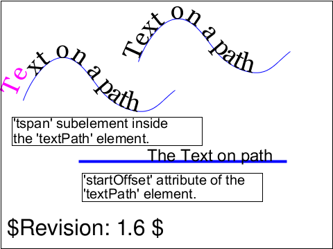 text-path-01-b.svg text-path-01-b.svg |
Shenxue Zhou |
AG |
accepted |
Test textPath element in combination with the tspan element. Properties
of the text on a path are changed using the tspan element.
|
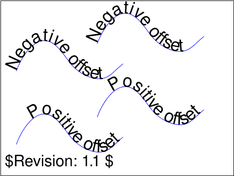 text-path-02-b.svg text-path-02-b.svg |
ED |
AG |
accepted |
This tests the 'textPath/startOffset' with both negative and positive values, and
compares it to the case where a 'tspan/dx' attribute is used with the same values.
|
 text-spacing-01-b.svg text-spacing-01-b.svg |
Jon Ferraiolo |
SVGWG |
accepted |
Test properties 'letter-spacing' and 'word-spacing'
The first three lines test property 'letter-spacing', with
values 0, -1 and .3em respectively.
The next three lines test property 'word-spacing', with
values 0, -3 and 3em respectively.
|
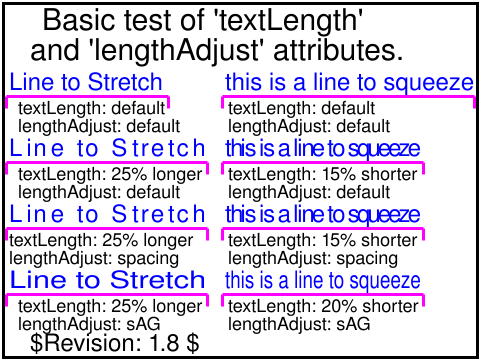 text-text-01-b.svg text-text-01-b.svg |
Lofton Henderson |
SVGWG |
accepted |
Test viewer capibility to handle basic use of 'textLength'
and 'lengthAdjust' attributes.
There are four pairs of sub-tests. Each pair of sub-tests consists
of the same two strings: "Line to Stretch" on the left, and "this is
a line to squeeze" on the right.
The first (topmost) pair contains no occurrences of the textLength and
lengthAdjust attributes in the 'text' elements.
The pink reference line under each of the top
two strings indicates the approximate length of the strings. Since
the lengths are not constrained by the 'textLength' attribute, small
variations of the lengths are permissible.
The remaining three pairs each applies 'textLength' attributes to the
strings. In the leftmost sub-test of each pair, the 'textLength' value
will cause a stretching of the string of approximately 25% over the
"normal" length. In the rightmost sub-test of each pair, the 'textLength' value
will cause a squeezing of the string of approximately 20% under the
"normal" length for the string.
In each of the sub-tests with an application of 'textLength', the
pink reference lines indicate the exact extent of the rendered text.
The rendered text should fit snugly just within the ticks at the end of
the pink lines.
The second pair from the top contains 'textLength' but no 'lengthAdjust'
attributes. In this case, the effect should be as if the value "spacing"
were specified. Only the inter-character advancement and inter-word spacing
should change. The aspect ratio of the glyphs should be unaffected. The
reference image illustrates one valid way to achieve this, by a
uniform increase or decrease of inter-character advancement.
The third pair from the top explicitly sets 'lengthAdjust' value
to "spacing". Therefore it should be rendered identically to the second pair.
The fourth (bottommost) sub-test pair explicitly sets 'lengthAdjust' value
to "spacingAndGlyphs". The advancements between characters and words, as well as
the glyph aspect ratios should be affected.
The reference image illustrates one valid way to achieve
this, by a uniform expansion or compression of the string as a whole.
This effect is equivalent to application of a "scale(xfactor, 1.0)" transformation
to the 'text' elements.
|
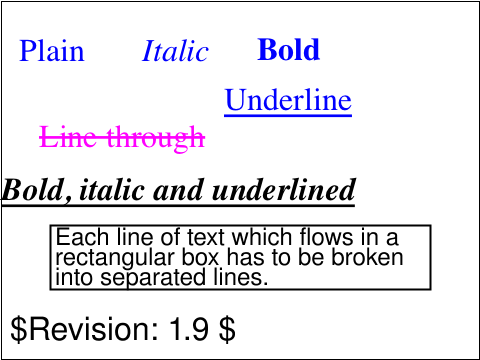 text-text-03-b.svg text-text-03-b.svg |
Shenxue Zhou |
SVGWG |
accepted |
Test text element, tspan element and various text decorations
|
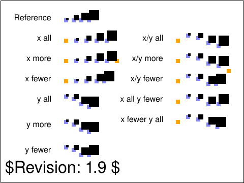 text-text-04-t.svg text-text-04-t.svg |
VH |
AE |
accepted |
The purpose of this test is to validate proper handling of
the text element's x and y attributes.
In the various samples, a orange marker shows the text's (0,0)
coordinate. The blue markers show the current text positions.
These are either defined by absolute x/y positioning or they
are computed from the embeded font's glyphs advances.
The first text sample shows a reference piece of text.
The second text sample (x all) shows a piece of text where
all the glyphs are positioned along the x axis.
The third text sample (x more) is a text element where there
are more x values than characters (5 values for 4 characters).
The last x value should be ignored and the result should
be the same as the third sample.
The fourth text sample (x fewer) is a text element where there
are fewer x values than characters (3 values for 4 characters).
The last character should not be positioned but laid out normally,
following its previous character sibling.
The fifth (y all), sixth (y more) and seventh (y fewer) text sample
parallel the second,
third and fourth test, but for the y attribute values.
The samples in the right column show combinations of x/y
value sets.
|
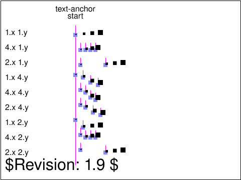 text-text-05-t.svg text-text-05-t.svg |
VH |
SVGWG |
accepted |
The purpose of this test is to validate the interaction of text-anchor
and x/y glyph positioning.
Each row shows a different combination of x/y values: 1, more than characters,
fewer than characters. This tests the anchor value: start.
The blue markers show the various x/y absolute positions around which text
chunks should be anchored. The glyphs are black squares of increasing sizes.
|
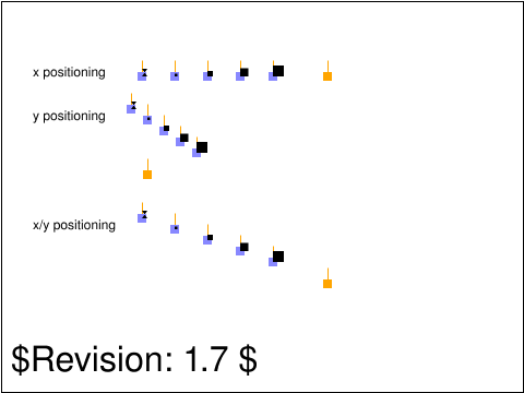 text-text-06-t.svg text-text-06-t.svg |
VH |
AE |
accepted |
The purpose of this test is to validate the interaction of x/y
glyph positioning and ligatures.
The first line shows an example where there is a ligature (fi) which
should be accounted for before breaking into text chunks (see specification
section 10.5, additional x/y/dx/dy processing rules, bullet discussing
ligatures). In this first line, the ligatures cause the x position 180
(shown in orange), to be ignored. As a result, a glyph should be shown over
each pale blue square markers. The glyphs are black squares of increasing sizes
except for the initial ligature which has the form of two small black triangles
joined at their tops. The ligature should show on the first pale blue
marker position.
The second line shows the same test but using multiple y positions.
The third line shows the same test but using multiple x and y
positions.
|
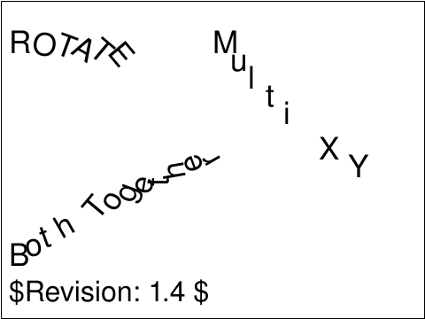 text-text-07-t.svg text-text-07-t.svg |
MI |
AE |
accepted |
Tests multiple x, y, rotate, with various combinations. Since an
array of values is given, each glyph must use the value from the
corresponding character in the list.
|
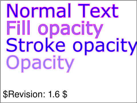 text-text-08-b.svg text-text-08-b.svg |
SH |
DJ |
accepted |
The three opacity properties (fill-opacity,
stroke-opacity, and opacity) of 'text' elements are
covered in this test.
|
 text-text-09-t.svg text-text-09-t.svg |
CL |
AE |
accepted |
Tests multiple x, y, rotate, with various combinations. Since an
array of values is given, each glyph must use the value from the
corresponding character in the list. In this test, there are less values
in the array than there are characters.
|
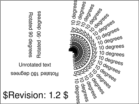 text-text-10-t.svg text-text-10-t.svg |
ED |
CL |
accepted |
Test rendering of text rotated by a transform attribute.
|
 text-text-11-t.svg text-text-11-t.svg |
ED |
CL |
accepted |
Test rendering of text rotated by a transform attribute, same as the text-text-10-t test but not using an SVGFont.
|
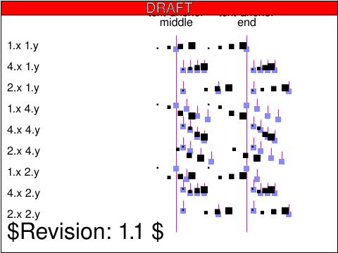 text-text-12-t.svg text-text-12-t.svg |
VH |
SVGWG |
issue |
ISSUE: the glyphs don't cover the entire em-cell, and the spec doesn't require visual alignment - text adjustments are based on advances
The purpose of this test is to validate the interaction of text-anchor
and x/y glyph positioning.
Each row shows a different combination of x/y values: 1, more than characters,
fewer than characters. Each column shows different anchor values: middle
and end.
The blue markers show the various x/y absolute positions around which text
chunks should be anchored. The glyphs are black squares of increasing sizes.
|
usesred |
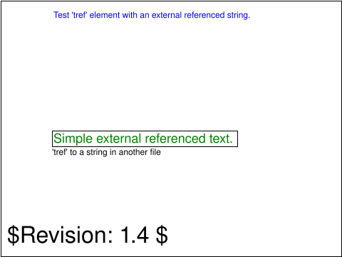 text-tref-01-b.svg text-tref-01-b.svg |
Lofton Henderson |
SVGWG |
accepted |
Test viewer capability to handle a basic 'tref' element
which points to a text string in an external file.
The test case consists of a single sub-test.
|
 text-tref-02-b.svg text-tref-02-b.svg |
CL |
ED |
accepted |
Test viewer capability to handle 'tref' elements
which point to text strings outside the current SVG document fragment.
The test case consists of two sub-tests; one results in the word "Hello" and the second, the word "World".
|
 text-tref-03-b.svg text-tref-03-b.svg |
Chris Lilley |
ED |
accepted |
Test viewer capability to handle 'tref' elements
which point to elements that have children. The flattened text content is to be used.
The test case consists of one sub-test; it results in the word "Flattened" being displayed.
|
 text-tselect-01-b.svg text-tselect-01-b.svg |
Jon Ferraiolo |
SVGWG |
accepted |
Test text selection.
Run the test. Make a text selection in the upper block of text, and verify that text selection is possible and that the selection does not extend across multiple lines. Now make a text selection in the lower block of text, verifying that the selection does extend over multiple lines.
Thus, it should
be possible to start text selection at the start of the "However"
and drag through the end of "same time." and the all four lines
should be selected.
|
 text-tselect-02-f.svg text-tselect-02-f.svg |
ED |
CL |
accepted |
This test demonstrates text selection of bidirectional text.
|
 text-tselect-03-f.svg text-tselect-03-f.svg |
ED |
CL |
accepted |
This test demonstrates text selection of bidirectional text.
|
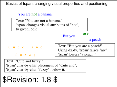 text-tspan-01-b.svg text-tspan-01-b.svg |
Lofton Henderson |
SVGWG |
accepted |
Test tspan element styling and relative position adjustments.
|
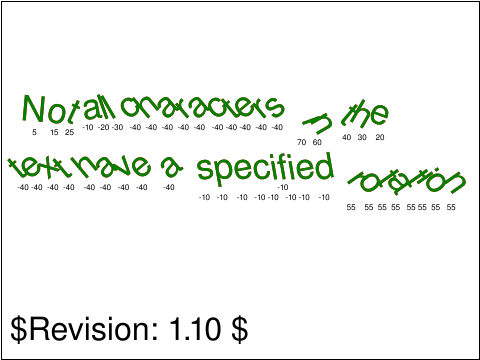 text-tspan-02-b.svg text-tspan-02-b.svg |
AG |
CL |
accepted |
Tests the rotate attribute in the tspan element.
Tests the case where more characters than rotate values are
supplied. In this case the last rotate value should propogate to
subsequent characters in the element and child tspan elements that
do not contain a rotate value.
Tests the case where more values than characters are supplied. In
this case each character should be rotated by the designated value
remaining unused values propogate to any child tspan elements that
do not contain a rotate value.
Tests the case where an ansestor of a tspan element specifies a
rotate value but the tspan itself doesn't. In this case the tspan
should use the current rotate value specified by the ansestor
element.
Tests the case where a tspan or text element specifies a rotate
value and contains a text string that is broken due to nested child
tspan. In this case characters after the child tspan element must
be rotated by the current rotate value.
|
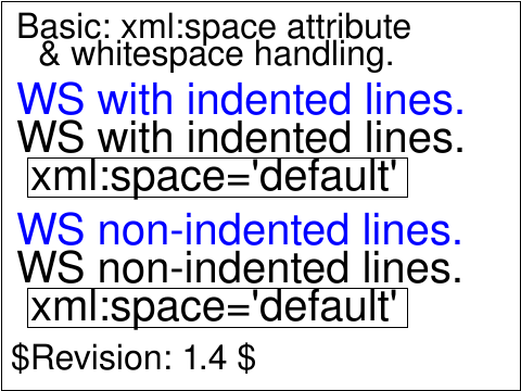 text-ws-01-t.svg text-ws-01-t.svg |
Lofton Henderson |
SVGWG |
issue |
Test for viewer correct handling of whitespace and the 'xml:space' attribute.
There are two sub-tests, for xml:space value "default".
In each test, the content of the 'text' element is written on
multiple lines. The first test of each pair has indented text with leading
space characters, tabs, etc. The second has no indentation, but a line break
before the content and after it. There are no space (or other whitespace)
characters at the ends of the lines.
The two test cases are self-descriptive. From the top;
first, "default" value applied to 3 lines of content with indents, space characters, tabs, etc;
second, "default" applied to two lines content with no indent;
|
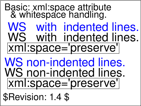 text-ws-02-t.svg text-ws-02-t.svg |
Lofton Henderson |
[reviewer] |
issue |
Test for viewer correct handling of whitespace and the 'xml:space' attribute.
There are two sub-tests, for value "preserve".
In each test, the content of the 'text' element is written on
multiple lines. The first test of each pair has indented text with leading
space characters, tabs, etc. The second has no indentation, but a line break
before the content and after it. There are no space (or other whitespace)
characters at the ends of the lines.
The two test cases are self-descriptive. From the top;
first, "preserve" applied to essentially the same content as first;
second, "preserve" applied to essentially the same content as second.
|
 text-ws-03-t.svg text-ws-03-t.svg |
CM |
CL |
issue |
This tests that an 'xml:space' attribute on a text element child
will be honored.
|
 types-basic-01-f.svg types-basic-01-f.svg |
CL |
ED |
accepted |
Tests scientific notation in attribute values; in particular, that numbers
of the form .n with a leading decimal point, are supported
|
 types-basic-02-f.svg types-basic-02-f.svg |
ED |
[reviewer] |
created |
Tests units and no units on <length> in CSS on a property defined in the SVG specification.
|
usesred |
 types-dom-01-b.svg types-dom-01-b.svg |
AN |
AE,ED |
accepted |
This test checks all the methods and properties of the SVGLocatable interface.
Note the use of nested svg elements and testing against different elements in the hierarchy.
Note that the values of .getScreenCTM() and .getCTM() can only be tested correctly if they are
in the html-based test or the width and height of the root element is explicitly set to 480x360.
The methods .getScreenCTM() and .getCTM() are tested from the rotated text element, the method .getBBox(),
.getTransformToElement() is tested between the rotated text and its parent group, the method .getBBox() and
the properties .farthestViewportElement and .nearestViewportElement are tested on the blue circle.
|
 types-dom-02-f.svg types-dom-02-f.svg |
CM |
CL |
accepted |
This tests that the animVal properties that are objects
are always distinct from their corresponding baseVal properties.
This is tested for interfaces SVGAnimatedNumberList, SVGAnimatedLength,
SVGAnimatedLengthList, SVGAnimatedAngle, SVGAnimatedRect,
SVGAnimatedTransformList and SVGAnimatedPreserveAspectRatio.
|
 types-dom-03-b.svg types-dom-03-b.svg |
CM |
ED |
accepted |
Test that bounding box geometry can be obtained
before the SVGLoad event is dispatched.
|
 types-dom-04-b.svg types-dom-04-b.svg |
CM |
ED |
accepted |
This tests that SVG DOM objects that correspond to attributes
are live.
This is tested for interfaces
SVGAnimatedNumberList, SVGAnimatedLength,
SVGAnimatedLengthList, SVGAnimatedAngle, SVGAnimatedRect,
SVGAnimatedTransformList, SVGAnimatedPreserveAspectRatio,
SVGAnimatedBoolean, SVGAnimatedString, SVGAnimatedEnumeration,
SVGAnimatedInteger and SVGAnimatedNumber.
|
 types-dom-05-b.svg types-dom-05-b.svg |
CM |
ED |
accepted |
This tests that assigning a valid length or angle string to
valueAsString on an SVGLength or SVGAngle will affect that object's
unitType, and that assigning an invalid string will throw
a DOMException with code SYNTAX_ERR.
|
 types-dom-06-f.svg types-dom-06-f.svg |
ED |
CM |
accepted |
This tests parts of the SVGStringList interface. Particularly it tests that
strings that are taken from one SVGStringList and then inserted into another
SVGStringList duplicates the value instead of removing the value from the
first list when it's inserted into the second list.
|
 types-dom-07-f.svg types-dom-07-f.svg |
CM |
CL |
accepted |
This tests that the contents of an animVal object are read only.
This is tested for interfaces SVGAnimatedNumberList, SVGAnimatedLength,
SVGAnimatedLengthList, SVGAnimatedAngle, SVGAnimatedRect,
SVGAnimatedTransformList and SVGAnimatedPreserveAspectRatio.
|
 types-dom-08-f.svg types-dom-08-f.svg |
ED |
[reviewer] |
created |
This test draws a few basic shapes and checks for correct values from getBBox().
|
usesred |
 types-dom-svgfittoviewbox-01-f.svg types-dom-svgfittoviewbox-01-f.svg |
Microsoft |
[reviewer] |
created |
Retrieving the 'viewBox' and 'preserveAspectRatio' attributes of the 'SVGFitToViewBox' interface is supported.
|
usesred |
 types-dom-svglengthlist-01-f.svg types-dom-svglengthlist-01-f.svg |
Microsoft |
CM |
reviewed |
The 'getItem', 'replaceItem', and 'removeItem' operations of the 'SVGLengthList' interface raise the 'INDEX_SIZE_ERR' exception when the specified
index number is greater than the number of items in the list.
|
usesred |
 types-dom-svgnumberlist-01-f.svg types-dom-svgnumberlist-01-f.svg |
Microsoft |
CM |
reviewed |
The 'getItem', 'replaceItem', and 'removeItem' operations of the 'SVGNumberList' interface raise the 'INDEX_SIZE_ERR' exception when the specified
index number is greater than the number of items in the list.
|
usesred |
 types-dom-svgstringlist-01-f.svg types-dom-svgstringlist-01-f.svg |
Microsoft |
CM |
reviewed |
The 'getItem', 'replaceItem', and 'removeItem' operations of the 'SVGStringList' interface raise the 'INDEX_SIZE_ERR' exception when the specified index number
is greater than the number of items in the list.
|
usesred |
 types-dom-svgtransformable-01-f.svg types-dom-svgtransformable-01-f.svg |
Microsoft |
CM |
reviewed |
Retrieving and setting the 'transform' attribute of the 'SVGTransformable' interface is supported.
|
usesred |
 animate-dom-01-f.svg
 animate-dom-02-f.svg
 animate-elem-02-t.svg
 animate-elem-03-t.svg
 animate-elem-04-t.svg
 animate-elem-05-t.svg
 animate-elem-06-t.svg
 animate-elem-07-t.svg
 animate-elem-08-t.svg
 animate-elem-09-t.svg
 animate-elem-10-t.svg
 animate-elem-11-t.svg
 animate-elem-12-t.svg
 animate-elem-13-t.svg
 animate-elem-14-t.svg
 animate-elem-15-t.svg
 animate-elem-17-t.svg
 animate-elem-19-t.svg
 animate-elem-20-t.svg
 animate-elem-21-t.svg
 animate-elem-22-b.svg
 animate-elem-23-t.svg
 animate-elem-24-t.svg
 animate-elem-25-t.svg
 animate-elem-26-t.svg
 animate-elem-27-t.svg
 animate-elem-28-t.svg
 animate-elem-29-b.svg
 animate-elem-30-t.svg
 animate-elem-31-t.svg
 animate-elem-32-t.svg
 animate-elem-33-t.svg
 animate-elem-34-t.svg
 animate-elem-35-t.svg
 animate-elem-36-t.svg
 animate-elem-37-t.svg
 animate-elem-38-t.svg
 animate-elem-39-t.svg
 animate-elem-40-t.svg
 animate-elem-41-t.svg
 animate-elem-44-t.svg
 animate-elem-46-t.svg
 animate-elem-52-t.svg
 animate-elem-53-t.svg
 animate-elem-60-t.svg
 animate-elem-61-t.svg
 animate-elem-62-t.svg
 animate-elem-63-t.svg
 animate-elem-64-t.svg
 animate-elem-65-t.svg
 animate-elem-66-t.svg
 animate-elem-67-t.svg
 animate-elem-68-t.svg
 animate-elem-69-t.svg
 animate-elem-70-t.svg
 animate-elem-77-t.svg
 animate-elem-78-t.svg
 animate-elem-80-t.svg
 animate-elem-81-t.svg
 animate-elem-82-t.svg
 animate-elem-83-t.svg
 animate-elem-84-t.svg
 animate-elem-85-t.svg
 animate-elem-86-t.svg
 animate-elem-87-t.svg
 animate-elem-88-t.svg
 animate-elem-89-t.svg
 animate-elem-90-b.svg
 animate-elem-91-t.svg
 animate-elem-92-t.svg
 animate-interact-events-01-t.svg
 animate-interact-pevents-01-t.svg
 animate-interact-pevents-02-t.svg
 animate-interact-pevents-03-t.svg
 animate-interact-pevents-04-t.svg
 animate-pservers-grad-01-b.svg
 animate-script-elem-01-b.svg
 animate-struct-dom-01-b.svg
 color-prof-01-f.svg
 color-prop-01-b.svg
 color-prop-02-f.svg
 color-prop-03-t.svg
 color-prop-04-t.svg
 color-prop-05-t.svg
 paths-data-01-t.svg
 conform-viewers-02-f.svg
 conform-viewers-03-f.svg
 coords-coord-01-t.svg
 coords-coord-02-t.svg
 coords-dom-01-f.svg
 coords-dom-02-f.svg
 coords-dom-03-f.svg
 coords-dom-04-f.svg
 coords-trans-01-b.svg
 coords-trans-02-t.svg
 coords-trans-03-t.svg
 coords-trans-04-t.svg
 coords-trans-05-t.svg
 coords-trans-06-t.svg
 coords-trans-07-t.svg
 coords-trans-08-t.svg
 coords-trans-09-t.svg
 coords-trans-10-f.svg
 coords-trans-11-f.svg
 coords-trans-12-f.svg
 coords-trans-13-f.svg
 coords-trans-14-f.svg
 coords-transformattr-01-f.svg
 coords-transformattr-02-f.svg
 coords-transformattr-03-f.svg
 coords-transformattr-04-f.svg
 coords-transformattr-05-f.svg
 coords-units-01-b.svg
 coords-units-02-b.svg
 coords-units-03-b.svg
 coords-viewattr-01-b.svg
 coords-viewattr-02-b.svg
 coords-viewattr-03-b.svg
 coords-viewattr-04-f.svg
 extend-namespace-01-f.svg
 filters-background-01-f.svg
 filters-blend-01-b.svg
 filters-color-01-b.svg
 filters-color-02-b.svg
 filters-composite-02-b.svg
 filters-composite-03-f.svg
 filters-composite-04-f.svg
 filters-composite-05-f.svg
 filters-comptran-01-b.svg
 filters-conv-01-f.svg
 filters-conv-02-f.svg
 filters-conv-03-f.svg
 filters-conv-04-f.svg
 filters-conv-05-f.svg
 filters-diffuse-01-f.svg
 filters-displace-01-f.svg
 filters-displace-02-f.svg
 filters-example-01-b.svg
 filters-felem-01-b.svg
 filters-felem-02-f.svg
 filters-gauss-01-b.svg
 filters-gauss-02-f.svg
 filters-gauss-03-f.svg
 filters-image-01-b.svg
 filters-image-02-b.svg
 filters-image-03-f.svg
 filters-image-04-f.svg
 filters-image-05-f.svg
 filters-light-01-f.svg
 filters-light-02-f.svg
 filters-light-03-f.svg
 filters-light-04-f.svg
 filters-light-05-f.svg
 filters-morph-01-f.svg
 filters-offset-01-b.svg
 filters-offset-02-b.svg
 filters-overview-01-b.svg
 filters-overview-02-b.svg
 filters-overview-03-b.svg
 filters-specular-01-f.svg
 filters-tile-01-b.svg
 filters-turb-01-f.svg
 filters-turb-02-f.svg
 fonts-desc-01-t.svg
 fonts-desc-02-t.svg
 fonts-desc-03-t.svg
 fonts-desc-04-t.svg
 fonts-desc-05-t.svg
 fonts-elem-01-t.svg
 fonts-elem-02-t.svg
 fonts-elem-03-b.svg
 fonts-elem-04-b.svg
 fonts-elem-05-t.svg
 fonts-elem-06-t.svg
 fonts-elem-07-b.svg
 fonts-glyph-02-t.svg
 fonts-glyph-03-t.svg
 fonts-glyph-04-t.svg
 fonts-kern-01-t.svg
 fonts-overview-201-t.svg
 imp-path-01-f.svg
 interact-cursor-01-f.svg
 interact-dom-01-b.svg
 interact-events-01-b.svg
 interact-events-02-b.svg
 interact-events-202-f.svg
 interact-events-203-t.svg
 interact-order-01-b.svg
 interact-order-02-b.svg
 interact-order-03-b.svg
 interact-pevents-01-b.svg
 interact-pevents-03-b.svg
 interact-pevents-04-t.svg
 interact-pevents-05-b.svg
 interact-pevents-07-t.svg
 interact-pevents-08-f.svg
 interact-pevents-09-f.svg
 interact-pevents-10-f.svg
 interact-pointer-01-t.svg
 interact-pointer-02-t.svg
 interact-pointer-03-t.svg
 interact-pointer-04-f.svg
 interact-zoom-01-t.svg
 interact-zoom-02-t.svg
 interact-zoom-03-t.svg
 linking-a-01-b.svg
 linking-a-03-b.svg
 linking-a-04-t.svg
 linking-a-05-t.svg
 linking-a-07-t.svg
 linking-a-08-t.svg
 linking-a-09-b.svg
 linking-a-10-f.svg
 linking-frag-01-f.svg
 linking-uri-01-b.svg
 linking-uri-02-b.svg
 linking-uri-03-t.svg
 masking-filter-01-f.svg
 masking-intro-01-f.svg
 masking-mask-01-b.svg
 masking-mask-02-f.svg
 masking-opacity-01-b.svg
 masking-path-01-b.svg
 masking-path-02-b.svg
 masking-path-03-b.svg
 masking-path-04-b.svg
 masking-path-05-f.svg
 masking-path-06-b.svg
 masking-path-07-b.svg
 masking-path-08-b.svg
 masking-path-09-b.svg
 masking-path-10-b.svg
 masking-path-11-b.svg
 masking-path-12-f.svg
 masking-path-13-f.svg
 masking-path-14-f.svg
 metadata-example-01-t.svg
 painting-control-01-f.svg
 painting-control-02-f.svg
 painting-control-03-f.svg
 painting-control-04-f.svg
 painting-control-05-f.svg
 painting-control-06-f.svg
 painting-fill-01-t.svg
 painting-fill-02-t.svg
 painting-fill-03-t.svg
 painting-fill-04-t.svg
 painting-fill-05-b.svg
 painting-marker-01-f.svg
 painting-marker-02-f.svg
 painting-marker-03-f.svg
 painting-marker-04-f.svg
 painting-marker-05-f.svg
 painting-marker-06-f.svg
 painting-marker-07-f.svg
 painting-marker-properties-01-f.svg
 painting-render-01-b.svg
 painting-render-02-b.svg
 painting-stroke-01-t.svg
 painting-stroke-02-t.svg
 painting-stroke-03-t.svg
 painting-stroke-04-t.svg
 painting-stroke-05-t.svg
 painting-stroke-06-t.svg
 painting-stroke-07-t.svg
 painting-stroke-08-t.svg
 painting-stroke-09-t.svg
 painting-stroke-10-t.svg
 paths-data-01-t.svg
 paths-data-02-t.svg
 paths-data-03-f.svg
 paths-data-04-t.svg
 paths-data-05-t.svg
 paths-data-06-t.svg
 paths-data-07-t.svg
 paths-data-08-t.svg
 paths-data-09-t.svg
 paths-data-10-t.svg
 paths-data-12-t.svg
 paths-data-13-t.svg
 paths-data-14-t.svg
 paths-data-15-t.svg
 paths-data-16-t.svg
 paths-data-17-f.svg
 paths-data-18-f.svg
 paths-data-19-f.svg
 paths-data-20-f.svg
 paths-dom-01-f.svg
 paths-dom-02-f.svg
 pservers-grad-01-b.svg
 pservers-grad-02-b.svg
 pservers-grad-03-b.svg
 pservers-grad-04-b.svg
 pservers-grad-05-b.svg
 pservers-grad-06-b.svg
 pservers-grad-07-b.svg
 pservers-grad-08-b.svg
 pservers-grad-09-b.svg
 pservers-grad-10-b.svg
 pservers-grad-11-b.svg
 pservers-grad-12-b.svg
 pservers-grad-13-b.svg
 pservers-grad-14-b.svg
 pservers-grad-15-b.svg
 pservers-grad-16-b.svg
 pservers-grad-17-b.svg
 pservers-grad-18-b.svg
 pservers-grad-20-b.svg
 pservers-grad-21-b.svg
 pservers-grad-22-b.svg
 pservers-grad-23-f.svg
 pservers-grad-24-f.svg
 pservers-grad-stops-01-f.svg
 pservers-pattern-01-b.svg
 pservers-pattern-02-f.svg
 pservers-pattern-03-f.svg
 pservers-pattern-04-f.svg
 pservers-pattern-05-f.svg
 pservers-pattern-06-f.svg
 pservers-pattern-07-f.svg
 pservers-pattern-08-f.svg
 pservers-pattern-09-f.svg
 render-elems-01-t.svg
 render-elems-02-t.svg
 render-elems-03-t.svg
 render-elems-06-t.svg
 render-elems-07-t.svg
 render-elems-08-t.svg
 render-groups-01-b.svg
 render-groups-03-t.svg
 script-handle-01-b.svg
 script-handle-02-b.svg
 script-handle-03-b.svg
 script-handle-04-b.svg
 script-specify-01-f.svg
 script-specify-02-f.svg
 shapes-circle-01-t.svg
 shapes-circle-02-t.svg
 shapes-ellipse-01-t.svg
 shapes-ellipse-02-t.svg
 shapes-ellipse-03-f.svg
 shapes-grammar-01-f.svg
 shapes-intro-01-t.svg
 shapes-intro-02-f.svg
 shapes-line-01-t.svg
 shapes-line-02-f.svg
 shapes-polygon-01-t.svg
 shapes-polygon-02-t.svg
 shapes-polygon-03-t.svg
 shapes-polyline-01-t.svg
 shapes-polyline-02-t.svg
 shapes-rect-01-t.svg
 shapes-rect-02-t.svg
 shapes-rect-03-t.svg
 shapes-rect-04-f.svg
 shapes-rect-05-f.svg
 shapes-rect-06-f.svg
 shapes-rect-07-f.svg
 struct-cond-01-t.svg
 struct-cond-02-t.svg
 struct-cond-03-t.svg
 struct-cond-overview-02-f.svg
 struct-cond-overview-03-f.svg
 struct-cond-overview-04-f.svg
 struct-cond-overview-05-f.svg
 struct-defs-01-t.svg
 struct-dom-01-b.svg
 struct-dom-02-b.svg
 struct-dom-03-b.svg
 struct-dom-04-b.svg
 struct-dom-05-b.svg
 struct-dom-06-b.svg
 struct-dom-07-f.svg
 struct-dom-08-f.svg
 struct-dom-11-f.svg
 struct-dom-12-b.svg
 struct-dom-13-f.svg
 struct-dom-14-f.svg
 struct-dom-15-f.svg
 struct-dom-16-f.svg
 struct-dom-17-f.svg
 struct-dom-18-f.svg
 struct-dom-19-f.svg
 struct-dom-20-f.svg
 struct-frag-01-t.svg
 struct-frag-02-t.svg
 struct-frag-03-t.svg
 struct-frag-04-t.svg
 struct-frag-05-t.svg
 struct-frag-06-t.svg
 struct-group-01-t.svg
 struct-group-02-b.svg
 struct-group-03-t.svg
 struct-image-01-t.svg
 struct-image-02-b.svg
 struct-image-03-t.svg
 struct-image-04-t.svg
 struct-image-05-b.svg
 struct-image-06-t.svg
 struct-image-07-t.svg
 struct-image-08-t.svg
 struct-image-09-t.svg
 struct-image-10-t.svg
 struct-image-11-b.svg
 struct-image-12-b.svg
 struct-image-13-f.svg
 struct-image-14-f.svg
 struct-image-15-f.svg
 struct-image-16-f.svg
 struct-image-17-b.svg
 struct-image-18-f.svg
 struct-image-19-f.svg
 struct-svg-01-f.svg
 struct-svg-02-f.svg
 struct-svg-03-f.svg
 struct-symbol-01-b.svg
 struct-use-01-t.svg
 struct-use-03-t.svg
 struct-use-04-b.svg
 struct-use-05-b.svg
 struct-use-06-b.svg
 struct-use-07-b.svg
 struct-use-08-b.svg
 struct-use-09-b.svg
 struct-use-10-f.svg
 struct-use-11-f.svg
 struct-use-12-f.svg
 struct-use-13-f.svg
 struct-use-14-f.svg
 struct-use-15-f.svg
 styling-class-01-f.svg
 styling-css-01-b.svg
 styling-css-02-b.svg
 styling-css-03-b.svg
 styling-css-04-f.svg
 styling-css-05-b.svg
 styling-css-06-b.svg
 styling-css-07-f.svg
 styling-css-08-f.svg
 styling-css-09-f.svg
 styling-css-10-f.svg
 styling-elem-01-b.svg
 styling-inherit-01-b.svg
 styling-pres-01-t.svg
 styling-pres-02-f.svg
 styling-pres-03-f.svg
 styling-pres-04-f.svg
 styling-pres-05-f.svg
 svgdom-over-01-f.svg
 text-align-01-b.svg
 text-align-02-b.svg
 text-align-03-b.svg
 text-align-04-b.svg
 text-align-05-b.svg
 text-align-06-b.svg
 text-align-07-t.svg
 text-align-08-b.svg
 text-altglyph-01-b.svg
 text-altglyph-02-b.svg
 text-altglyph-03-b.svg
 text-bidi-01-t.svg
 text-deco-01-b.svg
 text-dom-01-f.svg
 text-dom-02-f.svg
 text-dom-03-f.svg
 text-dom-04-f.svg
 text-dom-05-f.svg
 text-fonts-01-t.svg
 text-fonts-02-t.svg
 text-fonts-03-t.svg
 text-fonts-04-t.svg
 text-fonts-05-f.svg
 text-fonts-202-t.svg
 text-fonts-203-t.svg
 text-fonts-204-t.svg
 text-intro-01-t.svg
 text-intro-02-b.svg
 text-intro-03-b.svg
 text-intro-04-t.svg
 text-intro-05-t.svg
 text-intro-06-t.svg
 text-intro-07-t.svg
 text-intro-09-b.svg
 text-intro-10-f.svg
 text-intro-11-t.svg
 text-intro-12-t.svg
 text-path-01-b.svg
 text-path-02-b.svg
 text-spacing-01-b.svg
 text-text-01-b.svg
 text-text-03-b.svg
 text-text-04-t.svg
 text-text-05-t.svg
 text-text-06-t.svg
 text-text-07-t.svg
 text-text-08-b.svg
 text-text-09-t.svg
 text-text-10-t.svg
 text-text-11-t.svg
 text-text-12-t.svg
 text-tref-01-b.svg
 text-tref-02-b.svg
 text-tref-03-b.svg
 text-tselect-01-b.svg
 text-tselect-02-f.svg
 text-tselect-03-f.svg
 text-tspan-01-b.svg
 text-tspan-02-b.svg
 text-ws-01-t.svg
 text-ws-02-t.svg
 text-ws-03-t.svg
 types-basic-01-f.svg
 types-basic-02-f.svg
 types-dom-01-b.svg
 types-dom-02-f.svg
 types-dom-03-b.svg
 types-dom-04-b.svg
 types-dom-05-b.svg
 types-dom-06-f.svg
 types-dom-07-f.svg
 types-dom-08-f.svg
 types-dom-svgfittoviewbox-01-f.svg
 types-dom-svglengthlist-01-f.svg
 types-dom-svgnumberlist-01-f.svg
 types-dom-svgstringlist-01-f.svg
 types-dom-svgtransformable-01-f.svg